Forgotten zoom
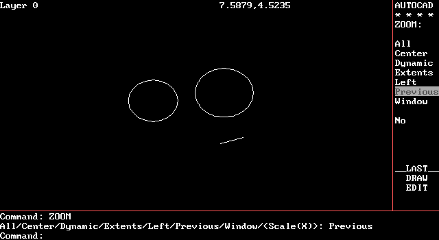
AutoCAD early 80s
The zoom appeared a long time ago, at the dawn of the era of graphic interfaces, with the first vector editors .
But since then it has not been used almost anywhere except for CAD and graphics software. They only remembered about him when mobile devices appeared - large pictures and web pages couldn’t fit on a small screen.
In mobile interfaces, the zoom has become quite familiar and natural and continues to evolve. But on the desktop, the zoom is abandoned and, in my opinion, completely in vain. Zoomable user interface (ZUI) gives a number of advantages allowing to solve actual problems better. I decided to describe these advantages by zoom type, with examples.
Geometric Zoom
There is a search by file name, a search inside documents, folders and tags, but you don’t always remember the keywords - you have to use a visual search. And when working with images or a large number of files, there’s no way around it. I'm sure the visual search is much simpler if you use zoom instead of scrolling. Zoom allows you to see all objects at the same time (zamappit on one screen) and quickly find the desired one. Here are some examples.
Seadragon (2006)
It is a technology for viewing large images or large collections of images via the Internet. Purchased by Microsoft, used in several not very well-known products. Based on this technology, the Deep Zoom was developed, which at one time became a “trick” for Silverlight. There is an Ajax API , but it works on tap only through tap.
')
You can go further and mute interactive elements, such as windows. A window manager with zoom and mapping is true multitasking! Will do without the use of multiple monitors.
Metisse (2006)
In my opinion, they made it unnecessarily complex and animated. Even before I saw Metisse, I drew my own, simpler and more rigorous concept (demo on Seadragon - you need a scroll). However, under Windows it is hardly possible.
But you can accurately map the tabs in the browser. One habrayuzer even tried and, I must say, was not alone in this — after Mozilla re-hired Humanized employees to work with its founder, Aza Raskin, who created the Tab Candy concept, it was embedded in Firefox 4. But the implementation It was not very good - any change in the size of the browser window led to the destruction of the layout of the image-tabs in space, which made the idea itself meaningless. And both projects seem to be closed. Although it's still just a mapping, it's much more interesting when you can interact with the contents of windows, as in Metisse. Maybe this can be done through an extension to the browser (if you solve XSS / same-origin policy problems).
Semantic zoom
Zoom can be used to visualize not only images, but also other types of information. Semantic zoom - when the level of detail changes to fit relevant information into the current object size, it is similar to a generalization in cartography . On the one hand, it allows you not to overload the interface with information, on the other hand, to obtain object metadata without additional clicks, and the main thing without losing focus is a quick transition from the general to the particular. In addition, using semantic zoom, you can make the text readable at any zoom level.
Web maps are a good example of semantic zoom, it got there from cartography, or rather from GIS, with the filing of Google Maps (2006) - at one time it was a very bold move. This is perhaps the only product with ZUI, which is known to the general public.
Semantic zoom is useful wherever objects have metadata. I didn’t find a good simple example - I drew my own abstract file manager:
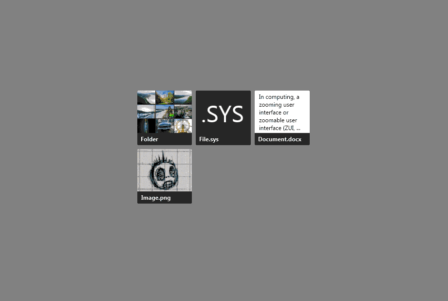
Changes both content specification and metadata.
Microsoft suggests developers use semantic zoom in Windows 8 applications for data abstraction. Although the geometry of the objects is lost, it is also an interesting type of semantic zoom. But it seems that developers do not care about it.
Zoom Navigation
With visual navigation, you can remember how this or that place or the way to it looks, refinding is shorter. Or look at several levels deep into the tree. Usually, no one believes that this is possible - we are sure that there will not be enough performance to maintain interactivity, but I show them the following example. Carefully, after watching, your life will probably never be the same!
Eagle Mode (2008)
The main part is the "fractal" file manager, allowing you to look at several levels deep. Very cool thing, but I can not believe that someone other than the author really uses it, since there is no familiar interaction - the usual menus, drag and drop, and even pan. What is interesting is C ++ API . On Android, the author also launched it - it does not slow down.
Combinations
By combining the principles and advantages described above, you can create many cool and useful interfaces - I’ll give a few examples.
Code Canvas (2009)
Advanced ZUI for Visual Studio from Microsoft Research, which, despite public interest, was never released. There is one more similar thing - Code Bubbles (2010) - also was not released. And Debugger Canvas (2013) was released after all.
Raskin (2011)
A visual file organizer for Mac, I haven’t managed to get to know him better yet, I’ll bring a comment from a friend of mine:
I tried to use Raskin for Mac, but this is just a zoomed space with all the content on the Mac disk, in which all the details are loaded immediately, which makes the program very slow and inconvenient for practical use. In addition, the program also shows system data, which is illogical in this situation, since this kind of application should focus on user content, providing separately specialized tools for working with the system. Considering that Aza did this project after working on Archy, it seems to me extremely strange why he made such a useless interface, relying on such a powerful idea as ZUI.
Raskin, of course, is named after Jeff Raskin , by the way, I advise you to read his book The Humane Interface , where he, among other things, talks about ZUI (6-2 Better Navigation: ZoomWorld). Here is another good article about him, there are the main ideas of the book.
ChronoZoom (2012)
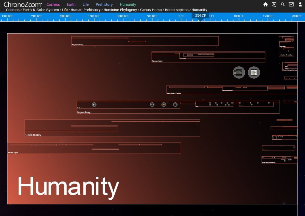
“An infinite canvas in time” is a visualization of the chronology of events that allows you to study history at any time interval, from billions of years to one day. Created by several universities (including Moscow State University) and Microsoft Research, it is especially interesting because it is implemented in HTML5. Read more about the project .
Zet Universe
This is a tool for visual organization and information retrieval, where you can create as many “endless desktops” as you like - spaces. Content in them — files, web pages, and so on — is organized into “visual clusters,” turning spaces into a kind of ordinary table. Spaces can be shared with other users via Dropbox. Now they are actively working on the beta. Part of the Zet Universe team worked with Microsoft to create Productivity Future Vision video (2009).
Previously, I wanted to do something similar, but with a clear hierarchy of folders - a tree - like file mapper with a semantic zoom - an interactive demo (you need a scroll). But soon I came up with another interface and decided that something more interesting and relevant could be done with it.
I have always been attracted to file management and web publishing, the new interface allowed me to combine them - to present information in the same way for the creator and consumer of the content. I do not believe that the “files will die”, at least in the foreseeable future. I used the zoom types mentioned in this article and added a zoom peek while navigating — the appearance of content inside the folder. Although by and large this is a file manager (desktop, mobile, cloud), I will show the operation of the zoom using the example of a photo publishing web application, it is more interesting.
Interface Monolith - interactive demo (need scroll)

At the same time, the usual interaction is preserved, the work is almost like in Explorer - the context menu, drag'n'drop, duplication of “fractal navigation” with clicks, a pan like in Google Maps, the address bar (omnibox). There is no such thing in the demo, but the salt is that no matter how many elements on the screen are 5, 200 or 1000 , the pictures are still visible, at least on the monitor, and it does not even slow down on the mobile. Tiles do not have to be square - pictures are much more convenient to view when their proportions are preserved .
Any system of storing and cataloging information tends to become a dump in the process of use, and it becomes quite difficult to find something logically. Using this interface, a flat (flat view) mapping - when there is no nesting and all the content is visible at once - can be used as a cleaning tool, or as a tool that allows you not to tidy up at all. By the way, in normal interfaces there is also a flat view, for example in Directory Opus , but there the tree is too stretched to a height.
You can make the dependence of the size or color of the tiles on the size of the files or folders, you can go ahead and zamappit so the root of the disk - you will immediately see how space is consumed. Or replace the desktop - everything will be at hand. But back to reality.
Apple realized the benefits of mapping, zoom, and data abstraction in the iOS 7 photo gallery (2013):
And this is really convenient, sorry for Andriod there is no such thing (UPD: yes !). The zoom is also present in some other
Conclusion
Zoom appeared in the mass product, which confirms its relevance and usefulness - wait for the further development of ZUI, especially on touch devices. But I hope not only on the touch - ZUI allows you to implement the same principles of control on all platforms, on devices with different resolutions and different aspect ratios of the screen.
I am sure that the advantages described above are a good reason to think about using the zoom in your application. If in doubt, you can read the ZUI philosophy from the author of Eagle Mode - he considered the pros and cons there.
PS: The word "zoom" probably came from the photo in the interface. In Russian, the word “scaling” will probably be more appropriate, but I don’t like it, and imagine how much longer this article would be!
Some more special zoom for sweet
Source: https://habr.com/ru/post/210408/
All Articles