Top 10 problems online stores
Recently, Qubit, a research company, presented a report entitled “The Value of Customer Feedback: Top 10 Things People Complain and How to Solve Them”. As the name implies - the researchers collected complaints and wishes of customers of 400 online stores for three years, and then on the basis of these data identified the main pain points of e-commerce sites.
Trends
The main points complained of by clients during the three years covered by the survey showed a rather high survivability.
')
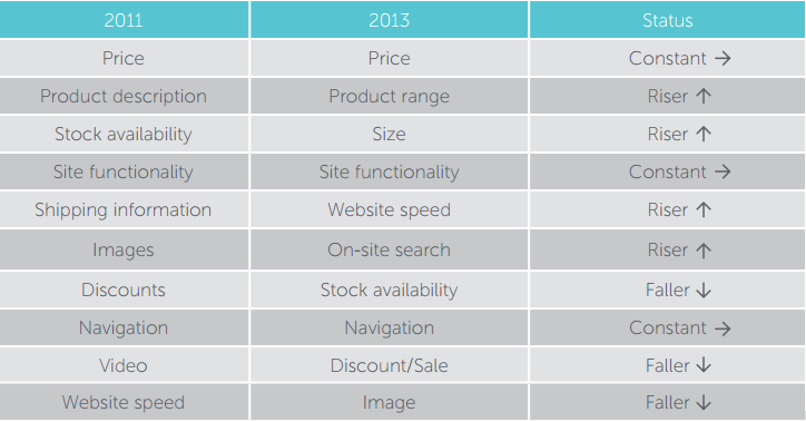
As can be seen from the picture above, out of 10 problems, only three of them have the number of complaints remained unchanged, 4 of them - they became only sharper in three years, and 3 problems began to worry customers a little less.
Price
This item is invariably annoying - people often complain that the price is too high for a particular product, or that it simply does not fit into their budget. Some people compare prices on different sites and are surprised when the price for the same product is lower in one store - making them buy where it is more expensive is very, very difficult. An example of such a complaint:
It was sad to see products from the same manufacturer for a much lower price on ebay.
Researchers believe that you can help reduce the number of customers who for one reason or another were upset when they saw your prices, by launching targeted offers, creating correct and accurate descriptions of goods, investing in advertising (including with the involvement of experts), etc.
For example, a furniture retailer Infurn noticed that visitors who complained most about prices and spent the most. Instead of offering such customers a fixed discount, they identified users who placed a certain number of products in their baskets, and gave them a discount for each subsequent one. This led to an increase in the average check by 17.1% - listening to feedback and developing flexible offers is a great way.

Variety of products
People who shop online want to make their shopping process as easy as possible, and they like to buy everything in one place, rather than running around different sites. The number of complaints about the meager selection in recent years has only grown.
According to researchers from Qubit, online stores should invest in integrating recommender systems, creating lists of new and seasonal products, and when viewing something in the online store, show the user similar products, like ASOS does.

Correct sizes
The average return rate for stores on the Internet Retailing 500 list is 4.96%, while for sellers working only online, it is 3.47%. Most of these returns are made by people who do not fit the size. This, by the way, can happen to anyone - not everyone knows the difference between European and American sizes, for example.
An example of how to act in such cases is the JC Penney brand, which made an opportunity for a visual demonstration of dimensions right on the site. It looks simple and clear.

Site functionality
The number of complaints about poorly made sites has increased over the years. If your site is inconvenient to use, you should not expect an increase in profits. With the increase in the proportion of users making purchases from a phone or tablet, such sites become even more difficult. Therefore, if you receive complaints from potential buyers about the usability of the site (or when it just “fell”) - they should not be ignored.
Work speed
Another problem that over the years has only become more acute. According to statistics, if the page load time increases by 1 second, this can lead to a seven percent (7%!) Drop in conversion. There are quite a few companies in the world that can safely afford to drop profits by 7%. As soon as users notice problems with the speed of the site, you need to urgently respond to it.
You must constantly work on the speed of the site. A great example here is Amazon, which, despite its gigantic size, is faster than any competitor.

Site search
Nothing infuriates online shoppers as a situation when they can not find a product on the site, using the built-in search. Often, problems with the search can be solved more closely by working with the tagging system, but not always everything is so easy. By using Google, people expect to see quality search absolutely everywhere. On some sites, up to 30% of visitors are looking for something first. So if you have a lot of products, you need to sort them well, and if you don’t have a search at all, this is a problem.
Too much choice is sometimes too bad, because it is confusing. House of Fraser has implemented many filtering options for its customers: by brand, gender, product name, price, and so on, and their search works very well - even if there is nothing to show for a specific request, some recommended products are displayed - all is positive affects the number of purchases made.

Incorrect product availability information
When a product is not available in an online store, it is annoying by definition - shouldn't the Internet solve all the problems of offline, where there is not always the right size or favorite color? But when there is no product, but it is on the site, and people are trying to order it - this situation is a hundred times worse than if they were told right away that they would not make such a purchase.
Here is an example of a sample complaint on this issue:
Show only those products that are in stock, because it is such a waste of time - to walk around the site, choose products, and then find out that they really are not!
Reputational losses are obvious. In addition, in such a situation there may well be real financial losses - after all, if the process of notifying about the stock balance is not properly organized, then advertising budgets can easily be spent on advertising the missing goods.
The way out is obvious here: online stores should show customers up-to-date information, if there is no product, just say so, or better still, not to show it. This can be achieved, for example, with the help of a special b2b-system for online distribution (for example, Agora Optima ), which helps automate the interaction of an online store with suppliers of goods (for more information, see our website ).
Navigation
If it is difficult for a potential client to find a button to place an order, any specific groups of goods or a search field, then this is an excellent reason to leave the site and never return to it. According to Gomez, 88% of customers in this situation will not return to the site. And that's it.
Farfetch, which sells goods from leading European fashion boutiques, noted a decrease in customer activity during its second and subsequent visits. To solve this problem, returning customers began to offer products marked "Farfetch choice" - this step significantly increased the conversion rate for returning visitors. Directing visitors in the right direction is very important.
Discounts / sales
It is not necessary to make discounts unobvious (“Where to drive a discount code?”) And, at the same time, too obvious. Of course, people always think that others are buying the same product, it is more profitable than they, but just as well, not every business can afford to sell the main product at a loss, hoping to attract an audience and make money on other products.
To notify about promotions, it is better to use targeted messages on the main page, so that all target groups of visitors know about profitable offers. It is necessary to conduct a / b tests to optimize pricing, to give people additional features such as free delivery. It’s a good idea to stimulate users with messages about the imminent end of stocks, then the issue of price goes to the second plan - for example, Woot.com, which sells goods at a discount in a strictly delineated framework and with a restriction on customers, uses it. It creates a feeling of shortage of the desired product, which has a positive effect on purchases.

Images
According to the NNGroup, up to 79% of people browse the web pages “diagonally” without carefully reading their contents. It is difficult to get someone to read a large amount of text. The Internet has made all of us visuals, so you just need to break the text with visual content that will help users make a purchase decision: images, videos, charts, infographics - everything will fit. If you sell a product, then people want to know what they are buying.
Need more pictures to explain what it is and how it looks.
So here you can simplify the situation to “no picture - no sale”. More and more online stores understand this, so the number of such complaints over the past three years has decreased slightly.
findings
Gathering feedback from users and further using this information to improve the service is very important. No matter how well you, in your own opinion, know your customers, they still know their needs better. Of course, collected opinions should be treated with caution. People who participate in opinion polls are usually either too happy or too disappointed with the experience of communicating with the company, so some “wind correction” should be made.
As a conclusion, the authors of the study propose online stores to combine historical data about visitors (session number, types of products viewed, amount of money spent in the past) with reviews of visitors and customers to optimize conversion and, as a result, increase revenue.
Source: https://habr.com/ru/post/210040/
All Articles