We analyze the interface details on the example of one mobile taxi client
We continue the series of posts about how good things can be done even better. By "good" we mean those where the first and only thought will not be: "Everything is wrong, everything needs to be redone."
Those who are interested to learn from the mistakes of others (or understand that even hundreds of millions of dollars and the best experts will not save you from mistakes), as well as the colleagues of Pavel Fage - welcome to the cat.

')
The splash screen (splash screen) is a very important thing: familiarity with the product begins with this, and it masks the shortcomings of your programmers. Since you would not see the screensavers, if the application was loaded instantly. Sometimes this is a limitation of the platform, and sometimes it is just too lazy for programmers to divide the loading of libraries, loading them by necessity, and not by the whole crowd at the moment the application starts.
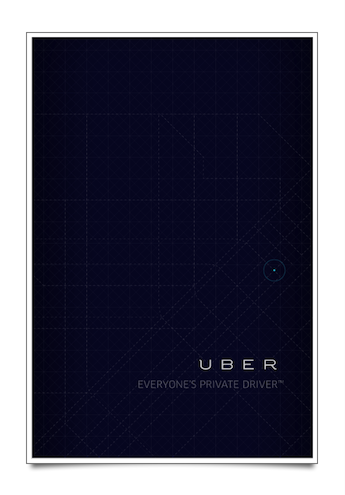
The creators of the U B E R logo knew what they were doing. The slogan is crooked: no discharge, no correct apostrophes, no common sense. From what you write "Microsoft. Your potential. Our passion "instead of" Microsoft®. Your potential. Our passion (TM) ”or do not put the copyright icon in the article, the laws will not cease to operate, your rights will continue to be respected (provided that you really have these rights). So try not to cross lawyers with users unnecessarily.
For beginners who have not read past posts, I continue to recommend Butterick's practical typography .

The profile button lives its interface life throughout the application. In the sense that it is not flush vertically with any of the elements, no matter what screen we are on, always a few millimeters to the right.

When all known maps were Google maps, the pin icon meant “You are here” or the button for opening the map. With the release of mobile phones with G P S, the icon for determining the current location has become a compass needle. Gugloikonka does not mean here either the transition to the current location, or the opening of the map (map and so below), but indicates the opening of a text search field, where you can enter the address from the keyboard.
Subjectively, you should not mix both icons in the same interface (compass and “google”) and you may need to replace the “google icon” with a magnifying glass icon, which is standard for search.

It should be noted mechanically narrowed font for the address. Made in order to accommodate the entire address, but taking into account the set of capital and the absence of discharge, turned into a hard-to-read type of message MINISTRY FORWARDING. Here, a lower case set will benefit (and it will fit more, and it will be much better read, as, for example, done in the previous screenshot of Sadovnicheskaya Embankment).
Well, the index in the address, of course, is not needed. But what is needed is memorization of previous addresses:

If you reopen the application after 24 hours instead of a beautiful magnifying glass (by the way, centered on the physical rather than the optical center and, therefore, moved a little to the left on the screen) it would be better to display a list of old addresses.
It is clear that providing a Mercedes es-class, we can assume that the target audience will not waste time entering the address, but will tell it to the driver, but the problem is that a) you can not remember the address; b) why waste time in the car (for which the client is already paying) while the driver knocks this address into the navigator. Not to mention the fact that the driver can not hear the address badly and take you away in another direction.
Imagine for a second that the application correctly determined your location, you do not want to drive in the destination address (you have perfect diction, and the driver does not use the navigator and knows all the streets by heart), you are ready to just call a taxi and go.
Opened in a couple of seconds the application. Question: where to click to call the car?

A button with a typewriter? Clicking it will open the next screen.

This is a window with information about the tariff, imposed in the most shameful way - everything can be seen in the screenshot. In addition, it is worth noting the moment with the display of figures, about which I spoke in previous articles: well, do not show you 340.00 and 16.00, if it is 340 and 16 rubles, respectively. Trim toe: they are not needed and only interfere with perception.
If we were not in Moscow, then here you can choose other types of machines (more expensive or cheaper), but in Moscow there are no machines, and the interface is cropped from the bottom.
Plus, here a taxi request button just suggests. But it is not, so you need to go back and think about how to order a taxi.
It is worth remembering about training when you first open the application (always try to educate the user, this is correct).

The section consists of three steps:
Nothing like?
And meanwhile, the fact that we have hidden in dots (and what is not in the “quick guide”) is the most important thing (the driver is not a telepath: he will not understand to whom and when to go). So far, as you can see, we did not really manage to order a taxi.
In fact, all the “training” is hidden in the first step, the other two explain the process (which is already known to the most stupid user: to order, drive, exit). But learning the application, in fact, no.
Plus, and the first item is misleading: if you just “zhmaknut” on the map, the departure point will not be put down. To put it, you need to drag the pin to the right place on the map (drag-and-drop), enter the address in the search text box, or click on the search button of the current location in the upper right corner (which, however, happens when you open the application - even " Tap "nowhere need not).
To go one step closer to ordering a taxi directly, you need to click on the "→" arrow on top of the pin (in the maps, this usually opens information about organizations at the selected address).

This is a question of the invention of bicycles and the importance of the continuity of interfaces (there must be a meme "You can not just take ..." from the "Lord of the Rings"). It was not limited to a Google phone icon and a taxi request button with a taxi icon (and not really a request). The cancel button can jump from one end of the screen to the other (plus, on the right, this is not even in accordance with iOS standards).

Experimentally, we realized that to order a taxi you need to click on the arrow. The following screen opens:

If you click on the “plus sign” for the first time, you can enter the destination address. If you click on the plus sign again and enter another address, it will not be added as an intermediate address (for example, if you need to call first to the flower and then to the station), and replace the existing one, which is illogical and will force you to re-enter the previous address. Why then show it as a "plus sign"? Why not hide and do not edit the destination address (the same standard pencil icon).
Because of this, you cannot build a route like a house → a train station → a house (if you need to meet someone close).
Plus, the estimated waiting time is not shown at the bottom of the screen (although it shows up nicely on the previous screen). Something like the recent case with the distribution of "Microsoft", when the subject of the letter was something like "Guys, we need the subject of the letter."

The menu item is not on the center, and not on the bottom edge of the icon - neither fish nor meat.
If someone responsible for the product in “Uber” reads up to this point, let him keep the bonus in the form of suggestions:
U p d. January 19 20:09: The Uber team contacted and kindly offered to place a promotional code for the first 2 trips (discount 700 p. for each) for new users, code H A B R A H A B R. That, however, is not very different from the heaps of others, which are easy to google (they act only once and only for new users).
Those who are interested to learn from the mistakes of others (or understand that even hundreds of millions of dollars and the best experts will not save you from mistakes), as well as the colleagues of Pavel Fage - welcome to the cat.
Screen saver
')
The splash screen (splash screen) is a very important thing: familiarity with the product begins with this, and it masks the shortcomings of your programmers. Since you would not see the screensavers, if the application was loaded instantly. Sometimes this is a limitation of the platform, and sometimes it is just too lazy for programmers to divide the loading of libraries, loading them by necessity, and not by the whole crowd at the moment the application starts.
The creators of the U B E R logo knew what they were doing. The slogan is crooked: no discharge, no correct apostrophes, no common sense. From what you write "Microsoft. Your potential. Our passion "instead of" Microsoft®. Your potential. Our passion (TM) ”or do not put the copyright icon in the article, the laws will not cease to operate, your rights will continue to be respected (provided that you really have these rights). So try not to cross lawyers with users unnecessarily.
For beginners who have not read past posts, I continue to recommend Butterick's practical typography .
Main screen
The profile button lives its interface life throughout the application. In the sense that it is not flush vertically with any of the elements, no matter what screen we are on, always a few millimeters to the right.
Address field
When all known maps were Google maps, the pin icon meant “You are here” or the button for opening the map. With the release of mobile phones with G P S, the icon for determining the current location has become a compass needle. Gugloikonka does not mean here either the transition to the current location, or the opening of the map (map and so below), but indicates the opening of a text search field, where you can enter the address from the keyboard.
Subjectively, you should not mix both icons in the same interface (compass and “google”) and you may need to replace the “google icon” with a magnifying glass icon, which is standard for search.
It should be noted mechanically narrowed font for the address. Made in order to accommodate the entire address, but taking into account the set of capital and the absence of discharge, turned into a hard-to-read type of message MINISTRY FORWARDING. Here, a lower case set will benefit (and it will fit more, and it will be much better read, as, for example, done in the previous screenshot of Sadovnicheskaya Embankment).
Well, the index in the address, of course, is not needed. But what is needed is memorization of previous addresses:
If you reopen the application after 24 hours instead of a beautiful magnifying glass (by the way, centered on the physical rather than the optical center and, therefore, moved a little to the left on the screen) it would be better to display a list of old addresses.
It is clear that providing a Mercedes es-class, we can assume that the target audience will not waste time entering the address, but will tell it to the driver, but the problem is that a) you can not remember the address; b) why waste time in the car (for which the client is already paying) while the driver knocks this address into the navigator. Not to mention the fact that the driver can not hear the address badly and take you away in another direction.
Unknown button and the most disgraceful section of the application
Imagine for a second that the application correctly determined your location, you do not want to drive in the destination address (you have perfect diction, and the driver does not use the navigator and knows all the streets by heart), you are ready to just call a taxi and go.
Opened in a couple of seconds the application. Question: where to click to call the car?
A button with a typewriter? Clicking it will open the next screen.
This is a window with information about the tariff, imposed in the most shameful way - everything can be seen in the screenshot. In addition, it is worth noting the moment with the display of figures, about which I spoke in previous articles: well, do not show you 340.00 and 16.00, if it is 340 and 16 rubles, respectively. Trim toe: they are not needed and only interfere with perception.
If we were not in Moscow, then here you can choose other types of machines (more expensive or cheaper), but in Moscow there are no machines, and the interface is cropped from the bottom.
Plus, here a taxi request button just suggests. But it is not, so you need to go back and think about how to order a taxi.
How to order a taxi
It is worth remembering about training when you first open the application (always try to educate the user, this is correct).
The section consists of three steps:
- Tap your finger to choose where to go.
- “Lean back and relax while the driver takes you to the right place.”
- Put a rating trip.
Nothing like?
- Open the app.
- ...
- You are being taken.
- P R O F I T!
And meanwhile, the fact that we have hidden in dots (and what is not in the “quick guide”) is the most important thing (the driver is not a telepath: he will not understand to whom and when to go). So far, as you can see, we did not really manage to order a taxi.
In fact, all the “training” is hidden in the first step, the other two explain the process (which is already known to the most stupid user: to order, drive, exit). But learning the application, in fact, no.
Plus, and the first item is misleading: if you just “zhmaknut” on the map, the departure point will not be put down. To put it, you need to drag the pin to the right place on the map (drag-and-drop), enter the address in the search text box, or click on the search button of the current location in the upper right corner (which, however, happens when you open the application - even " Tap "nowhere need not).
To go one step closer to ordering a taxi directly, you need to click on the "→" arrow on top of the pin (in the maps, this usually opens information about organizations at the selected address).
This is a question of the invention of bicycles and the importance of the continuity of interfaces (there must be a meme "You can not just take ..." from the "Lord of the Rings"). It was not limited to a Google phone icon and a taxi request button with a taxi icon (and not really a request). The cancel button can jump from one end of the screen to the other (plus, on the right, this is not even in accordance with iOS standards).
Taxi order window (finally)
Experimentally, we realized that to order a taxi you need to click on the arrow. The following screen opens:
If you click on the “plus sign” for the first time, you can enter the destination address. If you click on the plus sign again and enter another address, it will not be added as an intermediate address (for example, if you need to call first to the flower and then to the station), and replace the existing one, which is illogical and will force you to re-enter the previous address. Why then show it as a "plus sign"? Why not hide and do not edit the destination address (the same standard pencil icon).
Because of this, you cannot build a route like a house → a train station → a house (if you need to meet someone close).
Plus, the estimated waiting time is not shown at the bottom of the screen (although it shows up nicely on the previous screen). Something like the recent case with the distribution of "Microsoft", when the subject of the letter was something like "Guys, we need the subject of the letter."
Do not forget the little things
The menu item is not on the center, and not on the bottom edge of the icon - neither fish nor meat.
Product Suggestions
If someone responsible for the product in “Uber” reads up to this point, let him keep the bonus in the form of suggestions:
- show activated "promo" and their conditions in the application;
- let's choose the “promo”, if they are somewhat activated, to pay for the current trip;
- buy a paw breathalyser and test the drivers before the shift begins. Panibratsky stories with bravado about how the driver comes to change after the night of celebrating the birthday and the departure from the police - not comme il faut;
- In general, talk to the drivers so that they talk less: they found out on the first trip how many orders per day on average for a car and who are usually picked up from the regular customers at the same time from the regular metro station (would be a gangster and robbed);
- teach the drivers the gadgets of a Mercedes + reset the settings of the seats, massage, etc. after each trip: getting into a car with a vibrating lower back and a driver who doesn’t know how to turn it off is not cool;
- add “Yoty” usb-modem to the machines; it can raise a free Wi-Fi-network - a trifle, but nice;
- Do not turn on the radio without passenger demand. Driving under DFM, if you like, for example, Radio Jazz is unpleasant (not everyone can directly ask the driver to change or turn off the radio). It is even better to remember the passenger’s favorite radio station and turn it on before the customer arrives;
- do not hesitate to call the client if you give the 3rd circle around the house, not knowing how to drive up (delivery time is more important, and even in −10 ° in winter it’s unpleasant to stand outside, thinking that the driver is already in place). But only once, after that the driver should be able to leave a comment “for the future” for himself and colleagues with instructions on how to drive;
- taking at once for mileage and for minutes is a bit disgusting (in other cities, “Uber” or in some other taxis of Moscow for minutes are taken only at speeds below a certain threshold, or never taken at all for mileage).
U p d. January 19 20:09: The Uber team contacted and kindly offered to place a promotional code for the first 2 trips (discount 700 p. for each) for new users, code H A B R A H A B R. That, however, is not very different from the heaps of others, which are easy to google (they act only once and only for new users).
Source: https://habr.com/ru/post/209490/
All Articles