CSS animation tricks: instant changes, negative delays, transform-origin animation and more
Applying CSS animations in my daily work, I gradually developed the habit of experimenting with them in my spare time. Constantly trying to implement another interesting idea using as few HTML elements as possible, I discovered quite a few ways to do quite unclear things with CSS. In this article I want to share some of them.
Usually animations are used to smoothly change the properties of elements over time. However, changes can also be almost instantaneous. To do this, you need to set two keyframes at a very short interval, for example, 0.001%:
Here's how I used this technique to simulate a flashing neon sign using the transparency and
')

Codepen demo
A positive delay postpones the start of the animation for a while. And negative - starts the animation immediately, but not from the very first, but from the time specified in the delay. In other words, it starts the animation at some point within its cycle. This allows you to apply animation to several elements with a phase shift, changing only the delay time. Here is an example of using this animation:
Codepen demo
I try to make web applications as responsive as possible. This also applies to CSS animations. Although it is impossible to make absolutely all animations adaptive, sometimes it is still possible to use percentages and other relative units instead of absolute units of measurement.
In many of my animations, I use elements whose dimensions should be proportional to the size of the page. Perhaps you think that for this I use a fixed width and height, but this is not so. You can specify a width in percent, a zero height, and a percentage for
If you open the following codepen example and try to resize the window, you will see how it works. In this example, negative animation delays are also used.
Codepen demo
While working on one of the animations, I was surprised to find that the
Codepen demo
This trick has a flaw: you cannot use
You can set a negative transform-origin value, which can be useful for creating rotating elements. Instead of setting the offset and rotation angle for an element separately, as Lee Vera describes , this can be achieved more simply by using negative
Codepen demo
For animating simple forms without content inside, the

Codepen demo
Unfortunately,
Like
Codepen demo
In this example, all concentric circles around the central blinking circle, as well as the two small circles on the outer ring, are made using
As Paul Irish and others have shown , transformations work faster than resizing and positioning elements using the
With the help of transformations, it is easier to implement an adaptive design, using relative values for
Failure to use transformations leads to errors that are difficult to catch. For example, this animation is displayed in Chrome with incorrect colors, although the values in the code are correct. After switching to CSS transformations, the problem solved itself.
Perhaps, I spent more time on solving problems with
It is also worth noting that if you need the pseudo-elements to be behind the parent element, the pseudo-element must have a negative
And the last. Any element for which opacity is set other than “1” gets its own overlay context. For more on this, see Philip Walton's article .
Something in the real world, an interesting web page, an unusual video effect, animated gif or anything else - always look for things that you should try to realize.
I found that if you do not pry right away, how exactly this or that effect is made, you can find a unique way and even surpass the original. Even if I fail, I always at least learn something new about the programming language I use. It often happens that even a completely unrealized idea turns out to be quite spectacular. Sometimes, on the contrary, the result is much better than I could have dreamed of.
I hope that this article will help you to create something new and beautiful, even many of the specific techniques described in it are already familiar to you.
Fast state change in the middle of animation
Usually animations are used to smoothly change the properties of elements over time. However, changes can also be almost instantaneous. To do this, you need to set two keyframes at a very short interval, for example, 0.001%:
@keyframes toggleOpacity { 50% { opacity: 1; } /* Turn off */ 50.001% { opacity: 0.4; } /* Keep off state for a short period */ 52.999% { opacity: 0.4; } /* Turn back on */ 53% { opacity: 1; } } Here's how I used this technique to simulate a flashing neon sign using the transparency and
text-shadow property:')
Example code:
HTML:
CSS:
<link href='http://fonts.googleapis.com/css?family=Monoton' rel='stylesheet' type='text/css'> <div> <p id="error">E<span>r</span>ror</p> <p id="code">4<span>0</span><span>4</span></p> </div> CSS:
body { background-color: #111111; } div { padding: 40px; font-size: 75px; font-family: 'Monoton', cursive; text-align: center; text-transform: uppercase; text-shadow: 0 0 80px red,0 0 30px FireBrick,0 0 6px DarkRed; color: red; } div p { margin:0; } #error:hover { text-shadow: 0 0 200px #ffffff,0 0 80px #008000,0 0 6px #0000ff; } #code:hover { text-shadow: 0 0 100px red,0 0 40px FireBrick,0 0 8px DarkRed; } #error { color: #fff; text-shadow: 0 0 80px #ffffff,0 0 30px #008000,0 0 6px #0000ff; } #error span { animation: upper 11s linear infinite; } #code span:nth-of-type(2) { animation: lower 10s linear infinite; } #code span:nth-of-type(1) { text-shadow: none; opacity:.4; } @keyframes upper { 0%,19.999%,22%,62.999%,64%, 64.999%,70%,100% { opacity:.99; text-shadow: 0 0 80px #ffffff,0 0 30px #008000,0 0 6px #0000ff; } 20%,21.999%,63%,63.999%,65%,69.999% { opacity:0.4; text-shadow: none; } } @keyframes lower { 0%,12%,18.999%,23%,31.999%,37%,44.999%,46%,49.999%,51%,58.999%,61%,68.999%,71%,85.999%,96%,100% { opacity:0.99; text-shadow: 0 0 80px red,0 0 30px FireBrick,0 0 6px DarkRed; } 19%,22.99%,32%,36.999%,45%,45.999%,50%,50.99%,59%,60.999%,69%,70.999%,86%,95.999% { opacity:0.4; text-shadow: none; } } Codepen demo
Negative animation delays
A positive delay postpones the start of the animation for a while. And negative - starts the animation immediately, but not from the very first, but from the time specified in the delay. In other words, it starts the animation at some point within its cycle. This allows you to apply animation to several elements with a phase shift, changing only the delay time. Here is an example of using this animation:
Example code:
HTML:
CSS:
<div></div> <div></div> <div></div> <div></div> <div></div> <div></div> <div></div> <div></div> <div></div> <div></div> <div></div> CSS:
div { border-radius:50%; position:absolute; top:50%; left:75%; } div:nth-of-type(odd) { background:black; } div:nth-of-type(even) { background:white; border:2px solid black; } div:nth-of-type(11) { height:10px; width:10px; margin-top:-5px; margin-left:-5px; -webkit-animation:slide 3s ease-in-out infinite; animation:slide 3s ease-in-out infinite; } div:nth-of-type(10) { height:20px; width:20px; margin-top:-12px; margin-left:-12px; -webkit-animation:slide 3s -2.7s ease-in-out infinite; animation:slide 3s -2.7s ease-in-out infinite; } div:nth-of-type(9) { height:40px; width:40px; margin-top:-20px; margin-left:-20px; -webkit-animation:slide 3s -2.4s ease-in-out infinite; animation:slide 3s -2.4s ease-in-out infinite; } div:nth-of-type(8) { height:60px; width:60px; margin-top:-32px; margin-left:-32px; -webkit-animation:slide 3s -2.1s ease-in-out infinite; animation:slide 3s -2.1s ease-in-out infinite; } div:nth-of-type(7) { height:80px; width:80px; margin-top:-40px; margin-left:-40px; -webkit-animation:slide 3s -1.8s ease-in-out infinite; animation:slide 3s -1.8s ease-in-out infinite; } div:nth-of-type(6) { height:100px; width:100px; margin-top:-52px; margin-left:-52px; -webkit-animation:slide 3s -1.5s ease-in-out infinite; animation:slide 3s -1.5s ease-in-out infinite; } div:nth-of-type(5) { height:120px; width:120px; margin-top:-60px; margin-left:-60px; -webkit-animation:slide 3s -1.2s ease-in-out infinite; animation:slide 3s -1.2s ease-in-out infinite; } div:nth-of-type(4) { height:140px; width:140px; margin-top:-72px; margin-left:-72px; -webkit-animation:slide 3s -0.9s ease-in-out infinite; animation:slide 3s -0.9s ease-in-out infinite; } div:nth-of-type(3) { height:160px; width:160px; margin-top:-80px; margin-left:-80px; -webkit-animation:slide 3s -0.6s ease-in-out infinite; animation:slide 3s -0.6s ease-in-out infinite; } div:nth-of-type(2) { height:180px; width:180px; margin-top:-92px; margin-left:-92px; -webkit-animation:slide 3s -0.3s ease-in-out infinite; animation:slide 3s -0.3s ease-in-out infinite; } div:nth-of-type(1) { height:200px; width:200px; margin-top:-100px; margin-left:-100px; -webkit-animation:slide 3s ease-in-out infinite; animation:slide 3s ease-in-out infinite; } @keyframes slide { 0% { left:75% } 50% { left:25%; } 100% { left:75%; } } @-webkit-keyframes slide { 0% { left:75% } 50% { left:25%; } 100% { left:75%; } } Codepen demo
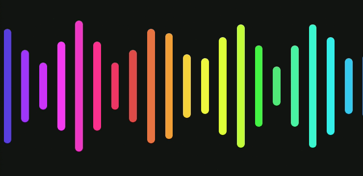
Proportional animations
I try to make web applications as responsive as possible. This also applies to CSS animations. Although it is impossible to make absolutely all animations adaptive, sometimes it is still possible to use percentages and other relative units instead of absolute units of measurement.
In many of my animations, I use elements whose dimensions should be proportional to the size of the page. Perhaps you think that for this I use a fixed width and height, but this is not so. You can specify a width in percent, a zero height, and a percentage for
padding . With padding-bottom height of the elements remains proportional to the width: .container { position: relative; display: block; width: 100%; height: 0; padding-bottom: 100%; } If you open the following codepen example and try to resize the window, you will see how it works. In this example, negative animation delays are also used.
Example code:
HTML:
CSS:
<span> <!-- Square container --> <div></div> <!-- Bars --> <div></div> <div></div> <div></div> <div></div> <div></div> <div></div> <div></div> <div></div> <div></div> <div></div> <div></div> <div></div> <div></div> <div></div> <div></div> <div></div> <div></div> <div></div> <div></div> <div></div> <div></div> </span> CSS:
body { background: rgb(20, 20, 20); overflow: hidden; } span { position: relative; display: block; width: 100%; height: 0; padding-top: 100%; overflow: hidden; } div { margin-top: -17%; height: 34%; width: 2%; top: 30%; border-radius: 20px; position: absolute; } div:nth-of-type(1) { animation: wave 17s 0.000s linear infinite; } div:nth-of-type(2) { animation: wave 17s -16.227s linear infinite; } div:nth-of-type(3) { animation: wave 17s -15.455s linear infinite; } div:nth-of-type(4) { animation: wave 17s -14.682s linear infinite; } div:nth-of-type(5) { animation: wave 17s -13.909s linear infinite; } div:nth-of-type(6) { animation: wave 17s -13.136s linear infinite; } div:nth-of-type(7) { animation: wave 17s -12.364s linear infinite; } div:nth-of-type(8) { animation: wave 17s -11.591s linear infinite; } div:nth-of-type(9) { animation: wave 17s -10.818s linear infinite; } div:nth-of-type(10) { animation: wave 17s -10.045s linear infinite; } div:nth-of-type(11) { animation: wave 17s -9.273s linear infinite; } div:nth-of-type(12) { animation: wave 17s -8.500s linear infinite; } div:nth-of-type(13) { animation: wave 17s -7.727s linear infinite; } div:nth-of-type(14) { animation: wave 17s -6.955s linear infinite; } div:nth-of-type(15) { animation: wave 17s -6.182s linear infinite; } div:nth-of-type(16) { animation: wave 17s -5.409s linear infinite; } div:nth-of-type(17) { animation: wave 17s -4.636s linear infinite; } div:nth-of-type(18) { animation: wave 17s -3.864s linear infinite; } div:nth-of-type(19) { animation: wave 17s -3.091s linear infinite; } div:nth-of-type(20) { animation: wave 17s -2.318s linear infinite; } div:nth-of-type(21) { animation: wave 17s -1.545s linear infinite; } div:nth-of-type(22) { animation: wave 17s -0.773s linear infinite; } @keyframes wave { 0% { left:-2%; background: #3B44D1; } 5% { background: #9337FE; } 10% { height:10%; margin-top: -5%; background: #C532FC; } 15% { background: #F639F8; } 20% { height:34%; margin-top:-17%; background: #F236C8; } 25% { background: #FF2F8D; } 30% { height:10%; margin-top: -5%; background: #EE3860; } 35% { background: #DC5245; } 40% { height:34%; margin-top:-17%; background: #F38643; } 45% { background: #F8B435; } 50% { height:10%; margin-top: -5%; background: #FAF444; } 55% { background: #E0FF3B; } 60% { height:34%; margin-top:-17%; background: #E1FF3C; } 65% { background: #46F443; } 70% { height:10%; margin-top: -5%; background: #54E67B; } 75% { background: #4DF3A9; } 80% { height:34%; margin-top:-17%; background: #3AF9DA; } 85% { background: #36EBF4; } 90% { height:10%; margin-top: -5%; background: #3DB3F3; } 95% { background: #3C82F1; } 100% { height:34%; margin-top:-17%; left:100%; background: #5B38EE; } } Codepen demo
Changing the transform-origin in the middle of an animation
While working on one of the animations, I was surprised to find that the
transform-origin property can not only change in the middle of the animation, but can itself be animated. In the following example, this is used to make four different turns in one animation instead of creating four separate animations:Example code:
HTML:
CSS:
<div></div> CSS:
div { width:200px; height:200px; background:rgba(0,0,255,.5); animation:flipAround 8s infinite; } @keyframes flipAround { 25% { animation-mode:forwards; transform-origin:right; transform:rotateY(-180deg); } 25.001% { transform:translateX(200px); } 50% { transform-origin:bottom; transform:translateX(200px) rotateX(-180deg); } 50.001% { transform:translateX(200px) translateY(200px); } 75% { transform-origin:left; transform:translateX(200px) translateY(200px) rotateY(180deg); } 75.001% { transform:translateY(200px); } 100% { transform-origin:top; transform:translateY(200px) rotateX(180deg); } } body { background:rgb(20,20,20); } Codepen demo
This trick has a flaw: you cannot use
animation-mode: forwards ; just for part of the animation. This means that we have to move the element each time the transform-origin changes. In this example, translate used to simulate the effects of rotation. In more complex examples, this can be quite tedious .Negative transform-origin
You can set a negative transform-origin value, which can be useful for creating rotating elements. Instead of setting the offset and rotation angle for an element separately, as Lee Vera describes , this can be achieved more simply by using negative
transform-origin values and an additional element or pseudo-element (or only one element if it is not required to maintain a constant angle relative to the horizon) . You can use the same animation for different elements with different transform-origin values:Example code:
HTML:
CSS:
<div></div> CSS:
div { width:100px; height:100px; margin-top:180px; transform-origin:200% center; position:relative; animation:rotate 3s linear infinite; } div:before { content:''; position:absolute; height:100%; width:100%; background:blue; animation:rotate 3s linear reverse infinite; } @keyframes rotate { 100% { transform:rotate(-360deg); } } body { background:rgb(20,20,20); } /* The best color ever */ Codepen demo
Magic box-shadow
For animating simple forms without content inside, the
box-shadow. property can be useful box-shadow. With it, you can create multiple borders around a single element . Based on this idea, using different offsets for shadows, you can create entire sets of animated shapes based on a single HTML element. Here is an example of an animation that looks like six rotating circles, which are entirely made using box-shadow :Example code:
HTML:
CSS:
<div></div> CSS:
div { border-radius:50%; height:2px; width:2px; /* To allow border-radius to work */ position:absolute; top:50%; left:50%; margin-top:-1px; margin-left:-1px; box-shadow: -75px -125px 0 40px #6cce74, 75px -125px 0 40px #c18d46, 150px 0px 0 40px #c14745, 75px 125px 0 40px #2e1e5b, -75px 125px 0 40px #9c37a6, -150px 0px 0 40px #76bdd1; -webkit-animation:rotate 12s infinite linear; animation:rotate 12s infinite linear; } @keyframes rotate { 16.67% { box-shadow: -75px -125px 0 40px #76bdd1, 75px -125px 0 40px #6cce74, 150px 0px 0 40px #c18d46, 75px 125px 0 40px #c14745, -75px 125px 0 40px #2e1e5b, -150px 0px 0 40px #9c37a6; } 33.33% { box-shadow: -75px -125px 0 40px #9c37a6, 75px -125px 0 40px #76bdd1, 150px 0px 0 40px #6cce74, 75px 125px 0 40px #c18d46, -75px 125px 0 40px #c14745, -150px 0px 0 40px #2e1e5b; } 50% { box-shadow: -75px -125px 0 40px #2e1e5b, 75px -125px 0 40px #9c37a6, 150px 0px 0 40px #76bdd1, 75px 125px 0 40px #6cce74, -75px 125px 0 40px #c18d46, -150px 0px 0 40px #c14745; } 66.67% { box-shadow: -75px -125px 0 40px #c14745, 75px -125px 0 40px #2e1e5b, 150px 0px 0 40px #9c37a6, 75px 125px 0 40px #76bdd1, -75px 125px 0 40px #6cce74, -150px 0px 0 40px #c18d46; } 88.88% { box-shadow: -75px -125px 0 40px #c18d46, 75px -125px 0 40px #c14745, 150px 0px 0 40px #2e1e5b, 75px 125px 0 40px #9c37a6, -75px 125px 0 40px #76bdd1, -150px 0px 0 40px #6cce74; } 100% { transform:rotate(-360deg); box-shadow: -75px -125px 0 40px #6cce74, 75px -125px 0 40px #c18d46, 150px 0px 0 40px #c14745, 75px 125px 0 40px #2e1e5b, -75px 125px 0 40px #9c37a6, -150px 0px 0 40px #76bdd1; } } @-webkit-keyframes rotate { 16.67% { box-shadow: -75px -125px 0 40px #76bdd1, 75px -125px 0 40px #6cce74, 150px 0px 0 40px #c18d46, 75px 125px 0 40px #c14745, -75px 125px 0 40px #2e1e5b, -150px 0px 0 40px #9c37a6; } 33.33% { box-shadow: -75px -125px 0 40px #9c37a6, 75px -125px 0 40px #76bdd1, 150px 0px 0 40px #6cce74, 75px 125px 0 40px #c18d46, -75px 125px 0 40px #c14745, -150px 0px 0 40px #2e1e5b; } 50% { box-shadow: -75px -125px 0 40px #2e1e5b, 75px -125px 0 40px #9c37a6, 150px 0px 0 40px #76bdd1, 75px 125px 0 40px #6cce74, -75px 125px 0 40px #c18d46, -150px 0px 0 40px #c14745; } 66.67% { box-shadow: -75px -125px 0 40px #c14745, 75px -125px 0 40px #2e1e5b, 150px 0px 0 40px #9c37a6, 75px 125px 0 40px #76bdd1, -75px 125px 0 40px #6cce74, -150px 0px 0 40px #c18d46; } 88.88% { box-shadow: -75px -125px 0 40px #c18d46, 75px -125px 0 40px #c14745, 150px 0px 0 40px #2e1e5b, 75px 125px 0 40px #9c37a6, -75px 125px 0 40px #76bdd1, -150px 0px 0 40px #6cce74; } 100% { -webkit-transform:rotate(-360deg); box-shadow: -75px -125px 0 40px #6cce74, 75px -125px 0 40px #c18d46, 150px 0px 0 40px #c14745, 75px 125px 0 40px #2e1e5b, -75px 125px 0 40px #9c37a6, -150px 0px 0 40px #76bdd1; } } Codepen demo
Unfortunately,
box-shadow does not support relative sizes in percentages, so it is more difficult to make them adaptive than ordinary elements. However, their sizes can be changed manually or by applying the transform:scale(n) for the parent element.Use of pseudo-elements
Like
box-shadow , pseudo-elements can be used to enrich the look of HTML elements. For them, you can use separate from the parent element animation, they can have separate shadows - almost like real elements. This allows you to do amazing things:Example code:
HTML:
CSS:
<div id='gif'></div> CSS:
body { background:black; overflow:hidden; } #gif { background:black; padding:10px; height:80px; width:80px; border-radius:50%; position:absolute; top:calc(50% - 40px); left:calc(50% - 40px); box-shadow: 178px 0 0 -25px black, 178px 0 0 -20px white, -178px 0 0 -25px black, -178px 0 0 -20px white, 0 0 0 20px black, 0 0 0 30px white, 0 0 0 130px black, 0 0 0 135px white; -webkit-animation: rotate 3s linear infinite; animation: rotate 3s linear infinite; } #gif:before { content: " "; position: absolute; height:50px; width:50px; border-radius:50%; top: -155px; left: 20px; background:black; border: 5px solid white; box-shadow: 0 355px 0 -5px black, 0 355px 0 0px white; -webkit-animation: reverseRotate 3s linear infinite; animation: reverseRotate 3s linear infinite; } #gif:after { /* Segmented circle code goes here */ content: " "; position: absolute; height:280px; width:280px; left:-90px; top:-90px; background-image: url("data:image/svg+xml;base64, PHN2ZyB4bWxucz0iaHR0cDovL3d3dy53My5vcmcvMjAwMC9zdmciIHhtbG5zOnhsaW5rPSAiaHR0cDovL3d3dy53My5vcmcvMTk5OS94bGluayIgdmlld0JveD0iMCAwIDEwMCAxMDAiID4NCiAgICA8Y2lyY2xlIGN4PSI1MCIgY3k9IjUwIiByPSI0MCIgc3Ryb2tlLWRhc2hhcnJheT0iMC45NTIiIHN0cm9rZS13aWR0aD0iOCIgZmlsbD0ibm9uZSIgc3Ryb2tlPSJ3aGl0ZSIvPg0KPC9zdmc+"); background-repeat: no-repeat; z-index:2; -webkit-animation: segmentRotate 300s linear infinite; animation: segmentRotate 300s linear infinite; } @keyframes rotate { 0% { transform: rotate( 0deg); } 10%, 15%, 35%, 40%, 60%, 65%, 85%, 90% { background: black; box-shadow: 178px 0 0 -25px black, 178px 0 0 -20px white, -178px 0 0 -25px black, -178px 0 0 -20px white, 0 0 0 20px black, 0 0 0 30px white, 0 0 0 130px black, 0 0 0 135px white; } 12.5%, 37.5%, 62.5%, 87.5% { background: white; box-shadow: 178px 0 0 -25px white, 178px 0 0 -20px white, -178px 0 0 -25px white, -178px 0 0 -20px white, 0 0 0 20px black, 0 0 0 30px white, 0 0 0 130px black, 0 0 0 135px white; } 100% { transform: rotate(360deg); } } @keyframes reverseRotate { 0% { transform: translateY(178px) rotate(0deg) translateY(-178px) rotate(0deg); } 10%, 15%, 35%, 40%, 60%, 65%, 85%, 90% { background: black; box-shadow: 0 355px 0 -5px black, 0 355px 0 0px white; } 12.5%, 37.5%, 62.5%, 87.5% { background: white; box-shadow: 0 355px 0 -5px white, 0 355px 0 0px white; } 100% { transform: translateY(178px) rotate(-720deg) translateY(-178px) rotate(0deg); } } @keyframes segmentRotate { 0% { transform: rotate(0deg); } 100% { transform: rotate(-32000deg); } } @-webkit-keyframes rotate { 0% { -webkit-transform: rotate( 0deg); } 10%, 15%, 35%, 40%, 60%, 65%, 85%, 90% { background: black; box-shadow: 178px 0 0 -25px black, 178px 0 0 -20px white, -178px 0 0 -25px black, -178px 0 0 -20px white, 0 0 0 20px black, 0 0 0 30px white, 0 0 0 130px black, 0 0 0 135px white; } 12.5%, 37.5%, 62.5%, 87.5% { background: white; box-shadow: 178px 0 0 -25px white, 178px 0 0 -20px white, -178px 0 0 -25px white, -178px 0 0 -20px white, 0 0 0 20px black, 0 0 0 30px white, 0 0 0 130px black, 0 0 0 135px white; } 100% { -webkit-transform: rotate(360deg); } } @-webkit-keyframes reverseRotate { 0% { -webkit-transform: translateY(178px) rotate(0deg) translateY(-178px) rotate(0deg); } 10%, 15%, 35%, 40%, 60%, 65%, 85%, 90% { background: black; box-shadow: 0 355px 0 -5px black, 0 355px 0 0px white; } 12.5%, 37.5%, 62.5%, 87.5% { background: white; box-shadow: 0 355px 0 -5px white, 0 355px 0 0px white; } 100% { -webkit-transform: translateY(178px) rotate(-720deg) translateY(-178px) rotate(0deg); } } @-webkit-keyframes segmentRotate { 0% { -webkit-transform: rotate(0deg); } 100% { -webkit-transform: rotate(-32000deg); } } : image / svg + xml; base64, PHN2ZyB4bWxucz0iaHR0cDovL3d3dy53My5vcmcvMjAwMC9zdmciIHhtbG5zOnhsaW5rPSAiaHR0cDovL3d3dy53My5vcmcvMTk5OS94bGluayIgdmlld0JveD0iMCAwIDEwMCAxMDAiID4NCiAgICA8Y2lyY2xlIGN4PSI1MCIgY3k9IjUwIiByPSI0MCIgc3Ryb2tlLWRhc2hhcnJheT0iMC45NTIiIHN0cm9rZS13aWR0aD0iOCIgZmlsbD0ibm9uZSIgc3Ryb2tlPSJ3aGl0ZSIvPg0KPC9zdmc +"); body { background:black; overflow:hidden; } #gif { background:black; padding:10px; height:80px; width:80px; border-radius:50%; position:absolute; top:calc(50% - 40px); left:calc(50% - 40px); box-shadow: 178px 0 0 -25px black, 178px 0 0 -20px white, -178px 0 0 -25px black, -178px 0 0 -20px white, 0 0 0 20px black, 0 0 0 30px white, 0 0 0 130px black, 0 0 0 135px white; -webkit-animation: rotate 3s linear infinite; animation: rotate 3s linear infinite; } #gif:before { content: " "; position: absolute; height:50px; width:50px; border-radius:50%; top: -155px; left: 20px; background:black; border: 5px solid white; box-shadow: 0 355px 0 -5px black, 0 355px 0 0px white; -webkit-animation: reverseRotate 3s linear infinite; animation: reverseRotate 3s linear infinite; } #gif:after { /* Segmented circle code goes here */ content: " "; position: absolute; height:280px; width:280px; left:-90px; top:-90px; background-image: url("data:image/svg+xml;base64, PHN2ZyB4bWxucz0iaHR0cDovL3d3dy53My5vcmcvMjAwMC9zdmciIHhtbG5zOnhsaW5rPSAiaHR0cDovL3d3dy53My5vcmcvMTk5OS94bGluayIgdmlld0JveD0iMCAwIDEwMCAxMDAiID4NCiAgICA8Y2lyY2xlIGN4PSI1MCIgY3k9IjUwIiByPSI0MCIgc3Ryb2tlLWRhc2hhcnJheT0iMC45NTIiIHN0cm9rZS13aWR0aD0iOCIgZmlsbD0ibm9uZSIgc3Ryb2tlPSJ3aGl0ZSIvPg0KPC9zdmc+"); background-repeat: no-repeat; z-index:2; -webkit-animation: segmentRotate 300s linear infinite; animation: segmentRotate 300s linear infinite; } @keyframes rotate { 0% { transform: rotate( 0deg); } 10%, 15%, 35%, 40%, 60%, 65%, 85%, 90% { background: black; box-shadow: 178px 0 0 -25px black, 178px 0 0 -20px white, -178px 0 0 -25px black, -178px 0 0 -20px white, 0 0 0 20px black, 0 0 0 30px white, 0 0 0 130px black, 0 0 0 135px white; } 12.5%, 37.5%, 62.5%, 87.5% { background: white; box-shadow: 178px 0 0 -25px white, 178px 0 0 -20px white, -178px 0 0 -25px white, -178px 0 0 -20px white, 0 0 0 20px black, 0 0 0 30px white, 0 0 0 130px black, 0 0 0 135px white; } 100% { transform: rotate(360deg); } } @keyframes reverseRotate { 0% { transform: translateY(178px) rotate(0deg) translateY(-178px) rotate(0deg); } 10%, 15%, 35%, 40%, 60%, 65%, 85%, 90% { background: black; box-shadow: 0 355px 0 -5px black, 0 355px 0 0px white; } 12.5%, 37.5%, 62.5%, 87.5% { background: white; box-shadow: 0 355px 0 -5px white, 0 355px 0 0px white; } 100% { transform: translateY(178px) rotate(-720deg) translateY(-178px) rotate(0deg); } } @keyframes segmentRotate { 0% { transform: rotate(0deg); } 100% { transform: rotate(-32000deg); } } @-webkit-keyframes rotate { 0% { -webkit-transform: rotate( 0deg); } 10%, 15%, 35%, 40%, 60%, 65%, 85%, 90% { background: black; box-shadow: 178px 0 0 -25px black, 178px 0 0 -20px white, -178px 0 0 -25px black, -178px 0 0 -20px white, 0 0 0 20px black, 0 0 0 30px white, 0 0 0 130px black, 0 0 0 135px white; } 12.5%, 37.5%, 62.5%, 87.5% { background: white; box-shadow: 178px 0 0 -25px white, 178px 0 0 -20px white, -178px 0 0 -25px white, -178px 0 0 -20px white, 0 0 0 20px black, 0 0 0 30px white, 0 0 0 130px black, 0 0 0 135px white; } 100% { -webkit-transform: rotate(360deg); } } @-webkit-keyframes reverseRotate { 0% { -webkit-transform: translateY(178px) rotate(0deg) translateY(-178px) rotate(0deg); } 10%, 15%, 35%, 40%, 60%, 65%, 85%, 90% { background: black; box-shadow: 0 355px 0 -5px black, 0 355px 0 0px white; } 12.5%, 37.5%, 62.5%, 87.5% { background: white; box-shadow: 0 355px 0 -5px white, 0 355px 0 0px white; } 100% { -webkit-transform: translateY(178px) rotate(-720deg) translateY(-178px) rotate(0deg); } } @-webkit-keyframes segmentRotate { 0% { -webkit-transform: rotate(0deg); } 100% { -webkit-transform: rotate(-32000deg); } } Codepen demo
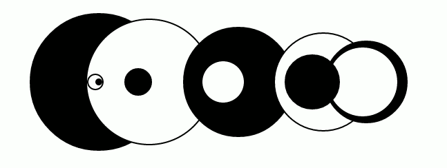
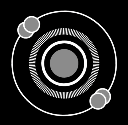
In this example, all concentric circles around the central blinking circle, as well as the two small circles on the outer ring, are made using
box-shadow . The other two circles are the shadows of the pseudo-element, and the ring of strokes is the background of another pseudo-element, given in the form of inline SVG.Some last tips
Use transformation wherever possible
As Paul Irish and others have shown , transformations work faster than resizing and positioning elements using the
top , left , width and height properties.With the help of transformations, it is easier to implement an adaptive design, using relative values for
scale ( example ).Failure to use transformations leads to errors that are difficult to catch. For example, this animation is displayed in Chrome with incorrect colors, although the values in the code are correct. After switching to CSS transformations, the problem solved itself.
z-index may cause problems
Perhaps, I spent more time on solving problems with
z-index than on any others. The z-index implementation varies from browser to browser. The main difference is that Mozilla does not animate z-index , and its value changes abruptly, then Webkit-based browsers can change it smoothly.It is also worth noting that if you need the pseudo-elements to be behind the parent element, the pseudo-element must have a negative
z-index , and the parent element must be located in the context of the overlay in the default location, that is, it cannot be applied to z-index or any other techniques that pull him out of the standard position in context.And the last. Any element for which opacity is set other than “1” gets its own overlay context. For more on this, see Philip Walton's article .
Look for inspiration
Something in the real world, an interesting web page, an unusual video effect, animated gif or anything else - always look for things that you should try to realize.
I found that if you do not pry right away, how exactly this or that effect is made, you can find a unique way and even surpass the original. Even if I fail, I always at least learn something new about the programming language I use. It often happens that even a completely unrealized idea turns out to be quite spectacular. Sometimes, on the contrary, the result is much better than I could have dreamed of.
I hope that this article will help you to create something new and beautiful, even many of the specific techniques described in it are already familiar to you.
Source: https://habr.com/ru/post/209462/
All Articles