Training course "Data Visualization"
On January 25 and 26, the laboratory conducts a practical training course on data visualization.

Over the past year, we in the laboratory solved visualization tasks and invented new formats for presenting data, I conducted ordinary and lively advice, read lectures and conducted practical exercises with students of the MAI, MSU and participants of the St. Petersburg Design Track. We have collected a huge amount of material that does not share, and have prepared a two-day practical course for those who want to go "on you" with complex data and immerse themselves in the topic.
')
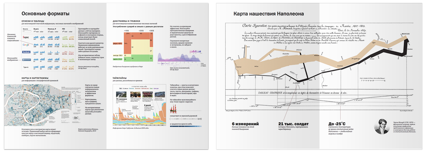
During the course, participants learn to work with data using design tools. On the first day, we will analyze good and bad examples, take a fresh look at the usual tables, graphs and diagrams, and get acquainted with unusual formats - boas, layered cake, mosaic, and homeogram. On the second day, Dima Tikhvinsky devgru , a web technologist at the laboratory, will show how to apply these skills when working with the D3.js library , the most modern and flexible tool for interactive visualizations. All course participants will receive handouts with a brief lecture summary:
The course will be useful for designers, analysts, managers, programmers, journalists and editors of online publications. Prior acquaintance with D3.js is not required, experience with HTML, CSS and JavaScript is useful, but not necessary.
To interest the habrovchan, I prepared a useful and pleasant surprises. In this post I will share the recipes for competent work with complex data that we learn on the course, and tell you how to get a discount.
This summer I took a course “Data Science” on a course . Among others, there was the topic of "Data Visualization", which for obvious reasons, I was very interested. Lectures were led by Professor Cecilia Aragon. I will give a brief fragment of one of them.
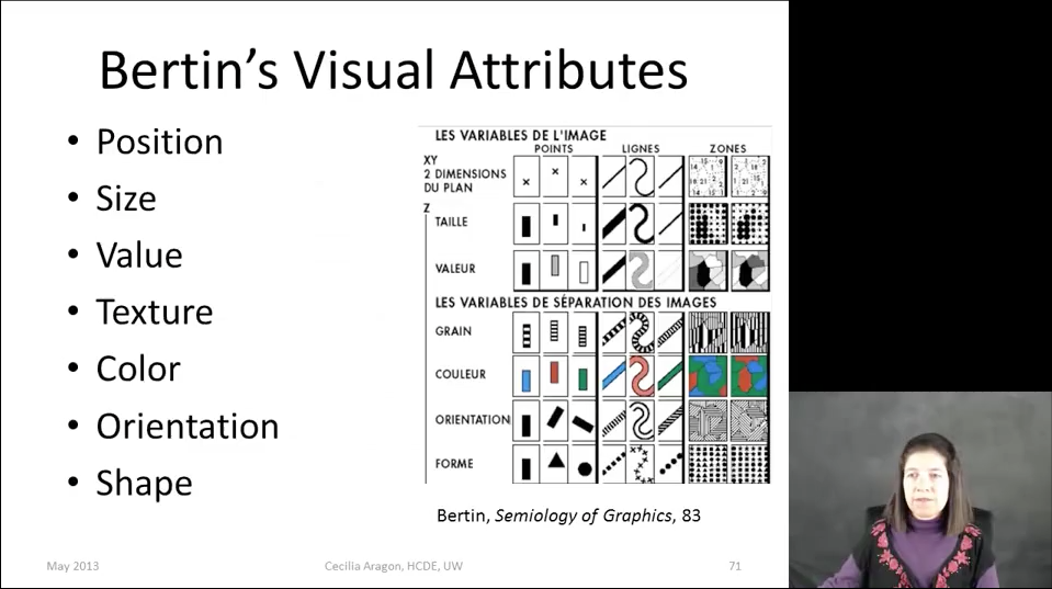
At the very beginning, the professor says that the task of visualization is to choose the most effective way of visual coding for a specific data set, and promises to tell how this is done. After several, in my opinion ambiguous, statements, including the prohibition on coding quantitative information in color (hello, Yandex traffic jams), Cecilia demonstrates all the visual attributes that are suitable for encoding information:
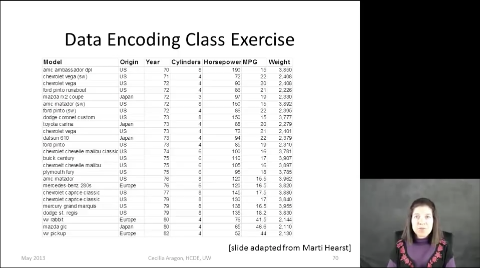
Then she offers, as an exercise, to visualize with their help automobile data:
At the end of the lecture, Cecilia shows the solution suggested by her student:
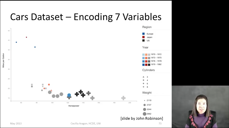
Look carefully at this visualization. What is she talking about? What patterns do you see? What benefits can you get?
All visual attributes in this example are chosen arbitrarily. Axes demonstrate an obvious pattern - the more engine power, the more fuel consumption. The data are heaped up at the lower boundary, the non-zero point of the vertical counting violates the scale (it seems that the most “voracious” car is different from the economical one in ten - actually, by three). How much do the "cross" and "triangle" weigh? What does the cluster of cars in the upper left corner mean? Visualization literally has to be deciphered, constantly referring to the legend, but even this does not give any interesting results.
This is how I would solve this problem.
First, it is necessary to examine the data, to understand what tasks they can solve. I can not imagine what significant conclusions can be drawn from the data about cars and why they should be studied without taking into account the most important parameter of automotive reality - the price. You say that it is dishonest, and the author of the first visualization of this parameter was not. But it is precisely this problem that is most often fraught with the data sets that we encounter in life: they are incomplete. The number of cylinders and weight, I, on the contrary, lowered, they seemed to me not interesting compared to other parameters.
So, the task of the information designer No. 1 is to study the data and scenarios of working with them, collect the most complete set and highlight key dimensions in it. In my example, I use Avto.ru data:

The task of information designer No. 2: to choose the most effective way of visual coding, which takes into account the meaning of the displayed parameter.
I want to find out how the price of cars depends on other parameters, therefore, on the Y axis, I save exactly the price (at school this was called the dependent variable). On the horizontal axis are asked year or power - numerical parameters with a more or less uniform distribution. Although the graph of cost versus release year may be interesting, I will choose power, and I will show the year differently. At this step we get a simple two-dimensional graph:

How to clearly show the year? Color? Size? Transparency? Let's try to just sign it with numbers:
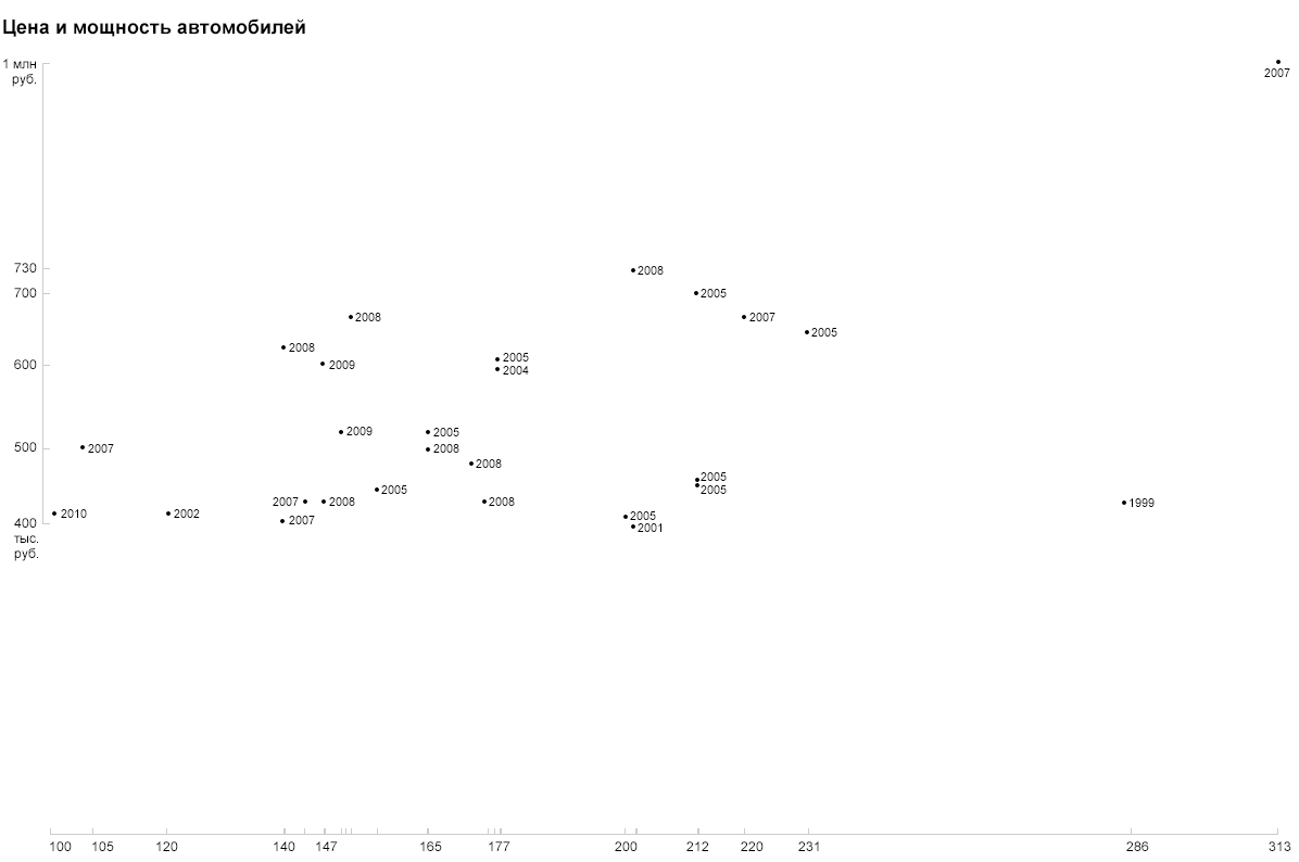
Due to the specific format, the years are read out unambiguously and do not require a legend or decoding.
Probably, you guessed it, as I propose to depict the country. Of course, flags:

Pay attention to the abundance of Asian brands, to the fact that the oldest (German) and the most expensive (Japanese) cars were ahead of all in power, that the price of Koreans kept below 500 thousand, that the newest car is Spanish and one of cheap. All these features are read simply due to the natural designations of the parameters.
Now let's deal with fuel consumption. Pictograms, color coding and other graphic pieces will overload our visualization. And what if you use existing measurements? After all, the expense - it is nothing like regular costs that will be added to the price of the car after purchase. But it is impossible to simply put down rubles with liters, therefore, in order to show the additive on the vertical axis, we need to convert the flow into rubles. For example, let's calculate how much the car owner will spend on gasoline to drive 50 thousand km: 50,000 / 100 * consumption * cost of a liter of gasoline.
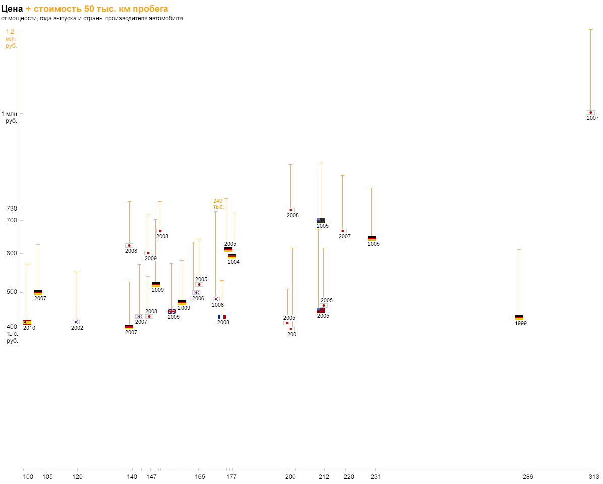
So we will see compare not only the cost of the car, but also on its operation. Similarly, you can show the cost of maintenance of 50 thousand km - the picture will turn out even fuller. Based on this visualization, you can explore trends in the market and choose a car affordable. At this point, I’ll finish the story, and I’m inviting readers to think for myself how to display information about the car model on this graph. Course participants will find out the correct answer on the first day of classes :-)
The course is worth a lot (I know that it stops many), but it's worth it. To make the course more accessible, we invented a special promotion for Habr users. Each new participant who, when recording, will refer to this note, will receive a discount of (N-1) thousand rubles, where N is the number of participants-habrovchan. That is, if two people come from Habra, then everyone will receive a discount of 1 thousand rubles, and if 11 - then the discount for each will be 10 thousand. Negotiate, join in groups, sign up and reduce the price! (You will need to pay for the course at the original price, we will calculate the discount on the day of the course by the number of paid participants and return the money in the way that is most convenient for you. The maximum group size is 16 people, several places are already taken.)
I really want as many guys as possible to make friends with the data. Tell your friends and colleagues about the promotion who may be interested in the course - this will help everyone to save a little!
Over the past year, we in the laboratory solved visualization tasks and invented new formats for presenting data, I conducted ordinary and lively advice, read lectures and conducted practical exercises with students of the MAI, MSU and participants of the St. Petersburg Design Track. We have collected a huge amount of material that does not share, and have prepared a two-day practical course for those who want to go "on you" with complex data and immerse themselves in the topic.
')
During the course, participants learn to work with data using design tools. On the first day, we will analyze good and bad examples, take a fresh look at the usual tables, graphs and diagrams, and get acquainted with unusual formats - boas, layered cake, mosaic, and homeogram. On the second day, Dima Tikhvinsky devgru , a web technologist at the laboratory, will show how to apply these skills when working with the D3.js library , the most modern and flexible tool for interactive visualizations. All course participants will receive handouts with a brief lecture summary:
The course will be useful for designers, analysts, managers, programmers, journalists and editors of online publications. Prior acquaintance with D3.js is not required, experience with HTML, CSS and JavaScript is useful, but not necessary.
To interest the habrovchan, I prepared a useful and pleasant surprises. In this post I will share the recipes for competent work with complex data that we learn on the course, and tell you how to get a discount.
Surprise useful
This summer I took a course “Data Science” on a course . Among others, there was the topic of "Data Visualization", which for obvious reasons, I was very interested. Lectures were led by Professor Cecilia Aragon. I will give a brief fragment of one of them.
At the very beginning, the professor says that the task of visualization is to choose the most effective way of visual coding for a specific data set, and promises to tell how this is done. After several, in my opinion ambiguous, statements, including the prohibition on coding quantitative information in color (hello, Yandex traffic jams), Cecilia demonstrates all the visual attributes that are suitable for encoding information:
Then she offers, as an exercise, to visualize with their help automobile data:
At the end of the lecture, Cecilia shows the solution suggested by her student:
Look carefully at this visualization. What is she talking about? What patterns do you see? What benefits can you get?
All visual attributes in this example are chosen arbitrarily. Axes demonstrate an obvious pattern - the more engine power, the more fuel consumption. The data are heaped up at the lower boundary, the non-zero point of the vertical counting violates the scale (it seems that the most “voracious” car is different from the economical one in ten - actually, by three). How much do the "cross" and "triangle" weigh? What does the cluster of cars in the upper left corner mean? Visualization literally has to be deciphered, constantly referring to the legend, but even this does not give any interesting results.
This is how I would solve this problem.
First, it is necessary to examine the data, to understand what tasks they can solve. I can not imagine what significant conclusions can be drawn from the data about cars and why they should be studied without taking into account the most important parameter of automotive reality - the price. You say that it is dishonest, and the author of the first visualization of this parameter was not. But it is precisely this problem that is most often fraught with the data sets that we encounter in life: they are incomplete. The number of cylinders and weight, I, on the contrary, lowered, they seemed to me not interesting compared to other parameters.
So, the task of the information designer No. 1 is to study the data and scenarios of working with them, collect the most complete set and highlight key dimensions in it. In my example, I use Avto.ru data:
The task of information designer No. 2: to choose the most effective way of visual coding, which takes into account the meaning of the displayed parameter.
I want to find out how the price of cars depends on other parameters, therefore, on the Y axis, I save exactly the price (at school this was called the dependent variable). On the horizontal axis are asked year or power - numerical parameters with a more or less uniform distribution. Although the graph of cost versus release year may be interesting, I will choose power, and I will show the year differently. At this step we get a simple two-dimensional graph:
How to clearly show the year? Color? Size? Transparency? Let's try to just sign it with numbers:
Due to the specific format, the years are read out unambiguously and do not require a legend or decoding.
Probably, you guessed it, as I propose to depict the country. Of course, flags:
Pay attention to the abundance of Asian brands, to the fact that the oldest (German) and the most expensive (Japanese) cars were ahead of all in power, that the price of Koreans kept below 500 thousand, that the newest car is Spanish and one of cheap. All these features are read simply due to the natural designations of the parameters.
Now let's deal with fuel consumption. Pictograms, color coding and other graphic pieces will overload our visualization. And what if you use existing measurements? After all, the expense - it is nothing like regular costs that will be added to the price of the car after purchase. But it is impossible to simply put down rubles with liters, therefore, in order to show the additive on the vertical axis, we need to convert the flow into rubles. For example, let's calculate how much the car owner will spend on gasoline to drive 50 thousand km: 50,000 / 100 * consumption * cost of a liter of gasoline.
So we will see compare not only the cost of the car, but also on its operation. Similarly, you can show the cost of maintenance of 50 thousand km - the picture will turn out even fuller. Based on this visualization, you can explore trends in the market and choose a car affordable. At this point, I’ll finish the story, and I’m inviting readers to think for myself how to display information about the car model on this graph. Course participants will find out the correct answer on the first day of classes :-)
Pleasant surprise
The course is worth a lot (I know that it stops many), but it's worth it. To make the course more accessible, we invented a special promotion for Habr users. Each new participant who, when recording, will refer to this note, will receive a discount of (N-1) thousand rubles, where N is the number of participants-habrovchan. That is, if two people come from Habra, then everyone will receive a discount of 1 thousand rubles, and if 11 - then the discount for each will be 10 thousand. Negotiate, join in groups, sign up and reduce the price! (You will need to pay for the course at the original price, we will calculate the discount on the day of the course by the number of paid participants and return the money in the way that is most convenient for you. The maximum group size is 16 people, several places are already taken.)
I really want as many guys as possible to make friends with the data. Tell your friends and colleagues about the promotion who may be interested in the course - this will help everyone to save a little!
Detailed program and enrollment: http://brainwashing.pro/dataviz
Source: https://habr.com/ru/post/209122/
All Articles