GUI Design

Introduction
In the modern world there are billions of computing devices. More programs for them. And each has its own interface, which is the "levers" of interaction between the user and the machine code. Not surprisingly, the better the interface, the more efficient the interaction.
However, not all developers and even designers think about creating a convenient and understandable graphical user interface.
')
For myself, I started by asking questions: general principles, which interface elements (EI) to create, what design should they have, where to place them correctly, and how should they behave.
Below I will try to answer these questions.
General principles
- The interface should be intuitive. So that the user does not need to explain how to use it.
- Help is needed to simplify the learning process. Literally - a graphic hint explaining the meaning of one or another EI. The complete manual should be part of the interface, available at any time.

- Return the user to the place where he finished work last time. Why press all over again?
- Most often, users in the interface first look for the entity (noun), and then the action (verb) to it. Follow the rule "noun -> verb". For example, the font -> change.

- The faster a person sees the result, the better. An example is a “live” search when options are in the process of typing a search query. The basic principle: the program should interact with the user based on the least significant input unit .
- Use quasi-modes. For example, entering capital letters with the shift key held down is quasi-mode. With capslock enabled - mode. The main difference is that a person can forget what mode he is in, and in quasi-mode (with the additional key pressed) this is much more difficult to do.

- Care should be taken to provide the user with the ability to set personal preferences. Imagine how much time an employee spends setting up Word, if its interface has been completely reworked previous.
- The more a user works with a particular task, the more he concentrates on it and the less he stops noticing the prompts and messages displayed by the program. The more critical the task, the less likely it is that the user will notice warnings regarding certain potentially dangerous actions.
What ei create?
- Interface development usually begins with defining a task or set of tasks for which the product is intended.
- The simple must remain simple. Do not complicate the interfaces. Constantly think about how to make the interface easier and more understandable.
- Users do not think about how the program works. All they see is the interface. Therefore, from the point of view of the consumer, the interface is the final product.
- The interface should be person-oriented, i.e. respond to the needs of the person and take into account his weaknesses. You need to constantly think about the difficulties that a user may encounter.
- Think about user behavior and habits. Do not change the well-known to all EI for the unexpected, and make new intuitive.

- Develop the interface based on the principle of the least possible number of actions by the user.
What should be the design of EI?
In fact, the design of EI is the subject of a separate article. Here you need to take into account everything: from color, form, proportions, to cognitive psychology. However, several principles are worth noting:
- Colour. The colors are divided into warm (yellow, orange, red), cold (blue, green), neutral (gray). Usually for EI use warm colors. This is precisely related to the psychology of perception. It is worth noting that the opinion about color is very subjective and can vary even from the mood of the user.

- The form. In most cases - a rectangle with rounded corners. Or a circle. Fully rectangular EI, I personally like less. Perhaps because of its "sharpness." Again, the shape as the color is quite subjective.
- Basic EI (frequently used) should be highlighted. For example, size or color.
- Program icons should be obvious. If not, sign. After all, in fact, instead of explaining, pictograms often require explanations for themselves.
- Try not to make too small elements - it is very difficult to hit them.
How to properly position the EI on the screen?
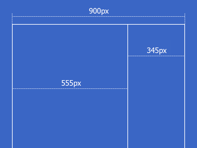
- There is a statement that visual appeal is based on proportions. Remember the famous number 1.62? This is the so-called Golden Section principle. The bottom line is that the entire segment refers to a larger part of it, as most, refers to a smaller one. For example, the total width of the site is 900px, we divide 900 by 1.62, we get ~ 555px, this is the width of the block with content. Now subtract 555 from 900 and get 345px. This is the width of the smaller part:
- Before location, EI should be ordered (grouped) by importance. Those. determine which are the most important and which are the least.
- Usually (but not necessarily), the elements are placed in the following gradation: from left to right, top to bottom. Top left most significant elements, lower right - less. This is due to the order of reading the text. In the case of touch screens, the most important elements are located in the area of action of the thumbs.
- It is necessary to take into account user habits. For example, if in Windows the close button is in the upper right corner, then the program needs to place a similar button in the same place. Those. The interface should have as many analogies as possible, with things known to the user.
- Place the EI closer where the user's cursor is located most of the time. Whatever he had to move the cursor, for example, from one end of the screen to the other.
- Keep the proportions
- An interface element can be considered visible if it is either currently available to human perception organs, or it has been so recently perceived that it has not yet managed to get out of short-term memory. For normal operation of the interface, only the necessary things should be visible - those that identify parts of the operating systems, and those that reflect the way the user can interact with the device.
- Indent between EI equal or multiple to each other.
How should EI behave?
- Users get used to it. For example, when deleting a file, a window appears with a confirmation: “Yes” or “No”. Over time, the user stops reading the warning and out of habit clicks "Yes." Therefore, the dialog box, which was designed to ensure security, absolutely does not fulfill its role. Therefore, it is necessary to give the user the opportunity to undo the actions taken by him.

- If you give the user information that he has to enter somewhere or somehow process, the information must remain on the screen until the person processes it. Otherwise, he may just forget.
- Avoid ambiguity. For example, there is one button on the flashlight. By pressing the flashlight turns on, clicked again - turned off. If a light bulb burns out in the flashlight, then when you press the button it is not clear whether we turn it on or not. Therefore, instead of a single switch button, it is better to use a switch (for example, a checkbox with two positions: “on” and “off”). Except when the state of the task is obvious.

This switch directly reflects the state of EI. - Make monotonous interfaces. A monotonous interface is an interface in which some action can only be done in one way. Such an approach will ensure quick getting used to the program and automate actions.
- Do not make adaptive interfaces that change over time. Since to perform some task, it is better to study only one interface, and not several. An example is the Chrome browser start page.
- If delays in the process of program execution are unavoidable or the action taken by the user is very significant, it is important that the interface provides feedback about them. For example, you can use the progress bar of a task (status bar).
- EI must respond. If the user made a click, then EI must somehow respond so that the person understands that the click has occurred.
In custody
This article does not claim to be the most comprehensive reference of the principles of interface design. The graphical user interface is an extensive subject closely intertwined with psychology, occupying the minds of scientists and hundreds of pages of books and studies. In such a small format, does not express the fullness of the topic touched. However, adherence to the basic principles will allow building user-friendly interfaces, as well as simplify the design process itself.
Thanks for attention.
Literature
Jeff Raskin , "Interface: New Directions in Computer Systems Design"
Alan Cooper , “On the Interface. Basics of interaction design "
Alan Cooper , "Mental Hospital in the Hands of Patients"
Source: https://habr.com/ru/post/208966/
All Articles