The device is minimalistic landing pages
The previous translation ( Landing page, which works ) on the design of high-quality landing pages gained more than 150,000 views. Much time has passed since then and the approach to design has changed - more and more minimalistic pages are being discussed, which will be discussed in the article.
Over the past few years, web designers have gradually come to the conclusion that piling up elements on the pages is not a good idea.
Senseless photos from photo stocks, repulsive textures in the background, winding navigation, social buttons, blog post widgets and other “bells and whistles” distract users from the goals that were set in the design.
')
Many designers prefer the use of fundamental forms to add more and more different elements and options.
And although we make websites that are visually simpler than their predecessors, they achieve far greater results.
Some examples of minimalistic LP
To make sure that we understand the same thing, let's take a look at the examples of minimalistic landing pages (hereinafter - LP):

Mailbox
Tinyletter

Dropbox

IFTTT
Please note that the applications in the examples are not the easiest; They solve useful, innovative and challenging tasks for their users.
But the complexity of LP is not related to the complexity of the application.
Let's explore some great examples of minimalistic LPs and display design approaches, tips, and ideas.
Minimalist LP: Big Idea
The first thing that catches your eye is that any minimalist LP serves only one main goal .
It can be registration, subscription or downloading something, but the most important thing is that there is only one clearly defined action that, in the opinion of the designer, the user must perform.
On minimalistic LP there is no difficult navigation, you will not see a lot of social buttons. This design does not apply photos from photo stocks, the purpose of which is to fill in the empty space.
Each element in the design is carefully selected to direct the user to perform the main action.
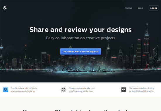
LP Examples: Dropbox
LP Dropbox is a prime example of a good minimalist design, which aims to make the user easily notice the only call to action - to register.
The only element on which the emphasis is placed is the “Register” button.
Yes, LP Dropbox has some secondary actions - downloading a desktop application, authorization or a tour of the site. But the design does not focus on them and does not prevent new users from performing the main action - to register.
All non-essential elements are either removed from the design or are not emphasized in any way:
- Site name (Dropbox) is not present on LP; it turned out that even the name of the application is an irrelevant element
- To explain how Dropbox works, a simple drawing is used, which also serves to draw attention to the registration button.
- The slogan "Your stuff, anywhere" is very short and simple.
Dropbox made a confident choice of the action that the user must perform and the LP design underlines this action.
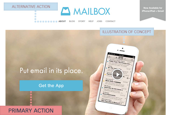
LP Examples: Mailbox
Mailbox is an application that helps users to effectively work with mail on smartphones. His LP is another good example of minimal design.
The main action is to go to the app page in the App Store.
To the right of the call to action is a clickable screenshot of the real application, which explains the essence of Mailbox.
There are alternative actions in the site menu, but visually they do not stand out in any way.
LP Examples: Karma
Karma is another great example of beautiful, minimalist LP design.
The main action on this page is to click on the “Buy Now” button, which is duplicated in the header of the page and in the center. The color, style, and text of both buttons match to create a link between them.
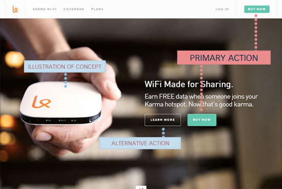
An alternative action that a user can take is to click on the “Learn more” button. But this button is transparent and has less visual weight, so as not to distract from the main button “Buy now” (Buy now).
A short description on top of the buttons contains a unique value proposition: public distribution of WiFi.
In this example, the background photo is important - it shows how the product looks and gives a visual representation of the size of the device (the hand holding the device is a kind of hint).
Main components of minimalistic LP
You must have noticed 3 repetitive minimalistic LP design elements:
- Main action
- Explanation of what constitutes a product / service
- Alternative actions
Keep these 3 points in mind by reading the next section and looking at examples.
Minimalist LP Design Tips
In this section, we look at some tips and ideas that are based on the key LP components described above.
Focus on creating a good visual hierarchy
In order to draw attention to the most important parts of the LP, the visual hierarchy must be properly aligned.
The visual hierarchy is a thoughtful arrangement of design elements, in which the order of viewing elements is observed (that is, users first pay attention to the most important elements).
Here is a list of some characteristics that affect the position of design elements in the visual hierarchy:
- Size The larger the size, the higher the item in the hierarchy.
- Position on the page . For most sites, the elements in the header and on the left of the page occupy a higher position in the hierarchy.
- Color contrast . The higher the contrast between the element and the background or neighboring elements, the higher the position of the element in the hierarchy
- Visual complexity . The more complex the element compared to its neighbors, the higher it is in the hierarchy.
- Empty space . The more empty space around the element, the higher it is.

In the example above, notice how the size, location, contrast, visual complexity, and empty space are used to form the visual hierarchy.
LP Examples: Numbrs
Using the example of minimalistic Numbrs design, one can deconstruct the principles of visual hierarchy.
Description of the application (1) and the call to action button (2) are the two most prominent elements on the page.
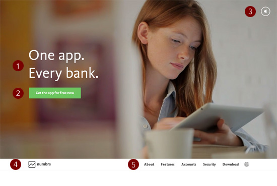
Buttons sound control (3) has a rather high position in the visual hierarchy, because the user may want to turn off the sound on the page.
As you can see, the product name (4) and alternative actions (5) are much lower in the visual hierarchy.
LP examples: Wander
Another example of a good visual hierarchy can be seen on LP Wander .
Having visited the page, you will see only 4 elements.

The most important element of the hierarchy is the inscription, which explains that the project needs new users (1). Under the inscription is a button-call to action, prompting users to log in (2).
Much lower in the visual hierarchy are alternative actions - for example, the “Like” button on Facebook, which also displays the current number of likes, urging users to take the main action (register).
The lowest element in the hierarchy is the views of the social profiles of the project.
Creating a visual hierarchy in your design
Here are some links to visual hierarchy guidelines:
- Working with visual weight in your design - a guide to choosing the right visual weight based on the positions in the visual hierarchy
- Creating focus in your design - a description of techniques for drawing attention to design elements
- The principles of gestalt design - a set of psychological theories (gestalt), which imply useful techniques for building a visual hierarchy
Make sure the main action is the most prominent element.
First you need to decide what action the users should take. Click on a specific button? Like Facebook pages? Fill in the form?
Choose the only main action and focus only on it; the page design should focus only on this action.
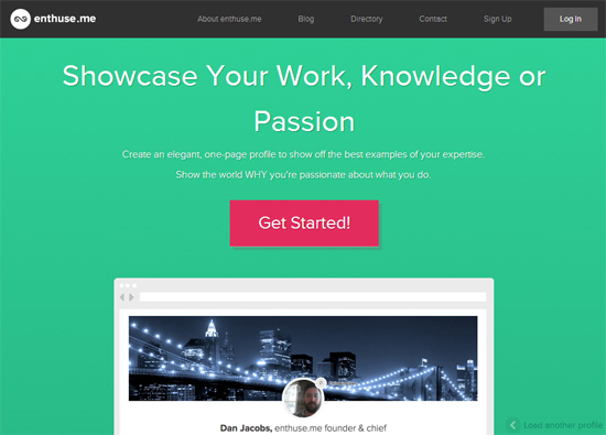
LP examples: enthuse.me
A good example of a page where the main action is brightly highlighted - LP enthuse.me :
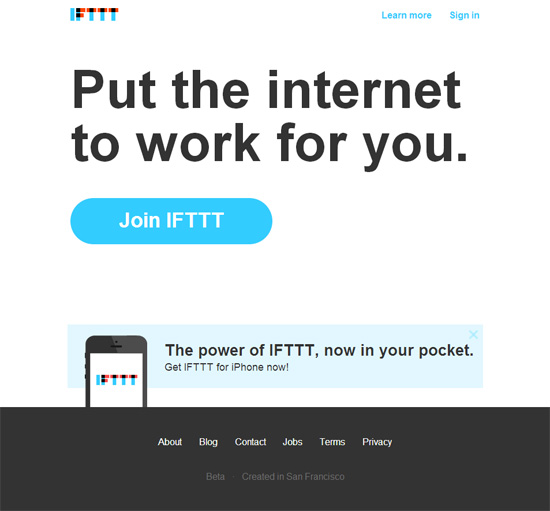
LP Examples: IFTTT
Notice how the call to action is striking at LP IFTTT :
Use colors and typography strategically
Web designers who create minimalistic LPs have limited tools - color and typography are the most important in it.
LP Examples: Basecamp
Basecamp is a good example of a minimalist LP in which color and fonts play a big role.
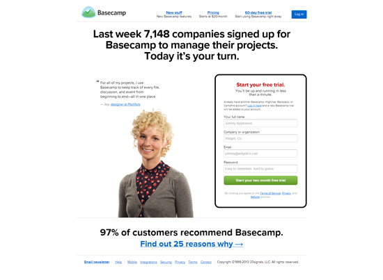
Green is used for the main call to action. Blue is used for secondary calls to action (authorization or viewing 25 reasons why it is worth using the service).
Font sizes and variations in the colors of the elements correctly distribute the attention between the LP elements.
LP Examples: Path
The next example is the LP Path, where color and excellent fonts are used to create the correct visual hierarchy.
A remarkable green color is used for the main action (form filling):
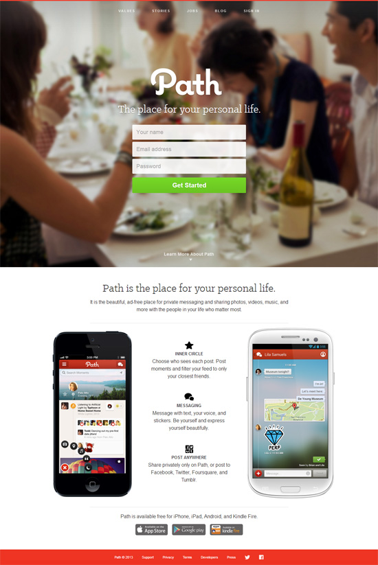
The difference in font size, text color and position correctly splits LPs into different areas of attention.
Use as little text as possible.
It is now known that users rarely read text on pages . It is logical to assume that on the LP product, which the user sees for the first time, his patience is even less.
Minimalist LPs should have short and clear labels. The less a user has to read, the faster he will perform the required action.
LP Examples: Contently
You can describe the essence of Contently in three words - “Tell Good Stories”. Immediately it becomes obvious that this is a service whose essence is focused on content. The amount of text on the page is minimized, reducing the likelihood that the user will go astray.

LP Examples: Shipment
A good example of short texts on LP is Shipment . Only 5 words - “Share and review your design” (Share and review your design) - it is necessary for the user to fully understand how Shipment can be useful.
Explain the essence of the product / service quickly
There are many ways to demonstrate how a product / service works. The only rule here is simplicity.
Example video explanation: Couple
The Couple project uses video to explain the essence of their work, given the fact that the video can significantly disrupt the conversion .
The video gradually appears when you click on the icon in the center of the screen:

After clicking, the YouTube video opens in a modal window. It is easy to close, so the user does not need to watch the entire movie before performing the next step.
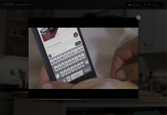
This example also demonstrates the rule that should be applied to secondary actions and content — a gradual discovery. Video on the page has a large visual weight, which greatly affects the visual hierarchy, so it opens only at the request of the user.
Example of an interactive description: Apple Mac Pro
Apple Mac Pro's minimalist LP demonstrates another popular subcode to the product description — an interactive tour.

The description begins with a small animation in order to attract attention and show that the page is interactive.
Example description using a static photo: Wallmob
A high resolution photo on LP Wallmob is a sample of how a photo is used to transmit a message.

It clearly demonstrates what Wallmob is - a cash application for a mobile device.
Complicated simplicity
As you can see, the minimalistic design for LP is based on a simple concept - there should be one and only one goal in the spotlight.
By removing unnecessary elements, you get the opportunity to direct your design (as well as the attention of users) only to those elements that are really important.
Source: https://habr.com/ru/post/208068/
All Articles