Intuitive and easy-to-use user interface (GUI) layout for communicators and tablet PCs
Introduction
 There are a lot of different methodologies and approaches to providing convenience for users when using this or that person's communication interface with a technical device. Now there is a large variety of communication interfaces: tactile (buttons / keyboard, levers / joysticks / manipulators (mouse, etc.), touch screens / pads, etc.) and non-tactile (based on gestures, acoustic, etc.). All of them have a different purpose and scope.
In this publication we will talk about mobile interfaces for navigating and working with WEB-pages and content. Also, we will try together to do something simple and intuitive for most users of mobile devices, such as communicators or tablets with touch screens (and / or similar devices).
Terms of use and license
Posted by: xmoonlight
License: http://creativecommons.org/licenses/by-sa/4.0/
Add. conditions: When distributing / implementing / copying / modifying in any form, save the displayed text caption in the lower right corner of the layout (without quotes): "2013, xmoonlight" in a convenient and easy to read for the eyes without using any additional technical means.
')
Layout
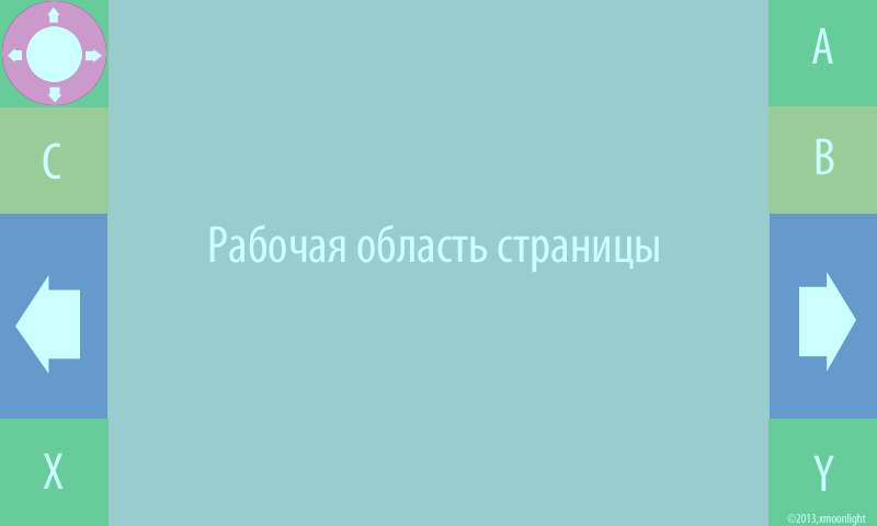
Description of the layout (landscape mode)
In the upper left corner is the joystick, which acts as the cursor keys, browse the sheet / scroll or the movement of the virtual cursor (for example, arrows). It works as a normal virtual joystick by shifting the central closed area in one of the possible directions.
Below it is the zone C - button auxiliary area. She can be responsible for any rare actions related to the work of the joystick or with navigation (for example: changing the mode of operation of the joystick). A zone C can work as a button, as a trigger, or as a cyclic trigger (more than 2 states).
Right: zones A and B are designed to work as command buttons together with a joystick.
The main zone "A" - for example, can work as a left "mouse" button.
Additional zone "B" - for example, can work as a right mouse button.
Symmetrically, on the sides of the working area of the page, there are areas with arrows. They can perform various roles: turning pages (scrolling down to the height of the visible working area of the page), flipping through slides in a presentation, choosing an item from the popup menu (for example, to select the desired object, section or category of the site).
In text editing mode - they perform the role of moving the text cursor left and right.
Zones X and Y are used for very rare actions: calling up a menu, changing any navigation modes, etc.
Zones X and Y can work as buttons, as triggers or as cyclic triggers (more than 2 states).
Also, in some cases, in these zones, you can do "exhaust" menu.
For example, drag up (drag-n-drop) - another menu appears in the same column.
Left and right - less convenient, but permissible in very rare cases when working with a considerable number of objects / points is necessary.
The status bar in this layout is intentionally not. Since It is more convenient to store all states on the stack (as a story) and show through a separate menu.
Not all columns and internal elements (zones) must necessarily be displayed.
For example, you can leave: joystick, zones A and B, and call the menu in zone X. Hide the rest (on the left: left arrow and zone C; on the right: right arrow and Y zone) and make a so-called ribbon ( or "border") for vertical movement (scrolling) of the page for this free space (tap-n-drag). At the same time there will be everything you need to work on the screen "at hand"
Conclusion
In the next release will be presented a layout with a portrait screen orientation mode.PS: I want to wish everyone a Happy New Year 2014 and wish everyone the achievement of their goals.
Source: https://habr.com/ru/post/207902/
All Articles