Dozen design jambs
Over the past months, I had to study and control a large number of designs. Criteria are completely ordinary - to follow the text, carefully reading into each phrase. And make sure that the design performs its tasks.
After a while I highlighted a few unobvious things that I tried to pay attention to, and in most cases I found errors. It turned out a small checklist. Very useful for self-checking, and for checking someone else's design. I want to share it with you:
')
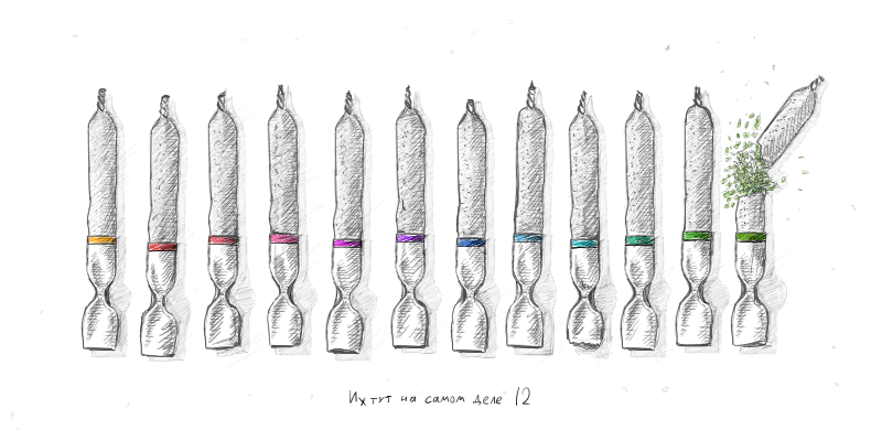
1. Leave a place
The longest name of the month is September. The longest name of the day of the week (like the day itself) is Monday. That is, with the expanded date format, the biggest sausage that can be made:
September 27 (Monday) at 20:35
Leave more space for the maximum possible amount or quantity of goods in the basket. Require the longest content that can be. Let the layout be a small white spot, but on a gloomy September Monday your layout will not spoil anyone's mood.
Do not forget about the long names. The longest real name I've ever met is: Panteleimon of Christ. Two letters longer than Constantin of Constantinople, who was beaten so much by designers that there was no place left for the poor fellow. And read easier.
2. Build your vocabulary

- Tell me your phone number, baby
- You mean a mobile phone, phone number or mobile number?
Try to adhere to the same terms and abbreviations. It often occurs when on different pages of the same site it says:
sms
SMS
SMS message
car loan
auto loan
car loan
It is sad that in most cases these are sites of mobile operators and banks. However, it is fun when even the name of your own company does not obey any rules of copywriters. It is written in Latin, Cyrillic or caps. In quotes or without. Bow or add tongue-tied postscript "in the company of such and such."
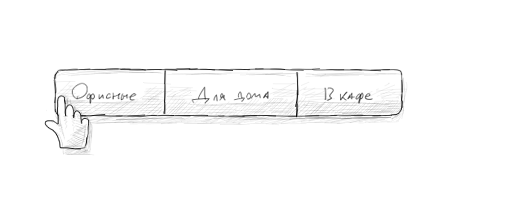
3. Roll one size fits all.
Not uncommon, when there are completely different links, not similar to each other, like DeVito and Schwarzenegger. And they lead to the same type of pages:
Buy a chair
Tables
Withdrawal of funds
Transfer funds
In both cases, with a click we will go to the same type of page. If the content is similar, then the form should be similar:
Chairs
Tables
Withdrawal of funds
Money transaction
Or so:
Buy a chair
Buy a table
Withdraw funds
Transfer funds
If you bring the headlines and links on the site to a general form, it will become easier for users to draw analogies between actions. And therefore easier to navigate.
4. Watch the first letters.

• Select a product and add it to the cart.
• Enter your card details
• In the "comment" field, specify the desired delivery time.
• Service questions can be asked to the online consultant.
When items start with a single letter, it makes reading difficult. Even worse, they start with a preposition. Did you meet such things - for home, for giving, for office? Much easier to understand ( Sugrob , thanks for the correct text):
• Add item to cart
• Enter your card details
• Specify the desired delivery time in the "comment"
• The online consultant will be happy to answer the remaining questions.
A capital letter is like a beacon, an eye clings to it to start reading. If all the sentences in the list begin with one letter, it is difficult to even understand on which line you stopped.
Some items can be swapped when their order is not important. For example, the first two begin with the letter B, and the third with the letter D. Let us rearrange and facilitate the perception of information.
5. Read the registration form
After you have drawn the design, try to read it like a book. From left to right, top to bottom. Everything written in it, starting with the title. Usually something like this comes out:
Buy a chair. Office, guest, for a cafe. Office chair. Herman Miller Aeron. 1500 bucks. Buy.
The same mess in the minds of customers. Much better:
Chairs. Office, guest, for a cafe. Herman Miller Aeron. 1500 bucks. Buy.
6. Catch on the fly
No matter how cool the texts are, in most cases no one will read them. Users work quickly and carelessly. Adapt texts for quick reading. The point is that the most important information in the proposal is at the beginning. For example:
In order to secure the transfer of funds to another account, to your mobile + 7 ... 1245
SMS sent with verification code.
Important information should always be ahead:
An SMS with a verification code has been sent to your mobile + 7 ... 1245. This is done for the purpose of
security of transferring funds to another account.
7. Click the opposite
Now it's time for links and buttons showing additional information. It is often forgotten that these elements have the opposite effect. It turns out that after clicking on this open box
Show more benefits ↓
Thirty-three items fall out, which are minimized to the same “Show more” link, although now they are shown less. Collapse - expand. Show - hide. Do not forget about antonyms.
8. Hover and see
This is a separate topic for the article and holivar. However, any interactive element must show that you can interact with it. In the modern conditions of modern design, when links no longer have to be blue and underlined, and icons sometimes look like checkboxes, this is a very useful practice.
9. Turn the wheel
Someone considers the users smart and relies on the scroll, someone makes their design with the expectation of grandmothers and tries to squeeze the maximum information to the first screen. There are too many very authoritative and controversial opinions on this subject on the Internet. Rule 700 px. So we call him in our internal kitchen. The point is that on the first screen it was clear what to do next and it was clear that there is something below.
10. Do not get fat
Perhaps in the static on the layouts looks normal when the text becomes bold when you select one tab or item in the menu. In fact, such items jump left and right as buffoon when users switch from one to the other. Very diligent designers even highlight the item when you hover the cursor in bold.
11. Do not apologize, do not make excuses and do not congratulate.
This is the sore point. I regularly see the following messages on websites and in letters:
Dear Vasily Petrovich! The company Stool ru congratulates
you with the purchase of Herman Miller Aeron in our online store!
Or so:
Unfortunately, we could not transfer your funds. We apologize.
I feel cheated when I read such texts. This is just a blatant lie through an email screen or web interface. Of course, you need to write for people. Yes, the interface should be with the soul, the texts should not be boring and dry. However, if you don’t waste the time of the user, scattering in apologies, and just write him the most important information, he will be sincere and sincerely grateful to you. Better this way:
You bought Herman Miller Aeron on Highchair
Translation failed
12. Save the cursor from convulsions.
There is with several positions. Often during layout they forget (or block) the areas in which the pointer should be displayed. The cursor turns from finger to arrow and back several times within a couple of centimeters of the screen. Such a kaleidoscope annoying
That's all for now. A little captaincy has not harmed anyone yet, in the end, repetition is the mother of stuttering. I hope, in comments will help to fill up the list of jambs.
UPD:
Thanks to all the commentators, honestly, did not expect such attention to the article and the accompanying holivar. For a long time I formed this article in my head as answers to questions, but as a result there were more questions :-)
Next, good advice from the guys. I took the liberty of correcting the comments a little and adding some ad-libbing in order to better fit into the style of the article:
Thank you Dima_Sharihin
With the modern development of input methods, you need to check each site on at least three devices: a smartphone, a tablet and a desktop / laptop. What is convenient for one may be inconvenient for others. Here you need to highlight the highest priority site, and find a middle ground for font sizes and interactive elements.
Thanks for qbz and vvzvlad holivar
Fixed elements of the site - for example, the button "checkout" or the basket icon, always hanging out in one place on the screen. Do not forget that such things are rather crookedly displayed when viewing the site on mobile devices, and can be very annoying to users.
Thank you kahi4 , reminded about third-party fonts, another sore subject:
If there are third-party fonts in the layout, ask yourself (or the author of the design):
- How does this font deal with a license, is it in all the necessary formats to connect to the site?
- How many font styles are in the layout, and how much do they weigh?
- What will the site look like if the third-party font does not load?
Do not forget that the text should be text. Insert picture instead of each title is not worth it. Many use all sorts of readers or plugins that facilitate reading. Do not complicate their lives.
Thanks monolithed for adding to the first item:
Do not forget about localization. If your site assumes versions for different languages, study the translations, and leave the necessary space. What looks short in one language can be a terrifying construct in another. Take at least:
Sign up Register
Happy New Year, everyone, and be careful!
Source: https://habr.com/ru/post/206886/
All Articles