We design a convenient email client
Recently, looking through old Habra articles, I came across a survey about email clients, which showed that the vast majority of readers prefer Gmail. I myself have been using it for many years, although a couple of times a year to no avail I am trying to “transfer” to something more comfortable. Since then, I began to think about how Gmail could be made better. There are so many ideas that I decided to create my own email client. Fans to read about the interfaces please under the cat. And let Fitts help me.
Low start. User portrait and positioning
The first thing to think about is the positioning of the product. Usually this issue is neglected when designing interfaces and go directly to the design. The result is a product for everyone and for anyone.
I have compiled a portrait of my target user. This is a completely fictional person, under which the product will be created:

')
Intuition tells me that such a mail client is better to take root first in the West, and only then in our country. So I decided to do all the materials at once in English.
Start
Competitors need to know in person. I tested a dozen web clients from the survey and made conclusions, which I took into account when designing further. When I created the prototype, first of all I was guided not by the principle “that it was not similar to ...”, but by my own logical considerations, the laws of Fitts and Hick, the works of Ruskin, Cooper and other authoritative designers.
Immediately launched a small survey on friends in the social network:

The result is highly expected: people want it to be quick, simple and beautiful. The target audience was not entirely voted, but the result was obtained quickly and for free: for now this is sufficient.
The most important thing: an interactive prototype
Some rush to do the design immediately. Honestly, I don’t understand at all how to debug the “mechanics” of interaction on graphic layouts. In general, we start with an interactive html prototype in Axure, in which we could test and rework various elements of interaction right at the design stage.
Below are the most interesting screenshots with explanations. If you are curious to touch hands, at the end of the article you will find a link to the prototype.
So, log in with your Gmail account, allow the application to use the data, get into the inbox
I gave my email client a temporary working name UXMail and will only use it within the scope of this article.
Just in case, I’ll clarify that this is only a functional prototype, which means all colors, fonts, icons and shapes are only conditional, you shouldn’t pay attention to the style: everything will be fine, “drawn” later by a professional designer.
Navigation and letters
To begin with, I decided to minimize the noise in the navigation bar, putting only icons in the menu - no signatures. The first 10 minutes, the user may feel slightly uncomfortable due to the fact that he does not immediately say, where is the archive, where is spam, and where are sent. For this case, standard pop-up tips are provided:

I am sure that this temporary drawback will pay off with constant use.
And here it was not without GTD and gamification
I respect the principles of Getting Things Done about the “empty inbox” methodology, so I tried in every way to motivate the interface not to delay the processing of letters, and to clear the inbox as soon as possible. For example, when the last letter is sent to the archive, UXMail praises the user

It is supposed to rotate inscriptions and pictures, so that there is a motivation to find out how the mail client will praise you. A sort of element now fashionable gamification .
When you hover on a letter in your inbox, a button for adding this letter to the archive appears. It will be enough for the user to move the cursor a few pixels and click on the icon:

After that, a letter with animation “flies” into the archive icon in the menu.
The Fitts Act is flawless as always
For comparison, the same action - adding to the archive - in Gmail. The user is forced to perform five (!) Operations instead of two each time:

- Move the cursor to the flag
- Set flag
- Move the cursor to the “archive” button
- To click
- Move the cursor to the next letter.
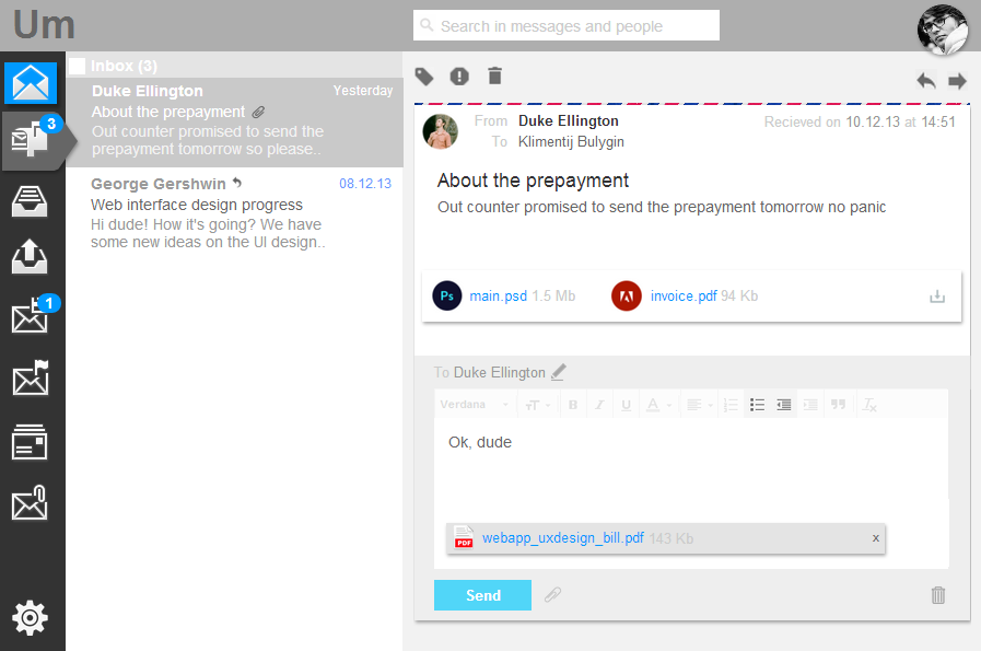
We respond to the letter
There is nothing conceptually new in the interface of the incoming letter. When clicked, the input field “travels” to the state in which it is convenient to write the answer

Less popular interface elements are hidden. For example, a copy when answering. The formatting panel is very muted by color, but when you hover and click, the tools are “highlighted”:

Undo and confirm actions
Modal confirmations like “Are you sure you want ...?” Users quickly get used to and automatically click “yes” without even reading. Therefore, it is better to make pop-up notifications: in this case, the user will have 3-4 seconds to change his mind and cancel his decision

Chains of letters and microchips
Some people like it a lot, some don't like it very much. It seems that indifferent is almost gone. In the comments to one article on Habré, the chain of letters was even compared to fresh cilantro .
Personally, I love fresh cilantro, but I think that the chain of letters is an unproductive and inconvenient invention. Yes, there is a small percentage of cases when they are justified, but even in these cases, the consequences of the fundamental shortcomings of this mechanism are affected:
- It is not clear how many new letters appeared in the chain. Just appeared one "unread" element - a chain of topics
- Opening the thread, all letters are marked as “read”. As a result, you can skip the new letter
- It is not clear to which letter the chains will apply general actions (reply, forward and others). Although in Gmail this is already partially resolved, which cannot be said about some other clients.
Chains have one significant advantage: they allow you to trace the entire line of communication and remember some important information. Frankly, at first I was also going to make chains, “muffling” the listed disadvantages with a number of interface “crutches”, but at the same time, UXMail lost in simplicity and minimalism.
In the end, I decided to introduce a new concept - microchips. In fact, the microchip is the incoming message and the user's response to this message. Such a mechanism allows us to preserve the simplicity and straightforwardness of the interface without chains and to obtain certain advantages of the interface with chains, at least within the framework of one iteration “incoming letter - answer to it”. In most cases, this is enough to restore the meaning of the correspondence in your head.

Check spam more often.
I deliberately “spammed” the spam folder to the top level. I believe that users should at least occasionally check spam for important emails, because spam filters are not yet 100% working correctly. Accordingly, this interaction is assumed: the user scans the list of letters in spam, using the quick button sends some letters back to the inbox, and at the end of the list it is waiting for the big button “Delete all spam irretrievably” - and then there will be again a laudatory inscription and a picture

Labels and filters: why?
But fans of UXMail tags and filters will most likely not like it: filters will have to be configured via the Gmail interface, and there are no tags at all - only the folders remain

I see the following disadvantages of using folders with filters:
- The principle of “one empty inbox” is violated. Those. to efficiently process mail, you need to ensure that several folders are empty or at least just processed
- The probability of missing an important letter increases: a person is not a robot: it may be banal to forget about a folder and not check it.
- If you put two people side by side and send them the same letters, then I venture to suggest that the one who receives everything in one folder will be faster to process the flow of letters, because he does not waste time switching between folders
As for the tags, I am in doubt: I have decided not to support them at all. Tags - this is when all the letters remain in the general “inbox”, they are simply marked with the words “work”, “study” and so on. I somehow used tags, then I stopped, because noticed that they only improve productivity for a short time. Then you have to systematically spend time on “reviewing” the created tags and adding new ones. This is despite the fact that in 9 out of 10 cases it is clear what letter to study, and what letter to work.
Investment management
Another feature that, in my opinion, can be in good demand is centralized investment management. Now in mail clients it is rather difficult to search for received files, especially if you don’t remember the sender’s name or the date. In UXMail, you can scroll through all attachments on one screen and filter them by date, sender or subject:

All-all, already round out. Settings
I studied the configuration interfaces of several popular email clients, thought and removed all unnecessary. Only 4 sections left: mailboxes, signatures, an answering machine and notifications

Each setting is necessarily accompanied by an explanatory text and an illustration of how it will look in the interface. Some settings are duplicated in “everyday” interfaces. For example, you can add another sender address directly from the context of creating a new letter:

And when the user turns on the answering machine, a message stating that the answering machine is on is static in the top panel.

This should motivate users at least a little to include an answering machine only for “good reasons" such as holidays or illness. I hope there will be a little fewer recipients, from whom, in response to each letter, scary words like “Thank you, I received your message” automatically come.
Perhaps that's all. In the interactive prototype, you will find many more amusing mechanisms with which you can “play around”, but it would be quite voluminous and boring to describe everything in the article (I'm afraid that I overdid it already a little).
What are your plans?
Collect feedback from Habr, finalize the prototype, make graphic design and promotional materials, attract investment in the development of crowdfunding platforms.
And why did I write all this?
I’m a terribly lazy person before an activity that could potentially be useless, so I wrote this article not only to entertain readers and myself a little, but also to draw on authoritative opinion from the community and to appeal to the brutal and extremely reasonable criticism of the ideas and solutions described above. I'm going to make a really cool product, and your opinions and arguments will help me better than anything else. Thank you for attention.
Source: https://habr.com/ru/post/206622/
All Articles