Designing a corporate site layout
Hi, Habrayuzer! The Internet is full of articles on what should be the perfect website design, many examples of already drawn layouts, but you almost never see how this layout was drawn, what changes it carried and how far it was originally from the final version. Today I invite you to make out the process of drawing the main page of the corporate website of the company, from scratch. We will look at 13 intermediate options that preceded the final version of the main page and analyze in detail all the changes introduced into the layouts.
Formulation of the problem
Our task: to create a layout of the main page of the site for the company, which is engaged in the production and delivery of construction soil. I deliberately take the theme rather narrow and not the most convenient for the designer in terms of aesthetics. But, as usually happens, the subject matter in site building is rarely limited to perfume, white clouds and fluffy kittens, in reality, more prosaic. Of course, this is not a reason to reduce the quality of design in advance, compared to cats.
Technical points
I deliberately omit all the technical details of the layout rendering, which can always be viewed separately (grid, drawing methods in Photoshop, etc.), I focus only on the design of the design.
')
In addition, the layout and its variants, which will be presented below, were drawn specifically for this article. The same applies to the logo of the company, which, of course, is fictional. Post is purely educational in nature.
Determining the boundaries of the site
Let's call the customer company "Company". This company is engaged in the production and distribution of its construction soil. Need a site that will promote products. That is, we need to design not an online store, but a corporate website with a catalog, offers and descriptions of the services provided.
Taking into account the theme of the site, we will not be able to use too many high-quality beautiful images of high resolution, therefore, first of all, we focus on concise information, in the form of fractional blocks with small images.
The layout should be suitable for adaptive layout, and when viewed on Full HD monitors, the useful space of the site should not stretch across the entire width of the screen in order to preserve readability and adequate perception of small images. Thus, with a monitor width of more than 1280 pixels, the site will maintain a fixed width of the usable space, and at lower resolutions, the usable space will decrease proportionally.
Ps. All screenshots below are clickable.
Sketch
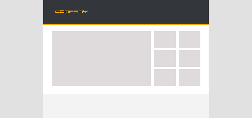
- For advertising products on the site it is reasonable to use a small slider with accompanying blocks of images that will familiarize the user with the main sections.
- The target audience of the company are mainly men 25-50 years old, searching for suppliers of soil for their construction companies, so the site should look respectable (high income of the audience), modern and easy (for the young part of the audience). We will use light tones for the base and a little dark with orange for contrast and focusing on important elements of the site.
Outcome: Color scheme, the main elements of the style are defined, we continue.
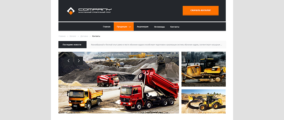
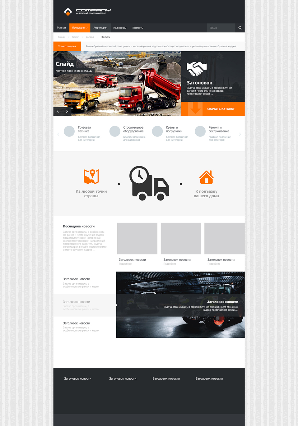
Location of blocks
- We play with the width of the cap and add the main menu. All this looks simple for now, but our task now is to determine the style, so in the first steps we will experiment, choose the direction.
- Remove the orange liner for the cap. Without it, the site looks more serious, we need respectability.
- In the design we use sharp corners and simplicity of forms for greater location from a respectable audience.
- Immediately under the header we have additional navigation, which will be relevant when visiting other sections of the site. Under the navigation, we assign a place to a small information block with the latest news or advantageous offer. This block can be executed in the form of a running line.
- For clarity, insert the image into the slider. Ideally, it should contrast well with the light background. Start drawing elements of the slider.
Bottom line: Our site has become a little juicier and more serious - not bad.
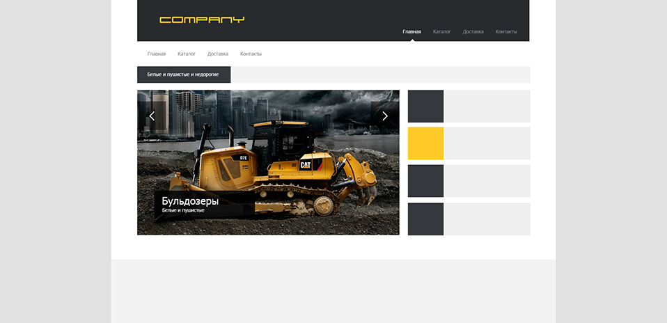
Searching of decisions

- You can start thinking about the logo, if the company did not provide it to us. In any case, its presence will make the cap visually more complete. In this case, we draw our logo in the form of a bucket digging the ground, while preserving the angularity and simplicity of the forms - it became better.
- We try to change the location of the main menu. While something is clearly wrong with him, it doesn’t attract attention at all. You can try to make a darker background for the logo. Visually, it will crush the cap into 2 parts. We try to return the orange liner under the cap - the result is mediocre, but we are experimenting.
- We continue to draw the slider elements and begin to think that somewhere in a prominent place, we must focus on the product catalog so that the user does not struggle to find prices for all types of soils.
- Use backgrounds for more navigation. The result: additional navigation, and should not focus too much on the user's attention.
Bottom line: The site lacks respectability, it is necessary to determine the style.
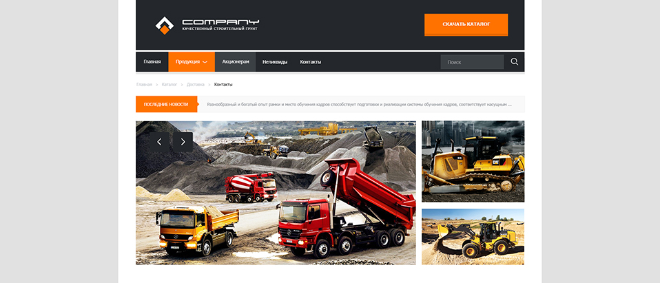
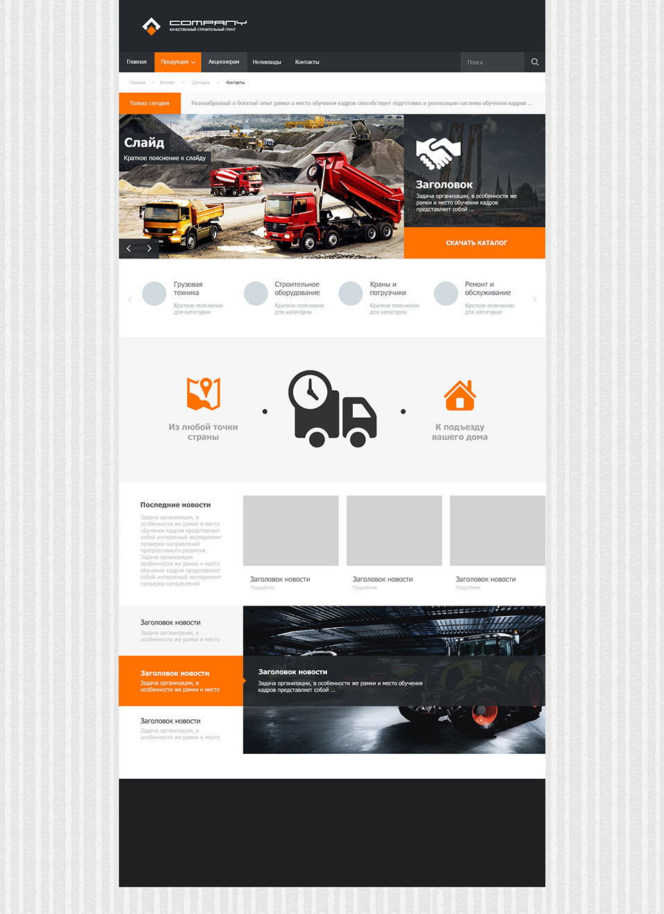
Search for solutions number 2
- A slight correction of the logo and menu. The cap became calmer.
- Correction of additional navigation. Now she does not focus on so much attention.
- The block with a running line became visually easier, due to the use of orange color. We try to round the corners a little.
- In addition to the button for downloading the catalog, a block should be available on the site that lists the main services provided. In this case, we will use a horizontal scroller under the slider.
Bottom line: We are definitely closer to the desired result. Design matured and feel better.
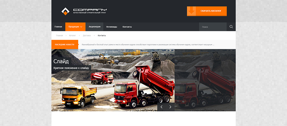
Main menu

- We get rid of the logo from the rounded element, keeping the main idea. Result worthy.
- A slight correction in color: go from orange to deep red.
- A very important decision: move the menu under the header. Thus, we visually separate the menu and put more emphasis on it - this is what we needed.
Bottom line: The site cap has become better in all respects. We finally decided on the location of the main menu.
Two-color logo
- Use the second color in the logo (white). It makes it brighter and more readable.
- We place the button for downloading the catalog in the header, after transferring the menu, we have for this free space.
Bottom line: Good work - the logo has become brighter, and the cap is even more concise.
Launch of the main menu
- We align the main menu items by the left border of the header (by analogy with the logo), and on the right we make room for the search bar. Use the red color for the current menu section and light gray for the hover effect.
- Return the ticker red color with sharp corners.
Summary: The main menu more efficiently uses the space of its block, which adds order to the header.
Style defined
- A very important change regarding the removal of side fields from the usable space of the site. We also remove extra padding over the main menu and between the slider blocks.
- Align the search bar with the right border of the "Download Directory" button.
- Instead of arrows in additional navigation, we use circles.
- We also use the inscriptions on the slider without indentation on the left.
- We begin to select the texture for the background.
Bottom line: Deleting margins makes the design more technical and simple. From this point on, we can assume that we have groped the style of the future site and are moving in the right direction.
Scroller and Delivery
- We are trying to move the button for downloading the catalog from the header to the slider area. Fill the slider information. Move the slide scroll arrows to the left border of the site to create a uniform information noise.
- We continue to work on the scroller. We use bold headlines and pale descriptions to them. Instead of icons, we use circles.
- Delivery is an important part of the company's work, so do not hesitate to pay special attention to this topic. Some graphics informing the client about quick delivery to the house from anywhere in Russia. In the future, we can make this graphic interactive: the user specifies the delivery point (city, district), and the site gives an approximate timeline.
Bottom line: The slider takes on an almost finished look, and the scroller and the delivery schedule make the site more informative, while not overloading it.
News feed and footer

- We pretend the approximate location of the block with the latest company news.
- Draw the estimated boundaries of the footer.
Bottom line: The site has increased in height, and the dark footer weighs down the bottom, making the overall design more balanced (the dark hat balances with the dark footer).
Breaking news feeds

- Graphics delivery becomes more contrast due to the clarified background.
- By analogy with the slider, we remove the extra fields from the news feed.
Bottom line: Now the top and bottom of the site are made in the same style.
Slider with sentences
- Remember, any information on the site is better supported by graphics, at least in the minimum amount. So the person is arranged. Add 3 blocks with images and one with text, this will be our news feed. Still ignore side margins for images (this time on the right).
- Slider under the blocks we use to represent the best deals of the company. Offers will be automatically clicked through. Accordingly, each of the three sentences will have its own illustration.
- We try to use a more contrast background for the site.
Bottom line: The site has become even higher and more informative. The graphics are not overloaded, but too contrasting background slightly distracts the user from exploring the main page.
Debugging proposals
- The active proposal is highlighted in red and we add a light gray hover effect. The explanatory bar in the illustration should move smoothly after the active point of the sentence.
- Under the footer leave some space for the intended copyright.
- Note that the images of news and offers are strictly aligned with each other, and also correspond to the width of the three categories of the upper scroller.
Bottom line: The bottom half of the site takes a finished look.
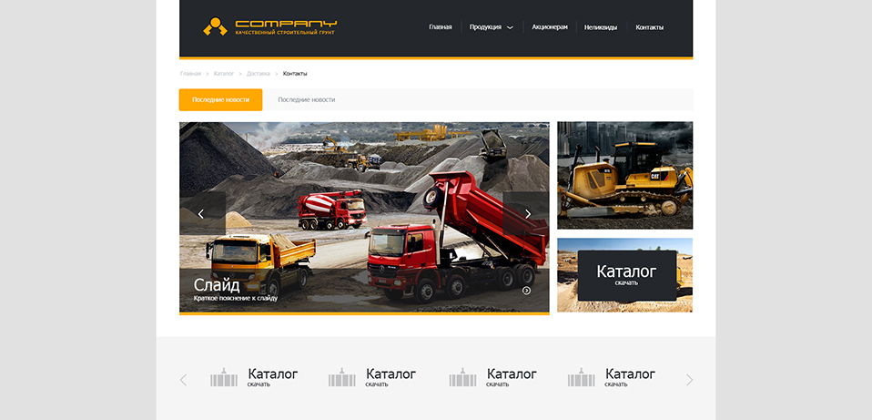
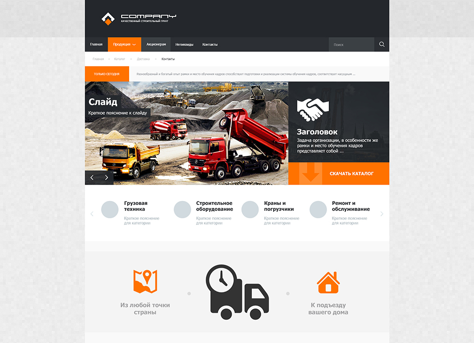
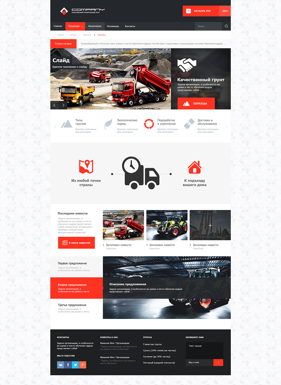
The final

- A slight correction in color in the direction of even more saturated red.
- Adjust the logo by removing small spaces between the orange and white elements. Now the logo fits even better into the overall style of the site without side margins.
- We picked up a less contrasting background, it consists of triangles, perfectly matching with the sketchy image of the mountains, and does not put too much emphasis on itself.
- In order to use more free space of the header, we return the download button for the catalog there. Add to it the icon and the ability to download in two formats to choose from (pdf and doc).
- In the slider, use the blur for the background of the information text block, from where we moved the catalog button. Instead of this button, we have a button for viewing photos with soil samples. We press it to the bottom of the slider to match the overall style.
- Add themed pictograms to the scroller with hover effect in orange color.
- Slight correction graphics delivery, add a horizontal line, symbolizing the path from the point of departure to the destination.
- Add photos to the news feed. Use thin arrows for headings. And to view the full tape draw red button.
- We fill the footer with four columns: contacts, social networking icons (corresponding to the general style), customer opinions about the company, soil types and feedback form. We use dotted delimiters for clearer visual division into columns.
Bottom line: The home page of the site looks completely finished. All basic information about the company is available and easy to read. A few seconds of study is enough to understand the scope of the company. The design is simple and informative - the task is complete!
Alternative color schemes


Ps.
We got a visually simple, but informative layout with a well-defined style, the main feature of which is the lack of side indents and simplicity of the forms. Pay attention that, despite the absence of fields, any text blocks should always have indents - the text should breathe, regardless of the style. Over the entire height of the layout can be traced interspersed in red, which is well revives the overall design. If there is a ready main page, it will not be difficult for us to draw other sections of the site, but this is another story.
Source: https://habr.com/ru/post/206604/
All Articles