Split testing of the landing page. results
In this article you will find unusual results of a split-test of the landing page design (landing page) made in August (from August 2 to 19) of this year within the framework of the “Intellect” project.
There was a landing page 1 :
As you can see, the design was made on the knee ...
')
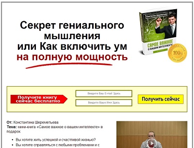
And landing page 2 :

A page with the same text, but in a new design.
Usually only one element is tested: title, button color, button text, image.
We decided to test the entire design.
Traffic was homogeneous with ads in Google Adwords in gmail:

For testing, the easywebsiteoptimizer service was used.
The script, installed on the first page, evenly divided traffic, sending half of the visitors to the 2nd page.
We make bets gentlemen! Which page won?
Yes, I almost forgot, the conversion was a subscription for the receipt of the book (this way we get the contact of a potential client).
Hmm ... I think you guessed it, with the achievement of statistical probability, won a beautiful design.
Clicks: 5647 ---> Subscribers: 722 ---> activated: 654
Clicks: 5647 ---> Subscribers: 817 ---> activated: 732
(activated - those who confirmed their data after the subscription)
Total, counting for the conversion only activated, we get:

Thus, the new design won!
Passed a month after the split test.
September 30 began to watch the return on investment in advertising for 30 days from the date of subscription.
(i.e. how much subscribers bought for the first 30 days after the subscription).
Help: We assign to each advertising channel its value as an advertising channel variable. Thus, we can track from which source the client came, where he left his contacts, and then how, where and what he bought.
Come back. The results were as follows:
Subscribers (leads) from the second page (with a new design): 732,
Subscribers (leads) from the first page: 654,
now the drum roll ...
Subscribers from the second page bought for 21.900 rubles, (28 subscribers made purchases, average check: 782 rubles)
Subscribers from the first page bought for 35,200 rubles. (21 subscribers have made purchases, average check: 1676 rubles)
The average check differs by more than 2 times, and the revenue is 1.6 times.
So with exactly the same funnel after the subscription,
The new design improved conversion to a subscription by 1.4%, but worsened final sales by 1.6 times.
These results made us wonder, Why?
Why does a beautiful inlet design impair exit sales?
There are only hypotheses, but they are very similar to the truth.
The main assumption:
The design of the second landing page is beautiful, but the design of letters, sales pages and ordering pages is “square”, to say the least:

Letter design ...

The “best” sales page for one of the products ...

Checkout page for one of the products ...
Thus, the visitors, who were satisfied with the simple design of the 1st page, calmly, without any complaints, were also concerned with the design of letters, and with the simple design of the selling pages, and with the checkout pages.
But visitors to page number 2 with a satin, beautiful (relative to page number 1) design were clearly disappointed by the lack of gloss in letters and on other pages, which prevented them from making a purchase.
Therefore, the conclusions are as follows:
1. Improving (changing) something, you need to analyze how this improvement will ultimately affect the entire system, and not in a separate area.
2. The design of all project pages should be done in the same style, so that the client does not have the shock and frustration of individual pages.
So, let's begin
There was a landing page 1 :
As you can see, the design was made on the knee ...
')
And landing page 2 :
A page with the same text, but in a new design.
Usually only one element is tested: title, button color, button text, image.
We decided to test the entire design.
Traffic was homogeneous with ads in Google Adwords in gmail:
For testing, the easywebsiteoptimizer service was used.
The script, installed on the first page, evenly divided traffic, sending half of the visitors to the 2nd page.
We make bets gentlemen! Which page won?
Yes, I almost forgot, the conversion was a subscription for the receipt of the book (this way we get the contact of a potential client).
Hmm ... I think you guessed it, with the achievement of statistical probability, won a beautiful design.
Clicks: 5647 ---> Subscribers: 722 ---> activated: 654
Clicks: 5647 ---> Subscribers: 817 ---> activated: 732
(activated - those who confirmed their data after the subscription)
Total, counting for the conversion only activated, we get:
Thus, the new design won!
BUT! This is not the end of the story ...
Passed a month after the split test.
September 30 began to watch the return on investment in advertising for 30 days from the date of subscription.
(i.e. how much subscribers bought for the first 30 days after the subscription).
Help: We assign to each advertising channel its value as an advertising channel variable. Thus, we can track from which source the client came, where he left his contacts, and then how, where and what he bought.
Come back. The results were as follows:
Subscribers (leads) from the second page (with a new design): 732,
Subscribers (leads) from the first page: 654,
now the drum roll ...
Subscribers from the second page bought for 21.900 rubles, (28 subscribers made purchases, average check: 782 rubles)
Subscribers from the first page bought for 35,200 rubles. (21 subscribers have made purchases, average check: 1676 rubles)
The average check differs by more than 2 times, and the revenue is 1.6 times.
So with exactly the same funnel after the subscription,
The new design improved conversion to a subscription by 1.4%, but worsened final sales by 1.6 times.
These results made us wonder, Why?
Why does a beautiful inlet design impair exit sales?
There are only hypotheses, but they are very similar to the truth.
The main assumption:
The design of the second landing page is beautiful, but the design of letters, sales pages and ordering pages is “square”, to say the least:
Letter design ...
The “best” sales page for one of the products ...
Checkout page for one of the products ...
Thus, the visitors, who were satisfied with the simple design of the 1st page, calmly, without any complaints, were also concerned with the design of letters, and with the simple design of the selling pages, and with the checkout pages.
But visitors to page number 2 with a satin, beautiful (relative to page number 1) design were clearly disappointed by the lack of gloss in letters and on other pages, which prevented them from making a purchase.
Therefore, the conclusions are as follows:
1. Improving (changing) something, you need to analyze how this improvement will ultimately affect the entire system, and not in a separate area.
2. The design of all project pages should be done in the same style, so that the client does not have the shock and frustration of individual pages.
Source: https://habr.com/ru/post/206414/
All Articles