Secrets of buttons in Android. Part 1: Layout Basics
Greetings, dear community.
In my series of articles on the development of Android applications, I want to share with you interesting and useful techniques for designing complex controls. We will consider both the basic layout techniques and advanced ways to optimize it, which greatly facilitate the development and maintenance of Android applications, saving time and money.
The first part is designed for novice developers. I will show you how to make a fairly complex button solely by typesetting, without using Java code, much less your own components. Knowledge of these layout techniques is useful when working with other components of Android. In the course of the article, I will explain in detail what one or another constants, attributes, commands and the like mean. But I will also provide links to official Google documentation, where you can examine each topic in detail. This article is an overview, I do not set a goal to provide here all the documentation translated into Russian. Therefore, I recommend studying official sources, in particular those articles, links to which I cite here.
')
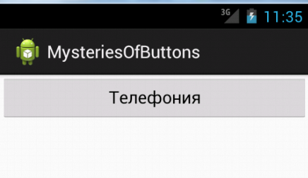
What do we want to do in this article? Suppose we make an application that allows you to enable / disable the telephony function on your smartphone, the application will have an on / off button. We will create a button with our own background and a frame with rounded corners. The background and frame will change when the button gets the focus or gets pressed. The button will have a text name and an icon explaining the purpose of the button visually. Text color and icons will also change when you click. What else? Since the on / off buttons are found in applications quite often, Android already has ready functionality for storing / changing state. We will use it instead of reinventing our own bike. But the mapping of this state, we will make his, so that it fits us in style.
It will look something like this:
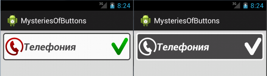

Align the icon on the left edge of the button. The text of the button is aligned vertically in the center, and horizontally to the left. But at the same time the text should not be on top of the icon. On the right edge of the button align the indicator on or off the phone. The space between the text on the button and the right indicator icon “stretches” if necessary. When you press the button, the background turns gray, and the frame and all the elements on the button turn white.
We will do all this only layout. Why layout and not code? A properly crafted page can be easily styled, that is, it can be changed almost beyond recognition by simply replacing the style. You can even offer the user to choose the style that he prefers. Styles on Android are similar to cascading CSS tables in HTML.
Decisions made by typesetting are usually smaller than similar solutions made by code, and there is less chance of making a mistake. And most of the pages that are laid out without the use of a code can be viewed and debugged in design mode (that is, directly in the IDE), for this you do not need to start the application, wait for deployment, etc.
We proceed to the implementation. For the demonstration, I will use Android Developer Tools (ADT) built on Eclipse.
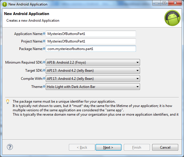
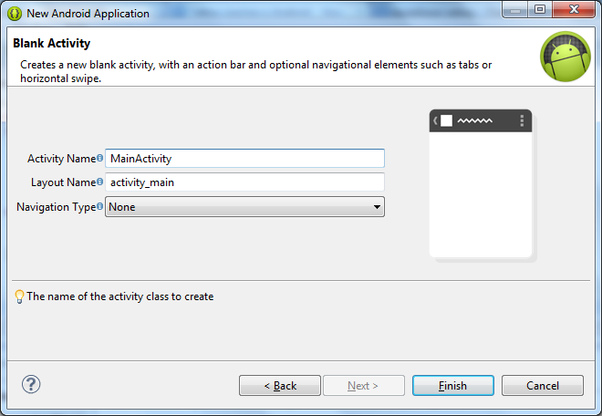
Create a new project. File-> New-> Android Application Project.
Application Name:
Project Name:
Package Name:
The remaining parameters will remain the default:
Next. On the next page, to save time, let ADT create a test Activity for us:
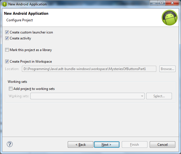
Next. We leave the icons by default, in this case it’s not about them.
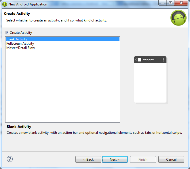
Next. Create an empty Activity, that is, again, all by default:
Next. The name of the activity is left without changes:
Finish. Finally, we can get down to business.
Let's start with the Layout code. Open the
And this is how we set the text displayed to the user:
Looking ahead, I’ll say that all the text that the user sees should be stored not in the page layout code and not in the Java code, but in the
Both
There is also the constant
I try to use these
Now that we’ve dealt with the base of the window, let's move on to the code for our Activity
In this code, we see only one command that makes sense:
This method sets the page layout resource that the Activity will work with.
Let's run our application and see what happens:
Now open the
We see the same button with the same dimensions, in the same colors as on the emulator. Just to see this, we did not have to wait for the emulator to start and the application deployment. Save time? The first profit from the layout. In the future, we will try to do without the emulator, testing not every step, but only the finished version.
Now let's do the alignment. Now the text on the button is centered. This is the default style for the button. But we need to align the text on the left edge, keeping the center alignment vertically. How to do it? Add the
This attribute can take one or two values, in our case two. Values are separated by a vertical bar
What it looks like:

You can read about the various alignment options and what they mean here.
Try to play with these options and see how this affects the appearance of the button. If you want to make the text on the button bold and / or italic, use the
Let's set these parameters to our button:

I prefer to keep the styles closer to the defaults, as they were carefully chosen by highly paid designers, and with my sense of taste, I very much doubt that I can do better. This example is intended to show the reader as many opportunities as possible, and does not claim to be a work of art, so please do not kick for the fact that earlier it looked better.
Go ahead. Now we need to add an icon to the button. The icon is defined by the following
 click to download
We import it into application resources in the

In addition to
As you noticed, we indicated the path to the icon without the
Now that we have dealt with the drawable resources, let's replace the background of our button with the one we need. For this we will use the following
 click to download
Import it into
This is called nine-patch drawable, you can read more about this typesetting technique here.
In order for a resource to be considered a 9-patch, in its name before the extension there must be a nine, separated from the rest of the name by another dot, like ours:
How to assign to the element such a stretchable background? Open the text of our button and add the

It doesn’t look very nice, as the button is pressed close to the sides of the screen. This happened because in the default background, which we changed to our own, the frame of the button was indented, and we saw this indent in the previous screenshots. We can also redraw the background of the button, but we can indent another way, and it would be good for all window elements to not duplicate the code for each. For this, the
What is
The
The attributes we have examined so far have not only the button, but also other elements. For example,
Go ahead. If you launch our application, we will see that when you click on a button, its appearance does not change at all, that is, you cannot visually see if the button is pressed or not. In this form, you cannot leave our button, since the user will not be able to understand whether the application is working or not.
Here states come to the rescue. When nothing happens to a button, it is in a non-depressed state. If the button has input focus, it changes to the
Let's start with the background. Let us set a red frame for our button when it is in focus, and a frame with inverted colors when it is pressed. To do this, import the following images into the
 click to download
 click to download
Now we have 3 background pictures for 3 states. But the
Right-click on the
Finish.
We received a blank of the following content:
Add a picture to the selector for the state
Notice that the
How does the selector work? When a selector is assigned to an element, it constantly receives the state of the master element, and returns to it the first of the listed resources, which corresponds to the state of the owner.
Open the text of our layout,
Also darken the background of the entire window in order to better see the white frame of the pressed button:
Now, if you run the application on the emulator, and press the button, we will see that it changes its background:
Already not bad, but it can be better. Let's repeat the process of creating a selector to change the phone icon in the down state. Import
 click to download
Create an
And in the button text, replace
Now the icon changes when you click on the button in the same way as the background. It remains to deal with the color of the text. He still remains black in any condition. If the pressed text also became white, like a frame and an icon, the button would have looked much more interesting.
Color management is slightly different from the pictures. Let's go in order. First, the colors are stored in a separate directory that we need to create. Add a

Next, in the

And replace its contents with the following:
By analogy with the pictures, colors for the
In the first case, we use the previously created color in the
Now back to the source of our button and write the text color
Now we can’t see the result in Graphical Layout, this is a known plug-in problem that I hope Google will fix someday. Unfortunately, testing colors with a state is possible only on an emulator or a real device.
This completes the artistic part of the layout. Now the button looks like this:
Next, let's talk about how to display the telephony status on the button (on / off). We remember that the button icon may not only be on the left. To display the current status, we will add an icon to the right of the button. Let it be a tick for the On state and a cross for the Off state. How are we going to change the icons? The most obvious option is to define the
Fortunately, Android provides for this purpose a special component -
Since
Now prepare the pictures to display the status of the button. Import the
 click to download
 click to download
 click to download
 click to download
Attention : white icons on a transparent background are not very cool visible in the browser on a white background.
Why four icons? Recall that we want to display all button elements as white when the user holds the button down. Therefore, for each state On and Off we must give two icons: in the pressed and released state. Total four.
Create a new
Here you can see that a component can have several states at once, for example, it can be simultaneously marked and pressed, or marked and unpressed, and so on.
Now back to our button and add the
What we get if you run the application? We see the button is not pressed, in the Off mode. Moreover, if you press and hold it, all elements appear white on a gray background:
Release the button, the status changes to Enabled. If you press again, you will see a gray background and white icons again, after which the status will again be turned off:
Exactly what we need.
Just in case, let's see how it is possible to understand in the code of our application whether the button is on or off. To do this, we can analyze the value of the
In the
By launching the application and pressing the button, we will see
As you can see, the layout features in Android are quite extensive: in this article, all the functionality, except for prompts, is implemented only by layout. But that's not all.
In this article, the XML code is intentionally left imperfect. The study of basic layout and advanced optimization - these are two different topics. Of course, real gurus should immediately write optimally. But this article has educational objectives and is designed for novice developers, so I decided to complicate things gradually.
Anyone wishing to explore an example of optimizing layout in Android, I invite you to read and discuss the second part of this article. :
. , . , - . Waiting for your feedback and comments.
In my series of articles on the development of Android applications, I want to share with you interesting and useful techniques for designing complex controls. We will consider both the basic layout techniques and advanced ways to optimize it, which greatly facilitate the development and maintenance of Android applications, saving time and money.
The first part is designed for novice developers. I will show you how to make a fairly complex button solely by typesetting, without using Java code, much less your own components. Knowledge of these layout techniques is useful when working with other components of Android. In the course of the article, I will explain in detail what one or another constants, attributes, commands and the like mean. But I will also provide links to official Google documentation, where you can examine each topic in detail. This article is an overview, I do not set a goal to provide here all the documentation translated into Russian. Therefore, I recommend studying official sources, in particular those articles, links to which I cite here.
')
What do we want to do in this article? Suppose we make an application that allows you to enable / disable the telephony function on your smartphone, the application will have an on / off button. We will create a button with our own background and a frame with rounded corners. The background and frame will change when the button gets the focus or gets pressed. The button will have a text name and an icon explaining the purpose of the button visually. Text color and icons will also change when you click. What else? Since the on / off buttons are found in applications quite often, Android already has ready functionality for storing / changing state. We will use it instead of reinventing our own bike. But the mapping of this state, we will make his, so that it fits us in style.
It will look something like this:
Align the icon on the left edge of the button. The text of the button is aligned vertically in the center, and horizontally to the left. But at the same time the text should not be on top of the icon. On the right edge of the button align the indicator on or off the phone. The space between the text on the button and the right indicator icon “stretches” if necessary. When you press the button, the background turns gray, and the frame and all the elements on the button turn white.
We will do all this only layout. Why layout and not code? A properly crafted page can be easily styled, that is, it can be changed almost beyond recognition by simply replacing the style. You can even offer the user to choose the style that he prefers. Styles on Android are similar to cascading CSS tables in HTML.
Decisions made by typesetting are usually smaller than similar solutions made by code, and there is less chance of making a mistake. And most of the pages that are laid out without the use of a code can be viewed and debugged in design mode (that is, directly in the IDE), for this you do not need to start the application, wait for deployment, etc.
Create an application framework
We proceed to the implementation. For the demonstration, I will use Android Developer Tools (ADT) built on Eclipse.
Create a new project. File-> New-> Android Application Project.
Application Name:
MysteriesOfButtonsPart1Project Name:
MysteriesOfButtonsPart1Package Name:
com.mysteriesofbuttons.part1The remaining parameters will remain the default:
Next. On the next page, to save time, let ADT create a test Activity for us:
Next. We leave the icons by default, in this case it’s not about them.
Next. Create an empty Activity, that is, again, all by default:
Next. The name of the activity is left without changes:
Finish. Finally, we can get down to business.
Simplest button
Let's start with the Layout code. Open the
/res/layout/activity_main.xml file and replace all its contents with the following code: <RelativeLayout xmlns:android="http://schemas.android.com/apk/res/android" android:layout_width="match_parent" android:layout_height="match_parent" > <Button android:id="@+id/act_main_btn_telephony" android:layout_width="match_parent" android:layout_height="wrap_content" android:text="" /> </RelativeLayout> RelativeLayout is a layout in which child elements are placed relative to each other, for example, to place a button to the left of another button, etc. You can read more about RelativeLayout here .Button is our button. We give it the android:id attribute, by which we can identify it in the application. The format @+id/ means that a new identifier must be created in the resources. If we specified @id/ , it would mean that the specified identifier should already be in the resources.And this is how we set the text displayed to the user:
android:text=""Looking ahead, I’ll say that all the text that the user sees should be stored not in the page layout code and not in the Java code, but in the
strings.xml resources strings.xml that the application can support more than one language, but more on this in the next part. For now we will show the text directly in the layout in order to improve the visibility of the example.Both
RelativeLayout and Button have the attributes android:layout_width and android:layout_height . These are the required attributes of any View . As the name implies, they denote the width and height of the elements, respectively. They can be set in different units, but we do not use specific dimensions, as you might have noticed. We use the match_parent and wrap_content .match_parent means that the element must completely fill its parent horizontally or vertically, depending on whether we specify the width or height.wrap_content means that the element size should be minimal, but such that the entire contents of the element fit into it.There is also the constant
fill_parent , which means exactly the same as match_parent . Why use two identical constants? fill_parent was introduced before API version 8, and since the eighth version is obsolete and not recommended for use. The fact is that for English-speaking developers, match_parent more accurately reflects the meaning of a constant than fill_parent .I try to use these
match_parent and wrap_content wherever possible, avoiding specifying fixed sizes in every possible way, since Android applications work on devices with very different screen sizes.Now that we’ve dealt with the base of the window, let's move on to the code for our Activity
MainActivity.java Activity.java: package com.mysteriesofbuttons.part1; import android.app.Activity; import android.os.Bundle; public class MainActivity extends Activity { @Override protected void onCreate(Bundle savedInstanceState) { super.onCreate(savedInstanceState); setContentView(R.layout.activity_main); } } In this code, we see only one command that makes sense:
setContentView(R.layout.activity_main);This method sets the page layout resource that the Activity will work with.
Let's run our application and see what happens:
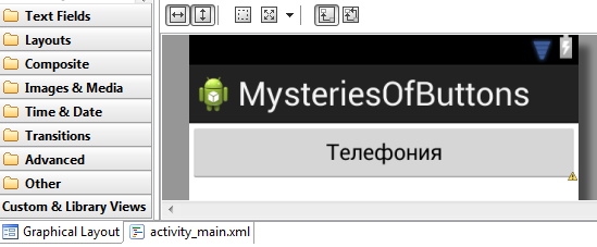
Now open the
activity_main.xml file in Eclipse and click the Graphical Layout button:We see the same button with the same dimensions, in the same colors as on the emulator. Just to see this, we did not have to wait for the emulator to start and the application deployment. Save time? The first profit from the layout. In the future, we will try to do without the emulator, testing not every step, but only the finished version.
Text styles
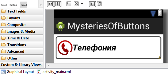
Now let's do the alignment. Now the text on the button is centered. This is the default style for the button. But we need to align the text on the left edge, keeping the center alignment vertically. How to do it? Add the
android:gravity attribute to the button: <Button android:id="@+id/act_main_btn_telephony" android:layout_width="match_parent" android:layout_height="wrap_content" android:text="" android:gravity="left|center_vertical" /> This attribute can take one or two values, in our case two. Values are separated by a vertical bar
|What it looks like:
You can read about the various alignment options and what they mean here.
Try to play with these options and see how this affects the appearance of the button. If you want to make the text on the button bold and / or italic, use the
android:textStyle , for example, android:textStyle="bold|italic" . If you need to change the size of the text on the button, the android:textSize parameter android:textSize , for example: android:textSize="24sp" .sp - Scale-independent Pixels is a unit of measurement based on screen density and font size settings. To make the text look equally good on different screens, it is recommended to set its size exactly in sp .Let's set these parameters to our button:
<Button android:id="@+id/act_main_btn_telephony" android:layout_width="match_parent" android:layout_height="wrap_content" android:text="" android:gravity="left|center_vertical" android:textStyle="bold|italic" android:textSize="24sp" /> I prefer to keep the styles closer to the defaults, as they were carefully chosen by highly paid designers, and with my sense of taste, I very much doubt that I can do better. This example is intended to show the reader as many opportunities as possible, and does not claim to be a work of art, so please do not kick for the fact that earlier it looked better.
Put the icon on the button
Go ahead. Now we need to add an icon to the button. The icon is defined by the following
icon_phone_normal.png file: click to downloadWe import it into application resources in the
drawable-hdpi . To set an icon for a button, add the android:drawableLeft attribute android:drawableLeft : <Button android:id="@+id/act_main_btn_telephony" android:layout_width="match_parent" android:layout_height="wrap_content" android:text="" android:gravity="left|center_vertical" android:textStyle="bold|italic" android:textSize="24sp" android:drawableLeft="@drawable/icon_phone_normal" /> In addition to
android:drawableLeft , there are several other attributes that allow you to set icons by placing them in other parts of the button: android:drawableTop , android:drawableBottom , android:drawableRight , android:drawableStart , android:drawableEnd .As you noticed, we indicated the path to the icon without the
PNG extension, as well as without the suffix -hdpi . This is not a typo. The extension is never specified, as there can be no dot in the identifier name. And the -hdpi suffix will be automatically substituted by Android, since this is the only drawable directory with the drawable icon. If the icon were not only in the drawable-hdpi , but also in drawable-mdpi , for example, Android would choose the one most suitable for the screen resolution of the device on which the application is running. So you can supply quality products that look equally good on devices with different sizes and screen densities. Google has a very good article on supporting various screens.Own background for button
Now that we have dealt with the drawable resources, let's replace the background of our button with the one we need. For this we will use the following
button_normal.png image: click to downloadImport it into
drawable-hdpi . In the picture we see black stripes along each of the edges of the screen. They serve to ensure that Android correctly stretches the image to the size we need. The left and upper lines show which area of the image will stretch vertically and horizontally, respectively. And the right and bottom lines show in which area of the stretched image you need to enter the contents of the element, if it has children. At the same time, the black lines themselves are certainly not visible on the resulting image.This is called nine-patch drawable, you can read more about this typesetting technique here.
In order for a resource to be considered a 9-patch, in its name before the extension there must be a nine, separated from the rest of the name by another dot, like ours:
button_normal.9.pngHow to assign to the element such a stretchable background? Open the text of our button and add the
android:background attribute to it android:background : <Button android:id="@+id/act_main_btn_telephony" android:layout_width="match_parent" android:layout_height="wrap_content" android:text="" android:gravity="left|center_vertical" android:textStyle="bold|italic" android:textSize="24sp" android:drawableLeft="@drawable/icon_phone_normal" android:background="@drawable/button_normal" /> It doesn’t look very nice, as the button is pressed close to the sides of the screen. This happened because in the default background, which we changed to our own, the frame of the button was indented, and we saw this indent in the previous screenshots. We can also redraw the background of the button, but we can indent another way, and it would be good for all window elements to not duplicate the code for each. For this, the
android:padding attribute will suit the RelativeLayout tag: <RelativeLayout xmlns:android="http://schemas.android.com/apk/res/android" android:layout_width="match_parent" android:layout_height="match_parent" android:padding="6dp" > What is
dp ? Density-independent pixel - a measure that will automatically scale on devices with different pixel densities of the screen so that the element looks the same. Always use dp , not px , when you need to set a specific size, otherwise the application will look good only on your phone.The
android:padding attribute sets the same indents on all sides. If we want to set different indents on each side separately, we can use the attributes android:paddingLeft , android:paddingRight , android:paddingTop , android:paddingBottom , android:paddingStart and android:paddingEnd .The attributes we have examined so far have not only the button, but also other elements. For example,
android:background all visible elements have, android:drawableLeft - TextEdit and so on.Go ahead. If you launch our application, we will see that when you click on a button, its appearance does not change at all, that is, you cannot visually see if the button is pressed or not. In this form, you cannot leave our button, since the user will not be able to understand whether the application is working or not.
We work with statuses in Android
Here states come to the rescue. When nothing happens to a button, it is in a non-depressed state. If the button has input focus, it changes to the
state_focused state. If you press a button with your finger, it will be in the state_pressed state until we release the finger. How does this help us? We can set the appearance of elements for each state separately. Next we look in detail at how this is done. Please note that the state can be used to draw everything that is visible to the user: icons, images, individual colors, etc.Let's start with the background. Let us set a red frame for our button when it is in focus, and a frame with inverted colors when it is pressed. To do this, import the following images into the
drawable-hdpi directory: click to download click to downloadNow we have 3 background pictures for 3 states. But the
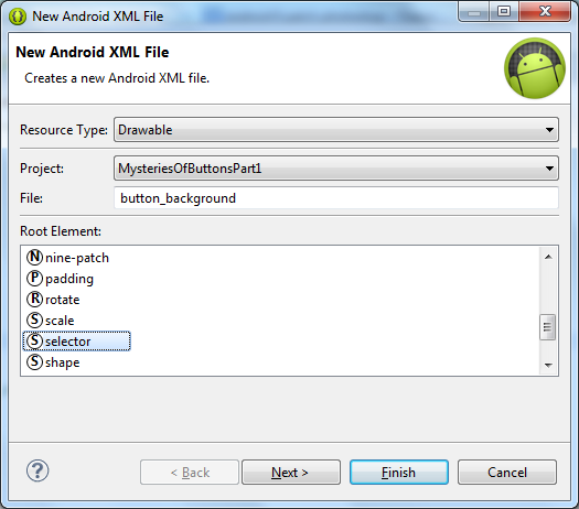
android:background attribute can only be set once. To get out of the situation, we will create a new selectable selectable resource that combines our 3 images.Right-click on the
drawable-hdpi , select New-> Android XML File. button_background file name button_background and select the root element selector :Finish.
We received a blank of the following content:
<?xml version="1.0" encoding="utf-8"?> <selector xmlns:android="http://schemas.android.com/apk/res/android" > </selector> Add a picture to the selector for the state
state_focused and state_pressed : <?xml version="1.0" encoding="utf-8"?> <selector xmlns:android="http://schemas.android.com/apk/res/android" > <item android:drawable="@drawable/button_pressed" android:state_pressed="true" /> <item android:drawable="@drawable/button_focused" android:state_focused="true" /> <item android:drawable="@drawable/button_normal" /> </selector> Notice that the
button_normal state is not specified for the image. This means that such a picture will always be used if the button is not able to state_focused or state_pressed . In addition to the considered states, you can use several more, the full list is described here.How does the selector work? When a selector is assigned to an element, it constantly receives the state of the master element, and returns to it the first of the listed resources, which corresponds to the state of the owner.
Open the text of our layout,
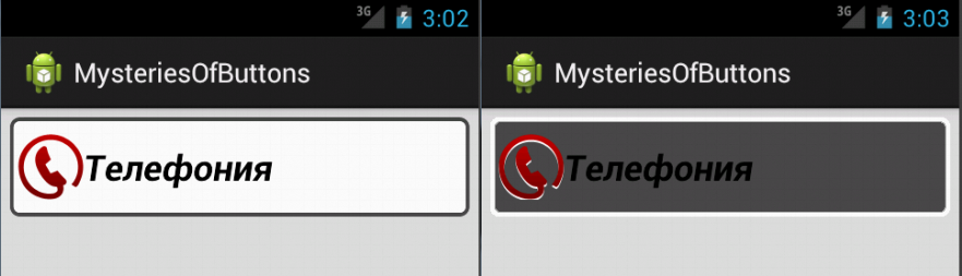
activity_main.xml and replace the background of the button with button_background : <Button android:id="@+id/act_main_btn_telephony" android:layout_width="match_parent" android:layout_height="wrap_content" android:text="" android:gravity="left|center_vertical" android:textStyle="bold|italic" android:textSize="24sp" android:drawableLeft="@drawable/icon_phone_normal" android:background="@drawable/button_background" /> Also darken the background of the entire window in order to better see the white frame of the pressed button:
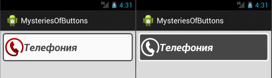
<RelativeLayout xmlns:android="http://schemas.android.com/apk/res/android" android:layout_width="match_parent" android:layout_height="match_parent" android:padding="6dp" android:background="#dddddd" > Now, if you run the application on the emulator, and press the button, we will see that it changes its background:
Change the icon when you click
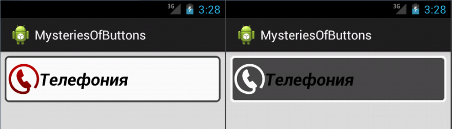
Already not bad, but it can be better. Let's repeat the process of creating a selector to change the phone icon in the down state. Import
drawable-hdpi icon into drawable-hdpi icon_phone_pressed.png : click to downloadCreate an
icon_phone selector with the following text: <?xml version="1.0" encoding="utf-8"?> <selector xmlns:android="http://schemas.android.com/apk/res/android" > <item android:drawable="@drawable/icon_phone_pressed" android:state_pressed="true" /> <item android:drawable="@drawable/icon_phone_normal" /> </selector> And in the button text, replace
drawableLeft with our new icon_phone selector: <Button android:id="@+id/act_main_btn_telephony" android:layout_width="match_parent" android:layout_height="wrap_content" android:background="@drawable/button_background" android:drawableLeft="@drawable/icon_phone" android:gravity="left|center_vertical" android:text="" android:textSize="24sp" android:textStyle="bold|italic" /> Change text color when pressed
Now the icon changes when you click on the button in the same way as the background. It remains to deal with the color of the text. He still remains black in any condition. If the pressed text also became white, like a frame and an icon, the button would have looked much more interesting.
Color management is slightly different from the pictures. Let's go in order. First, the colors are stored in a separate directory that we need to create. Add a
color subdirectory in the res directory, on the same level as the drawable-hdpi :Next, in the
color directory, create an Android XML File with the name text_color and the root selector element:And replace its contents with the following:
<?xml version="1.0" encoding="utf-8"?> <selector xmlns:android="http://schemas.android.com/apk/res/android"> <item android:color="@android:color/white" android:state_pressed="true" /> <item android:color="#484848" /> </selector> By analogy with the pictures, colors for the
state_pressed state and the default state are set here. The colors here are defined in two ways: android:color="@android:color/white" and android:color="#484848"In the first case, we use the previously created color in the
android namespace. In the second, we specify the RGB color value in hexadecimal. In this case, we set the default color to the same color as the frame in the unpressed form.Now back to the source of our button and write the text color
android:textColor="@color/text_color" : <Button android:id="@+id/act_main_btn_telephony" android:layout_width="match_parent" android:layout_height="wrap_content" android:background="@drawable/button_background" android:drawableLeft="@drawable/icon_phone" android:gravity="left|center_vertical" android:text="" android:textSize="24sp" android:textStyle="bold|italic" android:textColor="@color/text_color" /> Now we can’t see the result in Graphical Layout, this is a known plug-in problem that I hope Google will fix someday. Unfortunately, testing colors with a state is possible only on an emulator or a real device.
This completes the artistic part of the layout. Now the button looks like this:
Screw the ToggleButton
Next, let's talk about how to display the telephony status on the button (on / off). We remember that the button icon may not only be on the left. To display the current status, we will add an icon to the right of the button. Let it be a tick for the On state and a cross for the Off state. How are we going to change the icons? The most obvious option is to define the
OnClickListener event OnClickListener and alternately change the drawableRight icon. It is a working option. But what to do if there are not one buttons on a page, but 10 buttons, and in general a button can be not only on this page. Then our path will lead to duplication of code that will copy-paste to wander from one Activity to another, not the most beautiful solution. And if you need to change something, you will have to change in many places. I would like to avoid this.Fortunately, Android provides for this purpose a special component -
ToggleButton . This button can be in two states: on and off. Replace the Button tag with a ToggleButton in our layout: <ToggleButton android:id="@+id/act_main_btn_telephony" android:layout_width="match_parent" android:layout_height="wrap_content" android:background="@drawable/button_background" android:drawableLeft="@drawable/icon_phone" android:gravity="left|center_vertical" android:text="" android:textSize="24sp" android:textStyle="bold|italic" android:textColor="@color/text_color" /> Since
ToggleButton inherits from Button , all Button attributes apply to it, but there is a nuance. ToggleButton ignores the text attribute, but introduces two new ones: textOn and textOff . They set the text for the on and off states, respectively. But we want to display the state of the picture, and the text we want to leave as is. Therefore, we will prescribe our text to both attributes, and remove the text attribute as superfluous: <ToggleButton android:id="@+id/act_main_btn_telephony" android:layout_width="match_parent" android:layout_height="wrap_content" android:background="@drawable/button_background" android:drawableLeft="@drawable/icon_phone" android:gravity="left|center_vertical" android:textOn="" android:textOff="" android:textSize="24sp" android:textStyle="bold|italic" android:textColor="@color/text_color" /> Now prepare the pictures to display the status of the button. Import the
icon_on_normal.png , icon_on_pressed.png , icon_off_normal.png and drawable-hdpi resources into drawable-hdpi resources (listed in the order listed): click to download click to download click to download click to downloadAttention : white icons on a transparent background are not very cool visible in the browser on a white background.
Why four icons? Recall that we want to display all button elements as white when the user holds the button down. Therefore, for each state On and Off we must give two icons: in the pressed and released state. Total four.
Create a new
drawable selector named icon_on_off : <?xml version="1.0" encoding="utf-8"?> <selector xmlns:android="http://schemas.android.com/apk/res/android" > <item android:drawable="@drawable/icon_on_pressed" android:state_checked="true" android:state_pressed="true" /> <item android:drawable="@drawable/icon_on_normal" android:state_checked="true" /> <item android:drawable="@drawable/icon_off_pressed" android:state_checked="false" android:state_pressed="true" /> <item android:drawable="@drawable/icon_off_normal" android:state_checked="false" /> </selector> Here you can see that a component can have several states at once, for example, it can be simultaneously marked and pressed, or marked and unpressed, and so on.
android:state_checked="true" corresponds to the button in On mode, and android:state_checked="false" - to the button in Off mode.Now back to our button and add the
android:drawableRight="@drawable/icon_on_off" attribute to it android:drawableRight="@drawable/icon_on_off" . For clarity, I added it immediately after android:drawableLeft : <ToggleButton android:id="@+id/act_main_btn_telephony" android:layout_width="match_parent" android:layout_height="wrap_content" android:background="@drawable/button_background" android:drawableLeft="@drawable/icon_phone" android:drawableRight="@drawable/icon_on_off" android:gravity="left|center_vertical" android:textOn="" android:textOff="" android:textSize="24sp" android:textStyle="bold|italic" android:textColor="@color/text_color" /> What we get if you run the application? We see the button is not pressed, in the Off mode. Moreover, if you press and hold it, all elements appear white on a gray background:
Release the button, the status changes to Enabled. If you press again, you will see a gray background and white icons again, after which the status will again be turned off:
Exactly what we need.
Some code
Just in case, let's see how it is possible to understand in the code of our application whether the button is on or off. To do this, we can analyze the value of the
isChecked() button: true - on, false - off. Add the attribute android:onClick="onToggleButtonClick" to our button: <ToggleButton android:id="@+id/act_main_btn_telephony" android:layout_width="match_parent" android:layout_height="wrap_content" android:background="@drawable/button_background" android:drawableLeft="@drawable/icon_phone" android:drawableRight="@drawable/icon_on_off" android:gravity="left|center_vertical" android:textOn="" android:textOff="" android:textSize="24sp" android:textStyle="bold|italic" android:textColor="@color/text_color" android:onClick="onToggleButtonClick" /> In the
MainActivity.java add the appropriate method: package com.mysteriesofbuttons.part1; import android.app.Activity; import android.os.Bundle; import android.view.View; import android.widget.Toast; import android.widget.ToggleButton; public class MainActivity extends Activity { @Override protected void onCreate(Bundle savedInstanceState) { super.onCreate(savedInstanceState); setContentView(R.layout.activity_main); } public void onToggleButtonClick(View button) { Toast.makeText( getApplicationContext(), Boolean.toString(((ToggleButton) button).isChecked()), Toast.LENGTH_SHORT).show(); } } By launching the application and pressing the button, we will see
true / false text prompts at the bottom of the screen. This means that everything works.Conclusion
As you can see, the layout features in Android are quite extensive: in this article, all the functionality, except for prompts, is implemented only by layout. But that's not all.
In this article, the XML code is intentionally left imperfect. The study of basic layout and advanced optimization - these are two different topics. Of course, real gurus should immediately write optimally. But this article has educational objectives and is designed for novice developers, so I decided to complicate things gradually.
Anyone wishing to explore an example of optimizing layout in Android, I invite you to read and discuss the second part of this article. :
strings.xmlstyles.xmldimens.xml
. , . , - . Waiting for your feedback and comments.
useful links
Source: https://habr.com/ru/post/206012/
All Articles