We prototype the application: scripts, animation, icons, usability test on the example of My World
In this article, using the example of three months of work on designing a mobile application for My World, I will tell you how we went through all the stages of creation, why draw our ideas on paper, how to deal with fonts and overcome other difficulties, how to do UX testing and about many things a friend.
Inheritance
It all started with the fact that the first difficulty that awaited us in developing the design of the application was working with the so-called legacy design. We had a product in our hands that needed to be sorted out and understood which metaphors the previous designer used.
')
The profile example shows how it was “before” and what became “after”.

Project structure
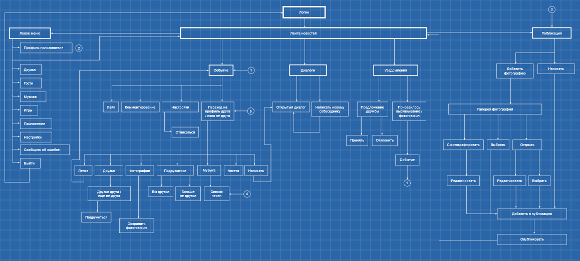
The first step was to draw up a structural scheme of the project. In preparing the program used Mindjet, allowing you to create a huge mind map'y. All descriptions, scripts, pages were added there. The picture shows a small fragment of the mind map.
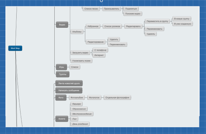
In fact, this is a hefty file with a tree hierarchy, with a description of almost every page and user scripts.
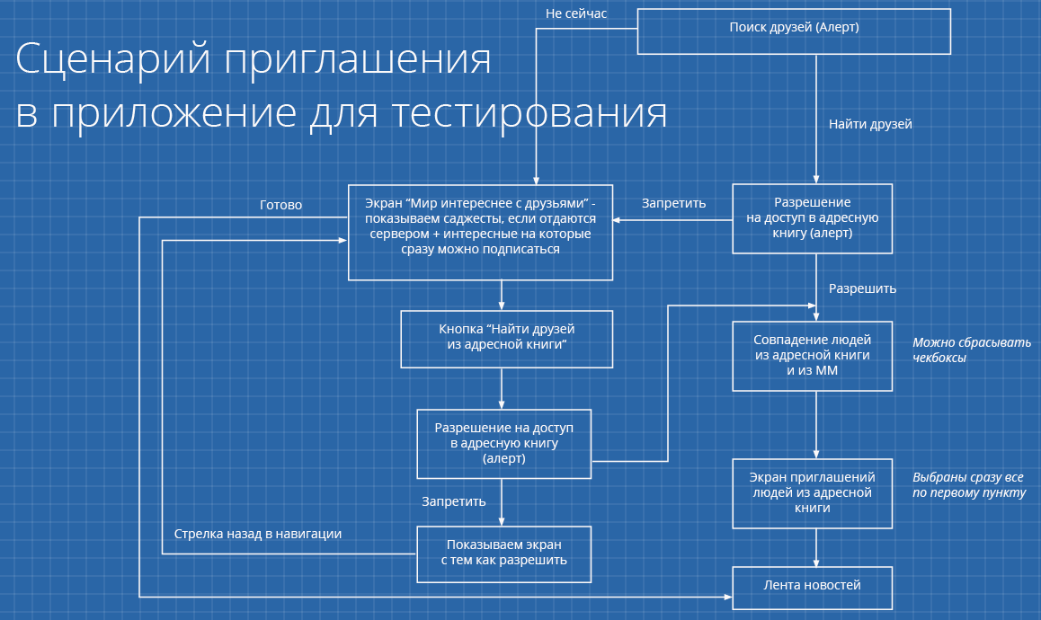
Application Usage Scenarios
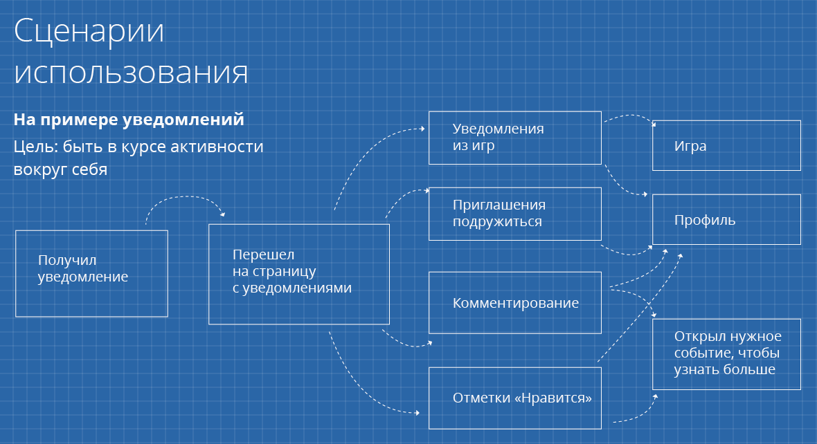
The next step was the development of custom scripts. I will tell you more about this using the example of notifications.
First of all, when a script is compiled, a goal is revealed that users will achieve on each of the application screens. In the case of notifications, the goal is to keep abreast of developments in their environment, that is, everything related to the user himself, his friends, colleagues, etc. After receiving the notification, the user can go to the appropriate page. Depending on the type of notification (notifications from games, invitations to friendship, commenting, “Like” marks ...) different scenarios are possible. The user can go to the game or the profile of another user, can write someone a message, and so on. All these options need to "register" in the mind map, noting possible intersections.
Analysis of competitors experience
So, the scripts are spelled out, you can proceed to the next stage - the analysis of competitors' experience. This stage is necessary when prototyping any applications: it allows, firstly, not to reinvent the wheel, and secondly, to avoid some possible errors.
Mainly, of course, direct competitors are considered. We studied not only the top social networks, but also less popular ones. We studied a huge layer of applications: all of them needed to be studied, to understand their behavior, how they communicate with the user, how they present information.
We also analyzed the experience of indirect competitors. For example, for our music section, these are iTunes and other profile applications. When it comes to photos, we photographed absolutely everything - on Instagram, Mobli, etc. All this gave us an understanding of how the audience behaves in various applications.
Paper first
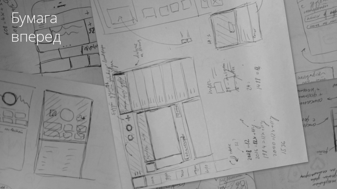
We wrote a whole stack of A4 paper, working through each screen in detail. Why on paper? So it is psychologically easier to start solving some problem. It is always clear where to "dance" - first you draw a square, and from it you are already building everything else. This helps to overcome the psychological barrier, and it is already much easier to “pour out” ideas onto a sheet.
Tool selection
So, the mountain of paper is painted. Now you need to understand what will create a graphical layout of the application. Photoshop was immediately swept away because of its redundant functionality: its capabilities tempt the designer to go into all the details. Such a super-detailed study takes too much time, you can work on each part almost endlessly, and the result is difficult to predict.
The next candidate was InDesign. I love this program, because at one time I published magazines and in general a lot of all kinds of paper products. Steeper than InDesign, probably, for this not to find. However, one of his problems immediately came to light: half-pixels. InDesign is sharpened for printing, where it is not so important. But when you sit down to draw something for the digital environment, it becomes a big problem. Another difficulty associated with paper orientation is the identification numbers for the pages: when you add a new page, the structure completely collapses, it’s impossible to understand where to go from each of the pages and as a result everything ends with a crash, anger and a lot of wasted time.
Next up was Axure. This is an ideal program for design, it has the most powerful prototyping tool, there are timings, you can emulate the actions that a person performs on mobile phones. But the final pictures in it can not be created, first you have to draw all these screens somewhere, fill it with Axure and mix it into a single prototype.
As a result, Fireworks was chosen. This is an Adobe product that is closely integrated with other Adobe products — Illustrator, Photoshop — so it was convenient to design in it. It exports the final options to HTML, which is convenient. In addition, everything can be demonstrated right from the phone to your management, colleagues, etc.
Wireframes
Another big stage - wireframes (wireframes). Usually it follows the “paper” stage - one can say that this is a kind of fixation of thought. At this stage, I still do not go into details, it does not matter to me what color the buttons will be, but I already compositionally impose blocks that I had born on paper. You can already assemble the first clickable prototypes and watch with your colleagues how it works, whether it is convenient or not. This is a kind of prototype designer, thanks to which our program is already beginning to materialize.
Consider the options for airframes that were created for the dialogs and the left menu. Almost immediately you can see where the dominants are located, and where everything is. After the blocks are placed in their places, it remains only to modify this graphics.
Clickable layouts
Something like this in Fireworks:
Turquoise blocks are clickable. Of course, this is only the tip of the iceberg. There were about 100 pages that led to each other and constantly intersected each other. At this point, the main thing is not to get confused; but in general, it is already possible to show how the product will look in the final.
Animation
We come to the next layer of work. Prototyping animation is very important - it takes us to a dialogue with the developer and helps to make sure that: a) all transitions are implemented logically and the user can navigate, and b) you speak the same language with the developer and equally imagine how these transitions will be implemented.
Sometimes you can work through a lot of details (for example, drag-to-refresh, which was also developed in the form of animation), then to transfer to developers. iOS provides good tools for working with animation, and programmers usually do it themselves.
With Android, this is hellishly difficult, you have to cut each frame. This is slowly going crazy. Then you still have to do in four different sizes. In the end, you realize how much you don’t want to make animation for Android and you want to make it for iOS.
As a result, we still achieved that My World retains a visual identity on iOS and Android, as well as in the mobile web. Our application, in general, is already close to its final appearance, the facade finish begins.
Single font
The achievement of this identity has contributed a lot to a single font. It was known that in the mobile web there would be no problems with the implementation: it was enough to choose a free font and connect it via the mobile web font face. On the iPhone and Android, too, there is a function "custom font." I was extremely happy that we will be even more identical on all platforms. However, problems started here.
The developers approached me every day and said that I was a scoundrel and should agree to default fonts. The font that was chosen, Open Sans, on iOS issued warnings and requests to plug in a different font: iOS seemed that the symbols were incorrect (in reality, nothing changed visually). There were also problems associated with the fact that iOS has its own idea of the line spacing - they were just huge. Thanks to the programmers who were able to hack around the system and make the selected font look nice to the eye.
Android, of course, delivered no less problems. For some reason, he believes that the navigation bar should come with system fonts. Moreover, if this font were the same everywhere, everything would not be so sad. But no! Each shell has its own font, lovingly chosen by the developer. For example, on Samsung it was a font similar to Comic Sans. Finally, all the inconsistencies with the fonts are overcome, proceed to the next stage.
Single grid for the project
Fonts and animations are not the only components that affect unification. The third "whale" is a single grid, which was developed directly under the three platforms. What to take for the module and from what then build all the other elements - this question tormented me for about two days, which I spent in the calculations.
Initially, it was necessary to understand which constants have already been laid by developers of operating systems (for example, in iOS it is a navigation panel with a size of 44 pixels) and take this into account when building the grid. As a result, the micromodule was chosen 4x4 pixels. The basis of the horizontal rhythm lay six column with a groove in 4 pixels.

Set of icons
The final gloss of our program was given with the help of icons. I have long looked at contour icons - I really liked the work iconwerk. We made a module under which the icons of My World were built. When the first beta of iOS 7 came out, I thought: “Not bad, we hit the trend”. Then there were many more similarities that we, not seeing iOS 7, have already implemented in the application. Therefore, we are one of the very first to enter the market of iOS 7 applications.
Usability testing
So, everything is ready, right down to the icons, it is time for tests. It will now become clear how true our calculations turned out to be, how accurately we were able to predict user behavior, whether we were able to strike a balance between the functionality and usability of each screen of the application. Usability testing is always a challenge for the developer. For testing, it is necessary to envisage and register all interaction scenarios: how the user will behave, where he will click and hit, what we need to get from users (in order to understand whether the result meets our expectations).
Further - more difficult: we tested our application entirely. What is shown in the screenshot is only part of the structure, and in the prototypes for further tests, the number of elements increased several times.
What can I advise: at this stage it is not necessary to lick absolutely all the details, down to the smallest pixel. The most important thing is for you to check whether the user is correctly following the route you have laid. If he fulfills everything at the speed you need, that is, he quickly perceives information, immediately realizes how important it is for him to go to a certain place, which section is located, how to find the person with whom he wants to talk, where there are notifications, etc. and the like, - that is the hat.
Editing and experiments
Usability tests we conducted almost interactively. We sat in the next room and watched the people undergoing testing work with the application. Let's say we noticed that respondents did not react to the “Find Friends” button as intended: then we immediately opened Fireworks and quickly changed “Find Friends” to “Good.” We proposed the following test participants to the new prototype and see how quickly they react. If the theory worked - and left.
Metaphor check
This stage of testing allows you to understand how well the icons are perceived by the user. In general, I'm not a big fan of pictograms and icons. I think it is much better to write with words (by the way, apparently, when working on iOS 7, they also made a start from it, everything there, basically, became in words).
We were especially interested in clarity for users of two metaphors. The first is a circle. If you look at the previous slides, then in the Navigation bar we have 3 buttons: standard bubble (dialogs), plus (adding a new record), and, actually, a circle that was born from the concept of the future logo. Once we had the idea of a conceptual logo: a circle like the halo of a planet. This metaphor, as a result, flowed into the application and was used to denote notifications. What is most surprising, as soon as the notification arrived, all users understood what was hidden behind this icon.
The second metaphor that interested us is the diamond. Behind it was auto-enhanced photos. As it turned out, users did not recognize this metaphor; we left the diamond, but added a hint: when you click on it, the message “Photo improved” appears.
Another point that the usability tests have clarified is the location of the avatars on a post that was commented by another person. At first we had the idea that you should not have two avatars close to each other, because it’s hard to understand, and we put the commentator right below the event.
On paper, everything was fine. But when we showed it to users, they didn’t understand this version, but they chose just that option when two avatars are nearby.
Time to collect stones
And here is the release, time to collect stones. That is, reviews from the App Store, Google Play and other sources. When you see the comment “in general, where is your settings screen?”, It's time to think about it. If this is a single review (the user has put our application just a “two”), then, in principle, you can skip past the ears. But if there are several of them, then you are obviously wrong somewhere.
Our application was generally well received by users. In the AppStore and Google Play, it received an average of 4 points. Some of the feedback that we received immediately after the update concerned the notification of the offer of friendship, where the user could not go to the offerer's page. This has been fixed. Another drawback was the difficulty in deleting and clearing messages, for which users gave our application 4 points. As a result, we just added a gear, which became a metaphor for such settings in the dialog.
Work on this application reaffirmed the importance of a number of stages in the design and creation of applications: structural development and user scenarios, "paper" design, error analysis and successful discoveries of competitors. We got a rich experience in solving problems with animations and fonts on different platforms, and also collected a lot of data about the real user behavior when testing the finished application.
Share your experience with similar quests in the comments!
Inheritance
It all started with the fact that the first difficulty that awaited us in developing the design of the application was working with the so-called legacy design. We had a product in our hands that needed to be sorted out and understood which metaphors the previous designer used.
')
The profile example shows how it was “before” and what became “after”.
Project structure
The first step was to draw up a structural scheme of the project. In preparing the program used Mindjet, allowing you to create a huge mind map'y. All descriptions, scripts, pages were added there. The picture shows a small fragment of the mind map.
In fact, this is a hefty file with a tree hierarchy, with a description of almost every page and user scripts.
Application Usage Scenarios
The next step was the development of custom scripts. I will tell you more about this using the example of notifications.
First of all, when a script is compiled, a goal is revealed that users will achieve on each of the application screens. In the case of notifications, the goal is to keep abreast of developments in their environment, that is, everything related to the user himself, his friends, colleagues, etc. After receiving the notification, the user can go to the appropriate page. Depending on the type of notification (notifications from games, invitations to friendship, commenting, “Like” marks ...) different scenarios are possible. The user can go to the game or the profile of another user, can write someone a message, and so on. All these options need to "register" in the mind map, noting possible intersections.
Analysis of competitors experience
So, the scripts are spelled out, you can proceed to the next stage - the analysis of competitors' experience. This stage is necessary when prototyping any applications: it allows, firstly, not to reinvent the wheel, and secondly, to avoid some possible errors.
Mainly, of course, direct competitors are considered. We studied not only the top social networks, but also less popular ones. We studied a huge layer of applications: all of them needed to be studied, to understand their behavior, how they communicate with the user, how they present information.
We also analyzed the experience of indirect competitors. For example, for our music section, these are iTunes and other profile applications. When it comes to photos, we photographed absolutely everything - on Instagram, Mobli, etc. All this gave us an understanding of how the audience behaves in various applications.
Paper first
We wrote a whole stack of A4 paper, working through each screen in detail. Why on paper? So it is psychologically easier to start solving some problem. It is always clear where to "dance" - first you draw a square, and from it you are already building everything else. This helps to overcome the psychological barrier, and it is already much easier to “pour out” ideas onto a sheet.
Tool selection
So, the mountain of paper is painted. Now you need to understand what will create a graphical layout of the application. Photoshop was immediately swept away because of its redundant functionality: its capabilities tempt the designer to go into all the details. Such a super-detailed study takes too much time, you can work on each part almost endlessly, and the result is difficult to predict.
The next candidate was InDesign. I love this program, because at one time I published magazines and in general a lot of all kinds of paper products. Steeper than InDesign, probably, for this not to find. However, one of his problems immediately came to light: half-pixels. InDesign is sharpened for printing, where it is not so important. But when you sit down to draw something for the digital environment, it becomes a big problem. Another difficulty associated with paper orientation is the identification numbers for the pages: when you add a new page, the structure completely collapses, it’s impossible to understand where to go from each of the pages and as a result everything ends with a crash, anger and a lot of wasted time.
Next up was Axure. This is an ideal program for design, it has the most powerful prototyping tool, there are timings, you can emulate the actions that a person performs on mobile phones. But the final pictures in it can not be created, first you have to draw all these screens somewhere, fill it with Axure and mix it into a single prototype.
As a result, Fireworks was chosen. This is an Adobe product that is closely integrated with other Adobe products — Illustrator, Photoshop — so it was convenient to design in it. It exports the final options to HTML, which is convenient. In addition, everything can be demonstrated right from the phone to your management, colleagues, etc.
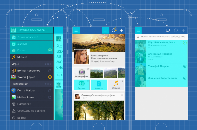
Wireframes
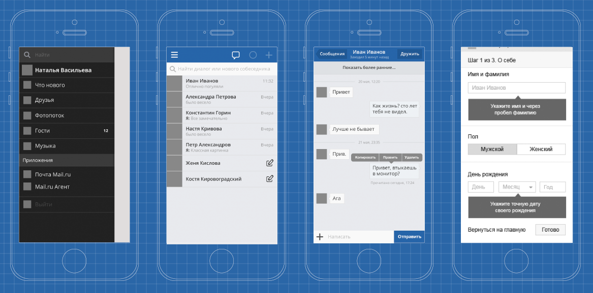
Another big stage - wireframes (wireframes). Usually it follows the “paper” stage - one can say that this is a kind of fixation of thought. At this stage, I still do not go into details, it does not matter to me what color the buttons will be, but I already compositionally impose blocks that I had born on paper. You can already assemble the first clickable prototypes and watch with your colleagues how it works, whether it is convenient or not. This is a kind of prototype designer, thanks to which our program is already beginning to materialize.
Consider the options for airframes that were created for the dialogs and the left menu. Almost immediately you can see where the dominants are located, and where everything is. After the blocks are placed in their places, it remains only to modify this graphics.
Clickable layouts
Something like this in Fireworks:
Turquoise blocks are clickable. Of course, this is only the tip of the iceberg. There were about 100 pages that led to each other and constantly intersected each other. At this point, the main thing is not to get confused; but in general, it is already possible to show how the product will look in the final.
Animation
We come to the next layer of work. Prototyping animation is very important - it takes us to a dialogue with the developer and helps to make sure that: a) all transitions are implemented logically and the user can navigate, and b) you speak the same language with the developer and equally imagine how these transitions will be implemented.
Sometimes you can work through a lot of details (for example, drag-to-refresh, which was also developed in the form of animation), then to transfer to developers. iOS provides good tools for working with animation, and programmers usually do it themselves.
With Android, this is hellishly difficult, you have to cut each frame. This is slowly going crazy. Then you still have to do in four different sizes. In the end, you realize how much you don’t want to make animation for Android and you want to make it for iOS.
As a result, we still achieved that My World retains a visual identity on iOS and Android, as well as in the mobile web. Our application, in general, is already close to its final appearance, the facade finish begins.
Single font
The achievement of this identity has contributed a lot to a single font. It was known that in the mobile web there would be no problems with the implementation: it was enough to choose a free font and connect it via the mobile web font face. On the iPhone and Android, too, there is a function "custom font." I was extremely happy that we will be even more identical on all platforms. However, problems started here.
The developers approached me every day and said that I was a scoundrel and should agree to default fonts. The font that was chosen, Open Sans, on iOS issued warnings and requests to plug in a different font: iOS seemed that the symbols were incorrect (in reality, nothing changed visually). There were also problems associated with the fact that iOS has its own idea of the line spacing - they were just huge. Thanks to the programmers who were able to hack around the system and make the selected font look nice to the eye.
Android, of course, delivered no less problems. For some reason, he believes that the navigation bar should come with system fonts. Moreover, if this font were the same everywhere, everything would not be so sad. But no! Each shell has its own font, lovingly chosen by the developer. For example, on Samsung it was a font similar to Comic Sans. Finally, all the inconsistencies with the fonts are overcome, proceed to the next stage.
Single grid for the project
Fonts and animations are not the only components that affect unification. The third "whale" is a single grid, which was developed directly under the three platforms. What to take for the module and from what then build all the other elements - this question tormented me for about two days, which I spent in the calculations.
Initially, it was necessary to understand which constants have already been laid by developers of operating systems (for example, in iOS it is a navigation panel with a size of 44 pixels) and take this into account when building the grid. As a result, the micromodule was chosen 4x4 pixels. The basis of the horizontal rhythm lay six column with a groove in 4 pixels.
Set of icons
The final gloss of our program was given with the help of icons. I have long looked at contour icons - I really liked the work iconwerk. We made a module under which the icons of My World were built. When the first beta of iOS 7 came out, I thought: “Not bad, we hit the trend”. Then there were many more similarities that we, not seeing iOS 7, have already implemented in the application. Therefore, we are one of the very first to enter the market of iOS 7 applications.
Usability testing
So, everything is ready, right down to the icons, it is time for tests. It will now become clear how true our calculations turned out to be, how accurately we were able to predict user behavior, whether we were able to strike a balance between the functionality and usability of each screen of the application. Usability testing is always a challenge for the developer. For testing, it is necessary to envisage and register all interaction scenarios: how the user will behave, where he will click and hit, what we need to get from users (in order to understand whether the result meets our expectations).
Further - more difficult: we tested our application entirely. What is shown in the screenshot is only part of the structure, and in the prototypes for further tests, the number of elements increased several times.
What can I advise: at this stage it is not necessary to lick absolutely all the details, down to the smallest pixel. The most important thing is for you to check whether the user is correctly following the route you have laid. If he fulfills everything at the speed you need, that is, he quickly perceives information, immediately realizes how important it is for him to go to a certain place, which section is located, how to find the person with whom he wants to talk, where there are notifications, etc. and the like, - that is the hat.
Editing and experiments
Usability tests we conducted almost interactively. We sat in the next room and watched the people undergoing testing work with the application. Let's say we noticed that respondents did not react to the “Find Friends” button as intended: then we immediately opened Fireworks and quickly changed “Find Friends” to “Good.” We proposed the following test participants to the new prototype and see how quickly they react. If the theory worked - and left.
Metaphor check
This stage of testing allows you to understand how well the icons are perceived by the user. In general, I'm not a big fan of pictograms and icons. I think it is much better to write with words (by the way, apparently, when working on iOS 7, they also made a start from it, everything there, basically, became in words).
We were especially interested in clarity for users of two metaphors. The first is a circle. If you look at the previous slides, then in the Navigation bar we have 3 buttons: standard bubble (dialogs), plus (adding a new record), and, actually, a circle that was born from the concept of the future logo. Once we had the idea of a conceptual logo: a circle like the halo of a planet. This metaphor, as a result, flowed into the application and was used to denote notifications. What is most surprising, as soon as the notification arrived, all users understood what was hidden behind this icon.
The second metaphor that interested us is the diamond. Behind it was auto-enhanced photos. As it turned out, users did not recognize this metaphor; we left the diamond, but added a hint: when you click on it, the message “Photo improved” appears.
Another point that the usability tests have clarified is the location of the avatars on a post that was commented by another person. At first we had the idea that you should not have two avatars close to each other, because it’s hard to understand, and we put the commentator right below the event.
On paper, everything was fine. But when we showed it to users, they didn’t understand this version, but they chose just that option when two avatars are nearby.
Time to collect stones
And here is the release, time to collect stones. That is, reviews from the App Store, Google Play and other sources. When you see the comment “in general, where is your settings screen?”, It's time to think about it. If this is a single review (the user has put our application just a “two”), then, in principle, you can skip past the ears. But if there are several of them, then you are obviously wrong somewhere.
Our application was generally well received by users. In the AppStore and Google Play, it received an average of 4 points. Some of the feedback that we received immediately after the update concerned the notification of the offer of friendship, where the user could not go to the offerer's page. This has been fixed. Another drawback was the difficulty in deleting and clearing messages, for which users gave our application 4 points. As a result, we just added a gear, which became a metaphor for such settings in the dialog.
Work on this application reaffirmed the importance of a number of stages in the design and creation of applications: structural development and user scenarios, "paper" design, error analysis and successful discoveries of competitors. We got a rich experience in solving problems with animations and fonts on different platforms, and also collected a lot of data about the real user behavior when testing the finished application.
Share your experience with similar quests in the comments!
Source: https://habr.com/ru/post/205658/
All Articles