10 deadly sins when using pop-ups on the site
Along with contextual advertising, email-mailing and search promotion, marketing tools inside the site are beginning to enjoy great popularity, the purpose of which is to interest the user, to motivate him to use the services or to purchase products sold on the site. In other words, increase the conversion of the online store.
Windows with smiling online consultants won't surprise anyone now - these services are available on most commercial and informational web resources. To date, the most promising type of marketing within the site is the so-called vitzheta - pop-up windows informing the user about profitable offers and promotions, or containing a form for collecting contacts about the visitor.
However, it must be remembered that any tool will be effective only if it is properly used. Often, site owners and marketers make unforgivable mistakes when working with pop-up windows. Let's try to disassemble the ten deadly sins that prevent the vitzhet to benefit the business.
1. Lack of targeting
Targeting is commonly understood as a marketing mechanism by which from among all users of the Network, you can select the audience that meets pre-selected criteria and convey information to it (usually advertising).
Naturally, if the site, for example, automotive topics suddenly pops up a page about baby carriages, it will be at least illogical and unlikely to prompt the user to continue working on the site. Therefore, the information provided should, above all, be thematic.
It is also illogical to your current client, who, for example, is authorized and the system knows that he already uses your services, to offer advice on services or a trial lesson / demo-access. Try to divide your audience into interest groups / attitudes to your business / socio-demographic indicators, etc. Then develop a pop-up window for each of these groups and show, based on cookies, login and tags.
')
2. Not relevant information
From the preceding paragraph follows the next, calling for the use of only relevant data. It is unlikely that the visitor will like it if he is offered to participate in the action, which has already ended a few weeks ago. Most likely, it will only irritate him, and he will quickly leave the page in search of more profitable, and most importantly - relevant and existing proposals. Keep track of the relevance of the information in the pop-up window, prepare updates in advance. Otherwise, you risk not only not getting the buyer, but also earning a negative feedback.
3. Poor quality design
It is not a secret for anyone that a talented webpage is a powerful tool that motivates a visitor to stay longer, at least to admire an attractive design. The same goes for pop-up windows. If a huge and low-quality decorated whitelling that occupies the entire screen suddenly appears to the user, then the only desire that will arise for any visitor is to quickly leave the page or close the popup.
If you do not have designer talent, I recommend not to risk the reputation of the site, but use the existing designers to create pop-up windows. In Russia, one of the most promising and easy-to-use services is the online Witget designer, where you can find free images and examples of ready-made windows that you only need to adapt for your site. From foreign tools, we can recommend Popup Domination, which offers the right templates.
You can also contact your own designer or web studio to create an image. However, this is a costly and time consuming path. Making an image takes 1-3 days depending on the workload of the designer and costs from 800 to 1500 rubles for one picture.
4. Showing the same information in 2-3 weeks
As you know, any information is aging and after a while bored. If regular visitors to the site for a long time see the same offer or message about the promotion, they will get the impression that the site is not being updated, and the information on it is no longer relevant. In addition, they would gladly take advantage of the new offer, and you are still offering an old one that is either not interesting or has already been used.
5. Showing a pop-up window immediately upon entering the site
The user has not yet had time to really understand what the subject of the site is, and an obsessive window immediately flashes in front of him, urging him to fill out a questionnaire immediately. The reaction is predictable - the visitor is unlikely to linger long on such a site. So stay tuned to show times. Is it worth it to show the window when on the site for more than 60 seconds? Or when visiting a particular page? Or when leaving the site?
Remember that the pop-up window is shown once, so as not to annoy potential buyers. And if the visitor, after being on the site, remembers your proposal, shown at the very beginning, assesses it and wants to use it, then he will not be able to call the popup. Therefore, the main thing is to show the window on time.
6. Implicit cross
If the user is not interested in the information he read on the page that appeared in front of him, he should have the opportunity to close the window in order to continue exploring the content of the site. If he is not given such an opportunity or makes it difficult to search for the cherished cross, the visitor will most likely leave the web page completely and never return. Remember that the first impression does not create twice. To the same point should be attributed those "tricky" cases when instead of a cross is used, for example, a tick or plus sign. Or placing it in an unconventional place, small size or color, indistinguishable from the background. In this case, the user cannot find the icon familiar to him, which closes the window, and simply leaves the site, annoyed that he could not get rid of the intrusive knit.
7. Lack of call for action
The main goal of any marketing is to induce consumers to purchase the advertised product or use the offered service. Like any marketing tool, a whiz should interest the user, which means that it should contain a direct call, for example, fill out a questionnaire and get a guaranteed discount or take part in an unprecedented action.
If there is no call to active action, the user will not understand why this pop-up window is needed at all, and you will not get the desired effect.
8. Ignoring received data
If the vitget was supposed to fill in contact information, leave a review, etc., then later it is necessary to use the obtained data to establish contact with a potential client. In this case, I recommend to pay attention to the email-newsletter with a description of interesting offers and promotions.
In addition, the data will help you to make a portrait of the average visitor to your site, then you will be able to focus on it when choosing, for example, content.
And two purely technical points ...
9. Using low-quality script
If the script for placing the cuff is not written with sufficient quality, this will cause the site to be overloaded and the download speed will increase. Users do not like when the page is slowly loading, so this fact is likely to entail leaving the site and searching for a similar, but faster one. It may also affect the position of the site in the search results. Therefore, when choosing a service that places a script on a site, pay attention to the size of the script (the smaller, the better), and also check the download speed of the site with and without the script. The difference should be insignificant, not at times.
10. The effect of the Christmas tree
The final point of our “hit parade” will be the phenomenon, which concerns, rather, the general design of the site and pop-up windows in particular. It is about overloading the page with banners, advertisements and other elements for which the main text is lost.
In this case, it is very important to maintain a balance, otherwise the user is unlikely to remain on the site, where it is difficult to discern the necessary information behind an abundance of pop-up windows.
Good luck in the development and optimization of your site!
Let's look at typical errors using examples:
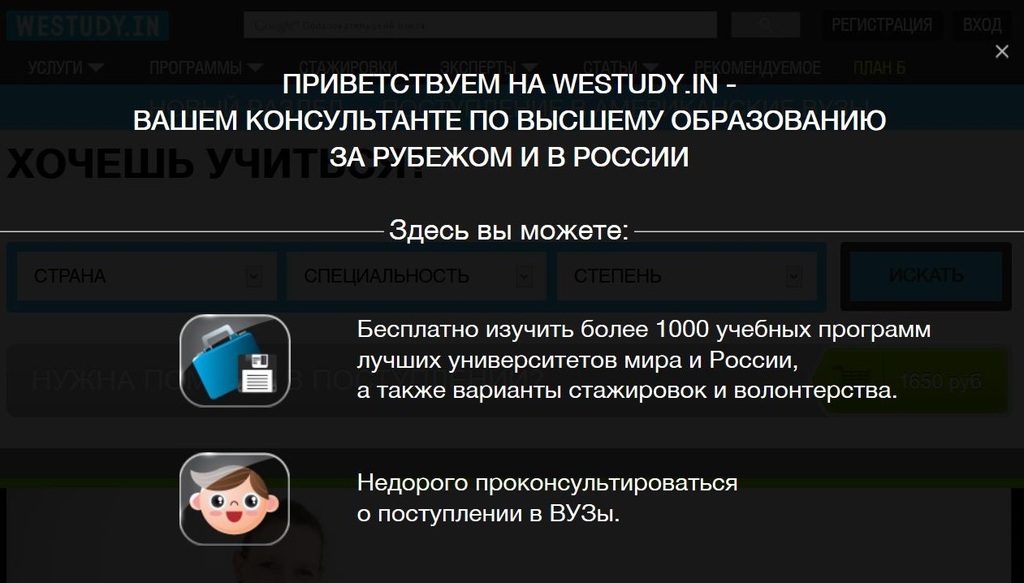
1. Website westudy.in. Black pop-up window on the whole screen, covering the entire screen, scares and alarms.
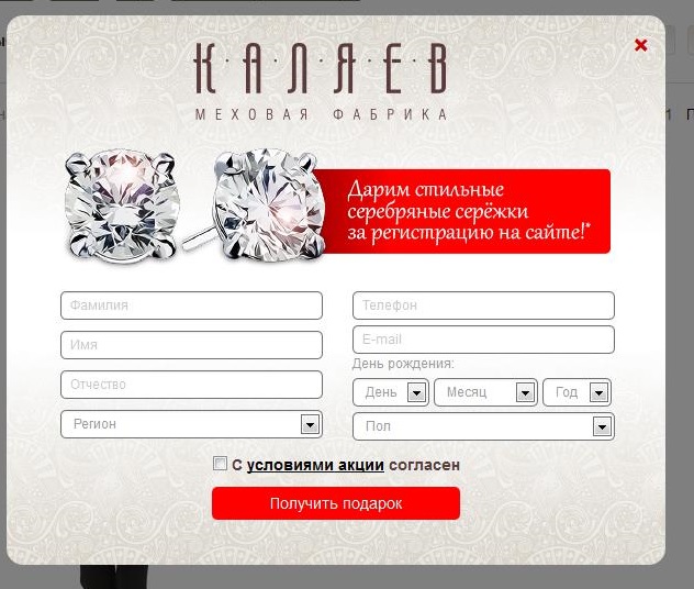
2. A pop-up window on the site fursk.ru. Too many fields in the form to fill. Remember, each new item in the questionnaire reduces the likelihood of filling it by 10%.
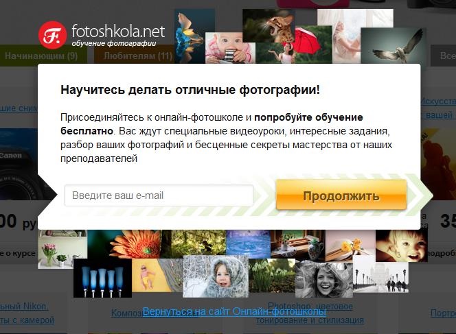
3. A pop-up window on fotoshkola.net. An unconventional location of the link to close the popup can lead to the closure of the whole site.
4. The site trendsbrands.ru. Fuzzy call to action in a pop-up window. It seems that the buttons and the introduction of e-mail'a not related to each other. Actually, “I'm a girl” is the submit button.

5. Site groupon.ru. No close button. When you click on an offer, it opens in the same window, which reduces the likelihood of filling the popup.
6. The pop-up window on the site vigoda.ru is misleading. The site "Benefits", in the subscription offers to Kupi-Vip.

A few examples of excellent pop-ups:
1. Sapato.ru

2. "Big City".

Windows with smiling online consultants won't surprise anyone now - these services are available on most commercial and informational web resources. To date, the most promising type of marketing within the site is the so-called vitzheta - pop-up windows informing the user about profitable offers and promotions, or containing a form for collecting contacts about the visitor.
However, it must be remembered that any tool will be effective only if it is properly used. Often, site owners and marketers make unforgivable mistakes when working with pop-up windows. Let's try to disassemble the ten deadly sins that prevent the vitzhet to benefit the business.
1. Lack of targeting
Targeting is commonly understood as a marketing mechanism by which from among all users of the Network, you can select the audience that meets pre-selected criteria and convey information to it (usually advertising).
Naturally, if the site, for example, automotive topics suddenly pops up a page about baby carriages, it will be at least illogical and unlikely to prompt the user to continue working on the site. Therefore, the information provided should, above all, be thematic.
It is also illogical to your current client, who, for example, is authorized and the system knows that he already uses your services, to offer advice on services or a trial lesson / demo-access. Try to divide your audience into interest groups / attitudes to your business / socio-demographic indicators, etc. Then develop a pop-up window for each of these groups and show, based on cookies, login and tags.
')
2. Not relevant information
From the preceding paragraph follows the next, calling for the use of only relevant data. It is unlikely that the visitor will like it if he is offered to participate in the action, which has already ended a few weeks ago. Most likely, it will only irritate him, and he will quickly leave the page in search of more profitable, and most importantly - relevant and existing proposals. Keep track of the relevance of the information in the pop-up window, prepare updates in advance. Otherwise, you risk not only not getting the buyer, but also earning a negative feedback.
3. Poor quality design
It is not a secret for anyone that a talented webpage is a powerful tool that motivates a visitor to stay longer, at least to admire an attractive design. The same goes for pop-up windows. If a huge and low-quality decorated whitelling that occupies the entire screen suddenly appears to the user, then the only desire that will arise for any visitor is to quickly leave the page or close the popup.
If you do not have designer talent, I recommend not to risk the reputation of the site, but use the existing designers to create pop-up windows. In Russia, one of the most promising and easy-to-use services is the online Witget designer, where you can find free images and examples of ready-made windows that you only need to adapt for your site. From foreign tools, we can recommend Popup Domination, which offers the right templates.
You can also contact your own designer or web studio to create an image. However, this is a costly and time consuming path. Making an image takes 1-3 days depending on the workload of the designer and costs from 800 to 1500 rubles for one picture.
4. Showing the same information in 2-3 weeks
As you know, any information is aging and after a while bored. If regular visitors to the site for a long time see the same offer or message about the promotion, they will get the impression that the site is not being updated, and the information on it is no longer relevant. In addition, they would gladly take advantage of the new offer, and you are still offering an old one that is either not interesting or has already been used.
5. Showing a pop-up window immediately upon entering the site
The user has not yet had time to really understand what the subject of the site is, and an obsessive window immediately flashes in front of him, urging him to fill out a questionnaire immediately. The reaction is predictable - the visitor is unlikely to linger long on such a site. So stay tuned to show times. Is it worth it to show the window when on the site for more than 60 seconds? Or when visiting a particular page? Or when leaving the site?
Remember that the pop-up window is shown once, so as not to annoy potential buyers. And if the visitor, after being on the site, remembers your proposal, shown at the very beginning, assesses it and wants to use it, then he will not be able to call the popup. Therefore, the main thing is to show the window on time.
6. Implicit cross
If the user is not interested in the information he read on the page that appeared in front of him, he should have the opportunity to close the window in order to continue exploring the content of the site. If he is not given such an opportunity or makes it difficult to search for the cherished cross, the visitor will most likely leave the web page completely and never return. Remember that the first impression does not create twice. To the same point should be attributed those "tricky" cases when instead of a cross is used, for example, a tick or plus sign. Or placing it in an unconventional place, small size or color, indistinguishable from the background. In this case, the user cannot find the icon familiar to him, which closes the window, and simply leaves the site, annoyed that he could not get rid of the intrusive knit.
7. Lack of call for action
The main goal of any marketing is to induce consumers to purchase the advertised product or use the offered service. Like any marketing tool, a whiz should interest the user, which means that it should contain a direct call, for example, fill out a questionnaire and get a guaranteed discount or take part in an unprecedented action.
If there is no call to active action, the user will not understand why this pop-up window is needed at all, and you will not get the desired effect.
8. Ignoring received data
If the vitget was supposed to fill in contact information, leave a review, etc., then later it is necessary to use the obtained data to establish contact with a potential client. In this case, I recommend to pay attention to the email-newsletter with a description of interesting offers and promotions.
In addition, the data will help you to make a portrait of the average visitor to your site, then you will be able to focus on it when choosing, for example, content.
And two purely technical points ...
9. Using low-quality script
If the script for placing the cuff is not written with sufficient quality, this will cause the site to be overloaded and the download speed will increase. Users do not like when the page is slowly loading, so this fact is likely to entail leaving the site and searching for a similar, but faster one. It may also affect the position of the site in the search results. Therefore, when choosing a service that places a script on a site, pay attention to the size of the script (the smaller, the better), and also check the download speed of the site with and without the script. The difference should be insignificant, not at times.
10. The effect of the Christmas tree
The final point of our “hit parade” will be the phenomenon, which concerns, rather, the general design of the site and pop-up windows in particular. It is about overloading the page with banners, advertisements and other elements for which the main text is lost.
In this case, it is very important to maintain a balance, otherwise the user is unlikely to remain on the site, where it is difficult to discern the necessary information behind an abundance of pop-up windows.
Good luck in the development and optimization of your site!
Let's look at typical errors using examples:
1. Website westudy.in. Black pop-up window on the whole screen, covering the entire screen, scares and alarms.
2. A pop-up window on the site fursk.ru. Too many fields in the form to fill. Remember, each new item in the questionnaire reduces the likelihood of filling it by 10%.
3. A pop-up window on fotoshkola.net. An unconventional location of the link to close the popup can lead to the closure of the whole site.
4. The site trendsbrands.ru. Fuzzy call to action in a pop-up window. It seems that the buttons and the introduction of e-mail'a not related to each other. Actually, “I'm a girl” is the submit button.
5. Site groupon.ru. No close button. When you click on an offer, it opens in the same window, which reduces the likelihood of filling the popup.
6. The pop-up window on the site vigoda.ru is misleading. The site "Benefits", in the subscription offers to Kupi-Vip.
A few examples of excellent pop-ups:
1. Sapato.ru
2. "Big City".
Source: https://habr.com/ru/post/204936/
All Articles