Serious design of a serious store. Part 1. We investigate and think over the functionality.
Not so long ago, I wrote an article about the design of large sites on the example of a social network with a similar name: "Serious design of serious sites." Today I want to talk about one of our main areas of activity - e-commerce, namely about the design of online stores.
This series of articles is more specialists, much more in depth than all my past articles in this area. In the article I will talk about the largest online stores in the USA, China, Russia and Ukraine, tell you how marketing affects the design, show a detailed Mind Map of the hypermarket, describe 57 main modules of online stores for the external (consumer) part and more than 50 modules for the internal part (administrative), I will show store interfaces and many more useful things.
I personally have been working with online shopping and technology sales on the Internet since the distant 2005. Over the years, my opinion on this issue has evolved greatly. Once I thought that an online store is a fairly simple site from the point of view of a developer or marketer, it seemed to me that all stores are similar to each other and it’s enough just to get a pool of knowledge that can be used for many years without any special changes. because an online store is only a type of site for selling goods and at first glance there is nothing difficult in developing a new store with similar functionality, but with other goods. In fact, everything is much more complicated and the more I learn about online shopping, the more I understand that in this matter it is impossible to know everything, even one little thing in the interface can change the store’s profit by thousands of dollars, and for big players this “little thing” can cost millions. It is this feature of e-commerce that makes the requirements for sites and professionals who make them insanely high. Below, I will show a lot of interesting figures that will prove my statement.
')
Earlier, I wrote an article about the technology of designing large sites, which, by the way, was very popular in the Russian and English segments of the Internet: “ Serious design of serious sites ”. Although designing an online store has a similar sequence of actions, which I described in the last article, the technology itself is still very different, so let's look at it in great detail. In the course of the article, I will refer to my past, so as not to repeat myself, and this one will focus on the differences.
To design such a voluminous and specific task, we need a whole team of specialists. In particular: business analyst, strategist, marketer, e-commerce specialist, UX / UI designer, as well as third-party expert consultants for specific stages, such as design requirements or technology requirements.
Traditionally, design must begin with the collection of requirements for the future project. For the purpose of the project, in principle, everything is immediately clear - sales. However, in the online store, there is one very important feature that needs to be found out at the very beginning: how all the business processes will be organized. There are two globally different options, which then greatly affect the design:
1. The online store is being done as an addition to an already existing offline business, therefore, the customer already uses some accounting systems and will either have to integrate with them or recycle.
2. The online store does as an independent business, therefore, all business processes and software for them will need to be created from scratch.
The rest is unchanged, I already wrote about this in the last article.
A very important stage, given the huge competition in the market. Here, of course, it is more important to find out the business processes of competitors, but it will be very useful to analyze the websites of companies with which to compete in the online trading market. Since we are talking about design here, I will not delve into the sphere of industrial espionage, but will focus on the study of sites, that is, those moments that we need for subsequent design.
First you need to understand that there are direct and indirect competitors. If we build a regional online store, for example, for one country, then direct competitors will be those online stores that sell the same goods and, like us, are “national,” and indirect are a number of global giants. In recent years, the trend of erasing borders in online sales has been developing: Americans are ordering in China, Russians in the United States, and Europeans in both. This trend will only continue to gain momentum; therefore, it is not the first year that the development of a high-quality online store has analyzed both national players and major players from the near abroad and world giants. In my example, I consider the design of a large hypermarket, so competitors will also be hypermarkets.
For the design, we are interested in the functionality of the competitors' stores, the interfaces of the main pages (main, product page, basket, etc.) and the marketing component is very important. I have written many competitors, I will not do a detailed analysis in the article, otherwise only it will take two dozen pages of text, I will write out a few comments on the whole for each site and main page.
American competitors:
Let's take one of the ratings of the largest online stores from the magazine “Forbes” - in it, by the way, not just American online stores, but also world leaders turned out.
Amazon.com is the flagship of e-commerce in the world, invented a lot of innovations in this area. A good two-level menu on the left, which fits a lot of product categories and even advertising in the second level. Large search in the center of the screen. A large promotional block through which sales of the most profitable goods for the store are stimulated. On the main page shows popular products and visible loyalty program.
Itunes.com is an Apple Store. Because of its specificity, we are not very interesting, except that the simplicity and logic of the interface pleases.
Zappos.com - shoe store. A very good example of a quality interface. On the main page you can find a convenient horizontal two-level menu, contacts and a large search in the header, and an auxiliary context menu on the left. Prudently made a breakdown of men's and women's products, which greatly helps the user in such specifics. A large promotional block, as well as in Amazon.com, stimulates the sale of profitable products. There is a block with recommended products and even reviews from other buyers.
Ebay.com is not exactly a classic online store, but an auction, but it also sells, so you should see how. The interface is modern, with a design in the style of interest (tiles with goods under the promotional unit). On the left is a two-level menu with icons that help the user navigate. Simply, the ingenious tool “Shop by category” is right next to the logo: there are so many goods, everything that can be sold is sold there, respectively, we do not know what the user is interested in, what category of goods. This tool allows you to customize the store site for a specific product category. To the right is a large search and promotional unit. Below are products in interest design, which, by the way, I personally don’t really like because of the abundance of information in which the user is often lost.
Officedepot.com is another major online store. Large search and the phone above it, the horizontal menu, which is due to the rather narrow specifics of the online store, under the menu is a promotional unit. The design as a whole is already outdated, so I will not dwell on it. By the way, for users from Russia and Ukraine the site is blocked, so look through an anonymous proxy server.
Chinese competitors:
Taobao.com is the largest Chinese player in which the C2C model is built, that is, the site is only an intermediary in sales. The interface is in Chinese, a lot of specificity, which is dictated by the local market: animation, a large abundance of information, etc. In the center is traditionally a big search, below are several promo-blocks. In general, the principle is the same as everyone else, just a lot of information.
Alibaba.com is the largest B2B marketplace. On the main page is traditionally a large two-level menu on the left, in the center of a large search, below it is a promotional unit, below promotional items.
PaiPai.com - like Taobao.com - is a C2C site. Interface in Chinese. On the main page there is a huge drop-down menu on the left, in the header is not very large, but a prominent search, below are promotional blocks and promotional items. Traditionally for Chinese sites information overload.
Russian competitors:
A large overview of the Russian largest e-commerce market companies can be found in the article of the blog "Shopolog" .
Ulmart.ru is traditionally the main page: on the left there is a large two-level menu, in the center is a large search, under the search is a promotional unit, and there are promotional items under it. The menu when scrolling is always “nailed” to the screen, and in the header you are prompted to select a city, otherwise this function does not work very correctly due to the technology that is used.
Exist.ru is not the most successful interface, but by its functionality the store is well automated and has a number of specific functions related to the subject.
Svyaznoy.ru - a large three-level horizontal menu, above it is a great search, below the menu is a promotional unit. On the main page there are a lot of promotional items, new products, bestsellers.
Ozon.ru is once the leader of the Russian e-commerce market, and now it is gradually lagging behind its competitors. The interface is outdated: the search is small, the phones in the header are poorly noticeable, the promotional unit does not stand out very well. In the content part sold bestsellers.
Kupivip.ru is a shopping club, a relatively new type of e-commerce project, purchases are available only to members of the club, so the main page is not selling.
Ukrainian competitors:
Again, "Forbes" spoke about the largest online stores in Ukraine.
Rozetka.ua is the largest and rather old online store in Ukraine. The interface is morally obsolete, but there is a good horizontal menu (most likely it will soon become vertical, due to the addition of new categories), a medium-sized search, a promotional unit is not very expressive.
Allo.ua - online store with a network of offline stores Allo. A large horizontal two-level menu with ads, a large search in the center, a promotional block is not aligned with the grid and therefore a feeling of “porridge” is created, in the content part there are popular items and new items. In general, the interface is also not the one to be oriented.
Fotos.ua is a big search in the header of the site, although its design is not very noticeable. A large drop-down menu with pictures, while in order for it to fall out, you need to click, and the extra action, as we know, is not very good. The names of the categories in the menu are very small, people with visual impairments may not read them at all. For some reason, the phones were taken out of the caps into a promotional unit, and even in the "blind zone", which violates the logic in the mind of the consumer. The promo block itself is quite large, but again - you need to click to scroll.
Mobilluck.com.ua is a big search, which is not highlighted in color, as well as the menu and therefore users do not pay attention to them. The menu is large, three-level, which is quite convenient. A big promo block that attracts more attention than the menu. Below is a big block with popular products divided into categories.
Fotomag.com.ua is a rather old interface, not adaptive, which is important now too. Phones above the logo are not very visible, search in the center of medium size. A very large two-level menu, in some categories, you can get lost. The auxiliary menu with information about the store for some reason turned out to be under the menu with goods and when the second level drops out it closes. On the left, in the context menu, the main categories of the drop-down menu are duplicated, with only one product group selected by default. In the center there are popular products and new items, this is a positive sign.
In general, the analysis of competitors shows a very large similarity of all successful online stores. Users have become accustomed to many things and expect to see the same everywhere. In particular, a large user-friendly menu, a large search, a promotional unit and promotional items are in 90% of cases on the main pages. Internal functionality is also often similar, and any successful online store uses a number of important functions, which I will discuss below, but the interfaces differ a bit.
Particularly pleased with the American online shopping, they are all very well developed in terms of interfaces and functionality. When designing better to focus on them. Ukrainian stores on the contrary are frustrating, it’s better not to orient oneself towards their interfaces.
This stage is also not much different from the technique of execution from the description in the last article, but its results will, of course, be different. When we have defined the target audience, we proceed to the characters. Below, I will design several characters for a hypermarket where you can buy absolutely everything, i.e. This is the widest CA:


By this principle, we write out all the typical groups of buyers. This will help us to get used to the role of our customers and understand exactly what they need.
Having studied Central Asia and got used to the role of our characters from the previous stage, we can understand what tasks they face, what problems they face and most importantly, what solutions we can offer in our online store.
Vasily Konyukhov
Tasks: buy a laptop and pay it by credit card.
Problems: I have not decided on the brand and model.
Solutions: 1. Make filtering tools by brand and price. 2. Make the possibility of on-line payment.
Ekaterina Kryukova
Objectives: buy a few household items in two weeks.
Problems: 1. Did not choose brands and models. 2. Will buy with a salary. 3. Saves money and does not want to overpay.
Solutions: 1. Make a wish list, in case the buyer finds something worthwhile in the catalog, but is not ready to make a purchase yet. 2. Make promotions and discounts, visually show savings. 3. Make it possible to subscribe to different product categories and promotions.
Evgeny Popov
Objectives: to buy food, while spending a minimum of time on it.
Problems: does not like shopping.
Solutions: 1. Keep a history of purchases and make the possibility of repeat purchases directly from your personal account. 2. To make it possible to automatically order certain products after a certain period of time and bring everything home once a week at a predetermined time. 3. Make personalization tools, in particular the setting of interests, which will allow you to view only the categories of goods or individual brands of interest.
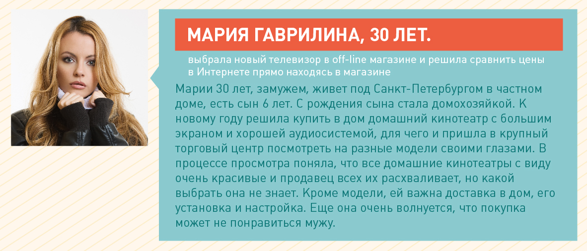
Maria Gavrilina
Tasks: 1. Choose a home theater. 2. Bring him home. 3. Install and configure. 4. To agree with the husband purchase, its cost and model.
Problems: 1. Not enough information to make a decision. 2. It is difficult to agree with the husband purchase in advance. 3. Not everywhere proposed installation and configuration.
Solutions: 1. Provide tools to help you choose: filtering in the catalog, reviews, rating of products, etc. 2. Tools for sharing goods or sending information to an email. 3. Offer additional services with the product, service. 4. Make a barcode scanning tool to quickly find this product in the online store, preferably in the form of an application for a smartphone, so that the buyer can do it right in the off-line store.
I did not tell about this stage in my previous article, but this is a rather important point, I would say in many ways fundamental. On the one hand, we are just starting to create a product, at the very beginning of the journey, and on the other, we must very clearly see its development strategy and final goals in order to take this into account in the design.
I have information on the target audience and competitors, we can develop a strategy for the development of our own project. At this stage, you do not need a large document of 100 pages with the prescription of each tactical detail. A general vision of the strategy will suffice. It should be tailored to our Central Asia and take into account the niches in which competitors operate. You can apply the well-known method of “strategy of the blue ocean” and “search for insights”.
The strategy will show us exactly what to focus on in the design. For example, if the future online store will compete at a low price - you need to indicate directly on the site that we have the lowest price, make the module “find cheaper”, constantly remind customers of the favorable price. The price is, of course, the most banal example, I would not recommend using it at all, although it is the most common one. This article is not about strategies, so I will not dwell on this in detail.
As we do the store, we will have a lot of different marketing. I will describe the part that concerns design, that is, marketing, which should be taken into account in further development.
Branding and positioning
This is one of the fundamental things on which the perception of the entire store will depend. In many ways, branding is intertwined with the strategy I mentioned above. Understanding the positioning of competitors on the Internet, you can develop your own unique positioning and navigate it through the entire store. Every little thing should reflect the positioning of the online store. This is again the correct placement of accents, especially in the interfaces.
AIDA
To begin with, let's recall the wonderful marketing model - AIDAs . The model is very simple, its meaning is to force the user to go through 5 basic steps that will lead him to the desired goal. The model is based on psychology and is applicable in our case to the interface of the site. The interface should “lead” the user and motivate him to perform the actions we need. The model is divided into 4 basic steps and one additional: Attention (attention), Interest (interest), Desire (desire), Action (action) and Satisfaction (satisfaction). The model can be applied both for the site as a whole and for individual pages.
An example of applying the AIDA model on the site as a whole:
1. Attention. On the main page we pay attention. This can be done with the slogan “We are online store number 1”, with a large banner “Buy now and get 80% discount!”, A block with popular products, etc. As a result, a person goes to the internal page, most often to the product catalog.
2. Interest. When a person went to the catalog or share, we need to arouse his interest. In this case, this can be done by demonstrating a product (for example, beautiful photos), showing social interest in a product (for example, many reviews), paying attention to an attractive price or special conditions (for example, an additional product as a gift). As a result, a person enters the product card.
3. Desire. There is always a lot of various information and different marketing gimmicks on the product card. She must all "scream" defiant desire. Desire can be invoked with the help of high-quality presentation of information about the product, stock, set of goods at a discount, etc. There are a lot of tools. As a result, a person must want to buy a product.
4. Action. Having the desire, you need to show the client a large, contrasting “Buy” button or a phone in a visible place, and also make a call to action. As an embodiment of this step: a contrast button to buy and after clicking the pop-up window should offer to “arrange the purchase”, as if pressing the client, telling him what he should do now.
5. Satisfaction. Do not think that after clicking on the "Buy" button, the job is done. If you look at the statistics, many customers do not reach the payment or return the goods even after the purchase. Customer need to fully satisfy. First, you need to make a simple ordering, ideally in a few clicks and with a minimum of fields to be filled. Secondly, after ordering, the client needs to call and, if the man ordered, a pleasant female voice, and if the woman is male, with a smile (this is felt by intonation) and very politely clarify all the details with the buyer, find out whether he liked everything , whether he has questions or wishes. And while the client does not receive the goods, he does not check and pay for it, he must be loved and satisfied!
The path of the user may be different, but in the end he must do the necessary action. And even on one page there can be several AIDA schemes: for someone the price will be the second step, and for someone the special characteristics of the product. Also conversely, one step can be stretched over several pages. But ideally, of course, concentrate the user's attention and apply one step per page or one script per page if the model is applied to a separate page.
I described a simple mechanism that works very well. Therefore, the principle builds the logic of designing individual pages, especially the product page. But this will not be enough. , « » , , . .
Loyalty program
, – . : 80% 20% . , , .
- , , : , . - , , . , , ?
, - . !? , .
, . . – , : . -, , , . , . , , , .
, , , . .
, . . .
, . , . , , , .
- , . , , « », . - , , . , , , .
– , , , .
4P
4P , , , . product (), price (), promotion () place ().
?
1. Product. , . , , . . , .
2. Price. , , : , , .. , , ( , ..).
3. Promotion. . , : , , , . , . , : - , , - , .
4. Place. «», . – . . ? ? ? -.
KPI
, , , , , KPI. , , , .
- KPI:
1.
2.
3.
4.
5.
6.
7.
8.
9.
10.
11. (3+ )
12.
13.
14.
15.
. . , , , .
. , , .
, KPI, .
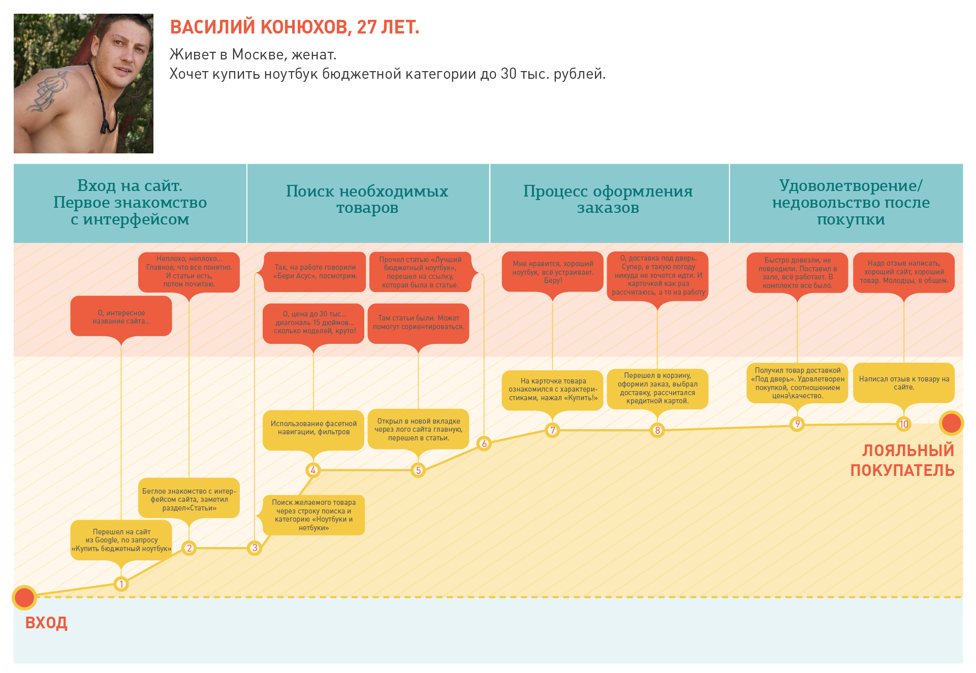
, . - , . , .
Fig. 1. Journey Map ( )
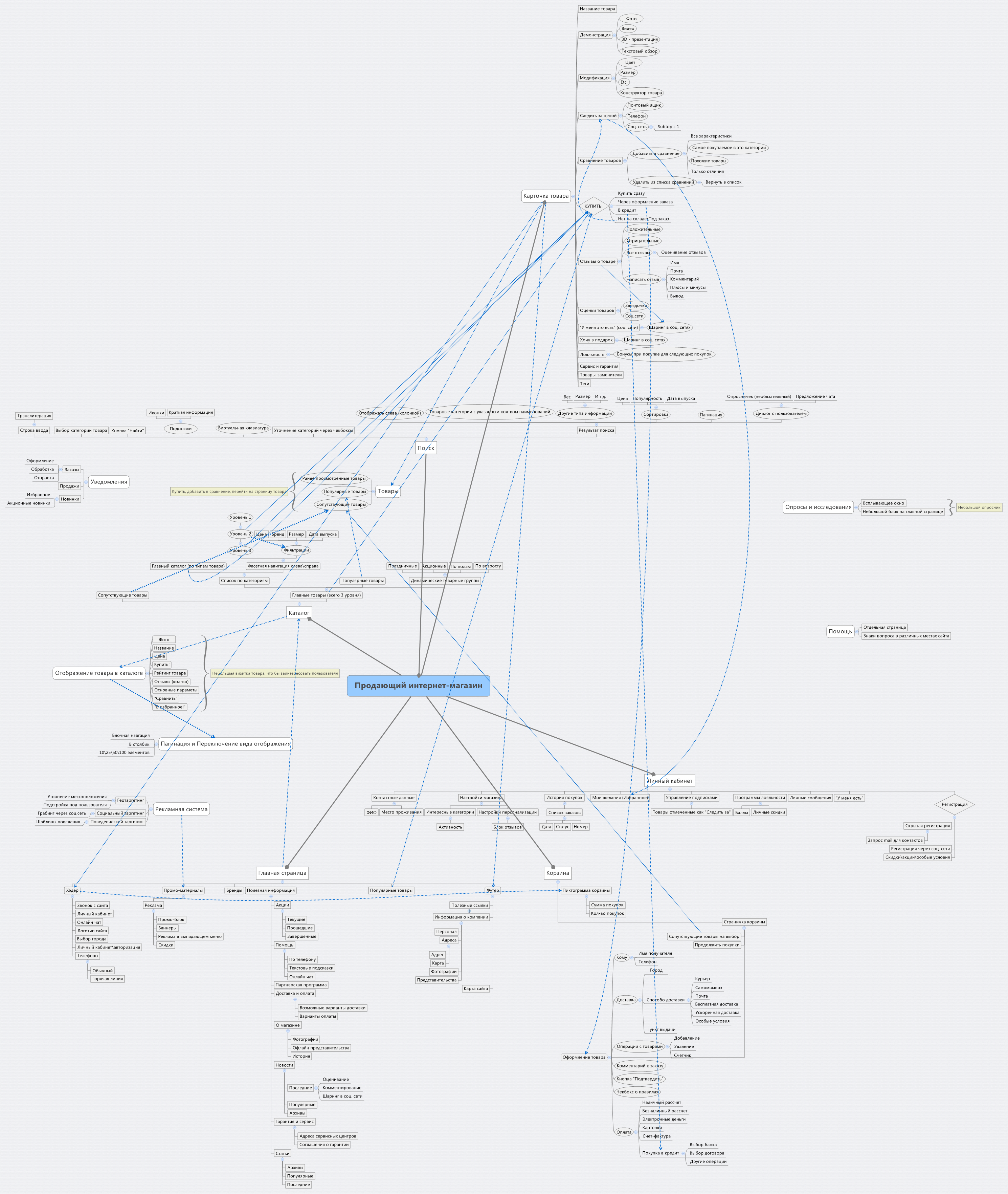
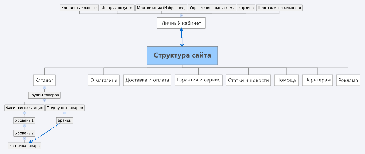
Mind Map , . , Mind Map, 50.
Fig. 2. Mind Map ( )
- . : . , . , . , , .
Fig. 3. .
. , . () , . , : , , , « », . , , .
:
Fig. 4. -
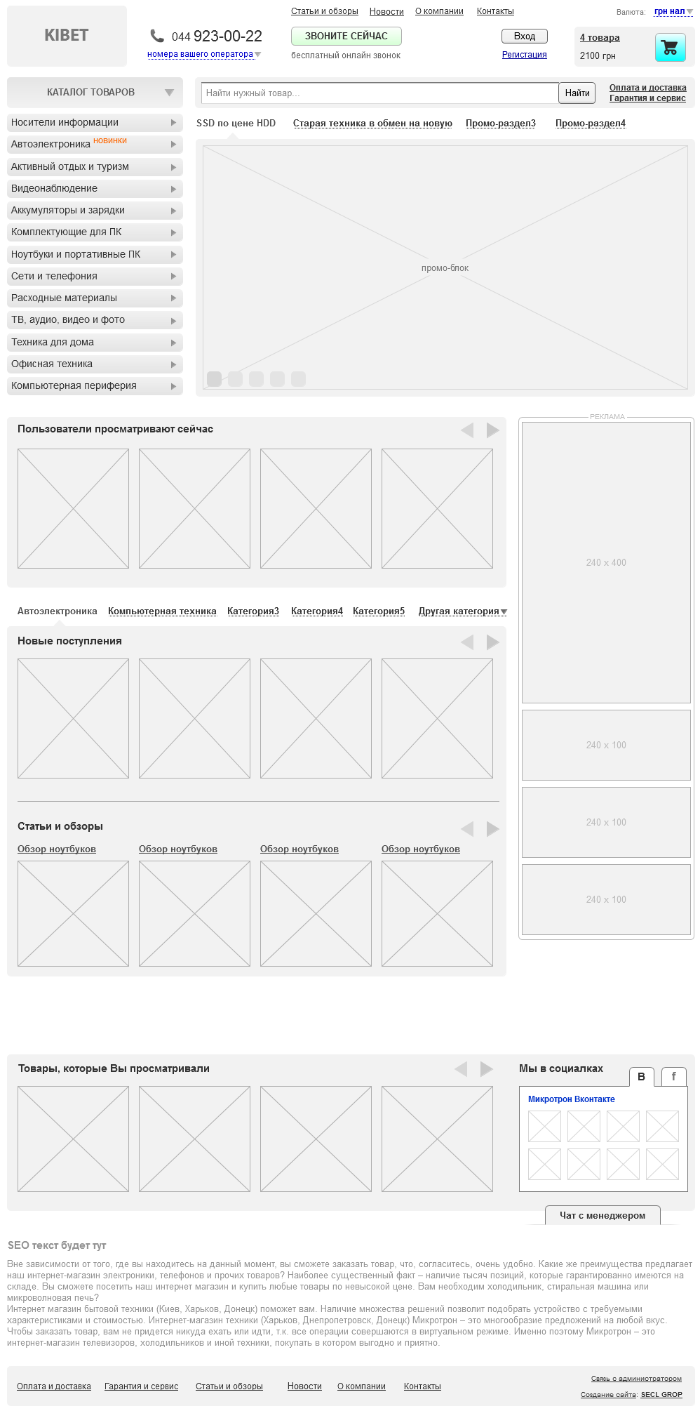
Fig. 5. -

57 -, , . , , , , . - , . 7 , .
:
. - «Digitov» : , - - . !
. -. . email: info@secl.com.ua - « » .
. — SECL Group: Facebook , VK , and Twitter .
Original article: http://secl.com.ua/article_serjoznoye_proyektirovaniye_serjoznogo_magazina_analitika.html
Author:
Nikita Semenov
The president
Company «SECL GROUP» / «Internet Sales Technologies»
This series of articles is more specialists, much more in depth than all my past articles in this area. In the article I will talk about the largest online stores in the USA, China, Russia and Ukraine, tell you how marketing affects the design, show a detailed Mind Map of the hypermarket, describe 57 main modules of online stores for the external (consumer) part and more than 50 modules for the internal part (administrative), I will show store interfaces and many more useful things.
I personally have been working with online shopping and technology sales on the Internet since the distant 2005. Over the years, my opinion on this issue has evolved greatly. Once I thought that an online store is a fairly simple site from the point of view of a developer or marketer, it seemed to me that all stores are similar to each other and it’s enough just to get a pool of knowledge that can be used for many years without any special changes. because an online store is only a type of site for selling goods and at first glance there is nothing difficult in developing a new store with similar functionality, but with other goods. In fact, everything is much more complicated and the more I learn about online shopping, the more I understand that in this matter it is impossible to know everything, even one little thing in the interface can change the store’s profit by thousands of dollars, and for big players this “little thing” can cost millions. It is this feature of e-commerce that makes the requirements for sites and professionals who make them insanely high. Below, I will show a lot of interesting figures that will prove my statement.
')
Earlier, I wrote an article about the technology of designing large sites, which, by the way, was very popular in the Russian and English segments of the Internet: “ Serious design of serious sites ”. Although designing an online store has a similar sequence of actions, which I described in the last article, the technology itself is still very different, so let's look at it in great detail. In the course of the article, I will refer to my past, so as not to repeat myself, and this one will focus on the differences.
To design such a voluminous and specific task, we need a whole team of specialists. In particular: business analyst, strategist, marketer, e-commerce specialist, UX / UI designer, as well as third-party expert consultants for specific stages, such as design requirements or technology requirements.
Requirements gathering (briefing)
Traditionally, design must begin with the collection of requirements for the future project. For the purpose of the project, in principle, everything is immediately clear - sales. However, in the online store, there is one very important feature that needs to be found out at the very beginning: how all the business processes will be organized. There are two globally different options, which then greatly affect the design:
1. The online store is being done as an addition to an already existing offline business, therefore, the customer already uses some accounting systems and will either have to integrate with them or recycle.
2. The online store does as an independent business, therefore, all business processes and software for them will need to be created from scratch.
The rest is unchanged, I already wrote about this in the last article.
Competitor research
A very important stage, given the huge competition in the market. Here, of course, it is more important to find out the business processes of competitors, but it will be very useful to analyze the websites of companies with which to compete in the online trading market. Since we are talking about design here, I will not delve into the sphere of industrial espionage, but will focus on the study of sites, that is, those moments that we need for subsequent design.
First you need to understand that there are direct and indirect competitors. If we build a regional online store, for example, for one country, then direct competitors will be those online stores that sell the same goods and, like us, are “national,” and indirect are a number of global giants. In recent years, the trend of erasing borders in online sales has been developing: Americans are ordering in China, Russians in the United States, and Europeans in both. This trend will only continue to gain momentum; therefore, it is not the first year that the development of a high-quality online store has analyzed both national players and major players from the near abroad and world giants. In my example, I consider the design of a large hypermarket, so competitors will also be hypermarkets.
For the design, we are interested in the functionality of the competitors' stores, the interfaces of the main pages (main, product page, basket, etc.) and the marketing component is very important. I have written many competitors, I will not do a detailed analysis in the article, otherwise only it will take two dozen pages of text, I will write out a few comments on the whole for each site and main page.
American competitors:
Let's take one of the ratings of the largest online stores from the magazine “Forbes” - in it, by the way, not just American online stores, but also world leaders turned out.
Amazon.com is the flagship of e-commerce in the world, invented a lot of innovations in this area. A good two-level menu on the left, which fits a lot of product categories and even advertising in the second level. Large search in the center of the screen. A large promotional block through which sales of the most profitable goods for the store are stimulated. On the main page shows popular products and visible loyalty program.
Itunes.com is an Apple Store. Because of its specificity, we are not very interesting, except that the simplicity and logic of the interface pleases.
Zappos.com - shoe store. A very good example of a quality interface. On the main page you can find a convenient horizontal two-level menu, contacts and a large search in the header, and an auxiliary context menu on the left. Prudently made a breakdown of men's and women's products, which greatly helps the user in such specifics. A large promotional block, as well as in Amazon.com, stimulates the sale of profitable products. There is a block with recommended products and even reviews from other buyers.
Ebay.com is not exactly a classic online store, but an auction, but it also sells, so you should see how. The interface is modern, with a design in the style of interest (tiles with goods under the promotional unit). On the left is a two-level menu with icons that help the user navigate. Simply, the ingenious tool “Shop by category” is right next to the logo: there are so many goods, everything that can be sold is sold there, respectively, we do not know what the user is interested in, what category of goods. This tool allows you to customize the store site for a specific product category. To the right is a large search and promotional unit. Below are products in interest design, which, by the way, I personally don’t really like because of the abundance of information in which the user is often lost.
Officedepot.com is another major online store. Large search and the phone above it, the horizontal menu, which is due to the rather narrow specifics of the online store, under the menu is a promotional unit. The design as a whole is already outdated, so I will not dwell on it. By the way, for users from Russia and Ukraine the site is blocked, so look through an anonymous proxy server.
Chinese competitors:
Taobao.com is the largest Chinese player in which the C2C model is built, that is, the site is only an intermediary in sales. The interface is in Chinese, a lot of specificity, which is dictated by the local market: animation, a large abundance of information, etc. In the center is traditionally a big search, below are several promo-blocks. In general, the principle is the same as everyone else, just a lot of information.
Alibaba.com is the largest B2B marketplace. On the main page is traditionally a large two-level menu on the left, in the center of a large search, below it is a promotional unit, below promotional items.
PaiPai.com - like Taobao.com - is a C2C site. Interface in Chinese. On the main page there is a huge drop-down menu on the left, in the header is not very large, but a prominent search, below are promotional blocks and promotional items. Traditionally for Chinese sites information overload.
Russian competitors:
A large overview of the Russian largest e-commerce market companies can be found in the article of the blog "Shopolog" .
Ulmart.ru is traditionally the main page: on the left there is a large two-level menu, in the center is a large search, under the search is a promotional unit, and there are promotional items under it. The menu when scrolling is always “nailed” to the screen, and in the header you are prompted to select a city, otherwise this function does not work very correctly due to the technology that is used.
Exist.ru is not the most successful interface, but by its functionality the store is well automated and has a number of specific functions related to the subject.
Svyaznoy.ru - a large three-level horizontal menu, above it is a great search, below the menu is a promotional unit. On the main page there are a lot of promotional items, new products, bestsellers.
Ozon.ru is once the leader of the Russian e-commerce market, and now it is gradually lagging behind its competitors. The interface is outdated: the search is small, the phones in the header are poorly noticeable, the promotional unit does not stand out very well. In the content part sold bestsellers.
Kupivip.ru is a shopping club, a relatively new type of e-commerce project, purchases are available only to members of the club, so the main page is not selling.
Ukrainian competitors:
Again, "Forbes" spoke about the largest online stores in Ukraine.
Rozetka.ua is the largest and rather old online store in Ukraine. The interface is morally obsolete, but there is a good horizontal menu (most likely it will soon become vertical, due to the addition of new categories), a medium-sized search, a promotional unit is not very expressive.
Allo.ua - online store with a network of offline stores Allo. A large horizontal two-level menu with ads, a large search in the center, a promotional block is not aligned with the grid and therefore a feeling of “porridge” is created, in the content part there are popular items and new items. In general, the interface is also not the one to be oriented.
Fotos.ua is a big search in the header of the site, although its design is not very noticeable. A large drop-down menu with pictures, while in order for it to fall out, you need to click, and the extra action, as we know, is not very good. The names of the categories in the menu are very small, people with visual impairments may not read them at all. For some reason, the phones were taken out of the caps into a promotional unit, and even in the "blind zone", which violates the logic in the mind of the consumer. The promo block itself is quite large, but again - you need to click to scroll.
Mobilluck.com.ua is a big search, which is not highlighted in color, as well as the menu and therefore users do not pay attention to them. The menu is large, three-level, which is quite convenient. A big promo block that attracts more attention than the menu. Below is a big block with popular products divided into categories.
Fotomag.com.ua is a rather old interface, not adaptive, which is important now too. Phones above the logo are not very visible, search in the center of medium size. A very large two-level menu, in some categories, you can get lost. The auxiliary menu with information about the store for some reason turned out to be under the menu with goods and when the second level drops out it closes. On the left, in the context menu, the main categories of the drop-down menu are duplicated, with only one product group selected by default. In the center there are popular products and new items, this is a positive sign.
In general, the analysis of competitors shows a very large similarity of all successful online stores. Users have become accustomed to many things and expect to see the same everywhere. In particular, a large user-friendly menu, a large search, a promotional unit and promotional items are in 90% of cases on the main pages. Internal functionality is also often similar, and any successful online store uses a number of important functions, which I will discuss below, but the interfaces differ a bit.
Particularly pleased with the American online shopping, they are all very well developed in terms of interfaces and functionality. When designing better to focus on them. Ukrainian stores on the contrary are frustrating, it’s better not to orient oneself towards their interfaces.
CA and characters
This stage is also not much different from the technique of execution from the description in the last article, but its results will, of course, be different. When we have defined the target audience, we proceed to the characters. Below, I will design several characters for a hypermarket where you can buy absolutely everything, i.e. This is the widest CA:
By this principle, we write out all the typical groups of buyers. This will help us to get used to the role of our customers and understand exactly what they need.
Problems-problems-solutions
Having studied Central Asia and got used to the role of our characters from the previous stage, we can understand what tasks they face, what problems they face and most importantly, what solutions we can offer in our online store.
Vasily Konyukhov
Tasks: buy a laptop and pay it by credit card.
Problems: I have not decided on the brand and model.
Solutions: 1. Make filtering tools by brand and price. 2. Make the possibility of on-line payment.
Ekaterina Kryukova
Objectives: buy a few household items in two weeks.
Problems: 1. Did not choose brands and models. 2. Will buy with a salary. 3. Saves money and does not want to overpay.
Solutions: 1. Make a wish list, in case the buyer finds something worthwhile in the catalog, but is not ready to make a purchase yet. 2. Make promotions and discounts, visually show savings. 3. Make it possible to subscribe to different product categories and promotions.
Evgeny Popov
Objectives: to buy food, while spending a minimum of time on it.
Problems: does not like shopping.
Solutions: 1. Keep a history of purchases and make the possibility of repeat purchases directly from your personal account. 2. To make it possible to automatically order certain products after a certain period of time and bring everything home once a week at a predetermined time. 3. Make personalization tools, in particular the setting of interests, which will allow you to view only the categories of goods or individual brands of interest.
Maria Gavrilina
Tasks: 1. Choose a home theater. 2. Bring him home. 3. Install and configure. 4. To agree with the husband purchase, its cost and model.
Problems: 1. Not enough information to make a decision. 2. It is difficult to agree with the husband purchase in advance. 3. Not everywhere proposed installation and configuration.
Solutions: 1. Provide tools to help you choose: filtering in the catalog, reviews, rating of products, etc. 2. Tools for sharing goods or sending information to an email. 3. Offer additional services with the product, service. 4. Make a barcode scanning tool to quickly find this product in the online store, preferably in the form of an application for a smartphone, so that the buyer can do it right in the off-line store.
Strategy? There is a strategy!
I did not tell about this stage in my previous article, but this is a rather important point, I would say in many ways fundamental. On the one hand, we are just starting to create a product, at the very beginning of the journey, and on the other, we must very clearly see its development strategy and final goals in order to take this into account in the design.
I have information on the target audience and competitors, we can develop a strategy for the development of our own project. At this stage, you do not need a large document of 100 pages with the prescription of each tactical detail. A general vision of the strategy will suffice. It should be tailored to our Central Asia and take into account the niches in which competitors operate. You can apply the well-known method of “strategy of the blue ocean” and “search for insights”.
The strategy will show us exactly what to focus on in the design. For example, if the future online store will compete at a low price - you need to indicate directly on the site that we have the lowest price, make the module “find cheaper”, constantly remind customers of the favorable price. The price is, of course, the most banal example, I would not recommend using it at all, although it is the most common one. This article is not about strategies, so I will not dwell on this in detail.
We think over marketing
As we do the store, we will have a lot of different marketing. I will describe the part that concerns design, that is, marketing, which should be taken into account in further development.
Branding and positioning
This is one of the fundamental things on which the perception of the entire store will depend. In many ways, branding is intertwined with the strategy I mentioned above. Understanding the positioning of competitors on the Internet, you can develop your own unique positioning and navigate it through the entire store. Every little thing should reflect the positioning of the online store. This is again the correct placement of accents, especially in the interfaces.
AIDA
To begin with, let's recall the wonderful marketing model - AIDAs . The model is very simple, its meaning is to force the user to go through 5 basic steps that will lead him to the desired goal. The model is based on psychology and is applicable in our case to the interface of the site. The interface should “lead” the user and motivate him to perform the actions we need. The model is divided into 4 basic steps and one additional: Attention (attention), Interest (interest), Desire (desire), Action (action) and Satisfaction (satisfaction). The model can be applied both for the site as a whole and for individual pages.
An example of applying the AIDA model on the site as a whole:
1. Attention. On the main page we pay attention. This can be done with the slogan “We are online store number 1”, with a large banner “Buy now and get 80% discount!”, A block with popular products, etc. As a result, a person goes to the internal page, most often to the product catalog.
2. Interest. When a person went to the catalog or share, we need to arouse his interest. In this case, this can be done by demonstrating a product (for example, beautiful photos), showing social interest in a product (for example, many reviews), paying attention to an attractive price or special conditions (for example, an additional product as a gift). As a result, a person enters the product card.
3. Desire. There is always a lot of various information and different marketing gimmicks on the product card. She must all "scream" defiant desire. Desire can be invoked with the help of high-quality presentation of information about the product, stock, set of goods at a discount, etc. There are a lot of tools. As a result, a person must want to buy a product.
4. Action. Having the desire, you need to show the client a large, contrasting “Buy” button or a phone in a visible place, and also make a call to action. As an embodiment of this step: a contrast button to buy and after clicking the pop-up window should offer to “arrange the purchase”, as if pressing the client, telling him what he should do now.
5. Satisfaction. Do not think that after clicking on the "Buy" button, the job is done. If you look at the statistics, many customers do not reach the payment or return the goods even after the purchase. Customer need to fully satisfy. First, you need to make a simple ordering, ideally in a few clicks and with a minimum of fields to be filled. Secondly, after ordering, the client needs to call and, if the man ordered, a pleasant female voice, and if the woman is male, with a smile (this is felt by intonation) and very politely clarify all the details with the buyer, find out whether he liked everything , whether he has questions or wishes. And while the client does not receive the goods, he does not check and pay for it, he must be loved and satisfied!
The path of the user may be different, but in the end he must do the necessary action. And even on one page there can be several AIDA schemes: for someone the price will be the second step, and for someone the special characteristics of the product. Also conversely, one step can be stretched over several pages. But ideally, of course, concentrate the user's attention and apply one step per page or one script per page if the model is applied to a separate page.
I described a simple mechanism that works very well. Therefore, the principle builds the logic of designing individual pages, especially the product page. But this will not be enough. , « » , , . .
Loyalty program
, – . : 80% 20% . , , .
- , , : , . - , , . , , ?
, - . !? , .
, . . – , : . -, , , . , . , , , .
, , , . .
, . . .
, . , . , , , .
- , . , , « », . - , , . , , , .
– , , , .
4P
4P , , , . product (), price (), promotion () place ().
?
1. Product. , . , , . . , .
2. Price. , , : , , .. , , ( , ..).
3. Promotion. . , : , , , . , . , : - , , - , .
4. Place. «», . – . . ? ? ? -.
KPI
, , , , , KPI. , , , .
- KPI:
1.
2.
3.
4.
5.
6.
7.
8.
9.
10.
11. (3+ )
12.
13.
14.
15.
. . , , , .
. , , .
, KPI, .
Journey Map
, . - , . , .
Fig. 1. Journey Map ( )
Mind Map
Mind Map , . , Mind Map, 50.
Fig. 2. Mind Map ( )
- . : . , . , . , , .
Fig. 3. .
. , . () , . , : , , , « », . , , .
:
Fig. 4. -
Fig. 5. -
57 -, , . , , , , . - , . 7 , .
:
. - «Digitov» : , - - . !
. -. . email: info@secl.com.ua - « » .
. — SECL Group: Facebook , VK , and Twitter .
Original article: http://secl.com.ua/article_serjoznoye_proyektirovaniye_serjoznogo_magazina_analitika.html
Author:
Nikita Semenov
The president
Company «SECL GROUP» / «Internet Sales Technologies»
Source: https://habr.com/ru/post/204914/
All Articles