What you should know about flat design
Dear designer and non-designer!
This article is for both of you. Designer, it will serve as a good reminder of what you need to pay attention first of all. For the non-designer, it will help to understand the shift from the bulk to the flat design, as well as what it means from a technical point of view.
Sleek and minimalistic design is what I make my bread. Since I started working with design, I have been simplifying the volume all the time, minimizing individual elements and increasing the empty space. At the moment, these two styles have merged together and reached the forefront of mobile design. And I would like to share what I learned.
')
In contrast to the fans of the underground group, who shout “sell out!” As soon as their favorite group gets into the mainstream, I am glad that Apple has made minimalist aesthetics slowly at the forefront of designer fashion. (We will return to what fashion is in design a little later).
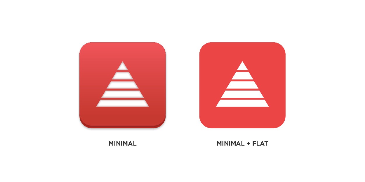
The minimalist design on the left still contains several surround effects that separate the elements from each other. The minimalistic and flat design on the right completely removes any volume and places all the elements on the same plane.
There is also a feeling that Apple brought flat design to the widest audience, and she fell in love with such a design. As expected, the iOS7 update in a flat design was presented as “new” and “fresh”, while this is new and fresh for Apple. All this has long been surrounding us.
Design aesthetics, like fashion, also follows trends: some things get cool for a while, then go away, and then - often after a long period of time - come back again. Anyone who tells you something else is just a stupid gnome (but without this huge pointed red hat, of course).
If you are one of those designers who just does their job without looking at trends, this is amazing. I will take courage and say that it should be so. But if you are one of those who follow all the new trends, then listen to what I tell you. Because if you are going to work with a flat design, then do it well. I do not want you to spoil this style to everyone else.
Since in our work we exclude one of the ways of separating the elements from each other, we must use the remaining methods even more subtly than before. In fact, the fewer elements we work with, the more effectively each of them must interact with the viewer.
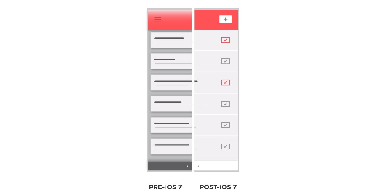
Up to iOS 7: a lot of gradients, shadows, chamfers and overlapping levels. After iOS 7: only one level (one dimension), no shadows, subtle gradients, nothing.
The main problem in the transition from three-dimensional to flat design is the work on only one level. Before the advent of iOS 7, we had such effects for volume transfer as drop shadows, textures, gradients, etc. Today, everything exists in a single plane. This is a flat design.
Here are three basic principles that you should always keep in mind when working with a flat design: hierarchy, blockiness and line of sight.
In iOS 6 and earlier versions, the hierarchy of elements was based, among other things, on differences in volume. You could apply the cast shadow to the menu block by “lifting” it in such a way over all other content and thus announcing its higher level in the hierarchy. Now this is not.

The more important the element, the more attention the user should attract.
Creating a visual hierarchy is essential for successful interaction with the viewer. The worst thing you can do is put a strong focus on the least important part of your interface. To make sure that you did not do this, create a list of elements, ordering them from the most important to the most unimportant, and check that you designed the interface accordingly using size, color, weight, location, etc.
This brings us to the second principle.
The very first thing taught in design schools is to step back from their work and look at it, squinting. This technique lubricates all the elements, allows you to see them in a less detailed form, and thus helps to see and appreciate the more general forms. Blockiness stems from the same method of evaluation.
To better understand blocking, imagine that this is a macro hierarchy. In other words, you take the most common parts of the interface and apply the hierarchy principle to them. You may have dozens of individual elements, but at the macro level there may be only two or three separate areas. These are the blocks.

Hierarchy structure at the macro level. Individual elements form a micro level.
Once you understand what common blocks you have, you can further apply the principle of hierarchy to each of them, more and more eliminating the need for outdated artificial shadows and textures. This is achieved in the ways we talked about hierarchy: size, color, weight, location, etc.
The last and most important element in our three principles is the viewer.
If the service starts in the center of the forest, and no one around sees it, does it exist? The viewer is an uncontrolled control group, it is a litmus test with which we, as designers, can evaluate and plan everything. In short, this is how we perceive what we do, what we work on, what we optimize.
The line of sight is the path along which our technique of hierarchy and blockiness leads the viewer's eyes. Usually, the look begins its way from the upper left corner and moves down to the lower right corner, “reading” the content like a book. From above - down, from left - to right.
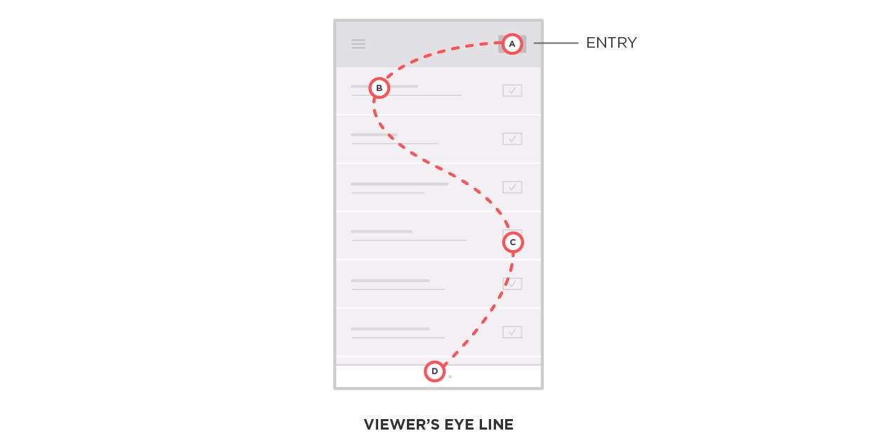
Keep in mind the natural inclination of the viewer when doing design. You do not have 100% control over the line of sight, which is not as flexible as our hierarchy.
By controlling the visual weights of the elements, the designer highlights his own path and thus can control the line of sight. We become pioneers of the screen, apply our hierarchy power and challenge its natural inclination at sight. "From above - down, from left - to right," ultimately turns into "Hold my hand, I will show you where to go."
I think it’s pretty obvious to everyone that all three principles we have explored overlap with each other. Hierarchy and blockiness are micro and macro methods for controlling the line of sight. And the line of sight is a semi-flexible rule that helps locate the elements in our hierarchy and blockiness. It is correct to always keep in mind all three principles, including their techniques and limitations, in order to create a design that effectively interacts with the user.
This article is for both of you. Designer, it will serve as a good reminder of what you need to pay attention first of all. For the non-designer, it will help to understand the shift from the bulk to the flat design, as well as what it means from a technical point of view.
Sleek and minimalistic design is what I make my bread. Since I started working with design, I have been simplifying the volume all the time, minimizing individual elements and increasing the empty space. At the moment, these two styles have merged together and reached the forefront of mobile design. And I would like to share what I learned.
')
All of a sudden everywhere
In contrast to the fans of the underground group, who shout “sell out!” As soon as their favorite group gets into the mainstream, I am glad that Apple has made minimalist aesthetics slowly at the forefront of designer fashion. (We will return to what fashion is in design a little later).
The minimalist design on the left still contains several surround effects that separate the elements from each other. The minimalistic and flat design on the right completely removes any volume and places all the elements on the same plane.
There is also a feeling that Apple brought flat design to the widest audience, and she fell in love with such a design. As expected, the iOS7 update in a flat design was presented as “new” and “fresh”, while this is new and fresh for Apple. All this has long been surrounding us.
Design like fashion
Design aesthetics, like fashion, also follows trends: some things get cool for a while, then go away, and then - often after a long period of time - come back again. Anyone who tells you something else is just a stupid gnome (but without this huge pointed red hat, of course).
If you are one of those designers who just does their job without looking at trends, this is amazing. I will take courage and say that it should be so. But if you are one of those who follow all the new trends, then listen to what I tell you. Because if you are going to work with a flat design, then do it well. I do not want you to spoil this style to everyone else.
One dimension
Since in our work we exclude one of the ways of separating the elements from each other, we must use the remaining methods even more subtly than before. In fact, the fewer elements we work with, the more effectively each of them must interact with the viewer.
Up to iOS 7: a lot of gradients, shadows, chamfers and overlapping levels. After iOS 7: only one level (one dimension), no shadows, subtle gradients, nothing.
The main problem in the transition from three-dimensional to flat design is the work on only one level. Before the advent of iOS 7, we had such effects for volume transfer as drop shadows, textures, gradients, etc. Today, everything exists in a single plane. This is a flat design.
Three principles to master
Here are three basic principles that you should always keep in mind when working with a flat design: hierarchy, blockiness and line of sight.
1. Hierarchy
In iOS 6 and earlier versions, the hierarchy of elements was based, among other things, on differences in volume. You could apply the cast shadow to the menu block by “lifting” it in such a way over all other content and thus announcing its higher level in the hierarchy. Now this is not.
The more important the element, the more attention the user should attract.
Creating a visual hierarchy is essential for successful interaction with the viewer. The worst thing you can do is put a strong focus on the least important part of your interface. To make sure that you did not do this, create a list of elements, ordering them from the most important to the most unimportant, and check that you designed the interface accordingly using size, color, weight, location, etc.
This brings us to the second principle.
2. Blocking
The very first thing taught in design schools is to step back from their work and look at it, squinting. This technique lubricates all the elements, allows you to see them in a less detailed form, and thus helps to see and appreciate the more general forms. Blockiness stems from the same method of evaluation.
To better understand blocking, imagine that this is a macro hierarchy. In other words, you take the most common parts of the interface and apply the hierarchy principle to them. You may have dozens of individual elements, but at the macro level there may be only two or three separate areas. These are the blocks.
Hierarchy structure at the macro level. Individual elements form a micro level.
Once you understand what common blocks you have, you can further apply the principle of hierarchy to each of them, more and more eliminating the need for outdated artificial shadows and textures. This is achieved in the ways we talked about hierarchy: size, color, weight, location, etc.
The last and most important element in our three principles is the viewer.
3. Line of sight
If the service starts in the center of the forest, and no one around sees it, does it exist? The viewer is an uncontrolled control group, it is a litmus test with which we, as designers, can evaluate and plan everything. In short, this is how we perceive what we do, what we work on, what we optimize.
The line of sight is the path along which our technique of hierarchy and blockiness leads the viewer's eyes. Usually, the look begins its way from the upper left corner and moves down to the lower right corner, “reading” the content like a book. From above - down, from left - to right.
Keep in mind the natural inclination of the viewer when doing design. You do not have 100% control over the line of sight, which is not as flexible as our hierarchy.
By controlling the visual weights of the elements, the designer highlights his own path and thus can control the line of sight. We become pioneers of the screen, apply our hierarchy power and challenge its natural inclination at sight. "From above - down, from left - to right," ultimately turns into "Hold my hand, I will show you where to go."
Like three drops of water
I think it’s pretty obvious to everyone that all three principles we have explored overlap with each other. Hierarchy and blockiness are micro and macro methods for controlling the line of sight. And the line of sight is a semi-flexible rule that helps locate the elements in our hierarchy and blockiness. It is correct to always keep in mind all three principles, including their techniques and limitations, in order to create a design that effectively interacts with the user.
Source: https://habr.com/ru/post/204194/
All Articles