Adapting Windows Phone applications for large screens
A week ago, Nokia came out on the market. Upgrading the Windows Phone operating system with the GDR3 label began to support 4-core processors and screen resolution up to FullHD. With these characteristics, Nokia has released its new flagship Lumia 1520 . But the manufacturer didn’t just increase the pixel density with the same screen sizes, as it was done in competitive models on the Android OS by HTC and Samsung. Nokia released a device with a screen diagonal of 6 inches, slightly overtaking even the third version of the ancestor of Galaxy Note tablet phones. The size of the screen and the device itself fascinates and scares at the same time. But, discarding the lyrics, try to figure out how we, the developers, live with it.
So, the main points that need to be considered when adapting the application for new phones:
- Aspect ratio 16: 9;
- FullHD screen resolution;
- Screen size 6 inches.
Now more and in order.
')
Screens with a 16: 9 ratio are slightly more elongated compared to screens of 15: 9. In principle, this aspect ratio of smartphones is far from new. Support for screens with a resolution of 1280x720 was introduced a year ago with the emergence of Windows Phone 8. Programs written for WP7 run on smartphones with such screens, however, to maintain the proportions, the system leaves a black bar on top. Until recently, the Samsung ATIV S was the only device with this screen resolution, and considering Samsung’s share in the WP market (about 1.8% as of November 2013 ), it was possible not to spend much time supporting this resolution.
But with the advent of FullHD-resolution and Lumia 1520 and Lumia 1320, 16: 9 aspect ratio will now have to be considered, since Nokia’s share in the Windows Phone market is 90%, and it’s about the new flagship.
What does this mean for the developer? Previously, to reach most WP7 and WP8 users, it was enough to have one version of the application compiled for WP7. Moreover, if you didn’t need any special functionality that appeared in WP8 (there were very few differences), then there was no point in developing software for the two platforms. Now, in order to support the elongated screens, it is necessary to recompile the application under Windows Phone 8, since only in this case it is possible to indicate in the manifest to the system that the application is ready for an aspect ratio of 16: 9. You also need to prepare new graphic resources at a scale of 150% of the “usual” resolution of 800x480 (for 720p screens) and make sure that the arrangement of the elements looks harmonious on the stretched screen.
It would seem that everything is simple:
- we obtain the scale value using the Application.Current.Host.Content.ScaleFactor property known in WP8;
- check whether it is equal to 225 (1080/480 = 2.25);
- PROFIT! ..
But it was not there. Because we get not 225, but 150. “What the hell! ..”, - exclaim you, and you will be absolutely right. Since the scale up to 150% check was the only way the application determined which screen it was running on and placed the elements accordingly, for compatibility of the old software with the new screens it was decided to return exactly 16: 9 screens this scale.
But do not despair: with the release of GDR3, developers have a new opportunity to determine the physical screen resolution:
Warning: on versions of WP8 to GDR3, calling the GetValue method with the PhysicalScreenResolution parameter will throw an exception. You need to be prepared for this, but you can be sure that you are dealing with a 1280x720 screen. If the result was obtained, the value of _resolution.Width will give you the exact width of the screen in pixels: 720 or 1080 (we are still talking only about 16: 9 screens). Now you can focus on this and load the raster resources correctly. By the way, do not forget to prepare them on a scale of 225%.
PS Remember that with XAML layout, even for FullHD resolution, all dimensions and padding should be specified as for WVGA resolution (480x800).
PPS If you don’t have a new device on GDR3, but you already want to test in the application support call DeviceExtendedProperties.GetValue ("PhysicalScreenResolution"), you can install the Preview for Developers application on your phone and allow it to install updates for developers on the phone. After that, you need to go to the phone update and check for updates. And yes, the phone must be unlocked for development.
And now the most delicious thing is support for huge screens.
First, we need to determine what we are dealing with. GDR3 has another property that tells us about the characteristics of the device:
This is the vertical and horizontal pixel density of the screen. Knowing the density and physical resolution (see the previous section), it is easy to calculate the width and height of the screen, and then go to the Pythagorean theorem:
This is where we get the desired 6 inches. The question is: what is considered a large screen? On its developer page, Nokia proposes to consider anyone as a “big” screen with a diagonal larger than 5 inches. We rely on their opinion (they may know which devices we will see soon):
When we know that we are dealing with a large screen, we need to adapt the content a bit.
If you use tiles in the interface, you can make them in three columns instead of two, by analogy with the start screen. The size of the elements and fonts make a little smaller to fit more content on the screen. To do this, in the resources, declare a set of constants that are referenced in the remaining xaml files, and when a large screen is detected, you replace these constants with smaller ones.
The whole process with the source code is described on the Nokia website for developers . It describes in some detail exactly how you can adapt the application, but I’ll add a little on my own.
Firstly, how much exactly do you need to reduce the size of the elements for large screens?
In the article Resolution specific considerations , Nokia developers advise you to multiply the original size by 0.711. They assume that the scale on WXGA screens is 1.6, and the scale for FullHD screens is 2.25. From this we derive the ratio: 1.6 / 2.25 = 0.711.
In this method, I am disturbed by the fact that the physical size of the screen is not taken into account. As a user of the HTC Titan, and then the Lumia 920, I am used to a screen size of about 4.5 inches. On this basis, we calculate the proportion of screen diagonals 4.5 / 6 = 0.75. For smaller screens, such as in the Lumia 620 (3.8 inches), we calculate the ratio with a possible screen of 5 inches: 3.8 / 5 = 0.76. Thus, you need to take for the standard screens with a diagonal of 3.8-4.5 inches (100%), and for screens 5-6 inches to reduce the size by 25%.
By the way, do not forget to change not only the size of elements and fonts, but also the margins (Margin), otherwise the elements will scatter from each other.
Secondly, the substitution of constants, as described in the above example, works well for DataTemplates, which are used when lists are displayed.
Parameters of elements not in lists we usually describe in styles. Styles are combined into resource dictionaries (ResourceDictionary) referenced in App.xaml. If in such styles you refer to the size constants, and then replace these constants, you will find that nothing has changed. This is because the style object was formed during the parsing of the dictionary and the replacement of constants no longer affects the size in it. Bring references to constants from the style to the objects themselves.
But that's not all. If you try to specify a reference to a constant as the size of an element that is created at the very beginning of the application launch (for example, the title of the main window), you will find that the substitution of constants had no effect on the size. The element managed to form before the substitution of constants. In this case, you can make the ScreenSizeHelper class, in which you can define a number of properties that describe the dimensions, and bind the screen elements to these properties.
In conclusion, I would like to show an example of how these tips were applied in one of our applications Mail.Ru Hub:
As you can see, more content began to fit on the screen.
By the way, the application has already been published in the "App Store" and all owners of tablet phones can fully enjoy the advantages of the big screen =)
So, the main points that need to be considered when adapting the application for new phones:
- Aspect ratio 16: 9;
- FullHD screen resolution;
- Screen size 6 inches.
Now more and in order.
16: 9
')
Screens with a 16: 9 ratio are slightly more elongated compared to screens of 15: 9. In principle, this aspect ratio of smartphones is far from new. Support for screens with a resolution of 1280x720 was introduced a year ago with the emergence of Windows Phone 8. Programs written for WP7 run on smartphones with such screens, however, to maintain the proportions, the system leaves a black bar on top. Until recently, the Samsung ATIV S was the only device with this screen resolution, and considering Samsung’s share in the WP market (about 1.8% as of November 2013 ), it was possible not to spend much time supporting this resolution.
But with the advent of FullHD-resolution and Lumia 1520 and Lumia 1320, 16: 9 aspect ratio will now have to be considered, since Nokia’s share in the Windows Phone market is 90%, and it’s about the new flagship.
What does this mean for the developer? Previously, to reach most WP7 and WP8 users, it was enough to have one version of the application compiled for WP7. Moreover, if you didn’t need any special functionality that appeared in WP8 (there were very few differences), then there was no point in developing software for the two platforms. Now, in order to support the elongated screens, it is necessary to recompile the application under Windows Phone 8, since only in this case it is possible to indicate in the manifest to the system that the application is ready for an aspect ratio of 16: 9. You also need to prepare new graphic resources at a scale of 150% of the “usual” resolution of 800x480 (for 720p screens) and make sure that the arrangement of the elements looks harmonious on the stretched screen.
FullHD
It would seem that everything is simple:
- we obtain the scale value using the Application.Current.Host.Content.ScaleFactor property known in WP8;
- check whether it is equal to 225 (1080/480 = 2.25);
- PROFIT! ..
But it was not there. Because we get not 225, but 150. “What the hell! ..”, - exclaim you, and you will be absolutely right. Since the scale up to 150% check was the only way the application determined which screen it was running on and placed the elements accordingly, for compatibility of the old software with the new screens it was decided to return exactly 16: 9 screens this scale.
But do not despair: with the release of GDR3, developers have a new opportunity to determine the physical screen resolution:
var resolution = (Size)DeviceExtendedProperties.GetValue("PhysicalScreenResolution"); Warning: on versions of WP8 to GDR3, calling the GetValue method with the PhysicalScreenResolution parameter will throw an exception. You need to be prepared for this, but you can be sure that you are dealing with a 1280x720 screen. If the result was obtained, the value of _resolution.Width will give you the exact width of the screen in pixels: 720 or 1080 (we are still talking only about 16: 9 screens). Now you can focus on this and load the raster resources correctly. By the way, do not forget to prepare them on a scale of 225%.
PS Remember that with XAML layout, even for FullHD resolution, all dimensions and padding should be specified as for WVGA resolution (480x800).
PPS If you don’t have a new device on GDR3, but you already want to test in the application support call DeviceExtendedProperties.GetValue ("PhysicalScreenResolution"), you can install the Preview for Developers application on your phone and allow it to install updates for developers on the phone. After that, you need to go to the phone update and check for updates. And yes, the phone must be unlocked for development.
6 inches
And now the most delicious thing is support for huge screens.
First, we need to determine what we are dealing with. GDR3 has another property that tells us about the characteristics of the device:
var screenDpiX = (double)DeviceExtendedProperties.GetValue("RawDpiX"); var screenDpiY = (double)DeviceExtendedProperties.GetValue("RawDpiY"); This is the vertical and horizontal pixel density of the screen. Knowing the density and physical resolution (see the previous section), it is easy to calculate the width and height of the screen, and then go to the Pythagorean theorem:
var screenSize = Math.Sqrt(Math.Pow(resolution.Width / screenDpiX, 2) + Math.Pow(resolution.Height / screenDpiY, 2)); This is where we get the desired 6 inches. The question is: what is considered a large screen? On its developer page, Nokia proposes to consider anyone as a “big” screen with a diagonal larger than 5 inches. We rely on their opinion (they may know which devices we will see soon):
var isBigScreen = (screenSize > 5.0); When we know that we are dealing with a large screen, we need to adapt the content a bit.
If you use tiles in the interface, you can make them in three columns instead of two, by analogy with the start screen. The size of the elements and fonts make a little smaller to fit more content on the screen. To do this, in the resources, declare a set of constants that are referenced in the remaining xaml files, and when a large screen is detected, you replace these constants with smaller ones.
Example
ScreenNormal.xaml
<ResourceDictionary xmlns="http://schemas.microsoft.com/winfx/2006/xaml/presentation" xmlns:x="http://schemas.microsoft.com/winfx/2006/xaml" xmlns:d="http://schemas.microsoft.com/expression/blend/2008" xmlns:mc="http://schemas.openxmlformats.org/markup-compatibility/2006" xmlns:system="clr-namespace:System;assembly=mscorlib" mc:Ignorable="d"> <system:Double x:Key="SmallThumbSize">75</system:Double> <system:Double x:Key="SmallIconFontSize">75</system:Double> <system:Double x:Key="ListNameFontSize">32</system:Double> <system:Double x:Key="ListDescFontSize">20</system:Double> <Thickness x:Key="ListItemMargin">0,10,0,10</Thickness> </ResourceDictionary> ScreenBig.xaml
<ResourceDictionary xmlns="http://schemas.microsoft.com/winfx/2006/xaml/presentation" xmlns:x="http://schemas.microsoft.com/winfx/2006/xaml" xmlns:d="http://schemas.microsoft.com/expression/blend/2008" xmlns:mc="http://schemas.openxmlformats.org/markup-compatibility/2006" xmlns:system="clr-namespace:System;assembly=mscorlib" mc:Ignorable="d"> <system:Double x:Key="SmallThumbSize">56</system:Double> <system:Double x:Key="SmallIconFontSize">56</system:Double> <system:Double x:Key="ListNameFontSize">24</system:Double> <system:Double x:Key="ListDescFontSize">15</system:Double> <Thickness x:Key="ListItemMargin">0,6,0,6</Thickness> </ResourceDictionary> App.xaml
<Application.Resources> <ResourceDictionary> <ResourceDictionary.MergedDictionaries> <ResourceDictionary Source="Styles/ScreenNormal.xaml" /> </ResourceDictionary.MergedDictionaries> App.xaml.cs
if (Platform.PlatformHelper.IsBigScreen) { var appTheme = new ResourceDictionary { Source = new Uri("/[projectname];component/Styles/ScreenBig.xaml", UriKind.Relative) }; Resources.MergedDictionaries.Add(appTheme); } The whole process with the source code is described on the Nokia website for developers . It describes in some detail exactly how you can adapt the application, but I’ll add a little on my own.
Firstly, how much exactly do you need to reduce the size of the elements for large screens?
In the article Resolution specific considerations , Nokia developers advise you to multiply the original size by 0.711. They assume that the scale on WXGA screens is 1.6, and the scale for FullHD screens is 2.25. From this we derive the ratio: 1.6 / 2.25 = 0.711.
In this method, I am disturbed by the fact that the physical size of the screen is not taken into account. As a user of the HTC Titan, and then the Lumia 920, I am used to a screen size of about 4.5 inches. On this basis, we calculate the proportion of screen diagonals 4.5 / 6 = 0.75. For smaller screens, such as in the Lumia 620 (3.8 inches), we calculate the ratio with a possible screen of 5 inches: 3.8 / 5 = 0.76. Thus, you need to take for the standard screens with a diagonal of 3.8-4.5 inches (100%), and for screens 5-6 inches to reduce the size by 25%.
By the way, do not forget to change not only the size of elements and fonts, but also the margins (Margin), otherwise the elements will scatter from each other.
Secondly, the substitution of constants, as described in the above example, works well for DataTemplates, which are used when lists are displayed.
Parameters of elements not in lists we usually describe in styles. Styles are combined into resource dictionaries (ResourceDictionary) referenced in App.xaml. If in such styles you refer to the size constants, and then replace these constants, you will find that nothing has changed. This is because the style object was formed during the parsing of the dictionary and the replacement of constants no longer affects the size in it. Bring references to constants from the style to the objects themselves.
But that's not all. If you try to specify a reference to a constant as the size of an element that is created at the very beginning of the application launch (for example, the title of the main window), you will find that the substitution of constants had no effect on the size. The element managed to form before the substitution of constants. In this case, you can make the ScreenSizeHelper class, in which you can define a number of properties that describe the dimensions, and bind the screen elements to these properties.
From practice
In conclusion, I would like to show an example of how these tips were applied in one of our applications Mail.Ru Hub:
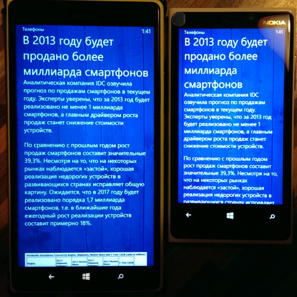
List of articles
Here is what happened:

Here is what became:

Here is what became:
Article text
Here is what happened:
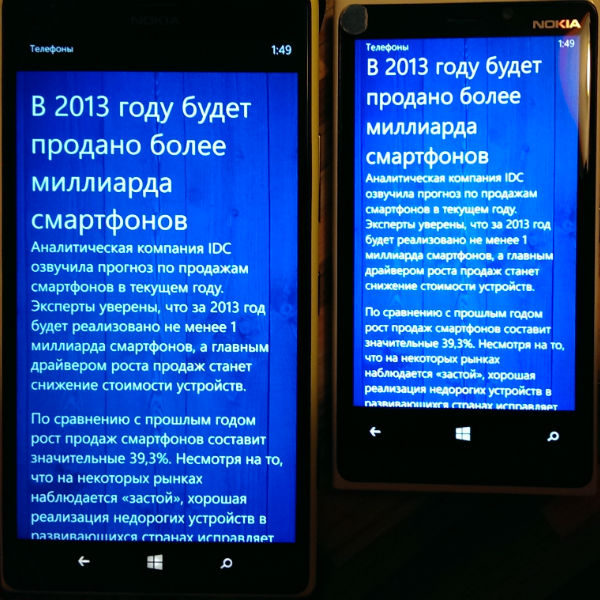
Here is what became:
Here is what became:
As you can see, more content began to fit on the screen.
By the way, the application has already been published in the "App Store" and all owners of tablet phones can fully enjoy the advantages of the big screen =)
Source: https://habr.com/ru/post/204036/
All Articles