We analyze the interface details-errors on the example of one banking site.
Last time we talked about the client . Today we will burn about a site.
Website for online business is always more important, because it is a showcase and source of new customers. It is extremely important to have the correct text and the correct presentation of material. Let us examine some shortcomings and, at the same time, discuss some interface trivia.

')

Well, if “Commission is zero percent,” but when I last checked, there were still cases and declensions in the language. That's right, because “zero percent (of whom, what?) Are commissions and, ” yes, a taxpile?
Although, of course, after such a picture is seen by “more than 3,000,000 customers” (judging by the inscription on the main bank), you will never see the correct spelling. This is a question of personal responsibility, touched upon in the last article.
Let's go with the main:
What an attentive reader should immediately see after reading the first article:
A little comb (remove the capslock and move the inscription 10 pixels to the right, correct the errors in the text):

Scroll home below:
Here, just, let's talk about the text:
What is wrong:
Change the text, add quotes and move them to the set bar, change the set of the upper slogan (add a discharge between uppercase letters), move the message about communication with the bank closer to the border of icons a little to the right:
Still not believing that text is very, very important? We flush the main one (yes, this is still the front online bank) another 10 cm below.

The clause on Freud: Indeed, it is better to go to repay a loan to another bank - it’s more profitable there (in fact, they want to say about paying off a loan from another bank , and not in another bank). And put already typographical layout . A dash is not „-“ and not „-“, but „-“.
You know, as they say: you do not know what to put - put a dash. No wonder he is called “the sign ofreceiving a policy of despair online ”.
We reached the basement:
Here are three things:
I know the question you want to ask: where are the contacts? Where is the phone support at the bank without branches. Once he was on the main (as with all normal banks). Now he was removed in contacts.
And not just removed, but ... but, incidentally, now show. But first story.
Somewhere a couple of years ago, when the site had a redesign, I urgently needed to call for support. Previously, the phone was at the top of the main one, which I opened on the phone and immediately called the bank (I always forget that the phone is on the back of the credit card). I open the main one, it loads for a very long time, there is no phone. But instead of the phone shows a video with Tinkov at the fireplace. Autoplayable video. Through the mobile Internet, as we know, the best quality. And no phone. In general, the phone, I honestly admit, I only found after 5 minutes. And the auto-playing video hung on the site for a few more days (as it turned out, on the personal order of Oleg Tinkov, although everyone in the team was against it).
So, open the page "contacts". Imagine that you come from a device with a not very large screen. Here is the first screen:

The phone is not given yet. Well, if you do not close on this, and in the hope of squandering below:
Here, as many phones as you want, your eyes run. Please do not do the same. It is better to write one or two, and remove everything else in the voice menu (especially since it will remain in support anyway).
Plus, the content manager obviously freaked out:
One would like to add the classic: "DOWNLOAD FREE WITHOUT SMS, WITHOUT REGISTRATION."
Always “answer” for words. Prove any phrase or do not write it at all. Submit an interview:
Job seeker: I'm the coolest!
Recruiter: Why?
Applicant: Because I strive to be the coolest of all!
Agree, you would not accept such arguments. So it is here:
How to prove a really good quality of service? That's right, the facts. Do not write clichés “one of the best,” “most,” etc. - write real numbers, research results (and a link to these studies). No numbers? Get them.
On this, perhaps, we will finish, although it is still worth discussing the concealment of competitive functionality in the wilds of leaflets and bad organization, which wants to throw everything at once on the visitor. But this is a topic for another conversation, for the time being we will continue in “Uber” .
Website for online business is always more important, because it is a showcase and source of new customers. It is extremely important to have the correct text and the correct presentation of material. Let us examine some shortcomings and, at the same time, discuss some interface trivia.
')
Well, if “Commission is zero percent,” but when I last checked, there were still cases and declensions in the language. That's right, because “zero percent (of whom, what?) Are commissions and, ” yes, a taxpile?
Although, of course, after such a picture is seen by “more than 3,000,000 customers” (judging by the inscription on the main bank), you will never see the correct spelling. This is a question of personal responsibility, touched upon in the last article.
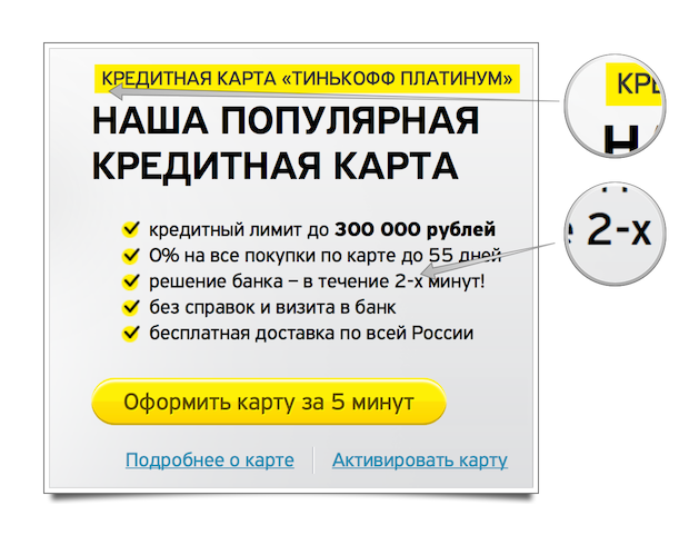
Let's go with the main:
What an attentive reader should immediately see after reading the first article:
- Love for hard to read kapsloku. I suspect that marketers demanded monumentality (they forgot to demand the discharge of capital letters).
- Recall the optical alignment. The title “Our card” needs to be aligned not along the edge of the yellow plate, but along the edge of the text “credit ...” in it.
- A thin space before the percentage (optional, but, in my opinion and the look of the “Publisher and Author's Guide”, should be put).
- The correct dash is "-" instead of the short "-".
- Incorrect accumulation of endings of numerals: “within 2 minutes”, in fact, reads like “within the second minutes”. And so on the whole site.
A little comb (remove the capslock and move the inscription 10 pixels to the right, correct the errors in the text):
Scroll home below:
Here, just, let's talk about the text:
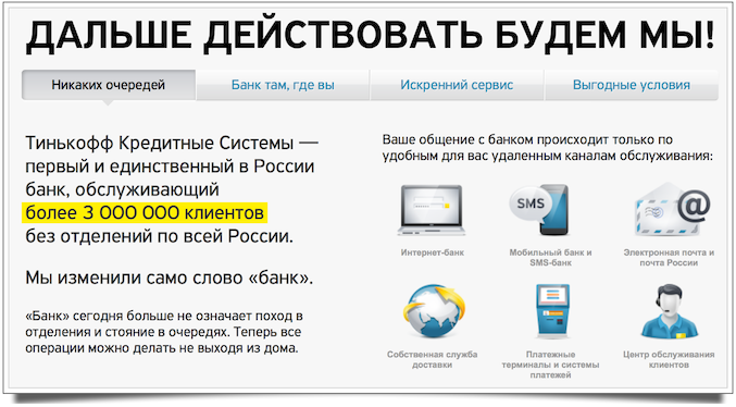
Tinkoff Credit Systems is the first and only bank in Russia serving more than 3,000,000 clients without branches throughout Russia.
What is wrong:
- Yoda-style: "Bank in Russia".
- A small tautology: "the only one in Russia throughout Russia."
- Change of meaning: "3 million clients without branches." Although, of course, they wanted to say that it was not a client without branches, but a bank without branches.
- The name of the bank without quotes and capital letters.
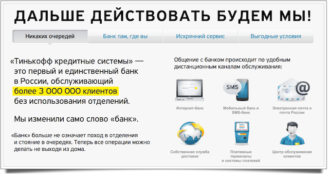
“Bank” today no longer means going to the offices and standing in lines. Now all operations can be done without leaving home.
- The site visitor already reads you "now." It is not necessary in the text to indicate the present time - this is “oil of oil”. You can write simply: “The Bank no longer means going to the branches and standing in lines. All operations can be done without leaving home. ” Want to point out that you did it first? Well, leave one now and focus on that.
- Non-Londoners may have other associations with going to the ward. And this is clearly not a bank :-).
Your communication with the bank occurs only via remote service channels that are convenient for you:
- Do not rub salt on the wound: you just shocked your grandmother with the fact that you are practically virtual (where to complain, if what?) And finish it up, that communication is only through remote channels. Plus, there is a false promise: on the one hand, “only convenient for you”, on the other - “remote” (or, maybe, I am uncomfortable remotely). You should not focus on this, it is better to focus on convenience and remove “only” at all.
- Again, “oil is oily”: you do not need to write yours , etc. Boldly remove the stop words: the text will not lose in the sense of a gram.
Change the text, add quotes and move them to the set bar, change the set of the upper slogan (add a discharge between uppercase letters), move the message about communication with the bank closer to the border of icons a little to the right:
Still not believing that text is very, very important? We flush the main one (yes, this is still the front online bank) another 10 cm below.
The clause on Freud: Indeed, it is better to go to repay a loan to another bank - it’s more profitable there (in fact, they want to say about paying off a loan from another bank , and not in another bank). And put already typographical layout . A dash is not „-“ and not „-“, but „-“.
You know, as they say: you do not know what to put - put a dash. No wonder he is called “the sign of
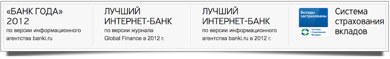
We reached the basement:
Here are three things:
- The names of periodic events or events are hyphenated with a year (“Sochi-2014”) or through a dash with a whip blank, if the name of the event is composite (“Russia's Beauty - 2013”), so the Bank of the Year - 2012 will be correct.
- There is no need to duplicate twice about the best Internet bank. You can combine in one section and add a year.
- It is worth giving a link to the description of the deposit insurance system. Now this is just a picture and causes ignorant questions more than answers.
I know the question you want to ask: where are the contacts? Where is the phone support at the bank without branches. Once he was on the main (as with all normal banks). Now he was removed in contacts.
And not just removed, but ... but, incidentally, now show. But first story.
Somewhere a couple of years ago, when the site had a redesign, I urgently needed to call for support. Previously, the phone was at the top of the main one, which I opened on the phone and immediately called the bank (I always forget that the phone is on the back of the credit card). I open the main one, it loads for a very long time, there is no phone. But instead of the phone shows a video with Tinkov at the fireplace. Autoplayable video. Through the mobile Internet, as we know, the best quality. And no phone. In general, the phone, I honestly admit, I only found after 5 minutes. And the auto-playing video hung on the site for a few more days (as it turned out, on the personal order of Oleg Tinkov, although everyone in the team was against it).
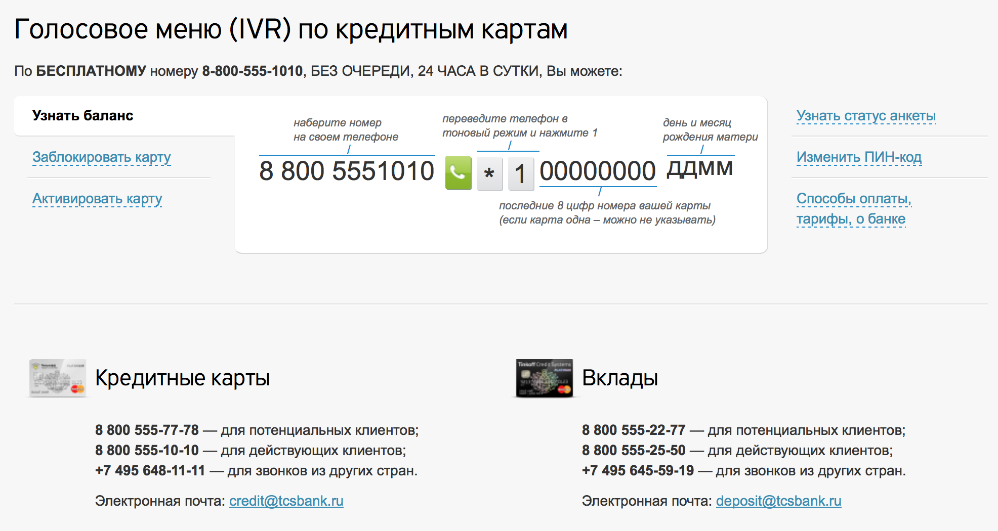
So, open the page "contacts". Imagine that you come from a device with a not very large screen. Here is the first screen:
The phone is not given yet. Well, if you do not close on this, and in the hope of squandering below:
Here, as many phones as you want, your eyes run. Please do not do the same. It is better to write one or two, and remove everything else in the voice menu (especially since it will remain in support anyway).
Plus, the content manager obviously freaked out:
For FREE 8-800-555-1010 , WITHOUT QUEUE, 24 HOURS A DAY, YOU CAN.
One would like to add the classic: "DOWNLOAD FREE WITHOUT SMS, WITHOUT REGISTRATION."
More about the content
Always “answer” for words. Prove any phrase or do not write it at all. Submit an interview:
Job seeker: I'm the coolest!
Recruiter: Why?
Applicant: Because I strive to be the coolest of all!
Agree, you would not accept such arguments. So it is here:
How to prove a really good quality of service? That's right, the facts. Do not write clichés “one of the best,” “most,” etc. - write real numbers, research results (and a link to these studies). No numbers? Get them.
On this, perhaps, we will finish, although it is still worth discussing the concealment of competitive functionality in the wilds of leaflets and bad organization, which wants to throw everything at once on the visitor. But this is a topic for another conversation, for the time being we will continue in “Uber” .
Source: https://habr.com/ru/post/203938/
All Articles