Ideal basket online store
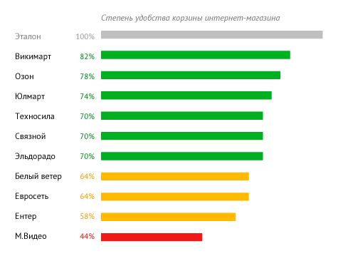
In this post, we will look at baskets of the most popular online stores on the Russian Internet, in the segment of electronics and technology. Below is a table with an expert assessment of the convenience of baskets of some online stores:
A good basket has the following features:
- A large photo of the product added to the cart, its name and availability status
- Specify the quantity and color of goods, with the possibility of editing and deleting
- A field to enter a promotional code; demonstration of applied promotions and discounts as marketing tools
- Offer related products and recommendations
- Additional ordering options: callback and credit
- The presence of a noticeable button "Checkout" and the total cost of the order
And also, the ideal basket is responsive and remembers that the user added to it and did not buy it, even if it is not authorized.
')
Among the most common problems can be identified:
- No alternative ordering methods: credit and order in one click
- Weakly pronounced main CTA-element of the page, with high general visual noise
- Lack of recommendations and related products
View product in cart

In both cases, the minimum is made: a rather large photo, a noticeable price tag.
In both cases, bad:
- It is not obvious that there is a price - the cost per piece, or the sum of two positions
- Cannot change color option from recycle bin.
- Somewhat clumsily placed Delete buttons
In the case of Technosila, it is bad and the fact that the color option is not even named, there is no information on the presence. The latter is important in the case of "abandoned baskets", when the user returns with remarketing tools and should see at a moment what products are actually available for order.

Svyaznoy and M.Video have slightly different approaches in reflecting the quantity of goods. A simple solution to specify rub. / Pcs. suitable for your store, as a quick, proactive solution to the problem. In M.Video, the same block of goods in the basket is represented by a table - a somewhat clumsy, not elegant solution, but absolutely workable from the point of view of perception.
In both cases, it is also a good thing that the buttons to remove goods from the basket are not so striking as in the first example.
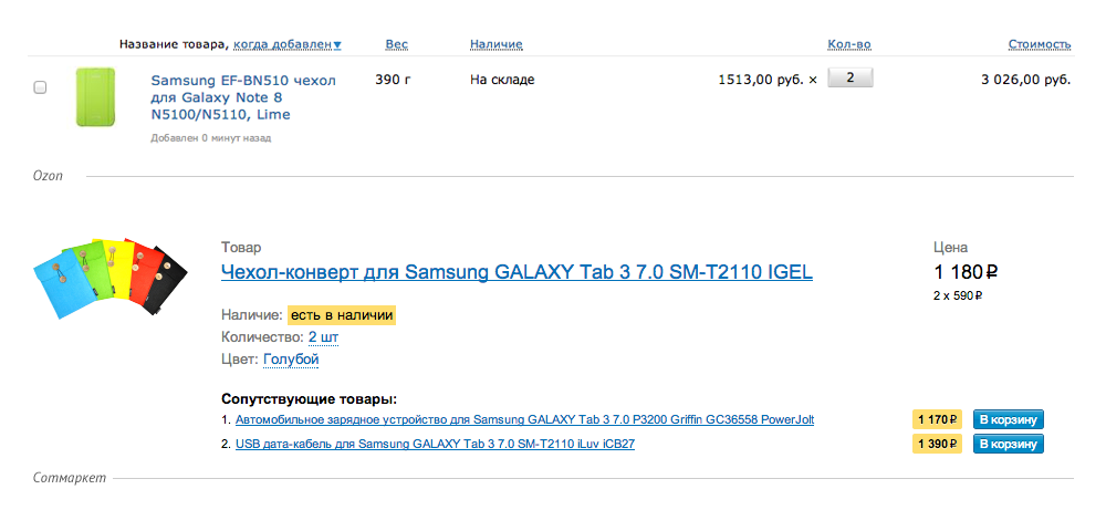
The disadvantage of the Ozone basket can be considered only the removal of goods from the basket in 2 clicks and the inability to change the color option. In our basket, you can change the color, quantity, price is shown summarized with the decoding calculation, inexpensive related products up to 1450 rubles. are offered directly below this offer.
Purchase unit in the item card
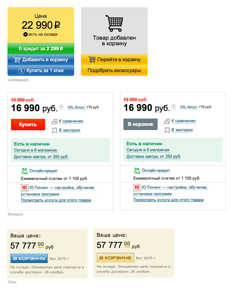
User interaction with the basket begins with the product page. Here a common mistake is the lack of feedback when adding goods to the basket. Some unsuccessful examples are given below. In the picture on the left before adding the product to the basket, on the right - after.
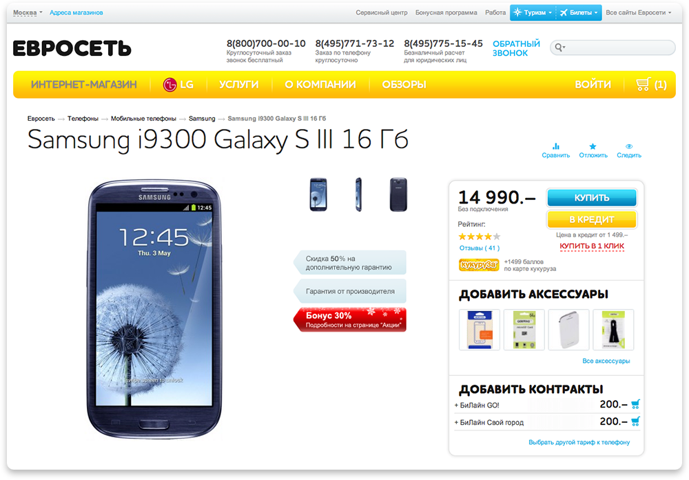

In Sotmarket, the block of purchase significantly changes after adding the product to the cart, in other online stores this block, as a rule, undergoes only a slight change.
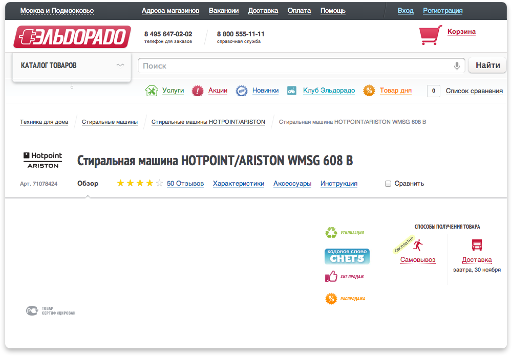
Do not lose sight of the technical implementation, incl. the speed of loading pages on the site. For example, on the Eldorado website, you will notice the absence of a purchase unit until the page is fully loaded, as well as a product photo.
One click order
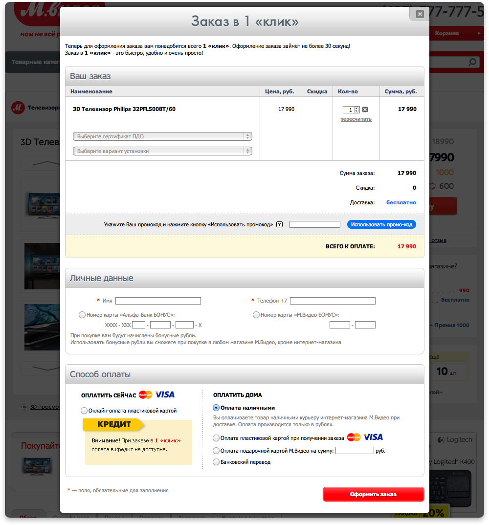
Often on the sites you can find the form "Quick order" or "Order in one click." It has the most marasmic interface solutions in the form of man-made barriers from complicated forms. For example:
One click in the view of M.Video looks monstrous
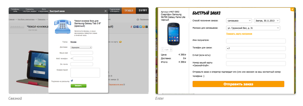
Svyaznoy and Enter profess a similar approach to a quick order.
Euroset turned out to be more caring, only 2 required fields, but in order for the client not to relax, he is offered to decipher the captcha.

Wikimart asks to explore a variety of fields, wonders what purpose a callback is ordered for, sets the often inappropriate question “Couldn't you get through?”.
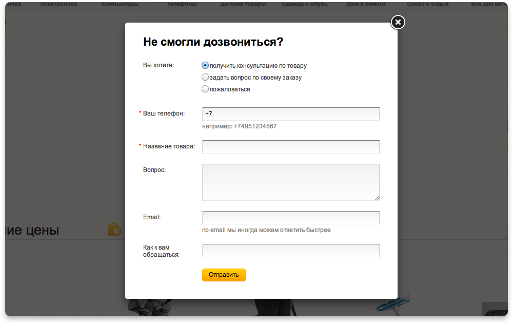
The quick order form should consist of one input field, and if the user is authorized and made purchases earlier, then the phone field should already be pre-filled .
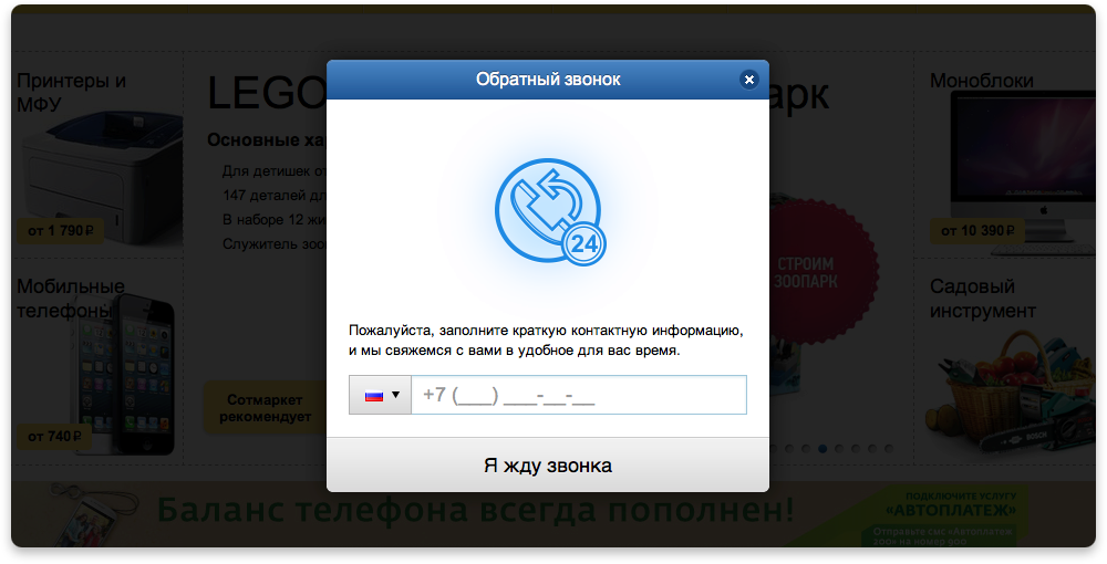
Another feature of the baskets of modern online stores is a reminder of the goods left in it through the popup, if the user is unauthorized and email notifications about goods forgotten in the basket for authorized users.
Source: https://habr.com/ru/post/203912/
All Articles