Selling design online store. Part 3. Design elements
The third part of the article from the cycle "Selling design online store." For those who missed the first and second, they can be read here: “Selling the design of an online store. Part 1. Analytics " and " Selling design online store. Part 2. Interface elements.
Once on the product page, a person should get maximum information about him. The “brevity is the sister of talent” rule does not work here. Since we are dealing with an online store, our buyer is deprived of the opportunity to see the goods live, so we must provide him with the maximum information we have: a detailed description, specifications, high-quality photos, reviews, videos or 3D-review. Reviews for products, by the way, invented Amazon, introduced sociality to the site, thereby greatly increasing conversion and sales.
The location of elements on the page. There is no single layout, otherwise all the stores would be on the same person. However, it is worth adhering to certain rules on the product page: what is more important and what is less, what to highlight first and what to leave in the background, etc. Let's talk about this in more detail.
')
The most important elements here that should be highlighted and be in the foreground are the name of the product, its photo, price and the “Buy” button. They should catch the eye in the first place, and ideally lead to "emotional purchases." Next in order of importance are the description of the product, specifications, rating, shipping information and other elements. But, despite the degree of importance, all this should be arranged as much as possible so that the user, when studying a product, does not rush from one end of the site to the other, but has all the information at hand. In addition, it's time to remember about AIDA and build the elements so that the user can view them in the right order, getting closer to buying.
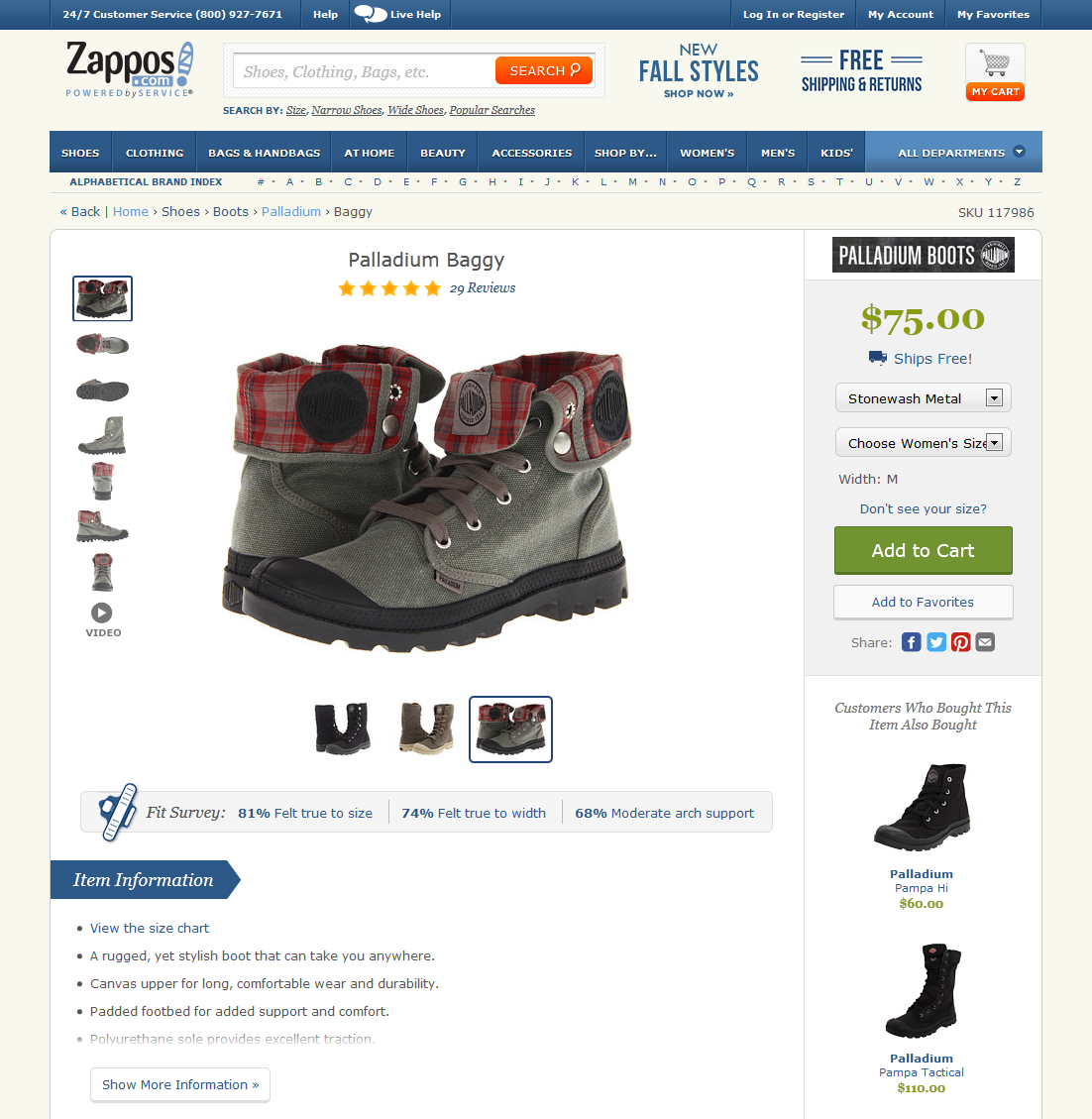
In the upper left corner, under the name, there is usually a block with photos. Even if there are many photos - do not make a transition to another page to view them, this is a blunder. The user is already on the product page, before the purchase he left quite a bit. Enlarging photos can be done in the same place (as in zappos.com) or in a pop-up window. Next to the block of photos, place the description, rating, the ability to select additional parameters. Characteristics of the goods can be located below, as well as reviews. All elements must be arranged in such a way that the user's gaze changes from one to the other, just as he thinks about the product. The approximate logic of an ordinary person goes in this sequence (simplified): What kind of product? What does he look like? How much is? What are the terms of delivery and payment? All elements that answer these questions must be placed sequentially, from left to right, from top to bottom. This is our AIDA.
Fig. 20. Product page on flipkart.com, zappos.com

Make the product page design spacious, with accents on the main elements that we wrote about above. If possible, do not clutter the page. The information here should be structured in separate blocks, people should not be confused about what is what, because people love specifics.
Demonstration of goods. Photos should be high quality, detailed, large. The user is not always enough to see 3-4 photos to evaluate the product. In an offline store, a person can pick up a thing that interests him and twist it from all sides, carefully studying before buying. We can not provide him with this opportunity, but we can post detailed photos of the goods from different angles. The manufacturer will always provide you with photos (so-called official photos), but they are usually only a few, and often in many online stores they are the same. It happens that a product that is not of the best quality looks quite different on such official photos, much better and more beautiful. The user cannot find fault here - the resulting item is the same as in the photo. But then he will be able to demand his money back and send the purchase back. The opinion of the buyer about the store, most likely, will deteriorate. And for us this is absolutely unacceptable. Therefore, we must provide maximum photos, and the more the better. Even 10-15 pieces - this will not be "too much." Also a good addition will be a video review and a 3D review. Quality is important at all points of the brand's visual identification, even photos become an integral part of the design and image of the entire store.
Fig. 21. Demonstration of goods on sites infibeam.com, homeshop18.com

Lack of goods. According to the principles of SEO-optimization, products that are not currently available on the site are not removed, they “hang” on a par with others. But you can not just remove the "Buy" button, without replacing it with anything. In this case, the user simply leaves, and will search for the same product in other stores. We must detain him even in the absence. After all, if the product is not available, but it is present on the site, then, most likely, it will still appear, otherwise it would have been removed completely. Instead of the “Buy” button, the “Notify about availability” button, or “Buy for order” button should appear. They can be made not as beautiful and attractive as the “Buy” button was, but it should still be a substitute. The price here should also be present, on the same principle - not a bright color, as it was before, but a muffled, barely visible, or gray. So that the user intuitively understood that there is no product, but was not upset because of the lack of information about the price or the ability to buy under the order. Be sure to ensure that information on the availability of goods was accurate. Not all buyers specify the availability, many immediately add the product to the cart and make an order. We cannot in any way upset the buyer with the fact that the “ordered item didn’t turn out”.
Fig. 22. Absence of goods, kubikmarket.com.ua

Popular goods. When a person is browsing, for example, microwaves, we cannot stand by and wait until he finally chooses something. We have to offer him something. To do this, there is a top category, bestsellers, those products that buy most often. There is for this the concept of goods-complements and other techniques. As it is known from psychology, many people often are guided by the opinion of others, take information from the outside, when they do not have enough knowledge about the subject matter. So it is here. A person sees that there are goods that buy more often than others, and, most likely, can be considered their best. This will help him make a choice if he does not yet know exactly what he wants. By the way, goods in the top are usually better than their counterparts. Therefore, the top of the goods can not be forgotten.
Fig. 23. Popular products, aliexpress.com, infibeam.com


Location On the category page, a block of popular products is best placed in the right column, since the left one will be occupied by a facet filter. Products here, of course, will belong to this category, for example, the rating of vacuum cleaners. This will help the person if he has not yet made a choice. On the product page, this unit may be located below, under the basic information. In case the buyer didn’t like the product, we should always offer him an alternative.
Highlight here 2 points: the name (for example, “Top Smartphones”), and the second is to focus the person’s attention on the fact that this is a rating, the top five (or 7) of the best products, and therefore you need to visually show their leadership. How to highlight them and convince the user that they are better? Use visual accents, hooks. To attract attention, you can use, for example, a certain icon with a certificate symbol. The image of the certificate, printing with ribbons subconsciously inspires confidence, gives officiality. And the numbers 1, 2, 3 ... clearly declare the championship, the victory. The user will immediately understand that products with such labels are in high demand, the best of many.
On the main page, popular products may be located in the very center, under the promotional unit. Here they will already belong not to one category, but to different ones. Here, this block can be called "Bestsellers" or "Most Selling."
Reviews Make sure that your site has a stable system of reviews and product rating. In preparation for the purchase, 65% of users are looking for feedback from other buyers (data from a street survey in Moscow). Reviews must be alive, not fictional. Now increasingly used integration with social networks. Commenting through social networks is very convenient, many have an account in them, and the buyer will not have to fill in any fields. The advantage of this, in addition to convenience, is that a review of a product left by a person through a social network profile - with a photo and initials. It inspires more confidence than impersonal comments with enthusiastic opinions. People need to believe that reviews are written by real people, just like them. When you see comments of people (or even your friends) who used, put likes, confidence grows.
The design of the form of comments from social networks has a standard look and is tied to the design of these social networks. It will differ from the design of your online store, but you shouldn’t be afraid of this; there are more advantages than disadvantages. Now more and more people are “sitting” on social networks, they spend a huge amount of time there and are used to the design of a project. According to 2013 inFOLIO Research Group, 84% of Internet users are registered in at least one social network, while 36% have more than one account. These users will be pleased to see a piece of their favorite "social" on the website of the online store and leave a comment in the usual way for them. So this kind of comments will not spoil the design, on the contrary, it will be recognizable, which means it will also play a role in increasing the conversion.
Do not be afraid of bad reviews. Any product, even the best, can be liked by someone, but not by someone (for various reasons: due to improper handling of it, individual dislike of the manufacturer, or something else). There are always reviews, bad and good, but as a rule, good product reviews and ratings are always better according to quality. Visually, you can highlight more positive feedback, thereby making the bias in the direction we want.
Fig. 24. Reviews on product page, aliexpress.com, flipkart.com

If you already have feedback about the store, emails, or thanks with stamps - do not be afraid to show them! This will give customers even more confidence in your store.
Order in 1 click. The ability to order in 1 click will be convenient for those who are ready to make a purchase immediately, and as soon as possible. An order in 1 click is the minimum number of fields to be filled in; you need to specify only the most basic, for example, the phone number to which the manager will call you and clarify all the necessary details. Previously, it was much more difficult to buy something on the Internet - the manager sent you a payment order, it needed to be printed out, go to the bank with it, and then wait for the recipient to see your transfer. And then go to the other end of the city to the only branch of the carrier convenient for you. Now everything is much simpler: to make a purchase, it is enough to provide only a phone number, the rest of the store manager will find out when calling. Everything, the goods goes to you! We live in a crazy rhythm, often have to quickly make decisions and act, and users are becoming increasingly lazy and spoiled. Here, there is a question of trust in online shopping services: 26% of users do not want to share their confidential information (inFOLIO Research Group, 2013), and when ordering in one click, the buyer gives only his phone number.
Fig. 25. Order in 1 click, amazon.com

The order button in 1 click should not visually compete with the "Buy" button. They should not interfere in size, emphasis and significance. This button may be slightly smaller, of a different color, but just as bright and attractive, the same rules about which we wrote above apply to it. If the "Buy" button (or "Add to cart") has the priority "№1", then the order button in 1 click immediately follows it.
Always quote the exact shipping cost. Any person making a purchase expects a certain amount, and it will be a great disappointment for him if the purchase price, already at checkout, turns out to be more than indicated earlier. This can instantly change his decision to buy and spoil the opinion of the store. Always indicate the actual cost of delivery, if the delivery is free - specify under what conditions and in which regions the goods will be sent free of charge. To visually understand what the user is talking about, use the appropriate associative images: truck, box, courier. On the product page, this information is best placed on the right side, not far from the price, so that when viewing a product a person always sees it and can find out how much the purchase will be with delivery.
Fig. 26. Shipping information, bigbrownbox.com.au, homeshop18.com


We are talking about the most important buttons, "Add to Cart", "Buy", "Checkout". These buttons are most important, because before the money gets to you, the user will have to press them. He should always easily find these buttons on the page. They should be large, bright, visible, be in a prominent place, attract attention. If a certain color predominates in your store design, do not make them in the same color. Their role on the site is special, and they must have a special color. These buttons should be contrasting (relative to the rest of the design), stand out from the content, i.e. be like on top of everything. Make them so that the person would like to press such a button. Use the hover, active buttons in the status of the buttons. If for small "gray" buttons it is not so important, then here the button must be done in all its glory.
Fig. 27. Buttons on flipkart.com, bigbrownbox.com.au


When the user gets to this page, you should know: he has almost made a purchase, it is very important not to frighten him away or distract him. There should not be anything superfluous, no shares and offers that could prevent our buyer from making a purchase. In addition, perhaps, offers to buy this product with a companion, which was offered on the product page (for example, a bag when buying a laptop). And then - placing the order step by step and making a purchase. This is the ultimate goal, the path to which we describe in such detail - to sell the goods, make the buyer satisfied and get our profit.
Fig. 28. Checkout page, yebhi.com, bigbrownbox.com.au

Your site must be able to subscribe to the newsletter. Anyone should be able to get the latest information. Usually mailing includes: the arrival of new products, promotions and goods at a discount, useful news and articles. Since our subscriber will always be up to date on new products, this can also serve as an additional incentive to purchase. In many English-speaking stores, this is one of the main sales tools.
The subscription form can be placed in the footer, or in the right column. This is not the most important element on the site, but it is needed to increase sales.
For mailing often use third-party mailing services. Their disadvantage for us is that the form of such a mailing will not fit into our design, and in a good design everything must be done from scratch so that there is harmony. Therefore, we advise you to use your own.
This form looks very simple: usually this is a field for entering email and a button. If we are going to sell a wide range of products, the newsletter needs to be specified. But do not do it right away, the user may simply not want to choose and fill in something. Let's give him information in portions. For a start, just enough forms and buttons. We can suggest setting up a mailing in the next step, in a confirmation letter. Here the user will have to select the categories of interest. In this case, he will not receive extra information. In the design, make the subscription form visible, the input field is large, the button is visible and attractive.
Fig. 29. Footer subscription form, beauty.com, zappos.com


Publish your current contacts on the site, the contact page should not be empty. This may reduce your credibility. There are such online stores where only one phone is listed. How can a person trust such a site and be sure that he will not be deceived? No way! The street survey data in Moscow showed: “90% of the respondents were faced with deception when making a purchase in the online store,” we always have scammers. Write down in detail all contact details, up to the address of the warehouse. This will once again confirm your seriousness and build confidence. On the contact page, make large headlines "Address", "Telephones", "Schedule", so that they immediately caught the eye. You can also place a map here with the location of the store's warehouse. If you have offices and warehouses in different cities - you can make on the page a button for choosing a city and change contacts depending on the selected city. Or automatically adjust this page for logged in users whose city we already know.
Fig. 30. Contact page, ballarddesigns.com, 2modern.com


Make sure that users are prompt, promptly receive answers to their questions. Do not force the user to wait, in case of a long wait, he will simply leave your site and find another one. This is absolutely unacceptable for us, we must fight for each client. Fast and quality service is one of the most important success factors.
. . - , , . , , . Forrester Research, 52,6% , - , . – , .
. , . , , , ( , , ). . , , , . , . , , , .
Fig. 31. ,

. 50% , , , . BPS 2- 25 3- 55. , , . - , - . , . , , , 12-14 px. , , . .
Fig. 32.

: - : , , «: (067)-123-45-67».
Fig. 33. .

? , , , , , . , , . . , ( ), Journey Map. .
, , , . .. - . , , , .. , , .
Fig. 34.

, -. -, « », , , .
- – , . .
, . – , . , . , . . , .
, , . – . , . , , . , , , . . , .
, , , , . ! - 20% – , ! !
:
. - «Digitov» : , - - . !
. -. . email: info@seclgroup.ru - « » .
. — SECL Group: Facebook , VK , Twitter Digitov, , : Facebook , VK , Twitter .
: http://seclgroup.ru/article_prodayushchiy_dizayn_internet-magazina_dizayn_elementov_3.html
The authors:
, Senior Designer, «SECL GROUP» / «Internet Sales Technologies»
( Facebook , VK , LinkedIn ), CEO, «SECL GROUP» / «Internet Sales Technologies»
Product page
Once on the product page, a person should get maximum information about him. The “brevity is the sister of talent” rule does not work here. Since we are dealing with an online store, our buyer is deprived of the opportunity to see the goods live, so we must provide him with the maximum information we have: a detailed description, specifications, high-quality photos, reviews, videos or 3D-review. Reviews for products, by the way, invented Amazon, introduced sociality to the site, thereby greatly increasing conversion and sales.
The location of elements on the page. There is no single layout, otherwise all the stores would be on the same person. However, it is worth adhering to certain rules on the product page: what is more important and what is less, what to highlight first and what to leave in the background, etc. Let's talk about this in more detail.
')
The most important elements here that should be highlighted and be in the foreground are the name of the product, its photo, price and the “Buy” button. They should catch the eye in the first place, and ideally lead to "emotional purchases." Next in order of importance are the description of the product, specifications, rating, shipping information and other elements. But, despite the degree of importance, all this should be arranged as much as possible so that the user, when studying a product, does not rush from one end of the site to the other, but has all the information at hand. In addition, it's time to remember about AIDA and build the elements so that the user can view them in the right order, getting closer to buying.
In the upper left corner, under the name, there is usually a block with photos. Even if there are many photos - do not make a transition to another page to view them, this is a blunder. The user is already on the product page, before the purchase he left quite a bit. Enlarging photos can be done in the same place (as in zappos.com) or in a pop-up window. Next to the block of photos, place the description, rating, the ability to select additional parameters. Characteristics of the goods can be located below, as well as reviews. All elements must be arranged in such a way that the user's gaze changes from one to the other, just as he thinks about the product. The approximate logic of an ordinary person goes in this sequence (simplified): What kind of product? What does he look like? How much is? What are the terms of delivery and payment? All elements that answer these questions must be placed sequentially, from left to right, from top to bottom. This is our AIDA.
Fig. 20. Product page on flipkart.com, zappos.com
Make the product page design spacious, with accents on the main elements that we wrote about above. If possible, do not clutter the page. The information here should be structured in separate blocks, people should not be confused about what is what, because people love specifics.
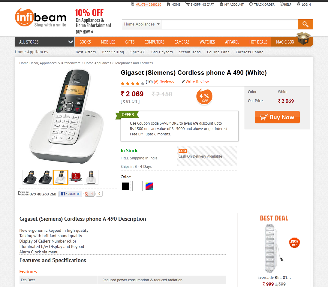
Demonstration of goods. Photos should be high quality, detailed, large. The user is not always enough to see 3-4 photos to evaluate the product. In an offline store, a person can pick up a thing that interests him and twist it from all sides, carefully studying before buying. We can not provide him with this opportunity, but we can post detailed photos of the goods from different angles. The manufacturer will always provide you with photos (so-called official photos), but they are usually only a few, and often in many online stores they are the same. It happens that a product that is not of the best quality looks quite different on such official photos, much better and more beautiful. The user cannot find fault here - the resulting item is the same as in the photo. But then he will be able to demand his money back and send the purchase back. The opinion of the buyer about the store, most likely, will deteriorate. And for us this is absolutely unacceptable. Therefore, we must provide maximum photos, and the more the better. Even 10-15 pieces - this will not be "too much." Also a good addition will be a video review and a 3D review. Quality is important at all points of the brand's visual identification, even photos become an integral part of the design and image of the entire store.
Fig. 21. Demonstration of goods on sites infibeam.com, homeshop18.com
Lack of goods. According to the principles of SEO-optimization, products that are not currently available on the site are not removed, they “hang” on a par with others. But you can not just remove the "Buy" button, without replacing it with anything. In this case, the user simply leaves, and will search for the same product in other stores. We must detain him even in the absence. After all, if the product is not available, but it is present on the site, then, most likely, it will still appear, otherwise it would have been removed completely. Instead of the “Buy” button, the “Notify about availability” button, or “Buy for order” button should appear. They can be made not as beautiful and attractive as the “Buy” button was, but it should still be a substitute. The price here should also be present, on the same principle - not a bright color, as it was before, but a muffled, barely visible, or gray. So that the user intuitively understood that there is no product, but was not upset because of the lack of information about the price or the ability to buy under the order. Be sure to ensure that information on the availability of goods was accurate. Not all buyers specify the availability, many immediately add the product to the cart and make an order. We cannot in any way upset the buyer with the fact that the “ordered item didn’t turn out”.
Fig. 22. Absence of goods, kubikmarket.com.ua
Popular goods. When a person is browsing, for example, microwaves, we cannot stand by and wait until he finally chooses something. We have to offer him something. To do this, there is a top category, bestsellers, those products that buy most often. There is for this the concept of goods-complements and other techniques. As it is known from psychology, many people often are guided by the opinion of others, take information from the outside, when they do not have enough knowledge about the subject matter. So it is here. A person sees that there are goods that buy more often than others, and, most likely, can be considered their best. This will help him make a choice if he does not yet know exactly what he wants. By the way, goods in the top are usually better than their counterparts. Therefore, the top of the goods can not be forgotten.
Fig. 23. Popular products, aliexpress.com, infibeam.com
Location On the category page, a block of popular products is best placed in the right column, since the left one will be occupied by a facet filter. Products here, of course, will belong to this category, for example, the rating of vacuum cleaners. This will help the person if he has not yet made a choice. On the product page, this unit may be located below, under the basic information. In case the buyer didn’t like the product, we should always offer him an alternative.
Highlight here 2 points: the name (for example, “Top Smartphones”), and the second is to focus the person’s attention on the fact that this is a rating, the top five (or 7) of the best products, and therefore you need to visually show their leadership. How to highlight them and convince the user that they are better? Use visual accents, hooks. To attract attention, you can use, for example, a certain icon with a certificate symbol. The image of the certificate, printing with ribbons subconsciously inspires confidence, gives officiality. And the numbers 1, 2, 3 ... clearly declare the championship, the victory. The user will immediately understand that products with such labels are in high demand, the best of many.
On the main page, popular products may be located in the very center, under the promotional unit. Here they will already belong not to one category, but to different ones. Here, this block can be called "Bestsellers" or "Most Selling."
Reviews Make sure that your site has a stable system of reviews and product rating. In preparation for the purchase, 65% of users are looking for feedback from other buyers (data from a street survey in Moscow). Reviews must be alive, not fictional. Now increasingly used integration with social networks. Commenting through social networks is very convenient, many have an account in them, and the buyer will not have to fill in any fields. The advantage of this, in addition to convenience, is that a review of a product left by a person through a social network profile - with a photo and initials. It inspires more confidence than impersonal comments with enthusiastic opinions. People need to believe that reviews are written by real people, just like them. When you see comments of people (or even your friends) who used, put likes, confidence grows.
The design of the form of comments from social networks has a standard look and is tied to the design of these social networks. It will differ from the design of your online store, but you shouldn’t be afraid of this; there are more advantages than disadvantages. Now more and more people are “sitting” on social networks, they spend a huge amount of time there and are used to the design of a project. According to 2013 inFOLIO Research Group, 84% of Internet users are registered in at least one social network, while 36% have more than one account. These users will be pleased to see a piece of their favorite "social" on the website of the online store and leave a comment in the usual way for them. So this kind of comments will not spoil the design, on the contrary, it will be recognizable, which means it will also play a role in increasing the conversion.
Do not be afraid of bad reviews. Any product, even the best, can be liked by someone, but not by someone (for various reasons: due to improper handling of it, individual dislike of the manufacturer, or something else). There are always reviews, bad and good, but as a rule, good product reviews and ratings are always better according to quality. Visually, you can highlight more positive feedback, thereby making the bias in the direction we want.
Fig. 24. Reviews on product page, aliexpress.com, flipkart.com
If you already have feedback about the store, emails, or thanks with stamps - do not be afraid to show them! This will give customers even more confidence in your store.
Order in 1 click. The ability to order in 1 click will be convenient for those who are ready to make a purchase immediately, and as soon as possible. An order in 1 click is the minimum number of fields to be filled in; you need to specify only the most basic, for example, the phone number to which the manager will call you and clarify all the necessary details. Previously, it was much more difficult to buy something on the Internet - the manager sent you a payment order, it needed to be printed out, go to the bank with it, and then wait for the recipient to see your transfer. And then go to the other end of the city to the only branch of the carrier convenient for you. Now everything is much simpler: to make a purchase, it is enough to provide only a phone number, the rest of the store manager will find out when calling. Everything, the goods goes to you! We live in a crazy rhythm, often have to quickly make decisions and act, and users are becoming increasingly lazy and spoiled. Here, there is a question of trust in online shopping services: 26% of users do not want to share their confidential information (inFOLIO Research Group, 2013), and when ordering in one click, the buyer gives only his phone number.
Fig. 25. Order in 1 click, amazon.com
The order button in 1 click should not visually compete with the "Buy" button. They should not interfere in size, emphasis and significance. This button may be slightly smaller, of a different color, but just as bright and attractive, the same rules about which we wrote above apply to it. If the "Buy" button (or "Add to cart") has the priority "№1", then the order button in 1 click immediately follows it.
Cost of delivery
Always quote the exact shipping cost. Any person making a purchase expects a certain amount, and it will be a great disappointment for him if the purchase price, already at checkout, turns out to be more than indicated earlier. This can instantly change his decision to buy and spoil the opinion of the store. Always indicate the actual cost of delivery, if the delivery is free - specify under what conditions and in which regions the goods will be sent free of charge. To visually understand what the user is talking about, use the appropriate associative images: truck, box, courier. On the product page, this information is best placed on the right side, not far from the price, so that when viewing a product a person always sees it and can find out how much the purchase will be with delivery.
Fig. 26. Shipping information, bigbrownbox.com.au, homeshop18.com
Buttons
We are talking about the most important buttons, "Add to Cart", "Buy", "Checkout". These buttons are most important, because before the money gets to you, the user will have to press them. He should always easily find these buttons on the page. They should be large, bright, visible, be in a prominent place, attract attention. If a certain color predominates in your store design, do not make them in the same color. Their role on the site is special, and they must have a special color. These buttons should be contrasting (relative to the rest of the design), stand out from the content, i.e. be like on top of everything. Make them so that the person would like to press such a button. Use the hover, active buttons in the status of the buttons. If for small "gray" buttons it is not so important, then here the button must be done in all its glory.
Fig. 27. Buttons on flipkart.com, bigbrownbox.com.au
Checkout page
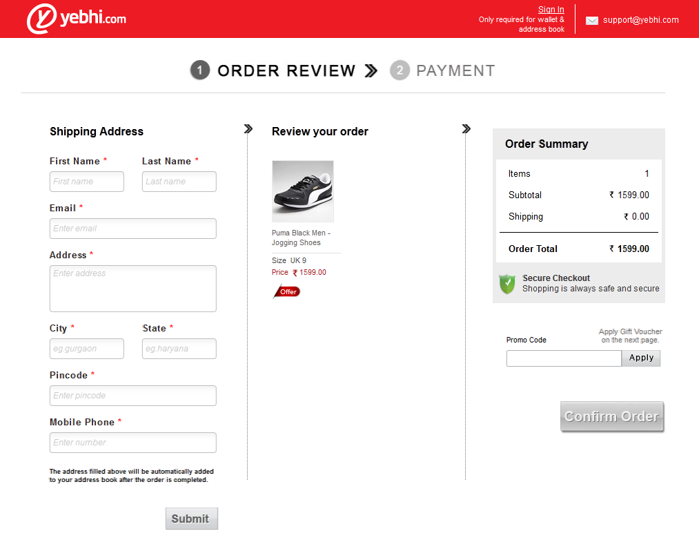
When the user gets to this page, you should know: he has almost made a purchase, it is very important not to frighten him away or distract him. There should not be anything superfluous, no shares and offers that could prevent our buyer from making a purchase. In addition, perhaps, offers to buy this product with a companion, which was offered on the product page (for example, a bag when buying a laptop). And then - placing the order step by step and making a purchase. This is the ultimate goal, the path to which we describe in such detail - to sell the goods, make the buyer satisfied and get our profit.
Fig. 28. Checkout page, yebhi.com, bigbrownbox.com.au
Subscription form
Your site must be able to subscribe to the newsletter. Anyone should be able to get the latest information. Usually mailing includes: the arrival of new products, promotions and goods at a discount, useful news and articles. Since our subscriber will always be up to date on new products, this can also serve as an additional incentive to purchase. In many English-speaking stores, this is one of the main sales tools.
The subscription form can be placed in the footer, or in the right column. This is not the most important element on the site, but it is needed to increase sales.
For mailing often use third-party mailing services. Their disadvantage for us is that the form of such a mailing will not fit into our design, and in a good design everything must be done from scratch so that there is harmony. Therefore, we advise you to use your own.
This form looks very simple: usually this is a field for entering email and a button. If we are going to sell a wide range of products, the newsletter needs to be specified. But do not do it right away, the user may simply not want to choose and fill in something. Let's give him information in portions. For a start, just enough forms and buttons. We can suggest setting up a mailing in the next step, in a confirmation letter. Here the user will have to select the categories of interest. In this case, he will not receive extra information. In the design, make the subscription form visible, the input field is large, the button is visible and attractive.
Fig. 29. Footer subscription form, beauty.com, zappos.com
Contact details
Publish your current contacts on the site, the contact page should not be empty. This may reduce your credibility. There are such online stores where only one phone is listed. How can a person trust such a site and be sure that he will not be deceived? No way! The street survey data in Moscow showed: “90% of the respondents were faced with deception when making a purchase in the online store,” we always have scammers. Write down in detail all contact details, up to the address of the warehouse. This will once again confirm your seriousness and build confidence. On the contact page, make large headlines "Address", "Telephones", "Schedule", so that they immediately caught the eye. You can also place a map here with the location of the store's warehouse. If you have offices and warehouses in different cities - you can make on the page a button for choosing a city and change contacts depending on the selected city. Or automatically adjust this page for logged in users whose city we already know.
Fig. 30. Contact page, ballarddesigns.com, 2modern.com
Feedback
Make sure that users are prompt, promptly receive answers to their questions. Do not force the user to wait, in case of a long wait, he will simply leave your site and find another one. This is absolutely unacceptable for us, we must fight for each client. Fast and quality service is one of the most important success factors.
Adaptive design
. . - , , . , , . Forrester Research, 52,6% , - , . – , .
. , . , , , ( , , ). . , , , . , . , , , .
Fig. 31. ,
. 50% , , , . BPS 2- 25 3- 55. , , . - , - . , . , , , 12-14 px. , , . .
Fig. 32.
: - : , , «: (067)-123-45-67».
Fig. 33. .
? , , , , , . , , . . , ( ), Journey Map. .
, , , . .. - . , , , .. , , .
Fig. 34.
Summarizing
, -. -, « », , , .
- – , . .
, . – , . , . , . . , .
, , . – . , . , , . , , , . . , .
, , , , . ! - 20% – , ! !
:
. - «Digitov» : , - - . !
. -. . email: info@seclgroup.ru - « » .
. — SECL Group: Facebook , VK , Twitter Digitov, , : Facebook , VK , Twitter .
: http://seclgroup.ru/article_prodayushchiy_dizayn_internet-magazina_dizayn_elementov_3.html
The authors:
, Senior Designer, «SECL GROUP» / «Internet Sales Technologies»
( Facebook , VK , LinkedIn ), CEO, «SECL GROUP» / «Internet Sales Technologies»
Source: https://habr.com/ru/post/203728/
All Articles