Selling design online store. Part 2. Interface elements
The second part of the article from the cycle “Designing an online store”. For those who missed the first, you can read it here: “ Selling the design of an online store. Part 1. Analytics . Today I will talk about different parts of store interfaces that are important for conversion and sales. I will try to identify what elements should be in the header and footer of the site, on the main page, on the catalog page and much more.
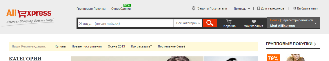
The header is a very important component, it is located at the very top of the site. Here are usually located such elements as a logo, site search, contact numbers, callback, basket, authorization panel. The user uses all these elements very often, much more often than all the others, so they are usually here in the header, so that they can always be accessed from any page of the site. When the user is “ripe” and he needs to go to the recycle bin, or find a phone number to check availability, he can always scroll up, or press the Home key - and instantly go to the top of the site, to the header.
Fig. 10. Caps sites, flipkart.com, aliexpress.com, infibeam.com
')


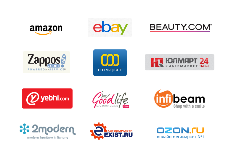
Logo. Look at the logos of world brands, no matter what, whether manufacturers of clothing, electronics, cars, home appliances or logos of IT-companies. One thing unites them all: a good logo is always unique, concise, simple and at the same time perfect, easily remembered and causes the right associations. The logo usually consists of 2-3 colors. You should not make a new logo according to the latest design trends, they will change in a year or two. The logo should be “out of time”, such as the Coca-Cola logo, which has remained almost unchanged for more than 100 years. A good logo will be easily remembered by the user, and he will subconsciously “connect” him with the store, good service, good shopping.
It is not by chance that the logo is usually placed on the left side of the cap. The fact is that the majority of users belong to the cultural environment with the direction of the letter from left to right. Therefore, our main focus is on the left side of the page. This is confirmed by the results of research by Jacob Nielsen and his usability team. A person’s gaze perceives information from left to right and from top to bottom, this technique is often used in advertising, information is placed precisely in this sequence, depending on its degree of importance. Also in our case: the user first sees the upper left corner, so here is usually the logo, which is the basis of the visual identification of the brand on the site.
Fig. 11. Logos of famous online stores
Site search. Search is an irreplaceable and extremely important function, which is used by many and very often. It is important because using the search, the user can always easily find the product he needs, without using navigation. Search leads - visitors rarely navigate the site, preferring to find products through a search (Data Insight, 2013). For example, in 2012, Sotmarket, one of the largest online stores in the CIS, redesigned the site, introducing a new search algorithm. This doubled the conversion. Search is always at hand, because located in the header of the site. This is the shortest way to go to the product page. If your store has many of these products, you can also add the ability to select a category to refine your search. Make the search a prominent, prominent input field large.
Fig. 12. Search on sites alibaba.com, homeshop18.com


Contact details. Many people for consultation prefer a telephone conversation, chatting with a living person, and not correspondence. This is especially true for Ukraine, because there is almost no online trading, the online store often serves as a showcase, and sales are still conducted by phone. Place the phones in a prominent place, they should always be visible.
Fig. 13. Phone numbers on sites bigbrownbox.com.au, ballarddesigns.com


Phone numbers. Large online stores usually use the hotline number 0 800. You can call this number from a landline phone for free, from a mobile phone - at the operator's rate (at a specified time, for example, 8:00 - 21:00, or around the clock, all this should be add). Most often online stores use a hotline number and local numbers for contacts. If you prefer to use the numbers of mobile operators, combine them by adding the operator’s choice to the drop-down list (if you have 5 or 7 of such numbers, they will all take up a lot of space).
Online chat. Let the user chat with you using online chat. Someone like this way of communicating more than a telephone conversation. Many need advice on products, for example. Place an online chat icon or link in the website header or attach it to the browser window so that it is always on the screen when scrolling. It is important to keep this button in a prominent place. It will be more convenient to one to call, and to another - to write. We need to create user comfort on the site. Service is an integral part of sales.
Fig. 14. Online chat in the header and on the product page, zappos.com, beauty.com


Request a call. This feature is also very convenient. For example, a person works in an office and, in order not to distract employees, can request a call back at a convenient time for him, say, at lunch. Also, do not forget that not everyone benefits from calling from a mobile phone and talking for a long time, for someone it is expensive, someone simply does not have a mobile phone, but has a landline. For these users, the service "Callback" will be most welcome.
Basket. To make the basket always easy to find, it must be present on all pages of the site. Therefore, the basket is usually located in the header of the site. Make the basket visible, stand out so that the user can always easily find it and place an order.
Fig. 15. Shopping cart on sites amazon.com, hushbabies.com, beauty.com


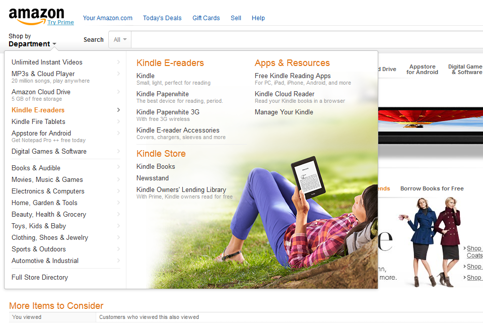
The cap may contain other elements. Product catalog can also be here. In Amazon, for example, it is under the logo, when hovering takes place in the left sidebar area. We have listed only the most important thing. Elements of the cap, in addition to the main ones, are always individual, but make sure that there is nothing superfluous among them, only that which is essential.
Catalog. It is usually located in the left sidebar (left side of the site) or in the center above the middle of the screen. Depending on the size of the store, the catalog of goods will also differ: its structure, size and location. For example, Amazon’s large online retailer has a 2-level product catalog, and the second level also has thematic advertising. If you have a small store with 5-7 product groups - you can position the catalog horizontally, with a drop-down menu of subcategories.
Do not, however, deviate from the traditional vertical or horizontal position of the menu. Users have long been accustomed to such an arrangement, no need to try to instill in them some kind of creative, this is not the case. Do not put the menu on the right side of the screen, this is a “blind zone” for users; everyone is used to the fact that only advertising is on the right and nothing is useful. Having found a catalog in a familiar place, a person always gets to the page with the product of interest without any problems.
Fig. 16. Product catalog on sites amazon.com, ebay.com, yebhi.com


Central part. According to research, the person subconsciously remembers the upper left corner, the area of the logo, which we described above. Immediately after that, his gaze goes down to the middle of the screen. Here you need to have information that can interest, arouse interest, lure. And this is the most popular products, goods at a discount, new arrivals, sales hits. Also use selling stock texts, for example: “Item of the Day: Blender. 599 UAH Instead of 900, there are 5 of them left. ” In short, everything that can hook the user, interest him and convince him to stay. There is also a promotional unit.
Promotional unit. This is the area at the top of the page (below the site header). The promo block is visible immediately when it hits the home page of the site, so posting information here is very effective. In the promotional unit usually advertise a product or group of products, promotional offers, discounts. In a word, sales of the most profitable goods for the store are stimulated here.
Fig. 17. Promotional block on amazon.com, beauty.com


What to say about the design of the promotional unit? Usually it is designed as a slider, vertical or horizontal with the possibility of interactive slide switching. Make the switching elements (arrows, pagination) visible and understandable, so that the user immediately understands that this is not a simple banner, but a promotional block (even if he does not know this word) where you can choose something for yourself. Design elements in slides (visual images, headings, catch phrases), as well as their arrangement, should be done according to the laws of marketing. Also use sales promotion methods (for example, prices "599.90", "old price-new price-saving", etc.). All this should hook our user, interest and motivate him to buy.
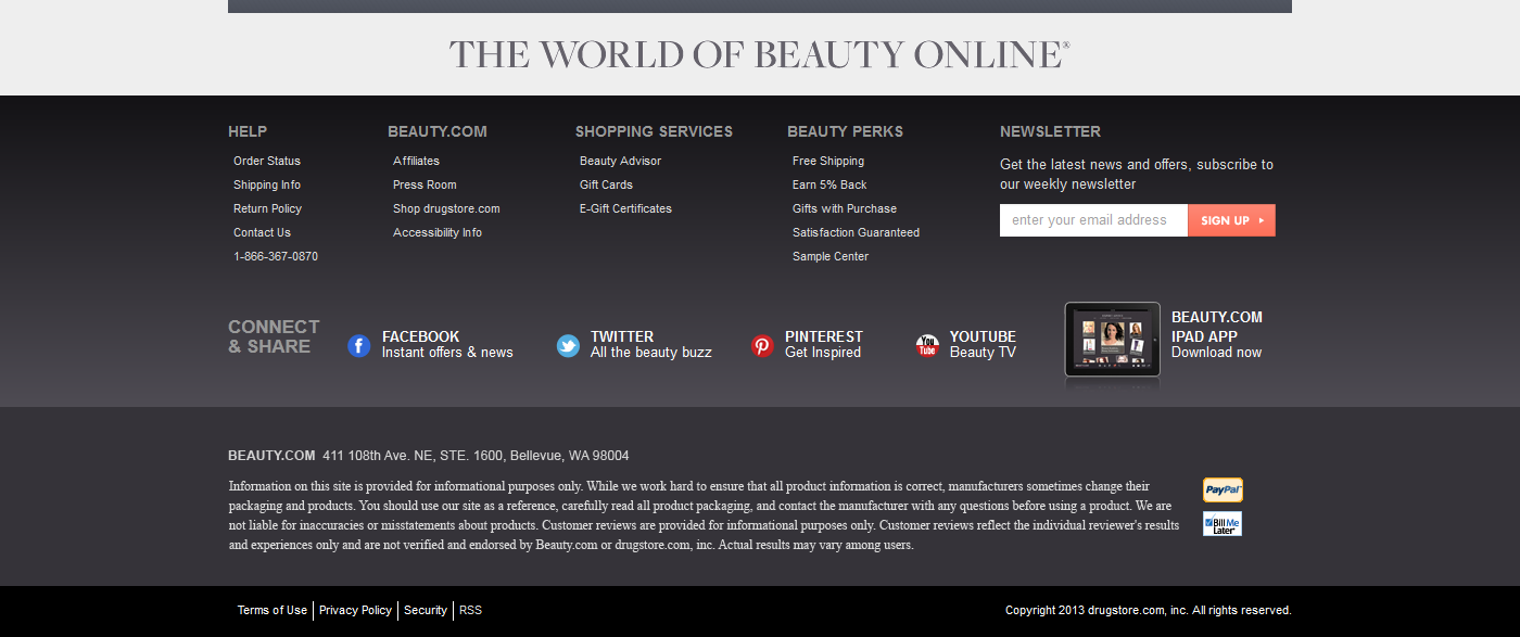
Basement. In the basement (footer) can be located links to information for customers: About the store, Payment and delivery, Contact information, Returns, Shopping safety, FAQ (frequently asked questions), etc. Here the categories menu can be briefly duplicated, for example, the menu of the first category only. Also, a subscription form, icons of payment systems, etc. can be located in the footer. Universality or some kind of unified footer scheme cannot exist, the elements here always depend on the scale and specificity of the store. If there is a lot of information in the footer, make it spacious and large. The text should be contrast, the headings stand out. Often the page view ends with the footer and the user can go to the desired section through it. In short, the footer is an important part of your site, so attention needs to be paid to it.
Fig. 18. Cellars online stores beauty.com, zappos.com
Products in your store will be a huge variety, and any person is usually guided by some selection criteria - price range, brand, color, etc. The filter (faceted navigation) must be detailed, contain the ability to select the main existing characteristics of this product group. It is located usually in the left sidebar of the catalog page, on the first screen. Make the filter design simple and straightforward. Headings should be highlighted, accentuated, well readable. Group and delimit the points of choice, so that the buyer is not lost in them.
Fig. 19. Examples of faceted navigation on sites bigbrownbox.com.au, amazon.com, yebhi.com


In the next and last article I will talk in detail about the product page, ordering, touch on delivery and payment, subscription and other important elements of the interface of the online store.
Announcements from the author:
E-commerce courses. Very soon, in our business school Digitov, practical courses will start from the authors of the article: Designing serious websites , Marketing for an online store, and Everything about creating an online store . Hurry up to sign up for a course and get a discount!
Book on e-commerce. We finish writing a book on creating and promoting online stores. Those interested can leave a request and get the first copies of the book. To do this, you need to send an email to the info@seclgroup.ru application letter with the subject “The book on e-commerce” and immediately after the book we will send detailed information.
New articles. To receive our new articles before others or simply not to miss new publications - subscribe to the SECL Group's fan pages: Facebook , VK , and Twitter or to the Digitov fan pages where learning materials and events will be posted, including free ones: Facebook , VK , and Twitter .
Original article: http://seclgroup.ru/article_prodayushchiy_dizayn_internet-magazina_elementy_interfeysa_2.html
The authors:
Sergey Yakovenko, Senior Designer, SECL GROUP / Internet Sales Technologies
Nikita Semenov ( Facebook , VK , LinkedIn ), CEO, SECL GROUP / Internet Sales Technologies
Site header
The header is a very important component, it is located at the very top of the site. Here are usually located such elements as a logo, site search, contact numbers, callback, basket, authorization panel. The user uses all these elements very often, much more often than all the others, so they are usually here in the header, so that they can always be accessed from any page of the site. When the user is “ripe” and he needs to go to the recycle bin, or find a phone number to check availability, he can always scroll up, or press the Home key - and instantly go to the top of the site, to the header.
Fig. 10. Caps sites, flipkart.com, aliexpress.com, infibeam.com
')
Logo. Look at the logos of world brands, no matter what, whether manufacturers of clothing, electronics, cars, home appliances or logos of IT-companies. One thing unites them all: a good logo is always unique, concise, simple and at the same time perfect, easily remembered and causes the right associations. The logo usually consists of 2-3 colors. You should not make a new logo according to the latest design trends, they will change in a year or two. The logo should be “out of time”, such as the Coca-Cola logo, which has remained almost unchanged for more than 100 years. A good logo will be easily remembered by the user, and he will subconsciously “connect” him with the store, good service, good shopping.
It is not by chance that the logo is usually placed on the left side of the cap. The fact is that the majority of users belong to the cultural environment with the direction of the letter from left to right. Therefore, our main focus is on the left side of the page. This is confirmed by the results of research by Jacob Nielsen and his usability team. A person’s gaze perceives information from left to right and from top to bottom, this technique is often used in advertising, information is placed precisely in this sequence, depending on its degree of importance. Also in our case: the user first sees the upper left corner, so here is usually the logo, which is the basis of the visual identification of the brand on the site.
Fig. 11. Logos of famous online stores
Site search. Search is an irreplaceable and extremely important function, which is used by many and very often. It is important because using the search, the user can always easily find the product he needs, without using navigation. Search leads - visitors rarely navigate the site, preferring to find products through a search (Data Insight, 2013). For example, in 2012, Sotmarket, one of the largest online stores in the CIS, redesigned the site, introducing a new search algorithm. This doubled the conversion. Search is always at hand, because located in the header of the site. This is the shortest way to go to the product page. If your store has many of these products, you can also add the ability to select a category to refine your search. Make the search a prominent, prominent input field large.
Fig. 12. Search on sites alibaba.com, homeshop18.com
Contact details. Many people for consultation prefer a telephone conversation, chatting with a living person, and not correspondence. This is especially true for Ukraine, because there is almost no online trading, the online store often serves as a showcase, and sales are still conducted by phone. Place the phones in a prominent place, they should always be visible.
Fig. 13. Phone numbers on sites bigbrownbox.com.au, ballarddesigns.com
Phone numbers. Large online stores usually use the hotline number 0 800. You can call this number from a landline phone for free, from a mobile phone - at the operator's rate (at a specified time, for example, 8:00 - 21:00, or around the clock, all this should be add). Most often online stores use a hotline number and local numbers for contacts. If you prefer to use the numbers of mobile operators, combine them by adding the operator’s choice to the drop-down list (if you have 5 or 7 of such numbers, they will all take up a lot of space).
Online chat. Let the user chat with you using online chat. Someone like this way of communicating more than a telephone conversation. Many need advice on products, for example. Place an online chat icon or link in the website header or attach it to the browser window so that it is always on the screen when scrolling. It is important to keep this button in a prominent place. It will be more convenient to one to call, and to another - to write. We need to create user comfort on the site. Service is an integral part of sales.
Fig. 14. Online chat in the header and on the product page, zappos.com, beauty.com
Request a call. This feature is also very convenient. For example, a person works in an office and, in order not to distract employees, can request a call back at a convenient time for him, say, at lunch. Also, do not forget that not everyone benefits from calling from a mobile phone and talking for a long time, for someone it is expensive, someone simply does not have a mobile phone, but has a landline. For these users, the service "Callback" will be most welcome.
Basket. To make the basket always easy to find, it must be present on all pages of the site. Therefore, the basket is usually located in the header of the site. Make the basket visible, stand out so that the user can always easily find it and place an order.
Fig. 15. Shopping cart on sites amazon.com, hushbabies.com, beauty.com
The cap may contain other elements. Product catalog can also be here. In Amazon, for example, it is under the logo, when hovering takes place in the left sidebar area. We have listed only the most important thing. Elements of the cap, in addition to the main ones, are always individual, but make sure that there is nothing superfluous among them, only that which is essential.
Home page
Catalog. It is usually located in the left sidebar (left side of the site) or in the center above the middle of the screen. Depending on the size of the store, the catalog of goods will also differ: its structure, size and location. For example, Amazon’s large online retailer has a 2-level product catalog, and the second level also has thematic advertising. If you have a small store with 5-7 product groups - you can position the catalog horizontally, with a drop-down menu of subcategories.
Do not, however, deviate from the traditional vertical or horizontal position of the menu. Users have long been accustomed to such an arrangement, no need to try to instill in them some kind of creative, this is not the case. Do not put the menu on the right side of the screen, this is a “blind zone” for users; everyone is used to the fact that only advertising is on the right and nothing is useful. Having found a catalog in a familiar place, a person always gets to the page with the product of interest without any problems.
Fig. 16. Product catalog on sites amazon.com, ebay.com, yebhi.com
Central part. According to research, the person subconsciously remembers the upper left corner, the area of the logo, which we described above. Immediately after that, his gaze goes down to the middle of the screen. Here you need to have information that can interest, arouse interest, lure. And this is the most popular products, goods at a discount, new arrivals, sales hits. Also use selling stock texts, for example: “Item of the Day: Blender. 599 UAH Instead of 900, there are 5 of them left. ” In short, everything that can hook the user, interest him and convince him to stay. There is also a promotional unit.
Promotional unit. This is the area at the top of the page (below the site header). The promo block is visible immediately when it hits the home page of the site, so posting information here is very effective. In the promotional unit usually advertise a product or group of products, promotional offers, discounts. In a word, sales of the most profitable goods for the store are stimulated here.
Fig. 17. Promotional block on amazon.com, beauty.com
What to say about the design of the promotional unit? Usually it is designed as a slider, vertical or horizontal with the possibility of interactive slide switching. Make the switching elements (arrows, pagination) visible and understandable, so that the user immediately understands that this is not a simple banner, but a promotional block (even if he does not know this word) where you can choose something for yourself. Design elements in slides (visual images, headings, catch phrases), as well as their arrangement, should be done according to the laws of marketing. Also use sales promotion methods (for example, prices "599.90", "old price-new price-saving", etc.). All this should hook our user, interest and motivate him to buy.
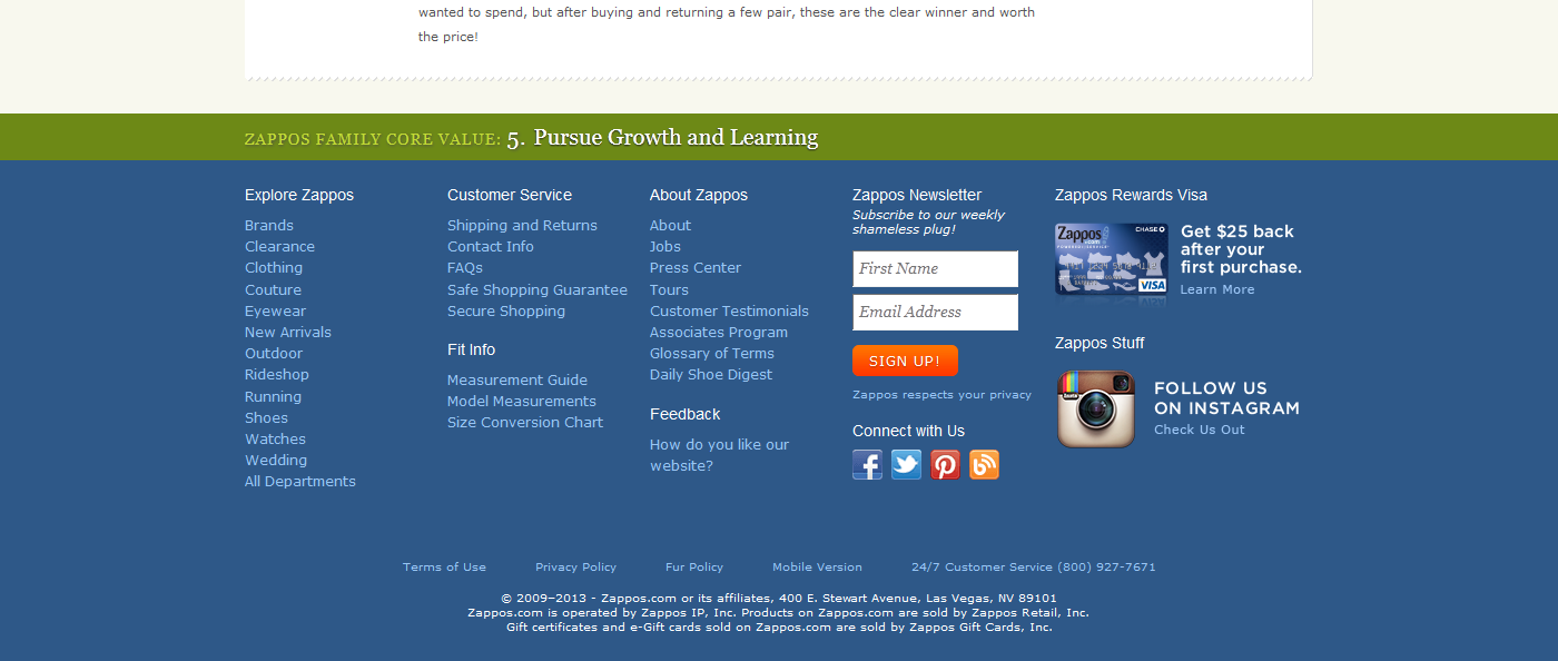
Basement. In the basement (footer) can be located links to information for customers: About the store, Payment and delivery, Contact information, Returns, Shopping safety, FAQ (frequently asked questions), etc. Here the categories menu can be briefly duplicated, for example, the menu of the first category only. Also, a subscription form, icons of payment systems, etc. can be located in the footer. Universality or some kind of unified footer scheme cannot exist, the elements here always depend on the scale and specificity of the store. If there is a lot of information in the footer, make it spacious and large. The text should be contrast, the headings stand out. Often the page view ends with the footer and the user can go to the desired section through it. In short, the footer is an important part of your site, so attention needs to be paid to it.
Fig. 18. Cellars online stores beauty.com, zappos.com
Product filters
Products in your store will be a huge variety, and any person is usually guided by some selection criteria - price range, brand, color, etc. The filter (faceted navigation) must be detailed, contain the ability to select the main existing characteristics of this product group. It is located usually in the left sidebar of the catalog page, on the first screen. Make the filter design simple and straightforward. Headings should be highlighted, accentuated, well readable. Group and delimit the points of choice, so that the buyer is not lost in them.
Fig. 19. Examples of faceted navigation on sites bigbrownbox.com.au, amazon.com, yebhi.com
In the next and last article I will talk in detail about the product page, ordering, touch on delivery and payment, subscription and other important elements of the interface of the online store.
Announcements from the author:
E-commerce courses. Very soon, in our business school Digitov, practical courses will start from the authors of the article: Designing serious websites , Marketing for an online store, and Everything about creating an online store . Hurry up to sign up for a course and get a discount!
Book on e-commerce. We finish writing a book on creating and promoting online stores. Those interested can leave a request and get the first copies of the book. To do this, you need to send an email to the info@seclgroup.ru application letter with the subject “The book on e-commerce” and immediately after the book we will send detailed information.
New articles. To receive our new articles before others or simply not to miss new publications - subscribe to the SECL Group's fan pages: Facebook , VK , and Twitter or to the Digitov fan pages where learning materials and events will be posted, including free ones: Facebook , VK , and Twitter .
Original article: http://seclgroup.ru/article_prodayushchiy_dizayn_internet-magazina_elementy_interfeysa_2.html
The authors:
Sergey Yakovenko, Senior Designer, SECL GROUP / Internet Sales Technologies
Nikita Semenov ( Facebook , VK , LinkedIn ), CEO, SECL GROUP / Internet Sales Technologies
Source: https://habr.com/ru/post/203570/
All Articles