Selling design online store. Part 1. Analytics
Today I want to talk about the design of an online store and approach this issue thoroughly. The article will not address other aspects related to online shopping, only design. This is the first part of the article, it’s more about analytics and general issues that are worked out even before the interfaces, and the second article will be more about the interfaces themselves.
This is the first article. In total there will be 3 of them.
')
Today, more and more people are shopping in online stores. The percentage of such purchases is growing every year and is gaining momentum more and more. In Russia, 22 million people are buying online (according to 2013 Data Insight agency). Now almost everything can be bought on the Internet, and all those products that we used to traditionally go to the markets and supermarkets for, we can now find and buy without leaving home. The scale of online stores is very different, from major world leaders such as Amazon, Ebay, Alibaba, and others, where you can find the most diverse groups of products, to small thematic stores.
As with any retail trade, there is tremendous competition. Create and run an online store in our days has become easier than it was some 10-15 years ago. Online shopping is now becoming more and more, but only a few are pulled forward. Units of them have a good conversion and, as a result, high profits.
What is the secret? How to make an online store successful? In addition to well-thought-out strategy and good marketing, you need to create an attractive shell, appearance. According to statistics, a person decides for only a few seconds (at the subconscious level) whether to remain on the site or not. Few of us can distinguish the concept of "beautiful" from "ugly" instantly, just by looking at something, but our subconscious - it knows what it is. In this case, this is the choice of the solution - to stay on the site or continue to travel to other online stores. Whether the person decides, “yes, everything is clear and simple here, you can trust this store,” or the subconscious will do it for him — not so important, our goal is to detain a person on the site, be it a potential buyer who purposefully searches for a specific product, or a simple user who came to the site by chance. Our task is to delay both, to form a good opinion about the store, to inspire confidence and lead them to purchase. Not now, so later.
Perhaps there are few such people who, having entered a new online store for the first time, will decide that they suddenly need to buy an electric combine, without fail now, and that life without it loses all color. Of course not! But it is important to make the store memorable, intuitive, so that a person, having come here for the first time, feels comfortable, can easily find the necessary thing, information, and in general - does not get on the site in a situation from which he would not see a way out. Everything should be very simple and easy to understand. If it worked, the process started. The person will remember the store, and, even if he has not made a purchase now, will return for it later. And then it is already extremely important not to scare away our buyer and bring him to the ultimate goal - making a purchase, which he will have to remain satisfied with.
In this case, it is more likely to become a regular customer. And here we have a satisfied customer who will share his opinion about a good online store with acquaintances and friends who will also come and shop. It will only remain to maintain the service at a height, to offer favorable conditions and develop customer loyalty. Regular customers, satisfied with their purchases, will become more and more, sales and profits will grow. And here it is, the long-awaited success!
Today we will not talk "about everything", but focus only on one side of creating a successful online store, namely, on design. Let's talk about the visual shell, the interface. We will touch, of course, and usability, as without it?
And we begin with the fact that the main goal of any online store is to sell. And the design goal is to help the store sell something to the buyer. The development of an online store usually consists of such milestones as research and analysis, design, design, layout, programming, quality control, project launch, promotion and support. Despite the fact that there are so many stages of creation, in the end, a simple user will not see, for example, analytics or design, layout or programming. These are incredibly important and irreplaceable processes, without which the site simply will not work effectively, but a simple user may not even know about them, we know about them, the developers. A simple user will see the design, see the convenience or inconvenience of use. And this is the interface, design, usability. Good design will promote sales and our goal will be achieved.
As we have said, the first thing that a person sees when entering the site is design. With usability, usability and other important nuances, he will face later, but the very first thing that he sees when entering the site (especially the new site, unknown) is by all means design. This is the most important component of the site, forming the first impression of a person and it is very important that this impression is not spoiled. "You will not have a second chance to make a first impression," as Coco Chanel said.
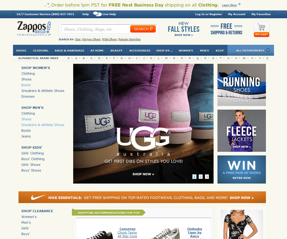
Fig. 1. Examples of well-designed online stores: goodlife.com, flipkart.com, beauty.com.

The first thing we need to understand and recognize is that we make design for a wide audience. Users of online stores are very different: people of different ages, opinions, tastes, different social status. Of course, there are narrowly thematic online stores with a narrow Central Asian, but this is the exception rather than the rule. So, besides the uniqueness about which we wrote above, it is extremely important to make our design universal and understandable to any user, be it a trendy teenager, a successful businessman, or a tender-hearted old woman. Everyone should understand our site. Each person is unique and individual, we all have our own tastes and attitudes. But in design, as in any other form of art, there is a classic, something that passes through time, generation and does not change.
“Fashion passes, style remains,” as the famous saying goes. Fashion dictates new design trends, including in the web industry. Today, one thing is important, tomorrow it will be replaced by another. But if we want to get closer to universality, we need to focus on what each of us recognizes, despite the time and fashion trends. This is a classic. She is in everything. Simplicity and at the same time wealth, uniform colors, simple shapes, attention to detail. It will always be relevant. Take, for example, classic black Mercedes Benz cars. One of them was driven by Stirlitz, and today heads of state and many others are driving. Mercedes does not need to be painted in red with white polka dots to please the fashion. This is a classic, a design standard, this is an expression of a brand, something that has always been relevant, something that will always be at the level and a step above any other design.
There is a classic in web design. Use simple geometric shapes of elements, calm, not flashy colors, correct color schemes, lack of information. Good design is when there is nothing left to remove. How does a sculptor work? Takes a boulder and cuts off all unnecessary from it. This principle undoubtedly applies to the creation of a good website design. Do not forget about the logic of design, about its correctness. The correct design a person will perceive subconsciously, such a design highlights the most important thing, the purpose of the site. These are, above all, the rules of the Golden Section, Fibonacci proportions, modular grids.
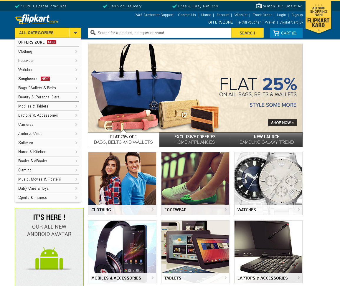
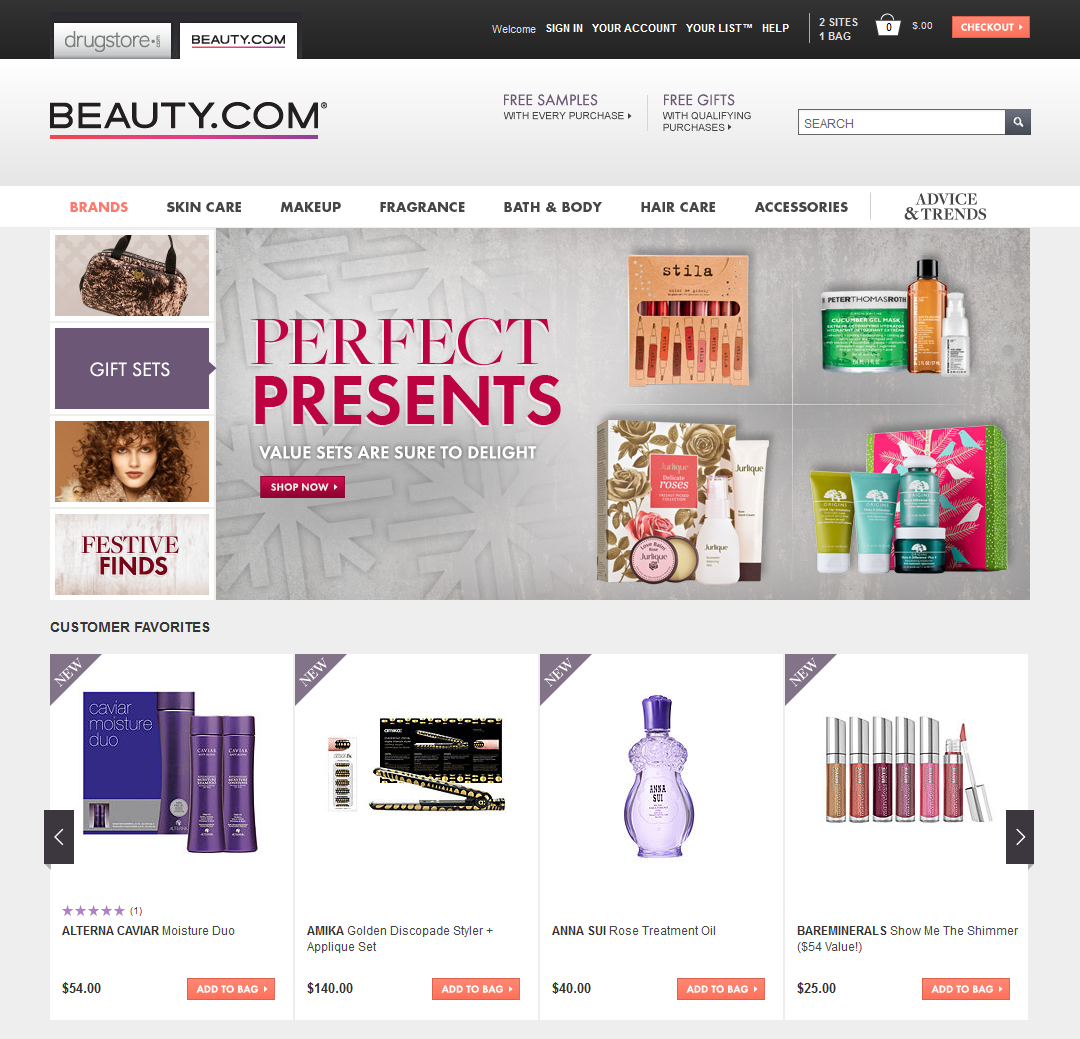
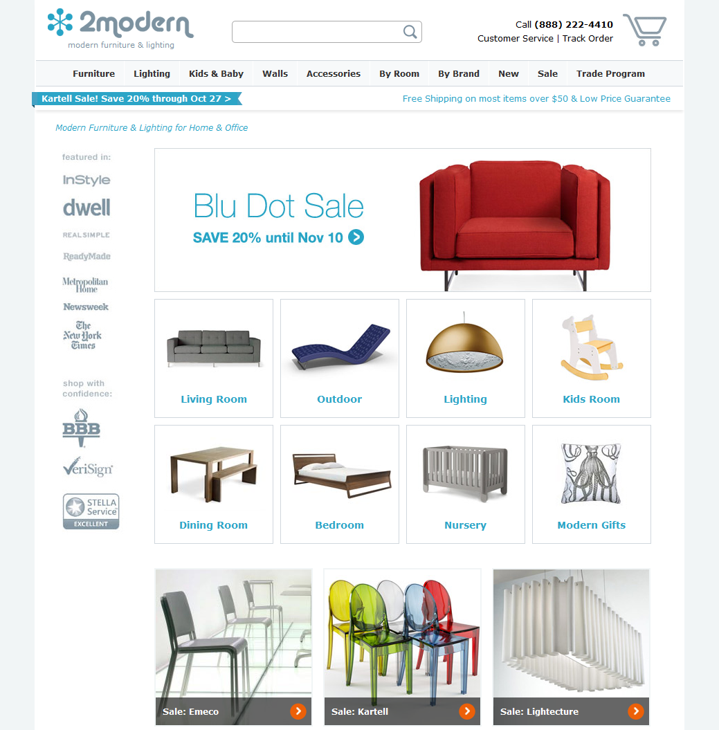
Fig. 2. More examples of good design, zappos.com, 2modern.com, tmlewin.co.uk

Consider the main stages of creating a design, as well as its individual elements.
Before embarking on creating a visual image of our store, it is necessary first of all to conduct analytical research and highlight the target audience (CA), understand the market, delve into the subject of the future store. What is it for? To make the right design, we need to understand for whom we are doing an online store, what kind of audience we need to count on, how it behaves. It is important for the designer to know the age, gender, social status, professional activities and other characteristics of people who will shop in the store.
The work of the designer does not include conducting analytical studies; marketing specialists usually do this, the designer receives the results of these studies directly, and then already takes them into account in his work. We are not going to talk about this in detail right now, but this is an important point to remember.
As we know, Internet marketing is designed to develop business in the Internet environment, using a set of measures. We must attract and retain customers. Its role is very important to achieve our goals, and when creating a design, many techniques and turns come from here, from internet marketing.
Aida. In marketing, there is such a model as AIDA. This stands for: Attention, Interest, Desire, Action (Attention, Interest, Desire, Action). Its principle is the general order of events that may occur when a consumer interacts with advertising, and in our case with content on the pages of the site. Using this system, we can "sell in 4 steps."
AIDA is a business logic that we recommend using when creating a design. This model can be applied throughout the site as a whole and on its individual pages. Each of these pages may have its own goal, for the achievement of which you can use AIDA.
On the product page, for example, this model will have one appearance, the user will have to click the Buy button in 4 steps. To this it should lead the correct placement of accents, selling texts, etc. On another page, which seems to be far away from the purchase, this model is also applicable. For example, the feedback page. The user reads other people's reviews, and with the help of this model we motivate him to write a review. But that's not all, we need sales, conversion, profit, we can not just let go of the visitor. Since the form “add a review” is usually located at the bottom of the page, and just below we have a basement, we can create an additional incentive in it, for example, by duplicating product categories there. Perhaps, during his stay on the site, a person could miss something, not notice, but now he can quite “catch” on the category of goods that he is interested in.
Fig. 3. How does AIDA work on the product page example
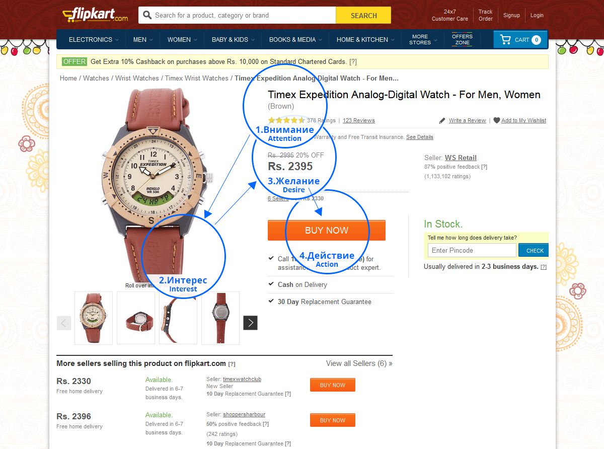
According to statistics, more than 30% of visitors leave the site after making a purchase, without completing it. They change their mind, or something distracts them, or the logic of their thinking is not well thought out. To reduce this percentage, we recommend that you use AIDA. This will undoubtedly play a big role in achieving the goals of the site and increasing the conversion. But we are not talking in this article about marketing, but about design, so we go further.
The first rule - do as the user is used to. The location of the elements should be familiar to people. Do not force a person to think once again, he must find everything in his usual places. Our store should be understandable to any user, both an experienced user, and a kettle that does not understand anything. The rule of "fool" says: even if the fool understands, then the rest will definitely understand, I think, you already understood who should be guided? The structure of the site should be clear and friendly. Moving around the site should be free, without obstacles and questions "how to get out of here?". The user must always understand where the information he needs is and how to get to it.
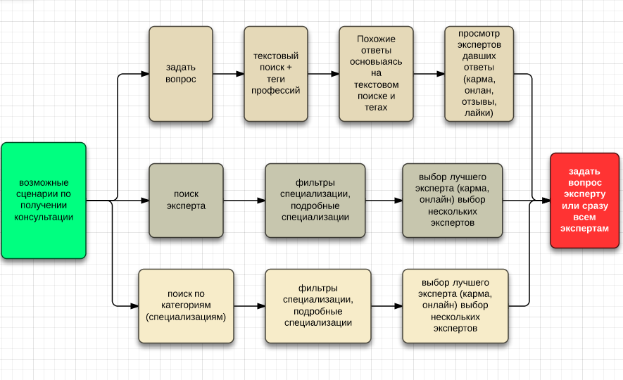
Scripts behavior (User Story). This stage is designed to identify errors in logic, set priorities and improve the solutions we have invented. Behavior scenarios are a pattern of general systems thinking, a step-by-step path for a user, the way a person comes to goals on a website. These scenarios describe in detail the options for solving specific tasks by users, in our case this is the way to purchase. Thinking through scenarios of behavior involves analyzing the behavior of users on the pages of a site: what actions are performed, how much time is spent, what attracts attention, etc. This is applied prior to the prototyping process, in order to better understand how to design, as well as to test ready-made layouts: have we considered everything, have we done everything correctly in terms of usability?
Behavior scenarios in our case may have different logic: the user’s start from the store’s main page, when going to the store from a search engine, social network, banner, etc. According to inFOLIO Research Group research, in 2012, search engines - 92% of the audience. If a user, for example, searched for a specific product through a search engine and came to our site, he will be on the page of the product he needs, or on the category page, or on the page of the article review. In short, close to the goal. But if he is with us for the first time - by itself, he may have doubts whether you can trust this store. He may be interested in the sections “About the Store” or “Contacts” to make sure that the store is “alive” and will not be deceived. It seems our buyer has deviated from the goal, left the product page. That is why different scenarios of behavior are being thought out, which we should follow while creating the design. If our customer is, say, on the contact page, remind him of his goal, for example, using the “recently viewed items” block. He will see a photo of what he was looking for, remember that he wanted to buy it, and return to his goal.
Fig. 4. Example of a behavior scenario upon receipt of a consultation.
Journey Map - a map of the user's path. It can begin only with an idea, buy something from an idea, and further shows the way to solve this idea. This map displays important steps that customers take in their decision making process. This map also marks the various elements arising at each step. The future of customer experience is, among other things, the creation of such cards.
Fig. 5. Journey Map Example

Why do we describe all this in the article about design? The fact is that a designer must think not only as a designer, but also as a marketer, as a usabilityist, and as a buyer, too. When we have already done research, studied Central Asia, worked marketing and are going to do the design - our designer should build his work based on the results of the previous stages. How to take the foundation laid and, on its basis, build and design. Since all this is teamwork, consistent and interrelated.
Design - one of the most important and difficult stages of website development. From the design depends on the effectiveness of the subsequent stages of development and the final result. Designing a site at an early stage allows you to structure work and see the life of a specific project in the long term. Thus, we get the opportunity to develop the project with the least losses, thereby saving resources as a developer, and the customer there.
Why design? Many are still starting to do design without design, it is very, very wrong, it always leads to endless alterations and will never lead to success. Let's look at the main tasks of design and prototyping.
A designer, no matter how experienced he is, cannot and should not know everything and be able to. As you know, success can be achieved only when each specialist does his job and achieves perfection in it, and is not dissipated in trying to know everything and be able to. This is a narrow specialization. The designer is familiar with the rules and laws of usability, but not as much as the designer knows. Therefore, you should always start with the design.
Why not without design? The fact is that the designer, in the course of his work, communicates a lot with the client, understands his goals and objectives. The designer lays the complexity and scale of the site, thinks over the business logic. Then it makes prototyping, creates layouts that will be used to design. In the layouts of these takes into account everything that should be on each page of the site, showing all the elements that should be present.
Fig. 6. Prototype of the main page of the Kibet online store

It takes much more time to design one page than one such prototype. If at first the designer did the design and tried to approve it with the customer, then in the process of work there would always be some flaws, missing or unnecessary elements. Design is a delicate and painstaking matter, and it takes time to design a new element in design. The process would be long, endless and would not lead to anything good. Therefore, you need to design pages. Since prototypes are circuits, much less time is needed to create them. Their goal is to show how the page will look, but without design, but schematically. Show all the items that should be present and their approximate location. So the designer will be able to concentrate all his attention on the design, and will not worry that he has forgotten or missed something. As you can see, the role of design is very important and we cannot do without it if we want to make the site high-quality and efficient.
Fig. 7. The same Kibet, but already in design

A really good store design is one that is not very noticeable. “Good design is immediately visible. Great design is invisible, ”as Joe Sparano put it. The design should not distract the user's attention from viewing products, studying information, making purchases. But at the same time the design should cause the user the right emotions that will prepare him for making a purchase. These are two sides of the coin that cause conflict: how to make a design invisible, but emotional? Below we will try to answer this question. Very often, many make a mistake, making beautiful pictures, animations and other "bells and whistles" in the design of an online store, but after all, what is our goal? We do design for buyers, not for the customer, remember this. And, since this is an online store where goods are sold (and they are the most important thing here), then we need to bring them to the fore, and let the design be in the background, as an addition and completion of the overall picture.
Fig. 7. Examples, infibeam.com, alibaba.com

Colors. The colors cause emotions and associations in a person, and it is very important that, while being on the site, a person’s emotions are correct. It is not without reason that entire departments of marketing specialists are fighting over the creation of corporate colors for political parties, the psychology of color is a very important question when it comes to a multitude of people.
If we want to create a quality design, clean and elegant, no need to use more than 2-3 colors. This is a truism that should not be neglected. We are talking only about the color scheme of the site itself. Other colors will appear later in advertising banners, this is normal, banners and should stand out and attract attention. There will also be a huge variety of photos of the product in various colors. But the color scheme of the site itself should not contain many colors. Do not use flashy, poisonous colors, they will cause only negative emotions, a person will not be able to stay on such a site for a long time. It is better to use soft and calm colors and color schemes, they will cause peace and confidence. Compliance with this rule will be one of the feet of creating an emotional background that will lead a person to purchase.
Fig. 8. Examples of color schemes of famous online stores: ebay.com, amazon.com, bigbrownbox.com.au


The background color is also recommended to make a uniform, clean. If the pattern is used, it is better to barely visible, low-key or uniform. The background should not distract attention from the information.
Fig. 9. Examples of the use of patterns and background images, hushbabies.com, ballarddesigns.com


In general, the design should not be anything extra, everything should look very neat, nothing should distract the user's attention from the content. And, despite the fact that we are doing a shop with a huge variety of products, you still need to avoid overloading with information. Do not create unnecessary elements if they do not carry any meaning and can be discarded. The best design in our case is light and spacious, not cramped and not overloaded.
In the next article we will talk about the design of individual elements of an online store: website header and footer, buttons, home page, product filter and catalog, product page, order processing, forms, we will tell you about website adaptability, testing ready pages and much more.
Announcements from the author:
E-commerce courses. Very soon, in our business school Digitov, practical courses will start from the authors of the article: Designing serious websites , Marketing for an online store, and Everything about creating an online store . Hurry up to sign up for a course and get a discount!
Book on e-commerce. We finish writing a book on creating and promoting online stores. Those interested can leave a request and get the first copies of the book. To do this, you need to send an email to the info@seclgroup.ru application letter with the subject “The book on e-commerce” and immediately after the book we will send detailed information.
New articles. To receive our new articles before others or simply not to miss new publications - subscribe to the SECL Group's fan pages: Facebook , VK , and Twitter or to the Digitov fan pages where learning materials and events will be posted, including free ones: Facebook , VK , and Twitter .
Original article: http://seclgroup.ru/article_prodayushchiy_dizayn_internet-magazina_analitika_1.html
The authors:
Sergey Yakovenko, Senior Designer, SECL GROUP / Internet Sales Technologies
Nikita Semenov ( Facebook , VK , LinkedIn ), CEO, SECL GROUP / Internet Sales Technologies
This is the first article. In total there will be 3 of them.
')
Introduction
Today, more and more people are shopping in online stores. The percentage of such purchases is growing every year and is gaining momentum more and more. In Russia, 22 million people are buying online (according to 2013 Data Insight agency). Now almost everything can be bought on the Internet, and all those products that we used to traditionally go to the markets and supermarkets for, we can now find and buy without leaving home. The scale of online stores is very different, from major world leaders such as Amazon, Ebay, Alibaba, and others, where you can find the most diverse groups of products, to small thematic stores.
As with any retail trade, there is tremendous competition. Create and run an online store in our days has become easier than it was some 10-15 years ago. Online shopping is now becoming more and more, but only a few are pulled forward. Units of them have a good conversion and, as a result, high profits.
What is the secret? How to make an online store successful? In addition to well-thought-out strategy and good marketing, you need to create an attractive shell, appearance. According to statistics, a person decides for only a few seconds (at the subconscious level) whether to remain on the site or not. Few of us can distinguish the concept of "beautiful" from "ugly" instantly, just by looking at something, but our subconscious - it knows what it is. In this case, this is the choice of the solution - to stay on the site or continue to travel to other online stores. Whether the person decides, “yes, everything is clear and simple here, you can trust this store,” or the subconscious will do it for him — not so important, our goal is to detain a person on the site, be it a potential buyer who purposefully searches for a specific product, or a simple user who came to the site by chance. Our task is to delay both, to form a good opinion about the store, to inspire confidence and lead them to purchase. Not now, so later.
Perhaps there are few such people who, having entered a new online store for the first time, will decide that they suddenly need to buy an electric combine, without fail now, and that life without it loses all color. Of course not! But it is important to make the store memorable, intuitive, so that a person, having come here for the first time, feels comfortable, can easily find the necessary thing, information, and in general - does not get on the site in a situation from which he would not see a way out. Everything should be very simple and easy to understand. If it worked, the process started. The person will remember the store, and, even if he has not made a purchase now, will return for it later. And then it is already extremely important not to scare away our buyer and bring him to the ultimate goal - making a purchase, which he will have to remain satisfied with.
In this case, it is more likely to become a regular customer. And here we have a satisfied customer who will share his opinion about a good online store with acquaintances and friends who will also come and shop. It will only remain to maintain the service at a height, to offer favorable conditions and develop customer loyalty. Regular customers, satisfied with their purchases, will become more and more, sales and profits will grow. And here it is, the long-awaited success!
Why is design so important for an online store?
Today we will not talk "about everything", but focus only on one side of creating a successful online store, namely, on design. Let's talk about the visual shell, the interface. We will touch, of course, and usability, as without it?
And we begin with the fact that the main goal of any online store is to sell. And the design goal is to help the store sell something to the buyer. The development of an online store usually consists of such milestones as research and analysis, design, design, layout, programming, quality control, project launch, promotion and support. Despite the fact that there are so many stages of creation, in the end, a simple user will not see, for example, analytics or design, layout or programming. These are incredibly important and irreplaceable processes, without which the site simply will not work effectively, but a simple user may not even know about them, we know about them, the developers. A simple user will see the design, see the convenience or inconvenience of use. And this is the interface, design, usability. Good design will promote sales and our goal will be achieved.
As we have said, the first thing that a person sees when entering the site is design. With usability, usability and other important nuances, he will face later, but the very first thing that he sees when entering the site (especially the new site, unknown) is by all means design. This is the most important component of the site, forming the first impression of a person and it is very important that this impression is not spoiled. "You will not have a second chance to make a first impression," as Coco Chanel said.
Fig. 1. Examples of well-designed online stores: goodlife.com, flipkart.com, beauty.com.
What should be a successful design for an online store?
The first thing we need to understand and recognize is that we make design for a wide audience. Users of online stores are very different: people of different ages, opinions, tastes, different social status. Of course, there are narrowly thematic online stores with a narrow Central Asian, but this is the exception rather than the rule. So, besides the uniqueness about which we wrote above, it is extremely important to make our design universal and understandable to any user, be it a trendy teenager, a successful businessman, or a tender-hearted old woman. Everyone should understand our site. Each person is unique and individual, we all have our own tastes and attitudes. But in design, as in any other form of art, there is a classic, something that passes through time, generation and does not change.
“Fashion passes, style remains,” as the famous saying goes. Fashion dictates new design trends, including in the web industry. Today, one thing is important, tomorrow it will be replaced by another. But if we want to get closer to universality, we need to focus on what each of us recognizes, despite the time and fashion trends. This is a classic. She is in everything. Simplicity and at the same time wealth, uniform colors, simple shapes, attention to detail. It will always be relevant. Take, for example, classic black Mercedes Benz cars. One of them was driven by Stirlitz, and today heads of state and many others are driving. Mercedes does not need to be painted in red with white polka dots to please the fashion. This is a classic, a design standard, this is an expression of a brand, something that has always been relevant, something that will always be at the level and a step above any other design.
There is a classic in web design. Use simple geometric shapes of elements, calm, not flashy colors, correct color schemes, lack of information. Good design is when there is nothing left to remove. How does a sculptor work? Takes a boulder and cuts off all unnecessary from it. This principle undoubtedly applies to the creation of a good website design. Do not forget about the logic of design, about its correctness. The correct design a person will perceive subconsciously, such a design highlights the most important thing, the purpose of the site. These are, above all, the rules of the Golden Section, Fibonacci proportions, modular grids.
Fig. 2. More examples of good design, zappos.com, 2modern.com, tmlewin.co.uk
Consider the main stages of creating a design, as well as its individual elements.
Research and Analytics
Before embarking on creating a visual image of our store, it is necessary first of all to conduct analytical research and highlight the target audience (CA), understand the market, delve into the subject of the future store. What is it for? To make the right design, we need to understand for whom we are doing an online store, what kind of audience we need to count on, how it behaves. It is important for the designer to know the age, gender, social status, professional activities and other characteristics of people who will shop in the store.
The work of the designer does not include conducting analytical studies; marketing specialists usually do this, the designer receives the results of these studies directly, and then already takes them into account in his work. We are not going to talk about this in detail right now, but this is an important point to remember.
Marketing in design
As we know, Internet marketing is designed to develop business in the Internet environment, using a set of measures. We must attract and retain customers. Its role is very important to achieve our goals, and when creating a design, many techniques and turns come from here, from internet marketing.
Aida. In marketing, there is such a model as AIDA. This stands for: Attention, Interest, Desire, Action (Attention, Interest, Desire, Action). Its principle is the general order of events that may occur when a consumer interacts with advertising, and in our case with content on the pages of the site. Using this system, we can "sell in 4 steps."
AIDA is a business logic that we recommend using when creating a design. This model can be applied throughout the site as a whole and on its individual pages. Each of these pages may have its own goal, for the achievement of which you can use AIDA.
On the product page, for example, this model will have one appearance, the user will have to click the Buy button in 4 steps. To this it should lead the correct placement of accents, selling texts, etc. On another page, which seems to be far away from the purchase, this model is also applicable. For example, the feedback page. The user reads other people's reviews, and with the help of this model we motivate him to write a review. But that's not all, we need sales, conversion, profit, we can not just let go of the visitor. Since the form “add a review” is usually located at the bottom of the page, and just below we have a basement, we can create an additional incentive in it, for example, by duplicating product categories there. Perhaps, during his stay on the site, a person could miss something, not notice, but now he can quite “catch” on the category of goods that he is interested in.
Fig. 3. How does AIDA work on the product page example
According to statistics, more than 30% of visitors leave the site after making a purchase, without completing it. They change their mind, or something distracts them, or the logic of their thinking is not well thought out. To reduce this percentage, we recommend that you use AIDA. This will undoubtedly play a big role in achieving the goals of the site and increasing the conversion. But we are not talking in this article about marketing, but about design, so we go further.
Usability
The first rule - do as the user is used to. The location of the elements should be familiar to people. Do not force a person to think once again, he must find everything in his usual places. Our store should be understandable to any user, both an experienced user, and a kettle that does not understand anything. The rule of "fool" says: even if the fool understands, then the rest will definitely understand, I think, you already understood who should be guided? The structure of the site should be clear and friendly. Moving around the site should be free, without obstacles and questions "how to get out of here?". The user must always understand where the information he needs is and how to get to it.
Scripts behavior (User Story). This stage is designed to identify errors in logic, set priorities and improve the solutions we have invented. Behavior scenarios are a pattern of general systems thinking, a step-by-step path for a user, the way a person comes to goals on a website. These scenarios describe in detail the options for solving specific tasks by users, in our case this is the way to purchase. Thinking through scenarios of behavior involves analyzing the behavior of users on the pages of a site: what actions are performed, how much time is spent, what attracts attention, etc. This is applied prior to the prototyping process, in order to better understand how to design, as well as to test ready-made layouts: have we considered everything, have we done everything correctly in terms of usability?
Behavior scenarios in our case may have different logic: the user’s start from the store’s main page, when going to the store from a search engine, social network, banner, etc. According to inFOLIO Research Group research, in 2012, search engines - 92% of the audience. If a user, for example, searched for a specific product through a search engine and came to our site, he will be on the page of the product he needs, or on the category page, or on the page of the article review. In short, close to the goal. But if he is with us for the first time - by itself, he may have doubts whether you can trust this store. He may be interested in the sections “About the Store” or “Contacts” to make sure that the store is “alive” and will not be deceived. It seems our buyer has deviated from the goal, left the product page. That is why different scenarios of behavior are being thought out, which we should follow while creating the design. If our customer is, say, on the contact page, remind him of his goal, for example, using the “recently viewed items” block. He will see a photo of what he was looking for, remember that he wanted to buy it, and return to his goal.
Fig. 4. Example of a behavior scenario upon receipt of a consultation.
Journey Map - a map of the user's path. It can begin only with an idea, buy something from an idea, and further shows the way to solve this idea. This map displays important steps that customers take in their decision making process. This map also marks the various elements arising at each step. The future of customer experience is, among other things, the creation of such cards.
Fig. 5. Journey Map Example
Why do we describe all this in the article about design? The fact is that a designer must think not only as a designer, but also as a marketer, as a usabilityist, and as a buyer, too. When we have already done research, studied Central Asia, worked marketing and are going to do the design - our designer should build his work based on the results of the previous stages. How to take the foundation laid and, on its basis, build and design. Since all this is teamwork, consistent and interrelated.
Design
Design - one of the most important and difficult stages of website development. From the design depends on the effectiveness of the subsequent stages of development and the final result. Designing a site at an early stage allows you to structure work and see the life of a specific project in the long term. Thus, we get the opportunity to develop the project with the least losses, thereby saving resources as a developer, and the customer there.
Why design? Many are still starting to do design without design, it is very, very wrong, it always leads to endless alterations and will never lead to success. Let's look at the main tasks of design and prototyping.
A designer, no matter how experienced he is, cannot and should not know everything and be able to. As you know, success can be achieved only when each specialist does his job and achieves perfection in it, and is not dissipated in trying to know everything and be able to. This is a narrow specialization. The designer is familiar with the rules and laws of usability, but not as much as the designer knows. Therefore, you should always start with the design.
Why not without design? The fact is that the designer, in the course of his work, communicates a lot with the client, understands his goals and objectives. The designer lays the complexity and scale of the site, thinks over the business logic. Then it makes prototyping, creates layouts that will be used to design. In the layouts of these takes into account everything that should be on each page of the site, showing all the elements that should be present.
Fig. 6. Prototype of the main page of the Kibet online store
It takes much more time to design one page than one such prototype. If at first the designer did the design and tried to approve it with the customer, then in the process of work there would always be some flaws, missing or unnecessary elements. Design is a delicate and painstaking matter, and it takes time to design a new element in design. The process would be long, endless and would not lead to anything good. Therefore, you need to design pages. Since prototypes are circuits, much less time is needed to create them. Their goal is to show how the page will look, but without design, but schematically. Show all the items that should be present and their approximate location. So the designer will be able to concentrate all his attention on the design, and will not worry that he has forgotten or missed something. As you can see, the role of design is very important and we cannot do without it if we want to make the site high-quality and efficient.
Fig. 7. The same Kibet, but already in design
Appearance, colors
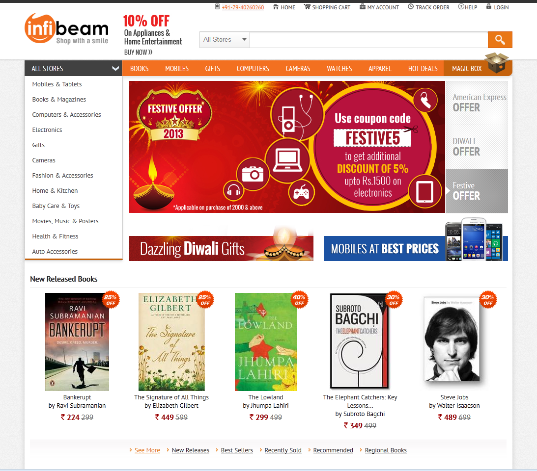
A really good store design is one that is not very noticeable. “Good design is immediately visible. Great design is invisible, ”as Joe Sparano put it. The design should not distract the user's attention from viewing products, studying information, making purchases. But at the same time the design should cause the user the right emotions that will prepare him for making a purchase. These are two sides of the coin that cause conflict: how to make a design invisible, but emotional? Below we will try to answer this question. Very often, many make a mistake, making beautiful pictures, animations and other "bells and whistles" in the design of an online store, but after all, what is our goal? We do design for buyers, not for the customer, remember this. And, since this is an online store where goods are sold (and they are the most important thing here), then we need to bring them to the fore, and let the design be in the background, as an addition and completion of the overall picture.
Fig. 7. Examples, infibeam.com, alibaba.com
Colors. The colors cause emotions and associations in a person, and it is very important that, while being on the site, a person’s emotions are correct. It is not without reason that entire departments of marketing specialists are fighting over the creation of corporate colors for political parties, the psychology of color is a very important question when it comes to a multitude of people.
If we want to create a quality design, clean and elegant, no need to use more than 2-3 colors. This is a truism that should not be neglected. We are talking only about the color scheme of the site itself. Other colors will appear later in advertising banners, this is normal, banners and should stand out and attract attention. There will also be a huge variety of photos of the product in various colors. But the color scheme of the site itself should not contain many colors. Do not use flashy, poisonous colors, they will cause only negative emotions, a person will not be able to stay on such a site for a long time. It is better to use soft and calm colors and color schemes, they will cause peace and confidence. Compliance with this rule will be one of the feet of creating an emotional background that will lead a person to purchase.
Fig. 8. Examples of color schemes of famous online stores: ebay.com, amazon.com, bigbrownbox.com.au
The background color is also recommended to make a uniform, clean. If the pattern is used, it is better to barely visible, low-key or uniform. The background should not distract attention from the information.
Fig. 9. Examples of the use of patterns and background images, hushbabies.com, ballarddesigns.com
In general, the design should not be anything extra, everything should look very neat, nothing should distract the user's attention from the content. And, despite the fact that we are doing a shop with a huge variety of products, you still need to avoid overloading with information. Do not create unnecessary elements if they do not carry any meaning and can be discarded. The best design in our case is light and spacious, not cramped and not overloaded.
In the next article we will talk about the design of individual elements of an online store: website header and footer, buttons, home page, product filter and catalog, product page, order processing, forms, we will tell you about website adaptability, testing ready pages and much more.
Announcements from the author:
E-commerce courses. Very soon, in our business school Digitov, practical courses will start from the authors of the article: Designing serious websites , Marketing for an online store, and Everything about creating an online store . Hurry up to sign up for a course and get a discount!
Book on e-commerce. We finish writing a book on creating and promoting online stores. Those interested can leave a request and get the first copies of the book. To do this, you need to send an email to the info@seclgroup.ru application letter with the subject “The book on e-commerce” and immediately after the book we will send detailed information.
New articles. To receive our new articles before others or simply not to miss new publications - subscribe to the SECL Group's fan pages: Facebook , VK , and Twitter or to the Digitov fan pages where learning materials and events will be posted, including free ones: Facebook , VK , and Twitter .
Original article: http://seclgroup.ru/article_prodayushchiy_dizayn_internet-magazina_analitika_1.html
The authors:
Sergey Yakovenko, Senior Designer, SECL GROUP / Internet Sales Technologies
Nikita Semenov ( Facebook , VK , LinkedIn ), CEO, SECL GROUP / Internet Sales Technologies
Source: https://habr.com/ru/post/203100/
All Articles