Payler: design work
Dear friends,
As promised, we continue to talk about the Payler development process in this blog. Today's post will be devoted to the development of design for the project.
')
The idea of the project was born at the end of last year. Initially, it was supposed to be a simple payment gateway that allows you to accept payment from bank cards. We thought for a long time and went through different names, mainly comparing them with the availability of free domains. We stopped at Payler, it was the most resonant and memorable. Then Ruslan, our art director, came up with the slogan - No nonsense payments. After all, the payment system must be transparent, understandable and meaningful. The main idea of the brand was the following: it definitely has to be a friend and know what its users need. Must prompt, be helpful and responsive. For some reason, many brands in Russia do it differently: we more often have such characters as “brand director”, “brand businessman on Bentley”, “brand teacher”. And Payler is an example of a “brand friend”. Made a logo and plugs for the site:

After the moment of calm came, there were many other projects requiring attention. Immediately, as the opportunity to continue, it was decided to do everything as quickly as possible, while there is time and resources. We already had a logo, a cap and a name, so we immediately began working on the project architecture and thinking through the functionality.
Began working chaos. Some screens were drawn in advance, because the full set of functionality was not fully formed. Initially, one designer worked on the project, a week later it became clear that the workload was very large, and another one was connected. According to the functional, so far it was clear only that it was necessary to accept payments, there must be an antifraud and a payment terminal for mototransactions. Initially, the admin design looked like this:

At the same time, the work of a marketing nature was carried out - we looked with a fresh look at the positioning of the project, changed the main messages and the slogan. Now it sounds like this: “Payler: Understandable Payments”. After working on positioning, a presentation was made, which was launched on the social network and sent to clients. You can download it here if you 're interested: payler.com/Payler.pdf .
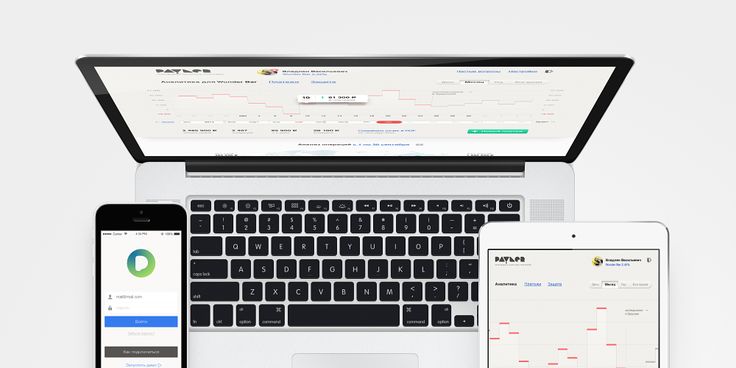
After some time, they began to shed some functionality for the mobile application and work on a working prototype of the web interface. Again, we ran a little ahead, since the functionality was not fully agreed. But in such conditions we managed to come up with some unusual design solutions, based on which we then determined the functional part. For example, graphs showing the dynamics of payments. We already have a prototype in Axure (http://www.axure.com/ is not the most convenient program, but at least it allows us to make a working prototype). With the resulting prototype, it became clear where to go, the approximate amount of work on design became clear. And so what happened:

The main feature of the Payler interface, as we would like it to be, is transparency and practicality. There are no hidden features, complex language or long menu lines. When you log into the system, the first thing that the user sees is a monitor of what is happening in the store, with analytics and problem areas in payments. Payments themselves are displayed clearly, with a flexible filtering system. We decided to use spring-animation of events in the future. For the rest, we believe that the interface in the first place should not interfere with the execution of the required tasks, promote productivity, be understandable and not cause eye cancer.
We are currently working on a mobile application. There is already an application design map, the functionality of which must be lowered from heaven to earth. First of all, we are now staffing some of the functionality in favor of its analytical data. There is even an idea to make a mobile application, sharpened more for work in read-only mode, that is, as a monitor to track what is happening. A connection to the full interface should occur if necessary. The logic is clear: the user is working at the computer, but he can monitor his transactions through the mobile application on the way.

Approximately in such a chaotic pace, in which this post turned out, and our work on the design of Payler takes place. And, frankly, in this mode, work brings pleasure and results. We have a rare opportunity to adjust the functionality, based on the design and vice versa, which is not always possible to implement in other projects.
Thank you for your attention, we will be glad to questions and comments.
With love,
Payler
payler.com
facebook.com/payler
As promised, we continue to talk about the Payler development process in this blog. Today's post will be devoted to the development of design for the project.
')
The idea of the project was born at the end of last year. Initially, it was supposed to be a simple payment gateway that allows you to accept payment from bank cards. We thought for a long time and went through different names, mainly comparing them with the availability of free domains. We stopped at Payler, it was the most resonant and memorable. Then Ruslan, our art director, came up with the slogan - No nonsense payments. After all, the payment system must be transparent, understandable and meaningful. The main idea of the brand was the following: it definitely has to be a friend and know what its users need. Must prompt, be helpful and responsive. For some reason, many brands in Russia do it differently: we more often have such characters as “brand director”, “brand businessman on Bentley”, “brand teacher”. And Payler is an example of a “brand friend”. Made a logo and plugs for the site:
After the moment of calm came, there were many other projects requiring attention. Immediately, as the opportunity to continue, it was decided to do everything as quickly as possible, while there is time and resources. We already had a logo, a cap and a name, so we immediately began working on the project architecture and thinking through the functionality.
Began working chaos. Some screens were drawn in advance, because the full set of functionality was not fully formed. Initially, one designer worked on the project, a week later it became clear that the workload was very large, and another one was connected. According to the functional, so far it was clear only that it was necessary to accept payments, there must be an antifraud and a payment terminal for mototransactions. Initially, the admin design looked like this:
At the same time, the work of a marketing nature was carried out - we looked with a fresh look at the positioning of the project, changed the main messages and the slogan. Now it sounds like this: “Payler: Understandable Payments”. After working on positioning, a presentation was made, which was launched on the social network and sent to clients. You can download it here if you 're interested: payler.com/Payler.pdf .
After some time, they began to shed some functionality for the mobile application and work on a working prototype of the web interface. Again, we ran a little ahead, since the functionality was not fully agreed. But in such conditions we managed to come up with some unusual design solutions, based on which we then determined the functional part. For example, graphs showing the dynamics of payments. We already have a prototype in Axure (http://www.axure.com/ is not the most convenient program, but at least it allows us to make a working prototype). With the resulting prototype, it became clear where to go, the approximate amount of work on design became clear. And so what happened:
The main feature of the Payler interface, as we would like it to be, is transparency and practicality. There are no hidden features, complex language or long menu lines. When you log into the system, the first thing that the user sees is a monitor of what is happening in the store, with analytics and problem areas in payments. Payments themselves are displayed clearly, with a flexible filtering system. We decided to use spring-animation of events in the future. For the rest, we believe that the interface in the first place should not interfere with the execution of the required tasks, promote productivity, be understandable and not cause eye cancer.
We are currently working on a mobile application. There is already an application design map, the functionality of which must be lowered from heaven to earth. First of all, we are now staffing some of the functionality in favor of its analytical data. There is even an idea to make a mobile application, sharpened more for work in read-only mode, that is, as a monitor to track what is happening. A connection to the full interface should occur if necessary. The logic is clear: the user is working at the computer, but he can monitor his transactions through the mobile application on the way.
Approximately in such a chaotic pace, in which this post turned out, and our work on the design of Payler takes place. And, frankly, in this mode, work brings pleasure and results. We have a rare opportunity to adjust the functionality, based on the design and vice versa, which is not always possible to implement in other projects.
Thank you for your attention, we will be glad to questions and comments.
With love,
Payler
payler.com
facebook.com/payler
Source: https://habr.com/ru/post/203042/
All Articles