Make the word beautiful!
Fonts as language graphics in CorelDraw.
In the beginning was the word! Language, spoken language, plus abstract thinking turned a skillful person into a reasonable person. Writing linked individual groups of people in the Society. And in human society it is customary not only to communicate, but to do it beautifully. Send soulful SMS, post attractive labels, send beautifully designed documents. At the same time to use in their messages and works the font corresponding to the place and time.
Over the centuries of typographic art, hundreds of thousands of fonts have been created. Many of them became classics and were converted to digital format - those who do not know the Times headset, which is so much loved by book publishers (it helps save paper). Pragmatica, Futura and Futuris Extra Bold are especially used in newspapers and magazines. All these fonts are good, they are easy to read. But readability and familiarity are not always positive features. There are cases when you need to move away from the font-stamps, expressing individuality in the original font . Of course, nothing prevents to order it for a new edition, product or advertising company in a font design studio. But this is a very expensive way.
And how about trying it yourself with one of the many specialized font programs? The development of new fonts is a whole science with its own laws and rules. Is it possible for a beginner to master them right away? After all, they will have to go deeper into the wilds of kerning and tracking, find out what apros are and what are the rules for constructing the actual characters? Fortunately, there is an opportunity only to try your hand, and if there is a serious interest, turn to the “classics” of font art. In this case, for those who continue, we recommend a no less classic book “Fonts. Development and use "(Baryshnikov G.M., Bizyaev A.Yu., Efimov V.V., Moiseev A.A., Pochtar E.I., Yarmola Yu.A. M.: EKOM Publishing House, 1997 .). We also offer a solution for a quick excursion into the world of individual fonts using the familiar tool - CorelDRAW. This skill will help in solving practical problems when you need to quickly create separate decorative characters, without drawing a full font.
Do it yourself
A designer using CorelDRAW can afford the luxury of creating their own completely original font - a set of printable characters (glyphs). It includes lowercase and uppercase letters, numbers, punctuation marks, mathematical and special characters. There are different formats of fonts, but take for a start TTF (True Type). In it, vector drawings of the characters that make up the font can be scaled without loss of quality.
What you need to do to create your own original font? Create a vector set: draw, trace scanned images, convert vector elements, apply vector effects and successively export each character to a special format file.
The technology of creating a font in the program CorelDRAW three-step:
1. Creating a template for marking the height, width, protruding accents and descenders of characters.
2. Drawing vector characters - letters, punctuation, special characters.
3. Export each character to a TTF file with the location of each character.
Starting with glyphs
Let's create a decorative font by modifying the existing characters, apply some interactive vector effects and create the font by scanning the finished characters. First we need a set of glyphs. And we will start by creating a multi-page document. Choose units of measurement - points, document size - 750 × 750 points. In the object manager, create a master layer for the template. Everything that is placed on the master layer will be visible on all pages of the document. Set the guides, retreating 30 points from the left and bottom edges of the document. These guides will serve as a guideline for baseline character placement. All symbols must be placed exactly along the guides. The vertical guide allows you to adjust the distance between the characters.
Open the menu "Text • Insert symbol" and select the basic font of the font that will be modified. Set the size of characters to 720 points and place two characters on the master layer, containing protruding subscripts and superscripts - the letters "C" and "J". Select the “Distortion” vector effect. Adjust distortion parameters: type - “zipper”, amplitude - 6, frequency - 5, smoothed distortion. The effect with such parameters will be applied to all symbols, so it is advisable to save its workpiece. We install guides defining the height of letters, protruding elements of the characters of superscript and descenders of letters.
')
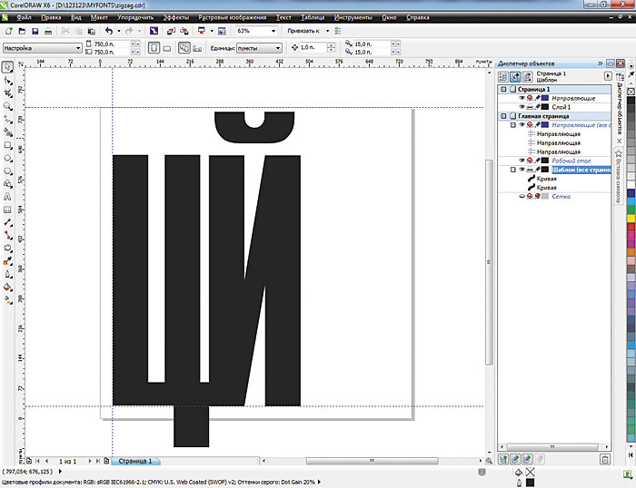
Fig. 1. Creating a master layer for the template
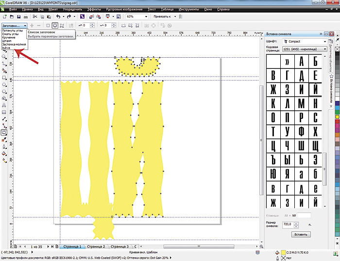
Fig. 2. Pattern letters with protruding superscript and descenders after applying the effect of “distortion”
The contents of the master layer will be visible on all pages of the document. Each character — in this case, a letter — will be placed on a separate page, “pulling” it out of the symbol table and applying a “distortion” effect. After applying the distortion, each character must be converted to curves.

Fig. 3. Insert the letter “A” from the symbol table, apply the “distortion” effect, and translate the symbol into curves
These operations are repeated until all capital letters are created. As a result, a multi-page document appears. For lowercase letters, you can create another template and work in a separate multipage document.
When creating symbols with “slanted” elements, for example, the Russian letter “D”, it is better to move the symbol to the edge of the sheet by the vertical guide. So it will be possible to reduce the distance between a pair of characters - the letter D and the letter preceding it. Otherwise, due to the inclination, the distance in the pair of “DG” will visually appear larger than the distance between the other letters. Professional font developers solve this problem by fine-tuning the distances between certain characters by specifying kerning pairs.
When exporting characters to a file, we set any file and font name names, but, of course, it is better if the names match. You can create fonts of various styles - bold, oblique. You can collect all the frequently used characters in certain design layouts into a single character font, or you can create a “different” font, generating individual letters. If you want to, we will make a font that imitates handwritten, sometimes deliberately careless letters. And we can scan our own awful handwriting and then modify it in a vector format. In the template, if we want, we change the distance between the base lines, thereby reducing or increasing the distance between the letters and the width of the letters themselves.
From glyphs to fonts
But back to the design of our font. We turn set of characters into a font.
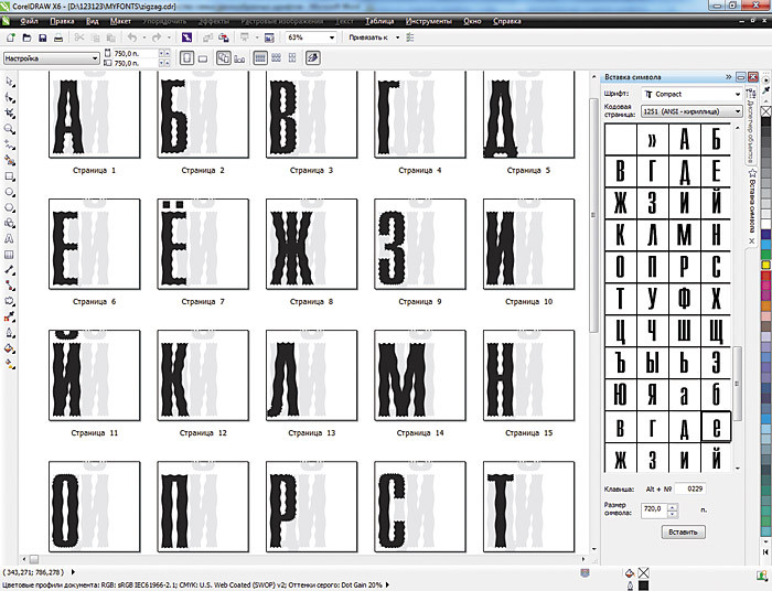
Fig. 4. The final multi-page document with capital letters-symbols of the "prickly" font
Select the letter “A” on the first page of the document, open the “File • Export” menu, select the format in which we will export the symbol, TrueType , enter the name of the new file.
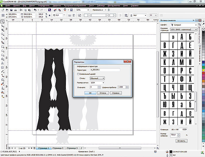
Fig. 5. Font parameters: the name of the headset to which it belongs; tracing; typesetting or character; the size of the grid in which the characters are represented; space width

Fig. 6. The window, which defines the parameters of the symbol and its position in the font
The "Project Size" window shows the initial character size. On the left is an example of a symbol with boundary lines and a base line. If “Auto” is on, the character width is automatically determined according to its original size and the amount of indent to the left. After turning off this parameter, you can change the width of the symbol in the example window or enter numerical values. In the right window - the position of the character in the font is determined. Already mapped symbols are highlighted in black. If you suddenly need to change the character settings during the export, you need to do this for all the characters in the font. After adding all the characters set the font in the system and see the result.

Fig. 7. The created decorative font allows working with text placed along an arbitrary path.

Fig. 8. The same font is selected for text in Word.
The font can be used by any applications installed on the computer.
Go ahead: custom template
It is accepted to create a pattern for designing letters, setting the document size to 750 × 750 points. The vertical and horizontal guides should be set at a distance of 30 points from the left and bottom edges of the document sheet. The character size must be at least 720 points (Y. Yarmola. Computer fonts. SPb: BHV, 1994).
However, it is sometimes useful to break the rules. You can try to create a font by choosing a document size of 1500 × 1500 points or a character size of 1000 points. Larger size - and you have more space for fantasy, tracing thin lines of objects and their smoothing.
Tips for beginners
For an experienced user, it is not important to have a template with images of letters, landmarks - it is enough and guides. He has a professional look, special. When a novice user masters the creation of a font in CorelDRAW, it is better to have a template before your eyes as a guideline. When there is no template, then approximately after the 10th “letter” symbol they already start “jumping”, “trembling” - the designer forgets about the upper bounds of the letter and the lower drawing element. And if in one document uppercase and lowercase, then it is easier to put another template for lowercase letters or create a new document.
Creating vector characters
This is the next step. You can "draw from scratch" each letter. You can apply interactive effects to existing characters of finished fonts. You can first draw letters on paper, scan, convert to vector format using tracing, and modify each vector object with CorelDRAW tools. It all depends on the desire, performance and artistic talent of the author of the future decorative font.
The composition of CorelDRAW included a large number of blanks of artistic brushes . Plus, each user can easily create their own brushes, diversify the standard set and expand it. To use this effect to create characters, follow the steps below.
Create a template, drag and drop the “C” and “Y” reference symbols onto the master layer, select the sample you like from the list of art brushes or create your own brush stroke. Next, apply this brush to the characters. The “Decorating” docker shows the last used brushes, which makes it easy to navigate and apply one favorite brush to all symbols of the future font. Do not forget to separate the result of applying the effect and the reference curve. To do this, there is the command “Organize • Disconnect the Decoration Group” . So, we leave only the symbol itself.
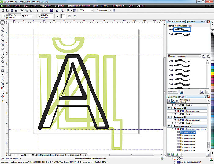
Fig. 9. Template for creating symbols and the result of applying to the symbol a stroke of an artistic brush
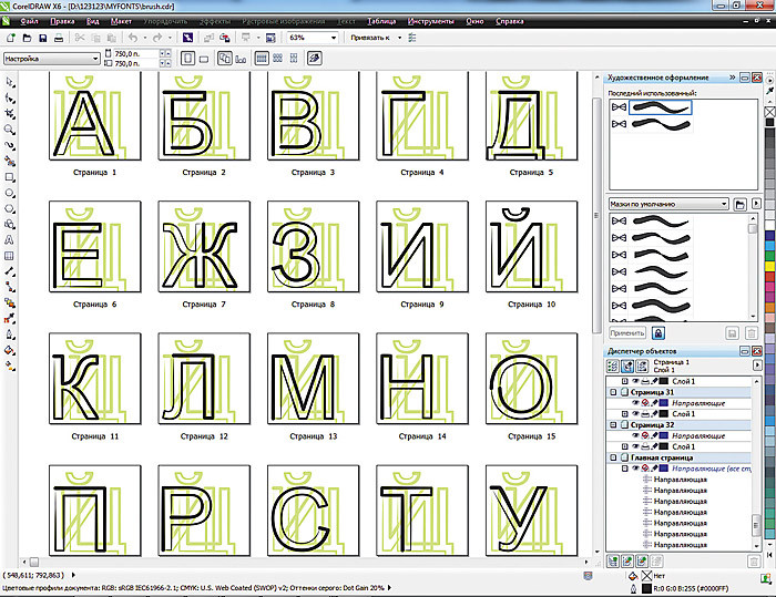
Fig. 10. Letters with the “Decorating • Brush” effect applied
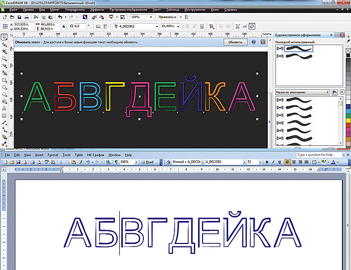
Fig. 11. Text in fonts with the effect of “Decoration • Brush” in the programs CorelDRAW and WORD
When creating characters from scratch, you can use drawing tools, logical operations to combine or cut out letter fragments (B, O, B). You can enter the letters in some simple or complex shapes.
For example, we created letters for the travel agency Tsvetik-Semitsvetik, inscribed in the outline of a seven-colors logo.
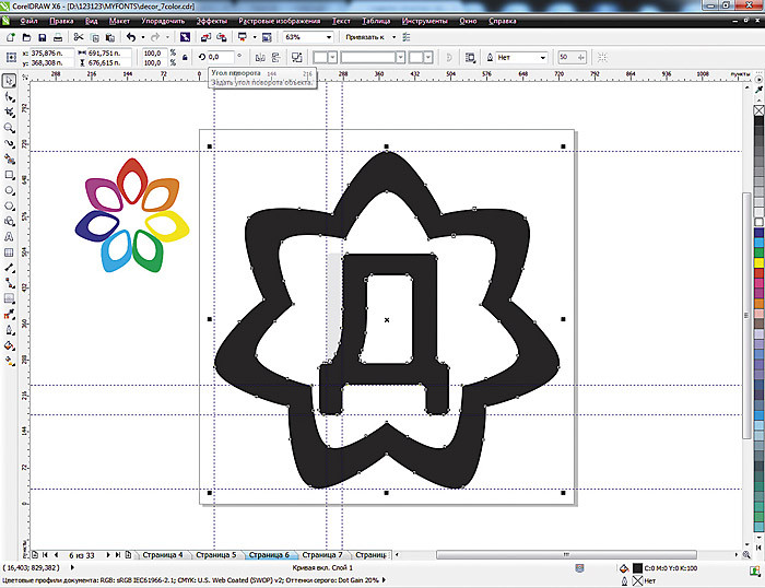
Fig. 12. Company logo and the letter inscribed in its contour.

Fig. 13. Multi-page document for “Seven-color” font
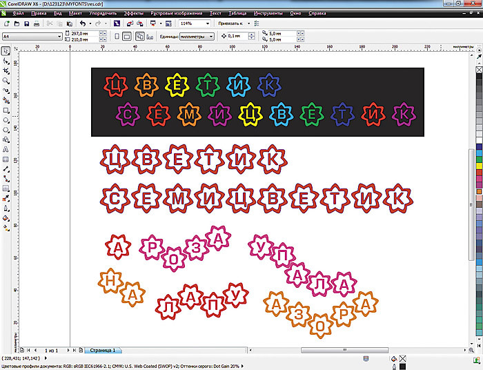
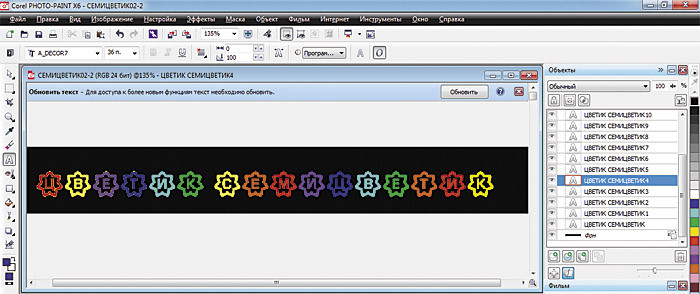
Fig. 14. The text in “Seven-color” font in CorelDRAW, which is also used for the basis of the animated banner created in Corel PHOTO-PAINT
Modify the classics
CorelDRAW has the ability to modify classic fonts beyond recognition, using a variety of techniques and effects - from artistic means to interactive distortion, blending or contour. You just need to remember that such a modification and the subsequent use of the resulting font for commercial purposes may be contrary to the agreement you adopted when purchasing the font.
Combining objects is a useful method for creating alphabetic characters. Each vector editor includes tools for combining, combining, cutting, intersecting, etc. You can create fonts from combined different symbols (Frankenstein). You can combine characters directly in the editor. You can apply a combination immediately to a group of characters, which significantly speeds up the work, for example, correct the error by specifying one element for all to replace.
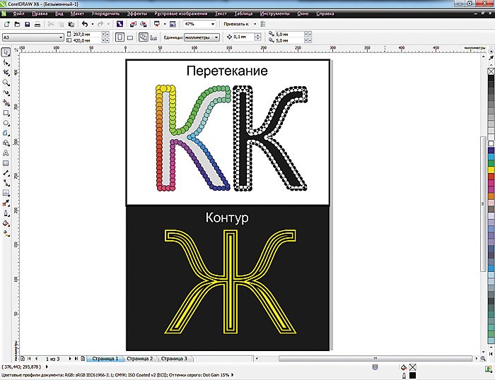
Fig. 15. Blanks for a possible font. Applying the effects of "flowing" and "contour"
After applying any effect, it is necessary to separate the interactive effect group and, combining all the objects, convert it into a single curve.
You can use the method of converting to a raster halftone image by selecting the appropriate type of conversion to halftone - lines, curves, square. Then trace the raster images and, converting them into a vector format, convert into a single curve.

Fig. 16. Examples of letters with imitation of a halftone screen of different types.
Down with the routine!
Is it tiresome to repeat the same routine operations, applying effects and consistently creating each character? Save the preset of the applied effect, write down a temporary macro, or create your own new macro by recording the entire sequence of your actions using the example of a single letter-symbol. Using the macro, you can quickly and easily modify the remaining characters of the font.
"Manual" font
If you do not shy away from manual work and want to create something completely special or to “remove” a rare font from a paper document, then you will be interested in learning how to draw symbols manually, scan and modify them in a vector editor.
For example, we scanned the page from the story of Arthur Conan Doyle “dancing little men”. The image is small, and I had to scan it with a resolution of 300 dpi. If the blank is the characters of a sufficiently large size drawn on paper, then you can scan them with a lower resolution - 72 dpi and in the Grayscale or Black & White color model. The symbols that we export will be in one color. In addition, they must contain the minimum number of nodes.

Fig. 17. Scanned image

Fig. 18. Tracing the outline in the “detailed logo” mode
As a template, only basic guides for height and width of letters are used here. Take for now only a few letters needed for one inscription.
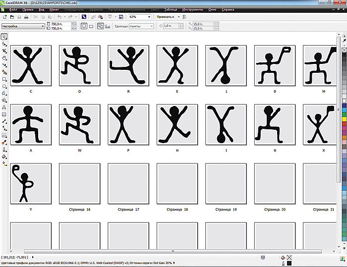
Fig. 19. Multi-page document with letter symbols
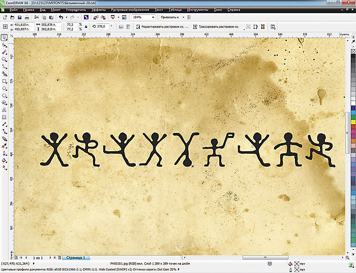
Fig. 20. This is the inscription "CORELDRAW"
View the created font on the screen and print a few lines. It is possible that in print it will look different. Experiment more, look at the headsets made by professional developers.
Glyph rules
Symbol (glyph) - can not be a group of objects, multi-colored, raster or have a huge number of nodes. And when we deliberately distort it,
the resulting characters in the font after installing it into the system are also distorted or the subsequent fill is distorted. So it is better to translate the workpiece into curves and double-check once again.
Strive for excellence
The font in the arsenal of a designer using CorelDraw software is one of the main tools that will create the necessary impression of the work done. Why do designers use such a huge number of different fonts? Yes, because the visual perception of the font helps clarity of information. You can send an SMS with smiles, or you can write a short joke in a funny font. And, of course, business documentation, presented deliberately clumsy children's handwriting, will cause confusion among the partner. Finally, some kind of lettering may appeal to a specific customer, and some not. With such a powerful tool for creating new and using classic fonts like CorelDraw, we can almost always and accurately guess the very one and only font that will make our work perfect.
About the authors: Elena Svistunova (elensvs@yandex.ru), computer graphics teacher; Alexander Svistunov (alexsvs@yandex.ru; alexrash.livejournal.com ), writer, director of the Internet company InterNext.
Based on COREL Magazine
Source: https://habr.com/ru/post/201900/
All Articles