The harsh realities of contests in runet. How uCoz bred designers
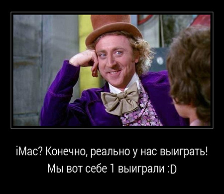
Recently I came across a banner on the network with an advertisement for a contest on the design of the blog Yukoza. The prize is iMac 27 ". Honestly I wanted to pass by, but I was enticed by the fact that the professional jury would evaluate the work without the influence of social likes. How I was naive.
"Well, I myself angry Buratino that climbed there" - you say and ... you will be right!
Earlier, I avoided contests in runet, but participated in foreign contests. For example, won the competition from MSI. I hoped that this will work.
')
Then I will give a couple of tips on such contests. Honestly, I did not follow them myself. He “stuck” into the contest on the last day as soon as he passed the session, defended his coursework and all the checks.
Council number 1. Do not participate in design competitions in runet
For free and salt sweet, as they say. But freebies are most often received by the organizers of competitions in runet.
The design is subjective, so you can easily find the reason for which they will refuse. For example, "Your blue is not enough orange" or "You have not played enough with fonts." Once I saw on freelance how the author of the contest wrote to all the contestants “Not hooked. I do not know why". Beyond that, even the missile pro trolls. The contest lasted 2 months and ended in nothing. The author received a lot of ideas and templates for free.
Council number 2. Rate the organizing company itself
Find out the history of company contests. It is possible that competitions have been held before, so there may be useful reviews about the company on the Internet.
Look at the company sites. If the sites show that companies are so mean that they are even greedy to spend money on themselves, then iMac clearly does not shine. He has long been shining in the face of an employee of their company.
Council number 3. Read the information about the competition not only on the official page of the competition
Blog, forums, informational portals. Maybe already somewhere there are angry reviews about the competition and the company itself, or vice versa positive feedback. Do not waste your time if you know in advance that the prize went to "his people."
Council number 4. Learn more about jury members.

Do not buy into the phrase "Professional jury". The jury members in the comments to the conditions of this competition wrote about the importance of usability and correctness of semantic accents. After completing the reception, I fell asleep and walked through the jury sites:
- usabilitylab.ru (the name does not match the quality of the site)
- rotapost.ru
- ekozlov.ru
And I realized that usability assessments would be very unexpected.
Council number 5. Read the comments to the works of the contestants
Do not be lazy and read. Suddenly, it may turn out that the IT department of the organizing company itself participates in the competition besides you. As one of my friends says: "nezhdanchik."
Eh, if it could at least suggest and read the comments on the very first works, I would definitely not participate. I could not even think that one of the workers could be so stupid as to publish it under her. It turned out that there is a whole gang of uCoz under their own and made-up names.
Yes, I know that these are tips in the style of Captain Obvious. But suddenly someone opens their eyes to a new one. I wish you fair contests.
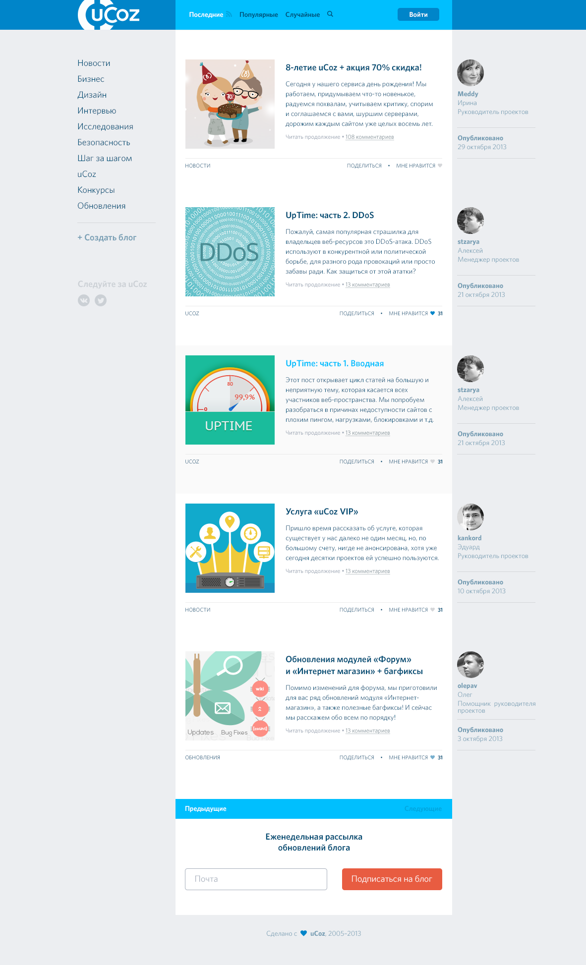
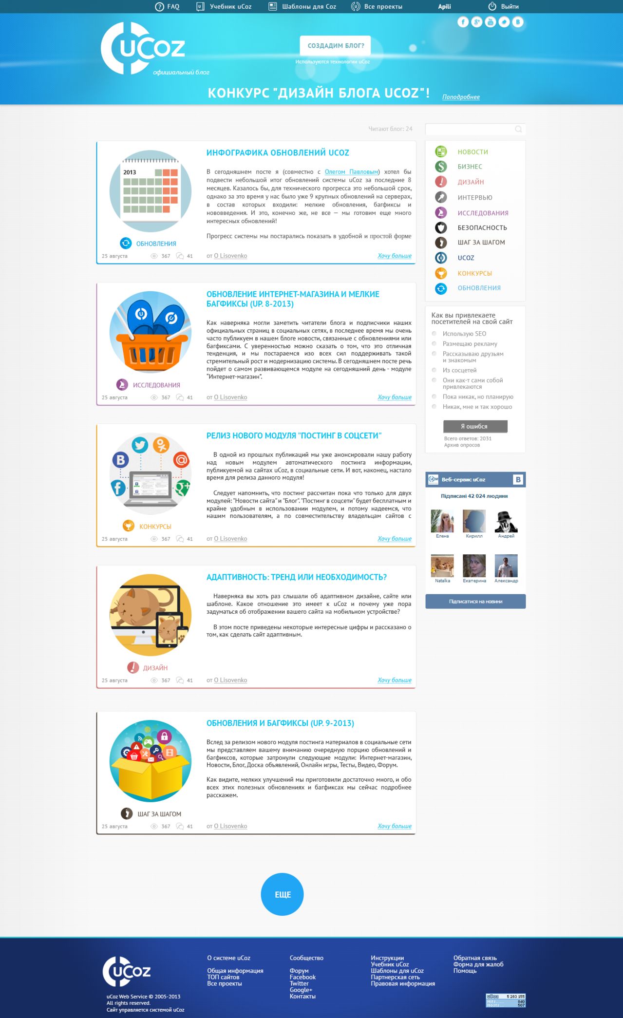
Works of participants
Next will be some of the work of the participants. You do not need to read this part. However, I will give some comments and some may be useful for you if you create the interface or even make out the abstract.
Design Discussion
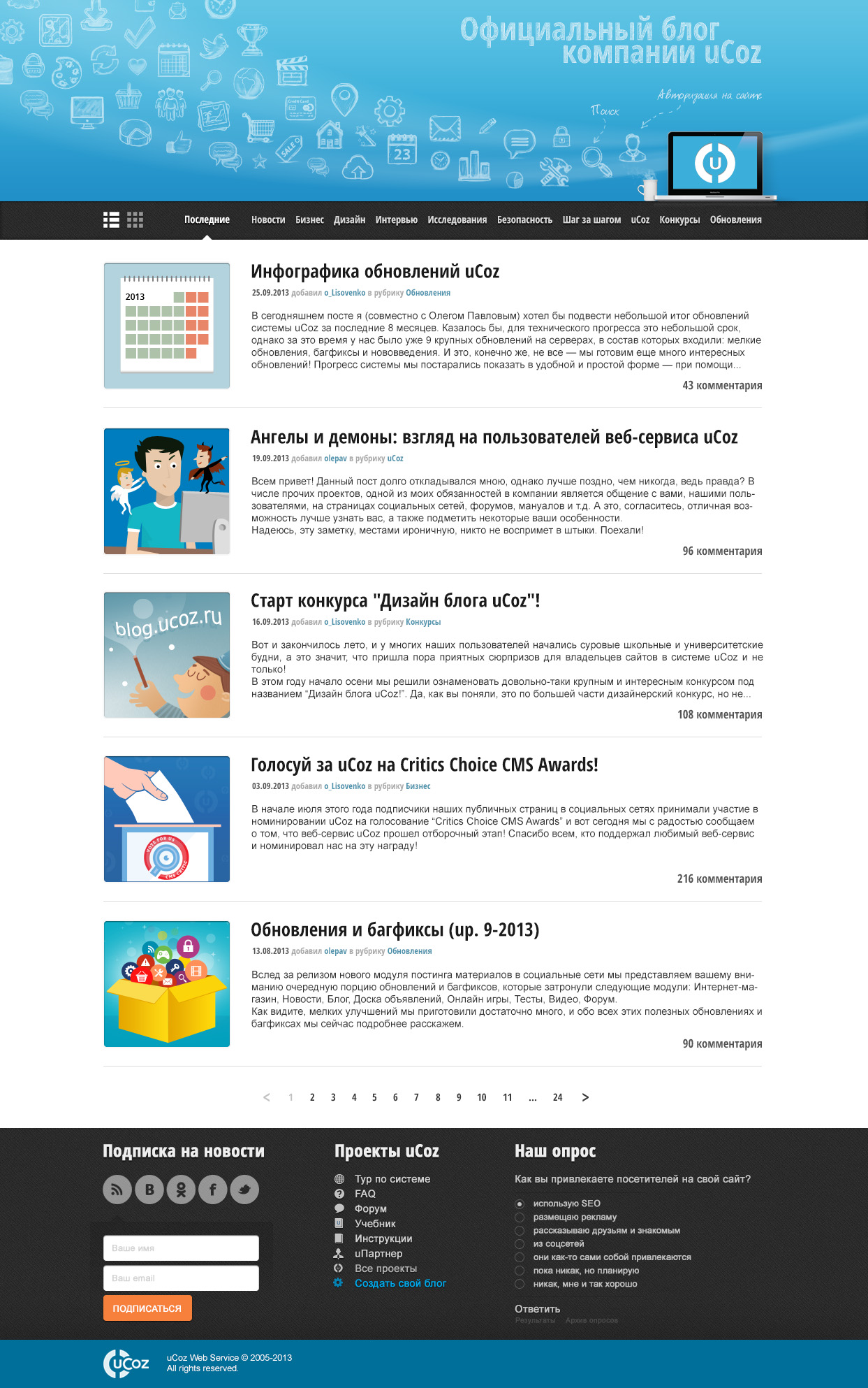
The task of the competition was to draw a design:
Mostly main pages were published.
Awful source (in fact, the page is 3 times longer):
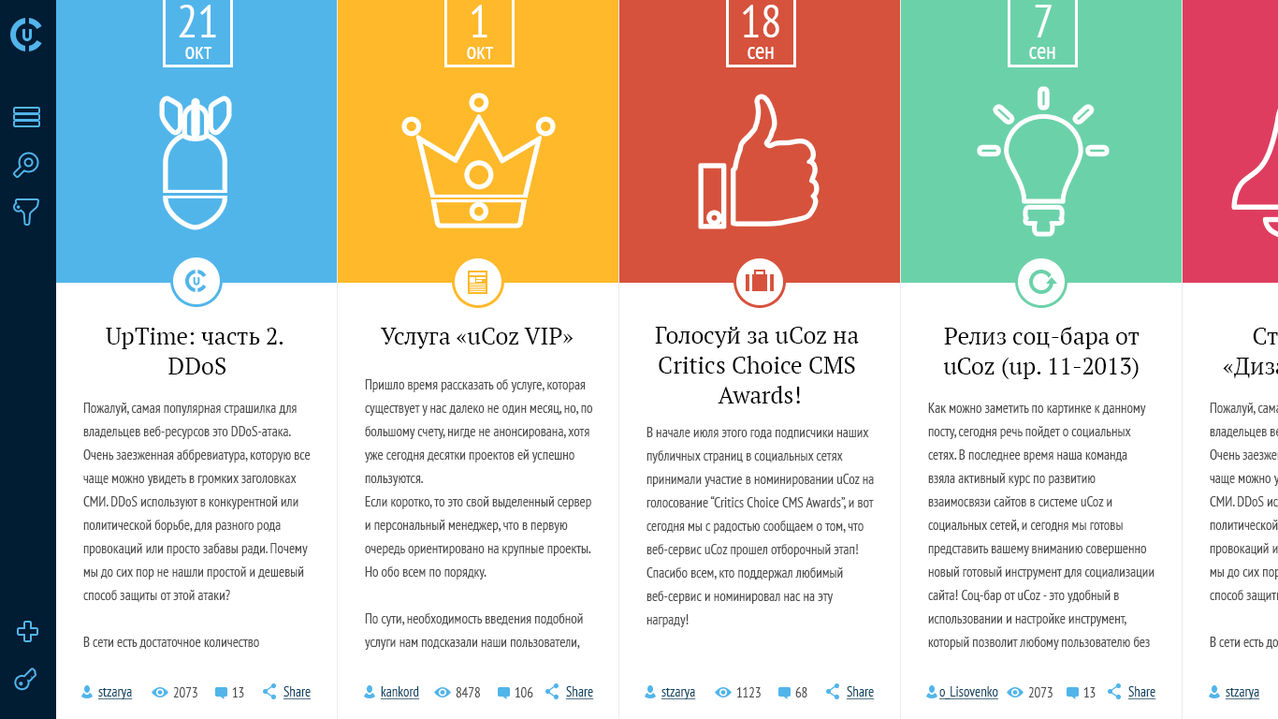
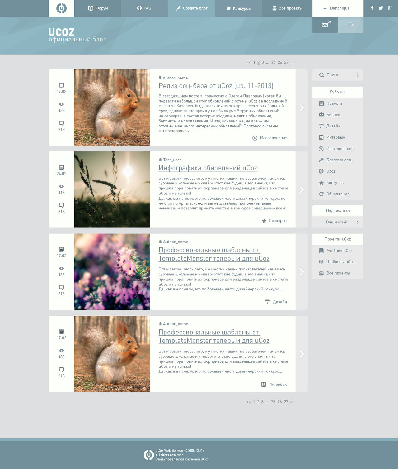
There were more than 170 works. As a result, 2 lists were published: semi-finalists (27) and finalists (21)
Almost all the works in the record are inserted in full size, that is, you can open in a new tab for viewing at 100% scale
With a couple of improvements, IMHO, worthy of the final.
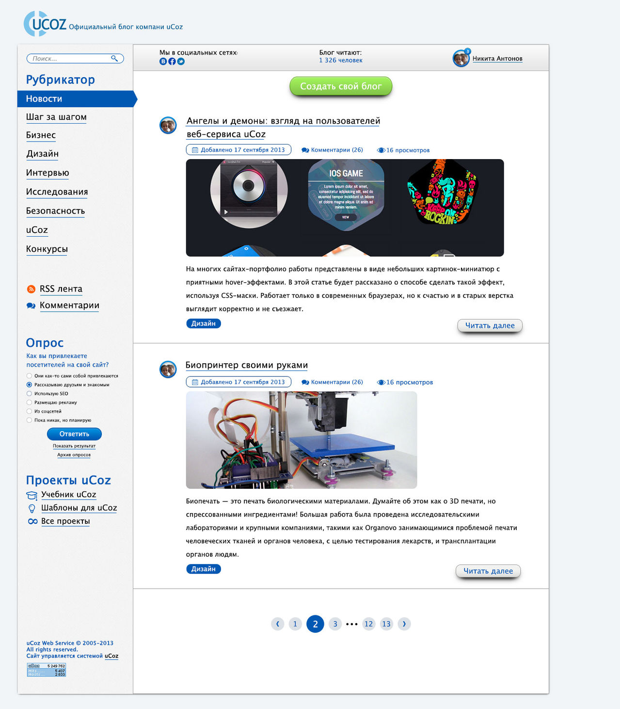
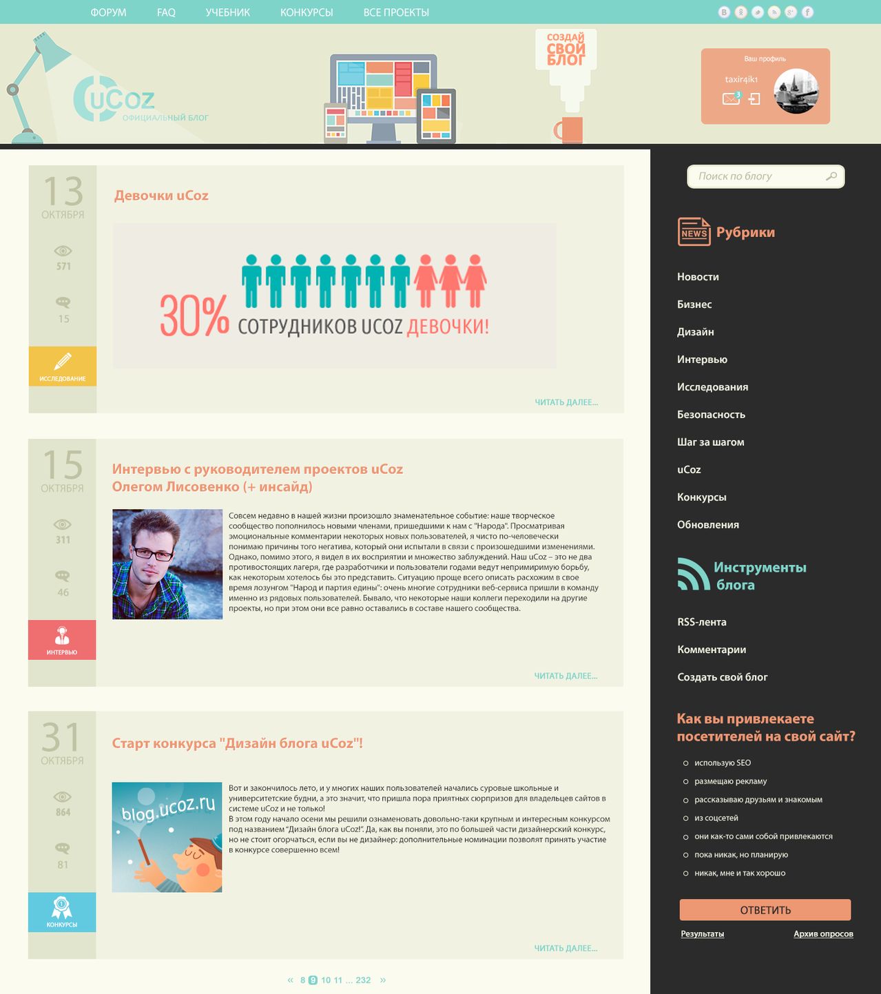
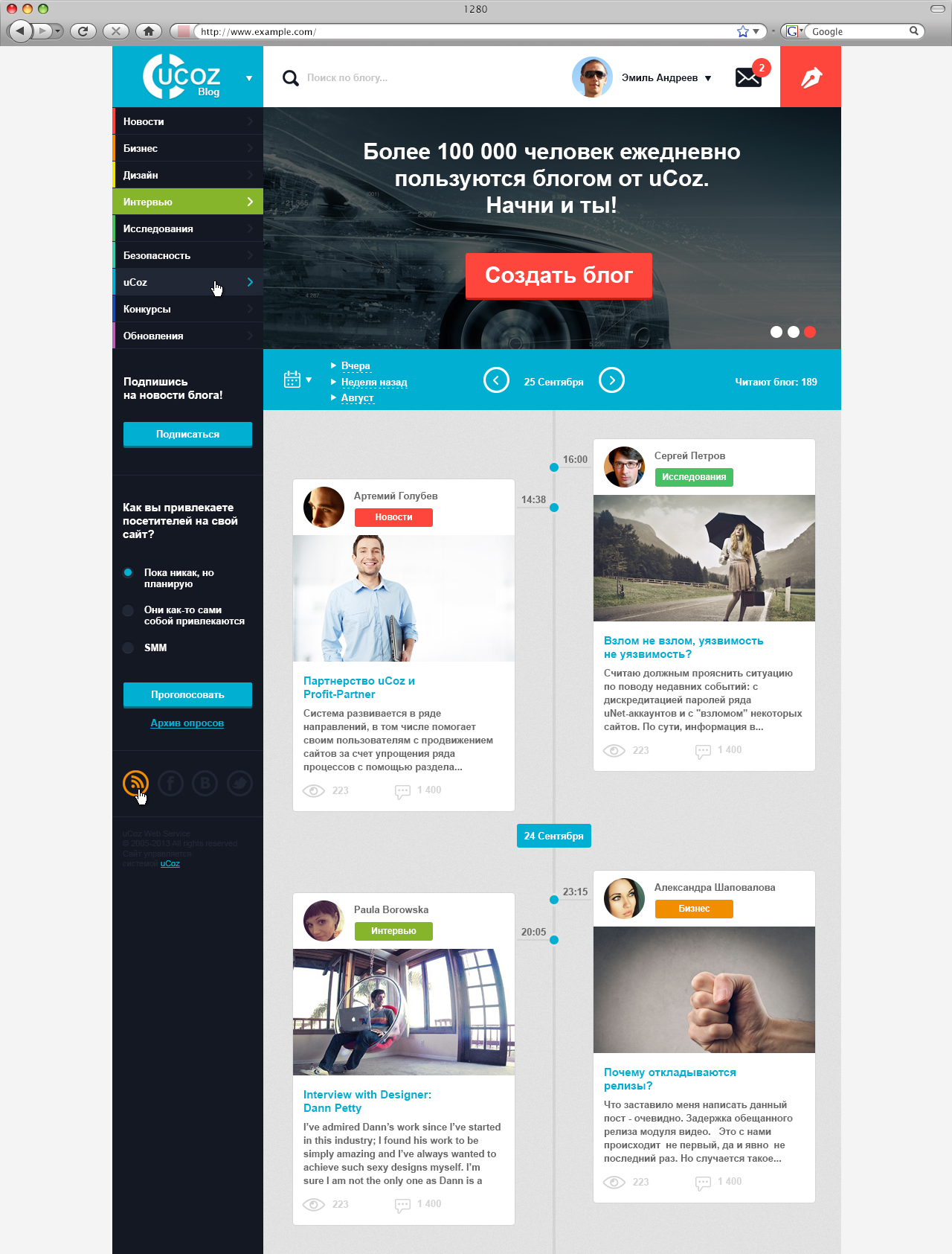
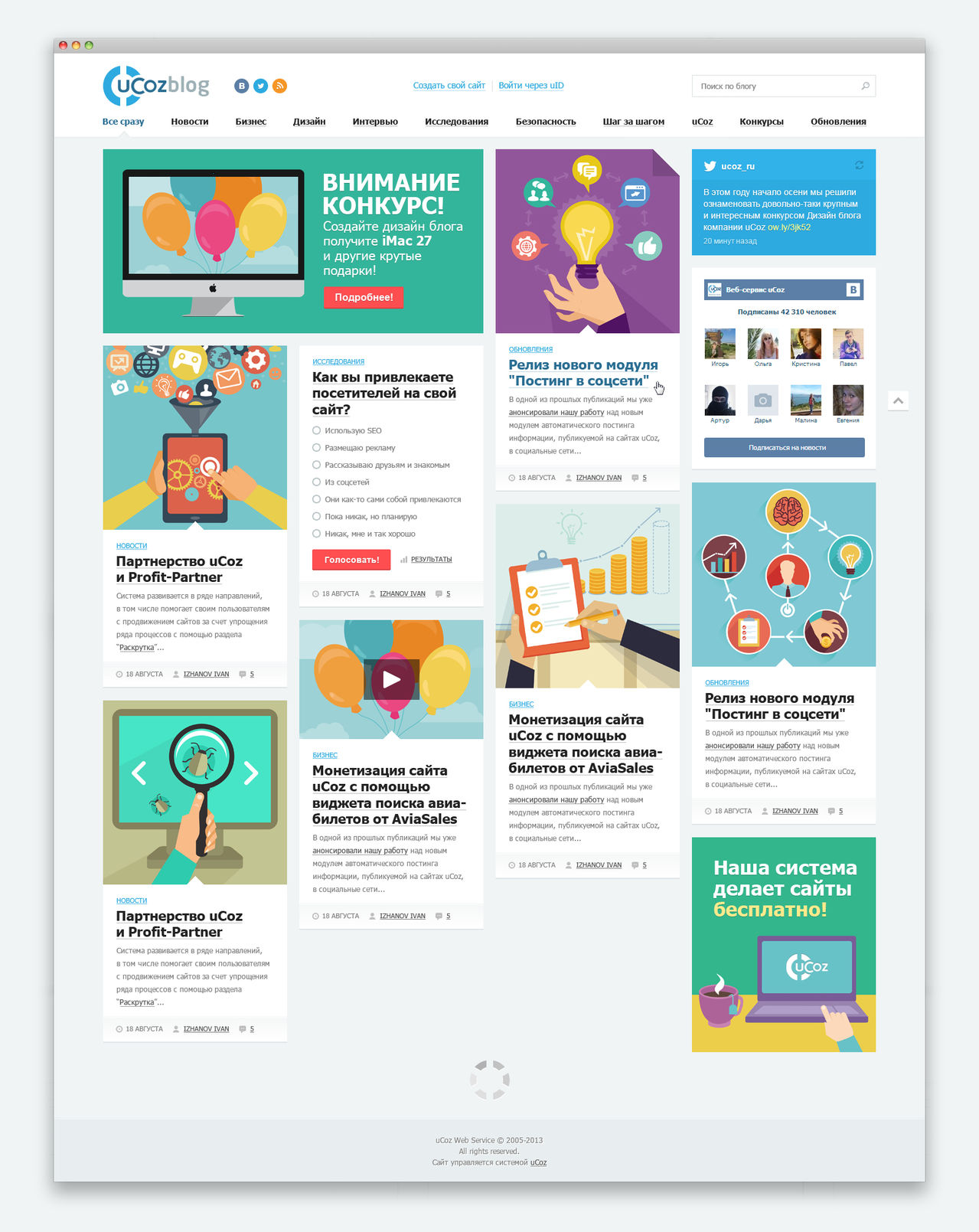
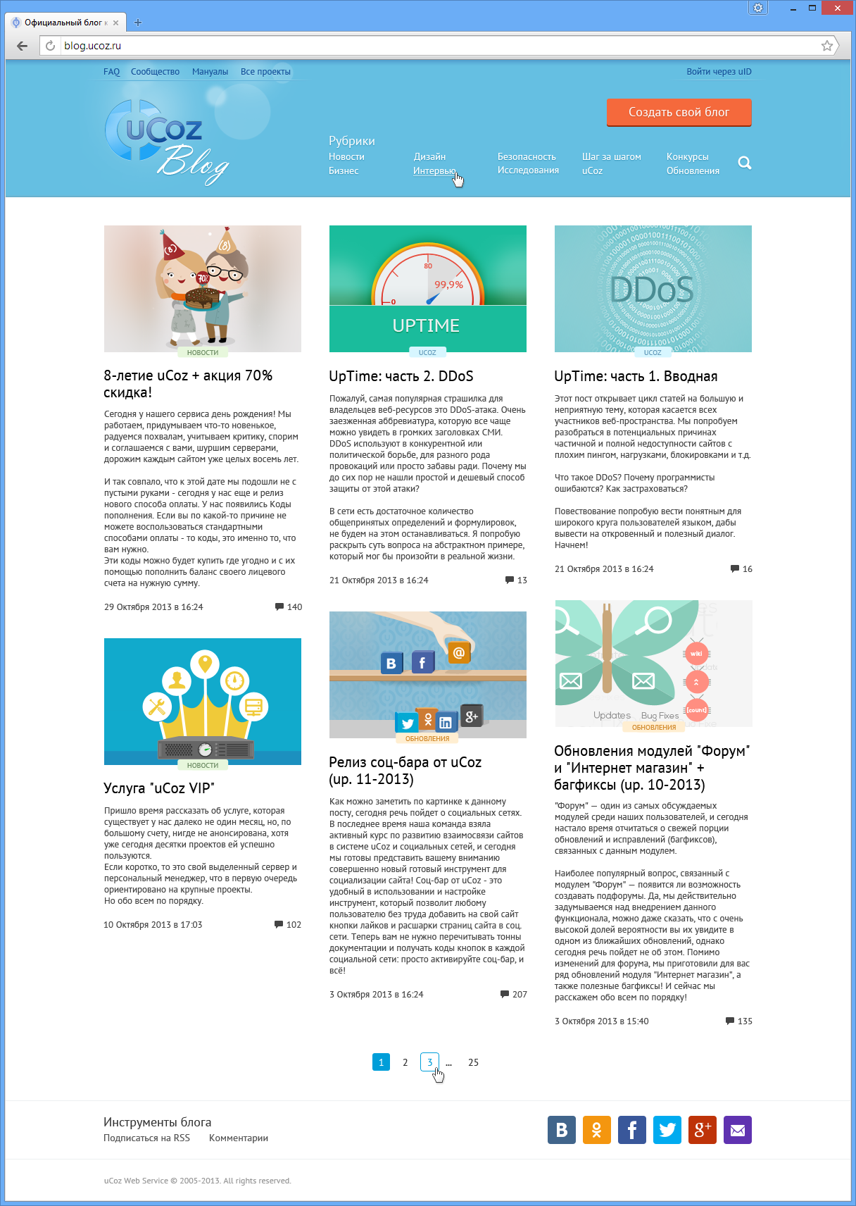
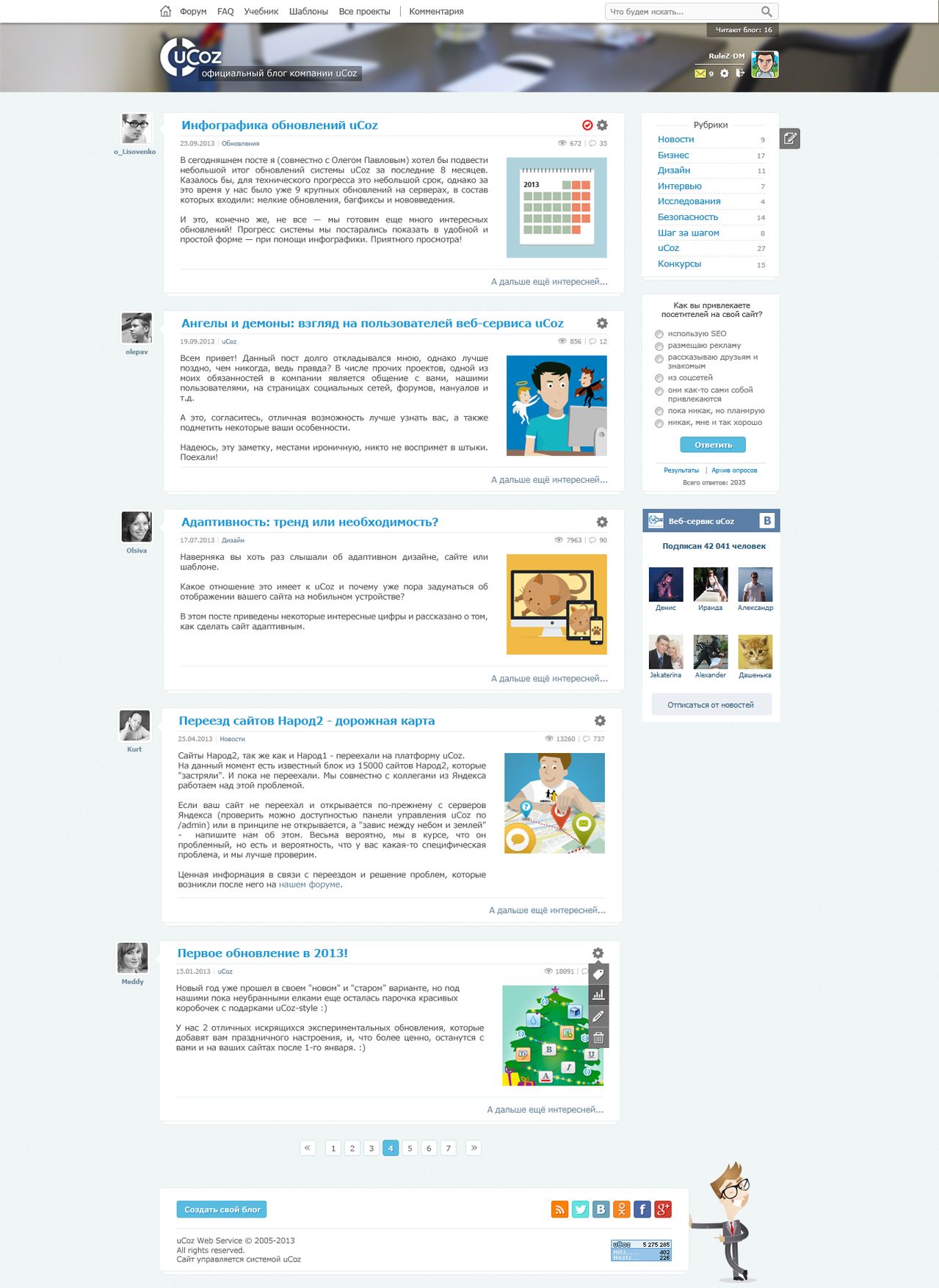
- Blog homepage blog.ucoz.ru
- Post page with comments
- Pop-up user profile page (680x350 pixels)
- UI design elements (add / reply to comment, button style, etc.)
Mostly main pages were published.
Awful source (in fact, the page is 3 times longer):
There were more than 170 works. As a result, 2 lists were published: semi-finalists (27) and finalists (21)
Almost all the works in the record are inserted in full size, that is, you can open in a new tab for viewing at 100% scale
At the beginning of the list are the most "pearls" of the semi-finalists:
See the semifinalists pearls
So, over Jonathan Ive, probably no one scoffed. The author introduced himself as the chief designer of Apple and described how cool everything is. I do not know how this work was allowed to compete. Half of the interface elements are completely absent.
The average word length in Russian is greater than in English. Therefore, do not use off-text formatting (especially in narrow columns). Very “liquid” lines and noticeable “corridors” and uneven spaces between words are obtained.
Probably a worker of yukoza. No 70% of interface elements, but semi-finalist.
An inexperienced user will put this design in a stupor for a couple of minutes. Experienced for a couple of seconds will understand that he was pleased in the blog with articles horizontal scrolling. Such a scrolling in a blog with articles is quite a controversial and unusual decision.
Next, users will begin to look for a way to interact with the site. There are no controls for scrolling entries. Pull the records, scroll the mouse wheel, control the arrows with the keyboard or "freak out" and close the site? By trial and error, the user will find a working version. There is another option to move the scroll bar, but from experience, you probably know how difficult it will be to accurately get to the desired range. After such anguish, you hardly want to go to this site next time from the Google search query page.
Let me remind you that good usability is the main selection criterion according to the jury. Yes, we see.
Only the question: “How did it go to the semifinals?” The performance is like a demiart.
The corporate color of yukoza is blue. But the author did differently and low contrast. In the composition, the dark right column is balanced by a large light area. It is right. There is no visual collapse of one side of the layout. Most did not think of it.
Note: Dark and saturated colors are visually heavier than light colors. If you want to achieve harmony, then you need to balance the dark part in proportion to the light part. Sometimes this rule is broken in order to create some attractive tension in the design. But do not overdo it. Your design may begin to "push" on the user.
It would hardly fit the site on which the records appear once a week. The author did not think it over and there will be gaps in the center of the main one.
In some places low contrast. The picture is the focus of attention of each individual record, so the order should be as follows: the picture is a lure, then the eye goes to the title, and then the text of the author and the category tag that does not hit the eye.
For a blog, it will be a brain explosion. Found where the survey?
Some uncomfortable sketch. Limited space on the monitor can and should be used more efficiently.
Such a mourning blog will be when yukoz bends. The composition is unbalanced (heavy left part), readability in the dark part is low. The arrangement of elements is controversial.
The font size for the main text is very small, and the distance between the lines is very large. Because of this, the text crumbles. It is better to use leading information about 1.5-1.75x for the main test (for grotesques with a large height of lowercase letters, more is needed), and for headings 1-1.25x is usually used.
There are still many pearls among the semi-finalists. There are generally bright red festoons that will tire you with their bright spots while you read the article.
"Pearls" of the finalists
See the pearls of the finalists
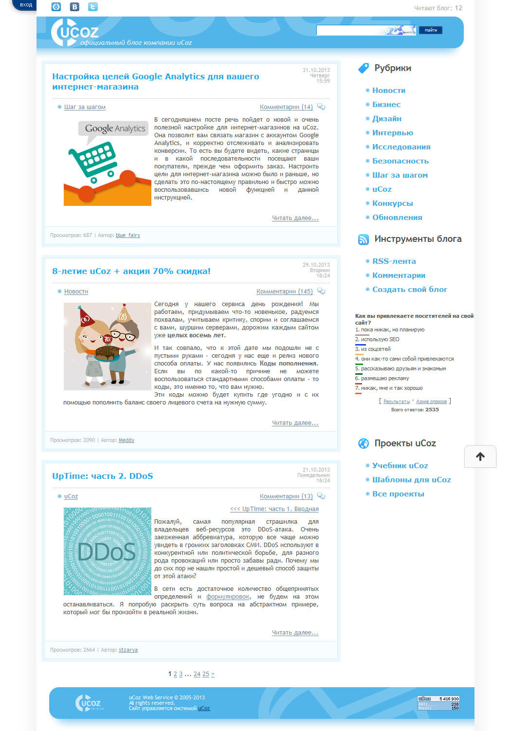
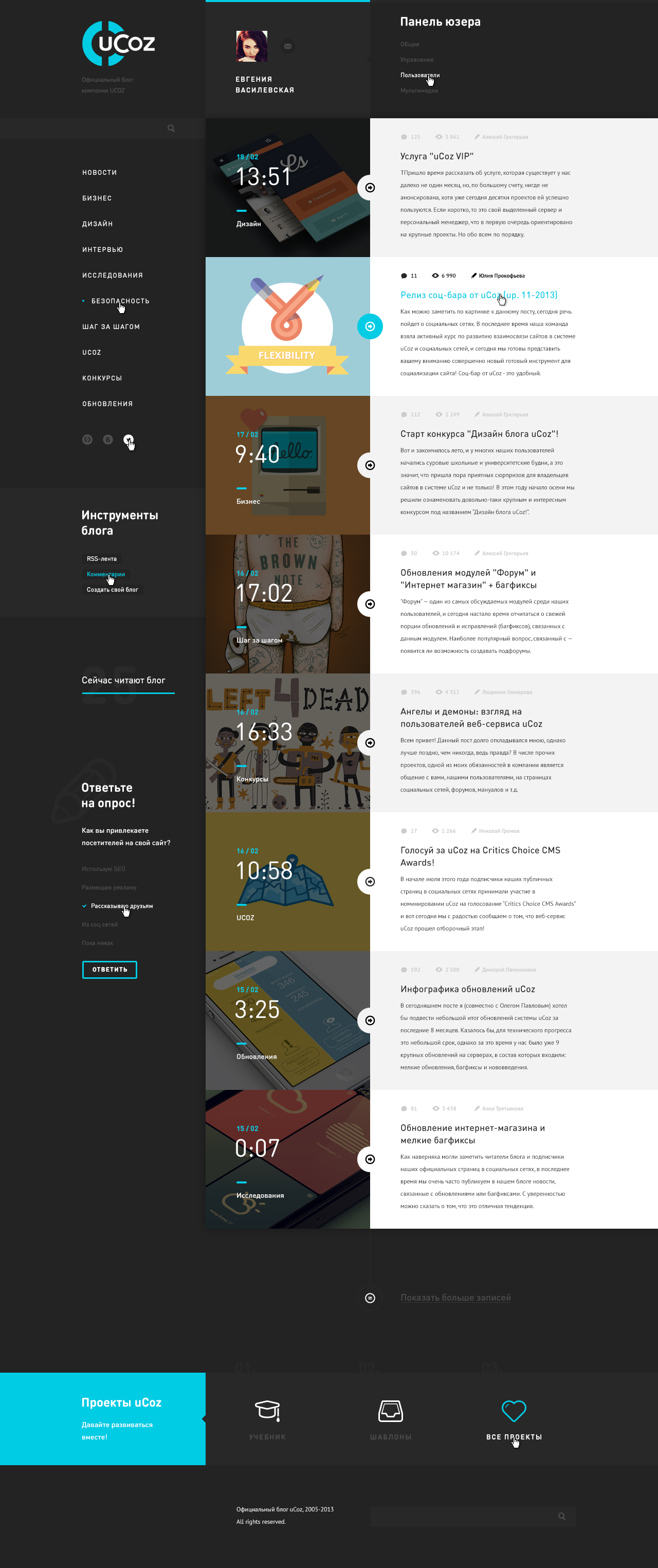
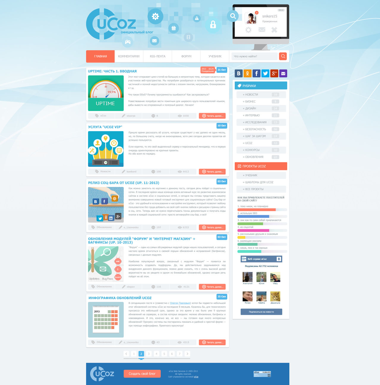
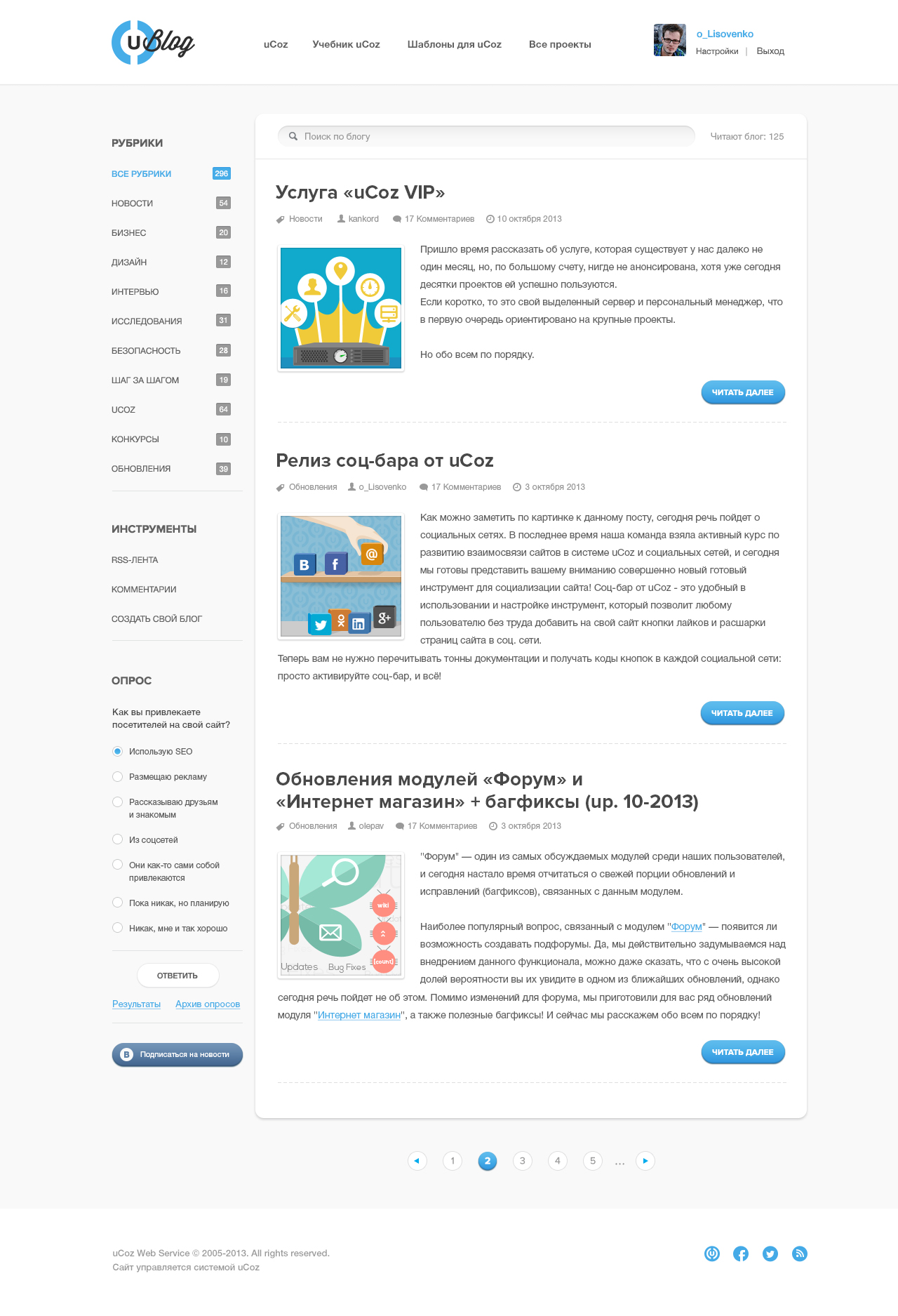
Actually the designer (wrote that the presenter) of the uCoz company heads the list of finalists:

I must say that of all her works, this is the best. To the rest were negative comments from visitors. Therefore, the final is not dedicated solely to this man.
Initially, in the comments to the work were claims of other participants due to the fact that the employee is officially involved, and her superiors judge. There were also objections to the fact that her work was completed 9 days before the announcement of the competition itself.
Functionality is not fully drawn. The right column is clamped at the most do not want. In dates for posts used months with a short name. The remaining 8 months, for which the name of the month is 2 times longer, no longer fit. In the news somewhere, alignment to the left, and somewhere in format. The girl did not align the pagination and close the hole at the bottom of the site. She can, she is a colleague. It is strange that the cap does not use the logo of the native company.
Note: if you make a block like "Our faces", then it is more correct to place the avatar first, and then the text. People are primarily attracted by faces and images, and then we follow from left to right to the text.
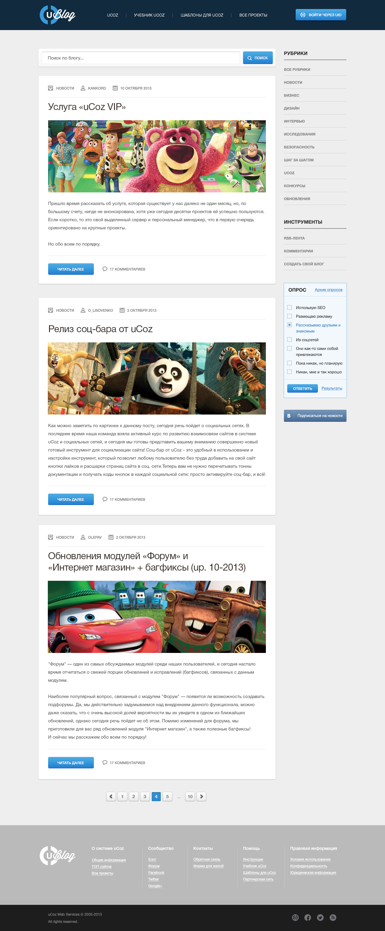
Grayness Functionally something incomprehensible. Especially the top menu (where is the emphasis on the "Create Blog" button?), Pagination. I would align the pagination with the center, and raise the right column so that the rubrics are on par with the news, and the search is on the pagination.
In the news the name of the author should not be above the title. The name of the section is located where we are waiting for the button "More", "More" incomprehensible. Secondary information (date, views) are taken to the place where we start reading. She is not so important.

Rather outdated visual work. Why is the current date at the top?
The logo is out of the general style and has a glossy glare (like the “Create a Blog” button). In the logo itself, they squeezed the link “All projects”, which fights with the very name “Official block”. Still, the bright blue color attracts more attention.
Above the title of each entry is the author, the number of views. Headings themselves are mostly in 2 lines and underlined. Such underlining looks unusual and ridiculous. As in any printed matter, you need to place the title, and at the bottom of it emphasize 1 die.
Social likes are not needed here. We can not say that we like this article, reading only the title and introductory text? The "full text" suggests thoughts about fat people. Better "Read more" or "Read more."
Typography neahti. Pictures of posts, as in the case of the authors, should be placed on the left. Otherwise, we “run” with our gaze to the picture, and then we have to return to the description to the left against the usual eye movement.
Tip: If you have long headers and you want to use a large font size, then use special narrowed fonts, for example, Roboto Condensed. These styles are specifically designed for these situations.

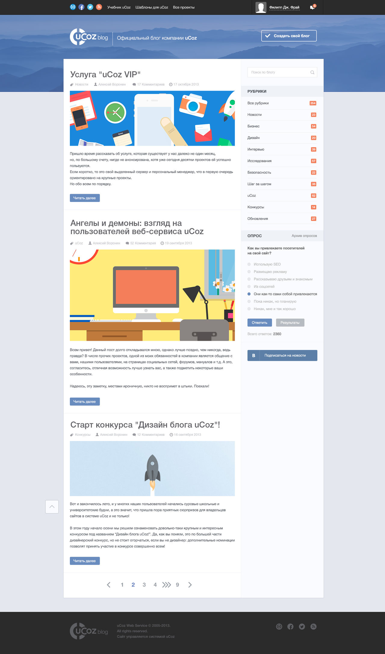
I do not think that this is 1 out of 21 finalists. There is a hole at the bottom.
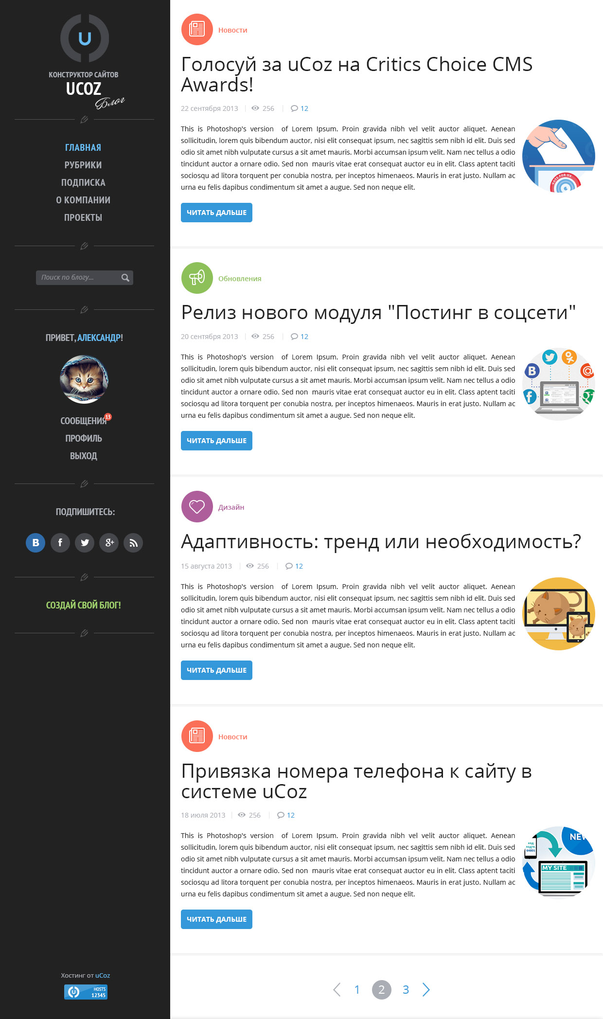
About posting pictures in posts wrote above. Section labels take up too much vertical space, are too catchy and should be in a different hierarchy. All important functions for the visitor: a list of categories, search, button "Create a blog" (brings profit to the company), user profile - hidden or moved down.
This is bad. Menu rubrics in 2 levels (they are not subordinate), the search is poorly noticeable. Part of the functionality is not drawn. With different lengths of materials, the user will constantly strain the brain, scanning the screen in search of headings. Despite their fatness, they will be located at different levels and the eyes will move like this / \ / \ / \ = / \.
Footer failed. In all blocks there are different indents. If you read the text inscriptions, then a lot of crazy stuff. In heder and footer chaotic arrangement of elements to fill the space. The arrangement of the elements in the design should guide the user around the screen as a guide to the museum, telling the story.
Too pale. In some places, elements in general cannot be distinguished from the background. Center alignment should not be used in this case. Every time the eye needs to look for the beginning of the line. The author, views and date are not so important as to place them just before the recording itself. In general, boring and fast.
5 years ago it would look good. About the pictures to the records and authors wrote above. From mobile devices on the links will get only true snipers. Even on a Wacom touchpad, you have to aim. "And then even more interesting ..." can be replaced by "More" or "Read more" without raping the visitor's brain.
If you replace blue with green, then there will be a design for the New Year's site. Attack on the brain in red. If a lot is highlighted, nothing is highlighted. Each red dot encourages a glance to yourself. The text is not very readable. The cap is large, but it has little functionality. I would remove the zebra (background alternation) from the menu and squeeze in the entries (adding more air). In the footer, it is stuck like a horrible to take a place.
The rest of the work will not describe, so as not to take up much space.
I must say that of all her works, this is the best. To the rest were negative comments from visitors. Therefore, the final is not dedicated solely to this man.
Initially, in the comments to the work were claims of other participants due to the fact that the employee is officially involved, and her superiors judge. There were also objections to the fact that her work was completed 9 days before the announcement of the competition itself.
Functionality is not fully drawn. The right column is clamped at the most do not want. In dates for posts used months with a short name. The remaining 8 months, for which the name of the month is 2 times longer, no longer fit. In the news somewhere, alignment to the left, and somewhere in format. The girl did not align the pagination and close the hole at the bottom of the site. She can, she is a colleague. It is strange that the cap does not use the logo of the native company.
Note: if you make a block like "Our faces", then it is more correct to place the avatar first, and then the text. People are primarily attracted by faces and images, and then we follow from left to right to the text.
Grayness Functionally something incomprehensible. Especially the top menu (where is the emphasis on the "Create Blog" button?), Pagination. I would align the pagination with the center, and raise the right column so that the rubrics are on par with the news, and the search is on the pagination.
In the news the name of the author should not be above the title. The name of the section is located where we are waiting for the button "More", "More" incomprehensible. Secondary information (date, views) are taken to the place where we start reading. She is not so important.
Rather outdated visual work. Why is the current date at the top?
The logo is out of the general style and has a glossy glare (like the “Create a Blog” button). In the logo itself, they squeezed the link “All projects”, which fights with the very name “Official block”. Still, the bright blue color attracts more attention.
Above the title of each entry is the author, the number of views. Headings themselves are mostly in 2 lines and underlined. Such underlining looks unusual and ridiculous. As in any printed matter, you need to place the title, and at the bottom of it emphasize 1 die.
Social likes are not needed here. We can not say that we like this article, reading only the title and introductory text? The "full text" suggests thoughts about fat people. Better "Read more" or "Read more."
Typography neahti. Pictures of posts, as in the case of the authors, should be placed on the left. Otherwise, we “run” with our gaze to the picture, and then we have to return to the description to the left against the usual eye movement.
Tip: If you have long headers and you want to use a large font size, then use special narrowed fonts, for example, Roboto Condensed. These styles are specifically designed for these situations.
I do not think that this is 1 out of 21 finalists. There is a hole at the bottom.
About posting pictures in posts wrote above. Section labels take up too much vertical space, are too catchy and should be in a different hierarchy. All important functions for the visitor: a list of categories, search, button "Create a blog" (brings profit to the company), user profile - hidden or moved down.
This is bad. Menu rubrics in 2 levels (they are not subordinate), the search is poorly noticeable. Part of the functionality is not drawn. With different lengths of materials, the user will constantly strain the brain, scanning the screen in search of headings. Despite their fatness, they will be located at different levels and the eyes will move like this / \ / \ / \ = / \.
Footer failed. In all blocks there are different indents. If you read the text inscriptions, then a lot of crazy stuff. In heder and footer chaotic arrangement of elements to fill the space. The arrangement of the elements in the design should guide the user around the screen as a guide to the museum, telling the story.
Too pale. In some places, elements in general cannot be distinguished from the background. Center alignment should not be used in this case. Every time the eye needs to look for the beginning of the line. The author, views and date are not so important as to place them just before the recording itself. In general, boring and fast.
5 years ago it would look good. About the pictures to the records and authors wrote above. From mobile devices on the links will get only true snipers. Even on a Wacom touchpad, you have to aim. "And then even more interesting ..." can be replaced by "More" or "Read more" without raping the visitor's brain.
If you replace blue with green, then there will be a design for the New Year's site. Attack on the brain in red. If a lot is highlighted, nothing is highlighted. Each red dot encourages a glance to yourself. The text is not very readable. The cap is large, but it has little functionality. I would remove the zebra (background alternation) from the menu and squeeze in the entries (adding more air). In the footer, it is stuck like a horrible to take a place.
The rest of the work will not describe, so as not to take up much space.
Interesting works that did not reach the final
With a couple of improvements, IMHO, worthy of the final.
See those who failed
Completely redo the polls. Give radio buttons a look of radio buttons, not checkboxes (checkboxes). Now their view is deceiving the user's expectations. Basement and cap add buns in the form of shadows and embossing as in the central part of the design. Replace the gray color in the basement.

Interesting job. I would translate it into shades of blue and increase the contrast of the text in the basement.
If you read Add Air! Basics of visual design for graphics, web and multimedia ”(K. Golombinski, R. Hagen), there much is said about the relationship of the title, illustration and text. I would place the text above the illustration and the text, since both of them are subject to the title along the hierarchy. In addition, we get a bonus - the smooth use of long headers. For headings, I would use bold instead of black.

Too fat headlines, too bright button details. Section labels out of place. The button "Create a blog" would transfer to the header (this is the company's earnings). About the authorization and the user menu is generally forgotten. We put in place social buttons, and put social buttons under the categories menu. Links are now merged with plain text. I would make the main text achromatic (in shades of gray), and made the links blue. Another option: the current text color and red links.
Interesting job. Change the shade of purple to blue, increase the contrast, rework pagination. Remove bold from headlines. Information about the record is placed under the button details. Make a couple more minor improvements to make it less gloomy.
Interesting contrast work. Requires some improvements. For example, horizontally mirror the image in the header so that the logo is on the left from where we start reading. Forgotten search and user menu.
Good detailed sketch, in which you need to add life in the form of color for the blocks and background. For example, a block of caps and a basement could be made in shades of blue or blue, and the background of the page is slightly grayish-blue.
I can hardly be 100% objective to myself. Frankly, I did what I did on the last day when I broke out of a heap of work and study. I would be grateful for your comments and edits.
Initially, I chose a pair of flowers with a shade of blue + orange. This is a complementary color combination. In addition to complementary contrast, this pair also creates a contrast of hot and cold. Red-orange is the hottest color, and turquoise (and closest to it) is the coldest.
PS Project manager of Yukoza (he accepted the works) congratulated on the future victory of their team in their competition.
Thanks ICELedyanoj for the hint how to align the pictures in the center.
Semi finalists
Completely redo the polls. Give radio buttons a look of radio buttons, not checkboxes (checkboxes). Now their view is deceiving the user's expectations. Basement and cap add buns in the form of shadows and embossing as in the central part of the design. Replace the gray color in the basement.
Interesting job. I would translate it into shades of blue and increase the contrast of the text in the basement.
If you read Add Air! Basics of visual design for graphics, web and multimedia ”(K. Golombinski, R. Hagen), there much is said about the relationship of the title, illustration and text. I would place the text above the illustration and the text, since both of them are subject to the title along the hierarchy. In addition, we get a bonus - the smooth use of long headers. For headings, I would use bold instead of black.
Too fat headlines, too bright button details. Section labels out of place. The button "Create a blog" would transfer to the header (this is the company's earnings). About the authorization and the user menu is generally forgotten. We put in place social buttons, and put social buttons under the categories menu. Links are now merged with plain text. I would make the main text achromatic (in shades of gray), and made the links blue. Another option: the current text color and red links.
Have not gone anywhere
Interesting job. Change the shade of purple to blue, increase the contrast, rework pagination. Remove bold from headlines. Information about the record is placed under the button details. Make a couple more minor improvements to make it less gloomy.
Interesting contrast work. Requires some improvements. For example, horizontally mirror the image in the header so that the logo is on the left from where we start reading. Forgotten search and user menu.
Good detailed sketch, in which you need to add life in the form of color for the blocks and background. For example, a block of caps and a basement could be made in shades of blue or blue, and the background of the page is slightly grayish-blue.
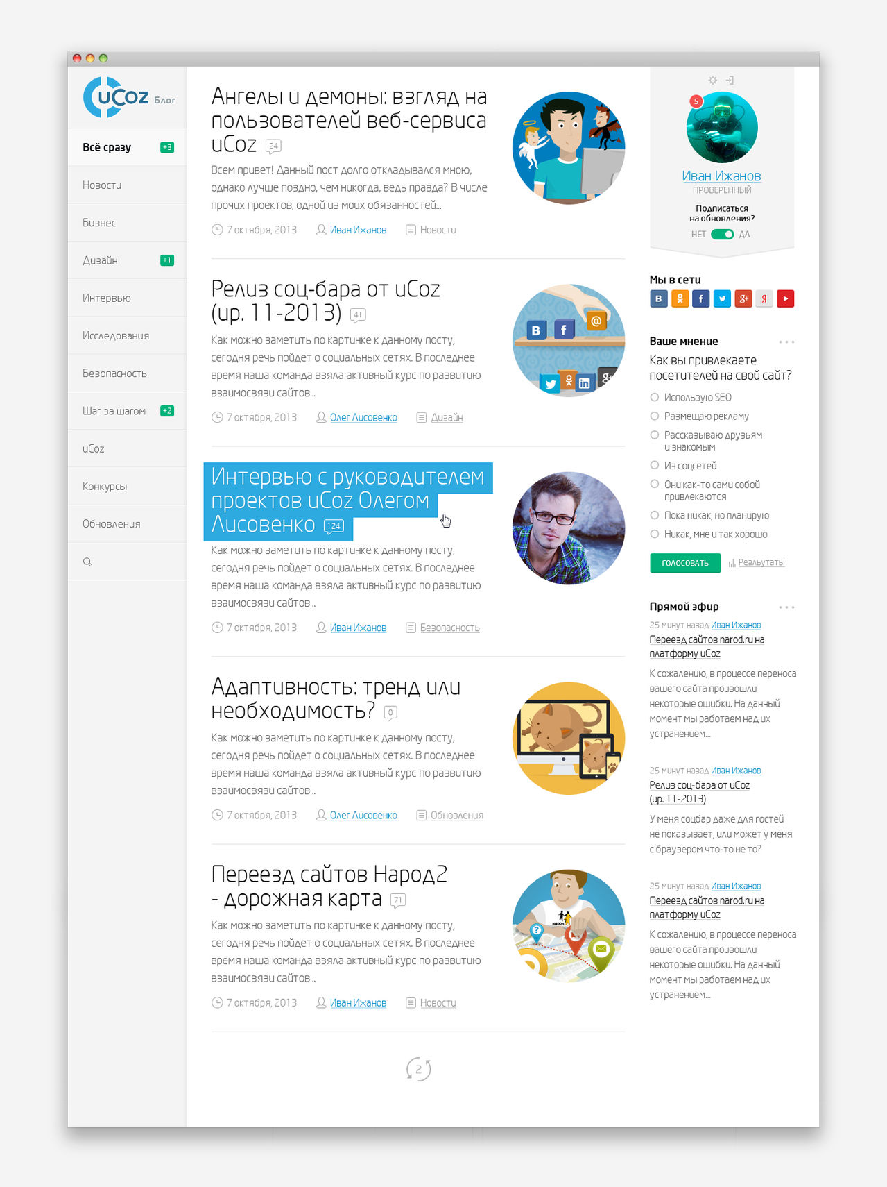
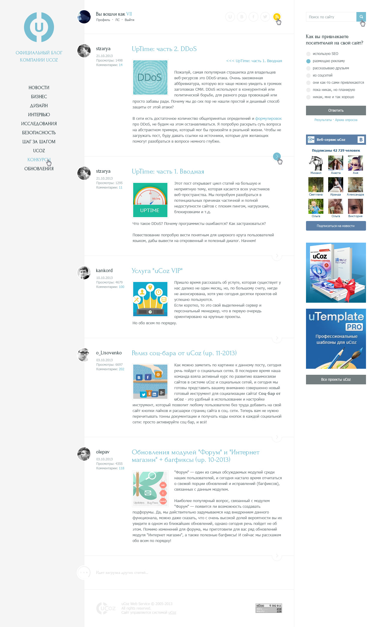
My works
I can hardly be 100% objective to myself. Frankly, I did what I did on the last day when I broke out of a heap of work and study. I would be grateful for your comments and edits.
Initially, I chose a pair of flowers with a shade of blue + orange. This is a complementary color combination. In addition to complementary contrast, this pair also creates a contrast of hot and cold. Red-orange is the hottest color, and turquoise (and closest to it) is the coldest.
View the work of the author
My work has not gone anywhere.
show work number 1
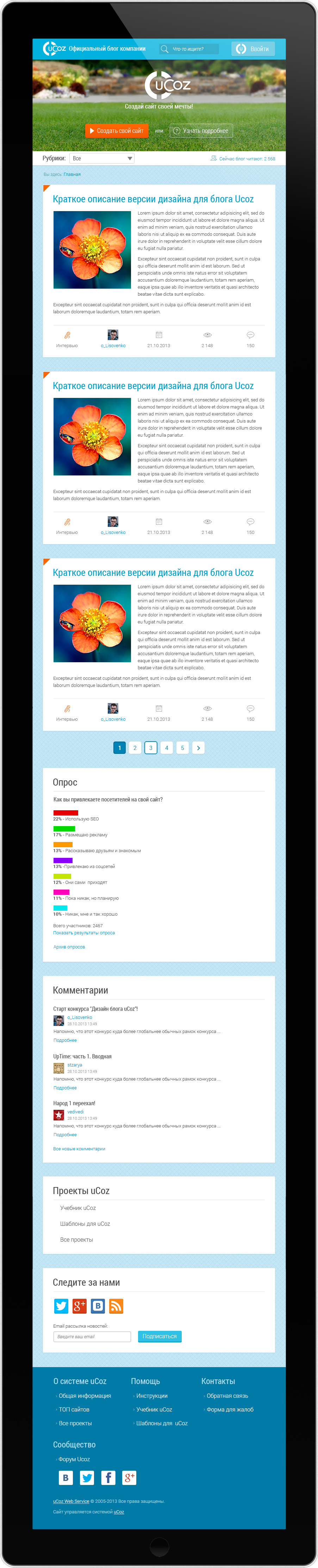
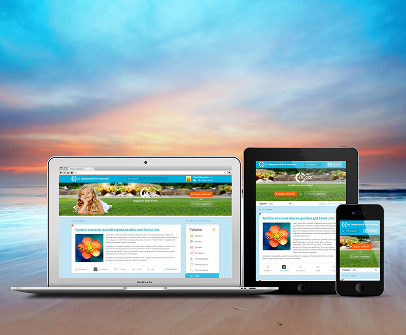
I immediately decided that I would make responsive designs and render them under 1200 pixels. At 960 pixels you have to squeeze it hard and the content just “suffocates”.
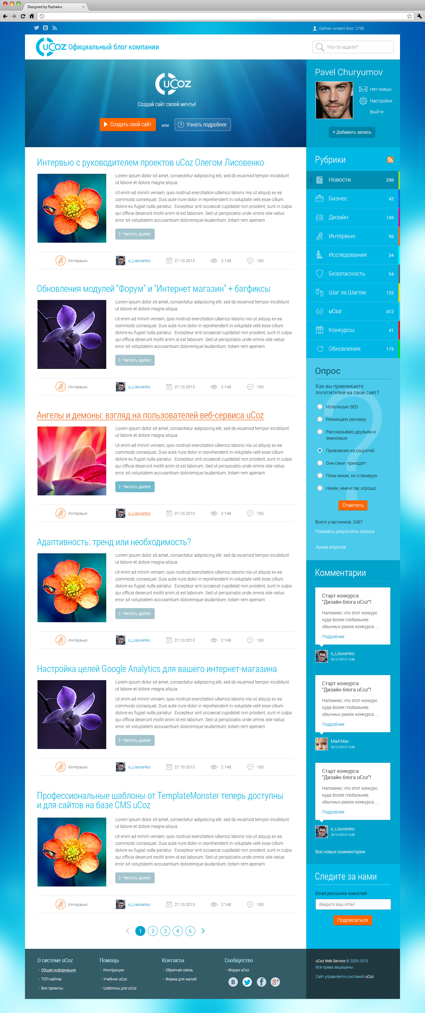
Home Page:

Immediately decided to write a description in the template itself. Suddenly the jury does not “fumble” in how and what.
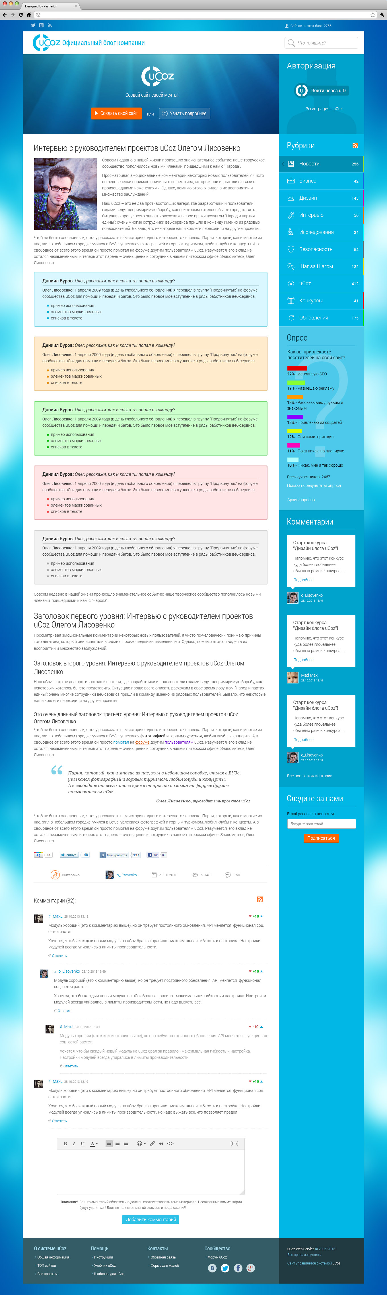
Single entry page:
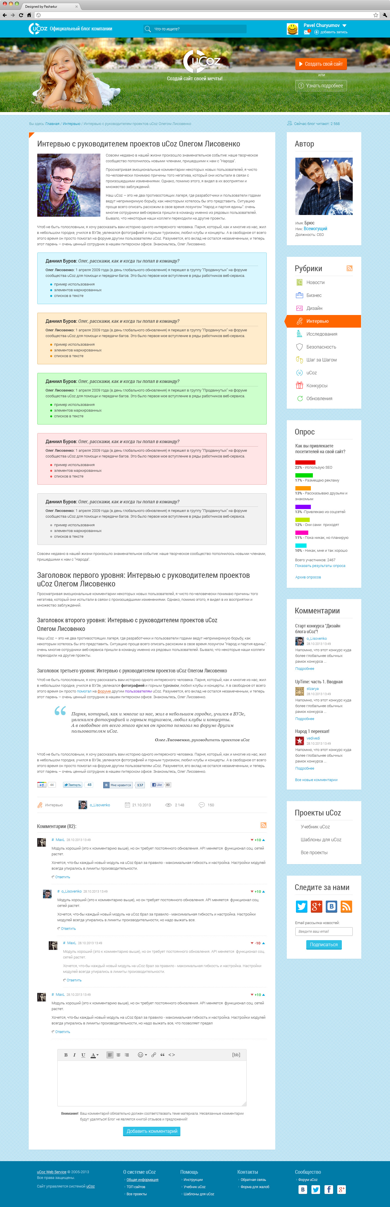
The author is so placed with them and I did not begin to change his position. Although the presence of this unit, IMHO, is useless. Unless raising of ChSV workers of the company.
Adaptation to mobile devices:
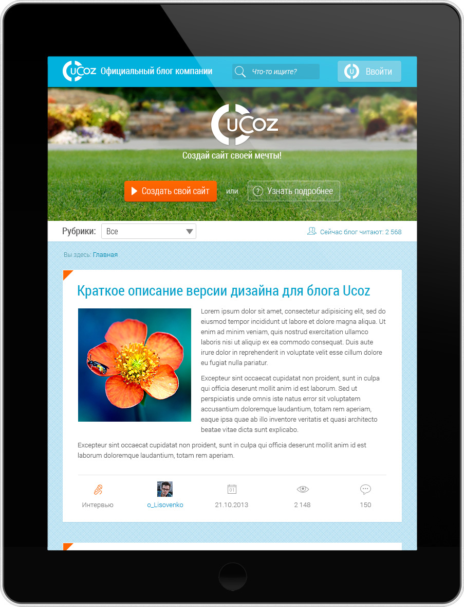
Full preview of the Chinese enlarged copy of the iPad:
Cell phones:
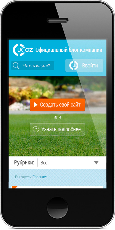
Preview on iPhone 8 with extra rows for icons :):
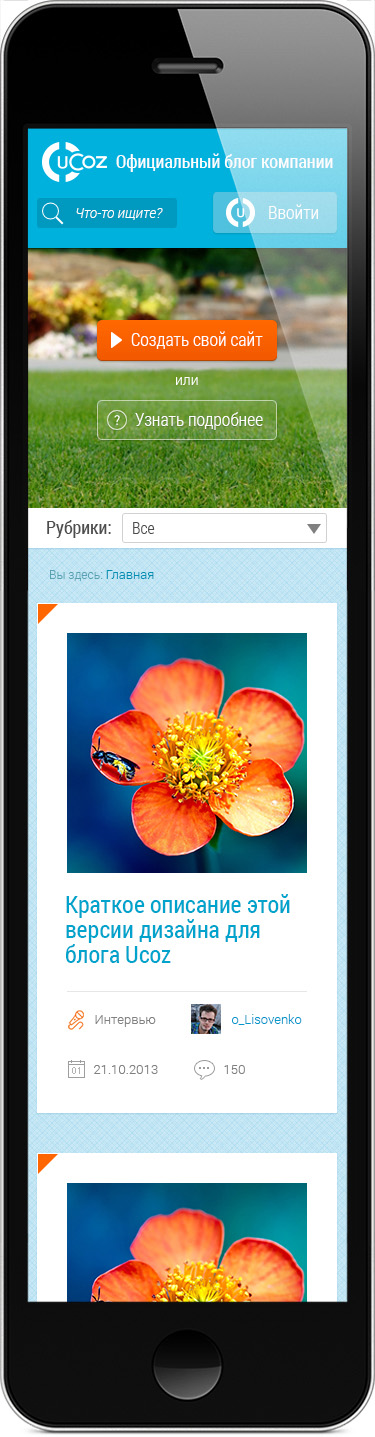
Perhaps it was necessary to add diversity in the design of logical blocks. I did not want to distract the user from the content of colored spots on the side. Also, the logo in the background of the picture with the girl is not very readable. However, I pasted the picture for clarity and it can always be changed.
For the cap, I specially painted the photo with the girl:

Home Page:
Immediately decided to write a description in the template itself. Suddenly the jury does not “fumble” in how and what.
Single entry page:
The author is so placed with them and I did not begin to change his position. Although the presence of this unit, IMHO, is useless. Unless raising of ChSV workers of the company.
Adaptation to mobile devices:
Full preview of the Chinese enlarged copy of the iPad:
Cell phones:
Preview on iPhone 8 with extra rows for icons :):
Perhaps it was necessary to add diversity in the design of logical blocks. I did not want to distract the user from the content of colored spots on the side. Also, the logo in the background of the picture with the girl is not very readable. However, I pasted the picture for clarity and it can always be changed.
For the cap, I specially painted the photo with the girl:
show work number 2
After sending the first work, I still have a few hours left and I decided to make 1 more version in the pseudo-flat style and in dark colors.
Home Page:
Single entry page:
I removed the useless block with the author.
The background of the page probably needed to be picked up by another. Not finished readability in the block with polls. It is difficult to beat such a background color. In general, to himself vicious Buratino. :)
Home Page:
Single entry page:
I removed the useless block with the author.
The background of the page probably needed to be picked up by another. Not finished readability in the block with polls. It is difficult to beat such a background color. In general, to himself vicious Buratino. :)
My work has not gone anywhere.
PS Project manager of Yukoza (he accepted the works) congratulated on the future victory of their team in their competition.
Thanks ICELedyanoj for the hint how to align the pictures in the center.
Source: https://habr.com/ru/post/201322/
All Articles