The long Gantt road in TeamLab Office. The story from the first persons
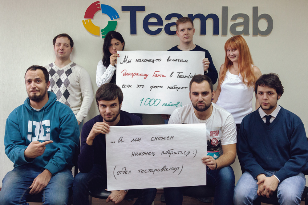
Since we published this , we have not received another question about when the Gant chart will be released. Everyone understood: it was just a bit to wait. Of course, we didn’t score the ill-fated thousand hearts, but the diagram was released.
Everybody was waiting for the release of the Gantt chart. They waited for almost 2 years - and users, and the marketing department, and management. In the reviews and wishes section for TeamLab Gantt Chart developers, it has long been in the first place with the number of votes exceeding 1000. So why did you have to wait so long? This time we decided to give the floor to the direct participants in the process.
Brief history of creating Gantt charts in faces
 Alexey Kazakov , Head of Design Department
The first attempts to design a Gantt chart were made two years ago. The task was set “simple”: to create a full-fledged visualized tool for working with projects, alternative to the existing one (lists of projects, milestones and tasks).
After analyzing the analogues, we proceeded to prototype prototypes, deliberately not limited in terms of functionality. The first version visually represented 3 slices: by projects, milestones and tasks with mutual connections of objects for each slice, developed filters and sorting, means of zooming and fast timeline scrolling. The prototype for the most part embraced the functionality “for the future”, since the current capabilities of the Projects module did not give an opportunity to implement everything completely. As a result, we decided to pause and postpone the chart until better times.
')
The “best times” came in early 2013, when the Gantt chart ranked first among the wishes of users. It was decided to resume development, this time starting with minimal functionality in a single project. Most controversial caused the layout of the diagram. The traditional approach won, which for us, as designers, was a bit distressing. But we still will fight for their ideas)
 Yulya Yakutova , programmer ( JuliaYa )
At the very beginning of the development we were asked to make a diagram at least for viewing, so that you can see the project in a graphical representation. So it all started with the visualization of the project in the form of ordinary rectangles (tasks) on the canvas with reference to the timeline. As soon as something began to emerge, everyone wanted to somehow interact with these colored rectangles. And then off we go. We’ve been flooded with mockups with what, where and what should be moving, what needs to be further drawn and painted. Only we had time to finish something on one layout, as the next one fell on our heads, often canceling what we had just finished doing. This, of course, is understandable: when you can interact with the prototype, immediately new ideas emerge about how to make it even better.
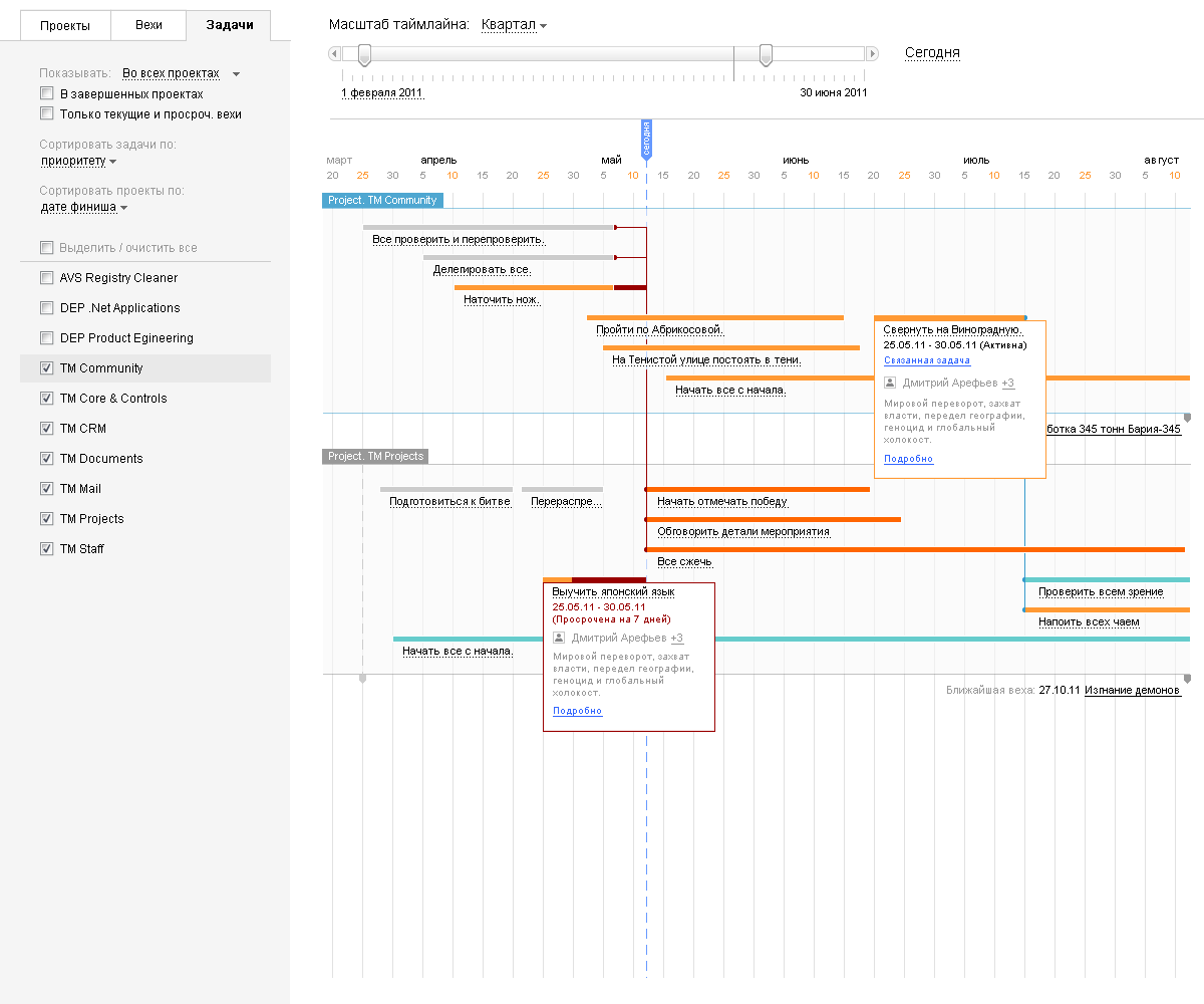
Until the final version, our Gantt chart was going in small steps through trial and error. We couldn’t think for a long time how to display tasks without an end date, and how to work with such tasks in general through a diagram. As a result, they came to the conclusion that you can now see - lines with an infinity sign on the right side.

There was a lot of controversy about the format of working with a diagram: add hotkeys or perform all actions with the mouse only. As a result, we stopped at the second version, and using the keyboard, we only write the names of tasks and milestones.
Now the view of Gantt, naturally, seems logical to us, but when I remember how we came to this, new ideas immediately arise that I really want to realize! We have to postpone them in the "box" until the next version - we must finally be released!
Summarize: what can our Gant
In order not to be too verbose, we just leave this video here:
And if someone wants more details, then welcome to our blog.
About implementation details and future plans
 Mikhail Grunin , Senior Testing Specialist
The diagram was one of the most difficult projects to test, because includes the interaction of the entire module "Projects", graphical display, speed and usability. But we did it - thanks to the developers for the quality fix bugs. We are most proud of the interactivity of our diagram: you can quickly change the scale with one movement of the wheel. And, of course, we have compiled a number of proposals for the design department: the ability to carry out group activities, move tasks in all planes at once, add more hotkeys. So in the next version our Gant will be even better!
 Pavel Bannov , Senior Programmer
There are already a lot of ideas for the following releases:
First, we plan to add the ability to visualize several projects at once, since Now everyone has their own Gantt chart. In the future, we will make it so that tasks from different projects can be linked together and, thus, get a complete picture of all projects of interest at once.
Secondly, we are sure to optimize for tablets so that it is convenient to view the chart in full screen mode. Now the left panel "eats" a lot of space, and there is almost no room left for Gant.
Thirdly, the next release will be able to set task status and priority. This will also appear in the Gantt chart.
PS How to find a Gantt chart in TeamLab Office
Go to the "Projects" section and open the project that interests you. In the upper right corner you will find the Gantt Chart button.

Source: https://habr.com/ru/post/200846/
All Articles