Fighting abundance: usability filtering forms
Most online stores, news portals, and many informational sites contain a large amount of content items in one category. One structuring of the directory is not enough. You will have to either build a hierarchy of menu levels in 5-7 (although this may not solve the problem), or throw out dozens of pages of output to the user in the hope that he will figure out what he needs.
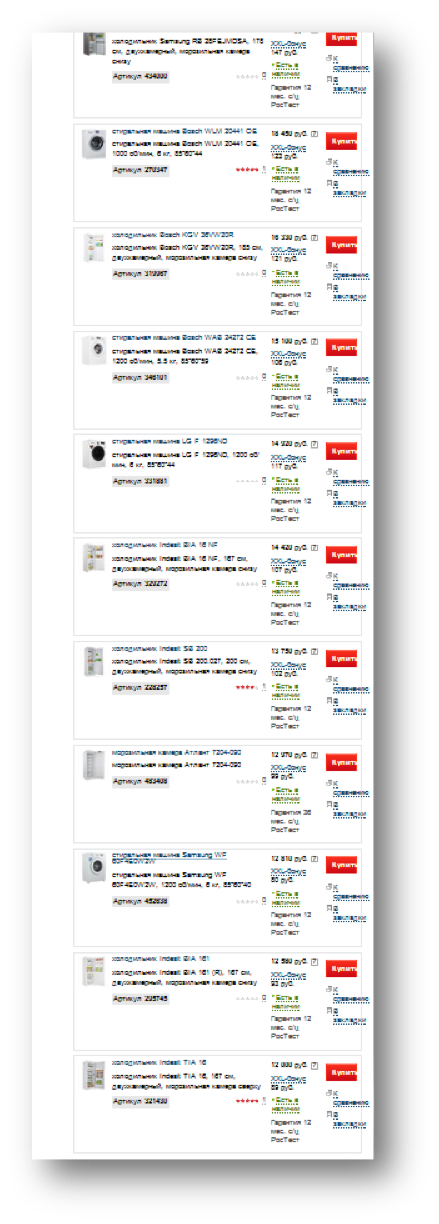
It usually looks like in the picture (plus 10 more screens down). The division into pages (paging), of course, does not improve the interaction experience; it is only a way to reduce the load on the system.
The bad news is that the abundance of proposals does not help decision making. On the contrary.
At one time, an experiment was conducted in retail supermarkets. Buyers were offered to taste jams and buy one they liked.
On one table were exhibited 6 kinds of jam, on the other - 26 kinds. Only 40% of visitors came to the first table and 60% - to the second. As long as the bill in favor of abundance.
However, tasters tasted 2-3 jams from both tables. That is, the volume of the proposal does not affect the selection process.
Moreover, as a result of the tasting, they bought jam: from the first table 31% of tasters, from the second - 3% of tasters.
Such a striking difference in conversion is explained simply: in the second case, people thought that they had tried too few options and they had no good reason to choose.
We conclude: to increase conversion, it is necessary to reduce the number of options in the issue. At the same time, we cannot reduce the total number of proposals in the catalog and cannot divide the entire catalog into micro sections, as this will make navigation too complicated. What to do?
A good solution is catalog filtering forms.
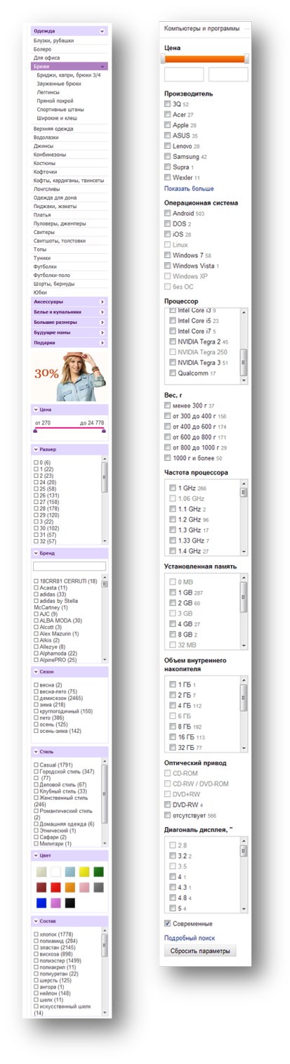
Many (perhaps most) site developers have realized this fact. Or unknowingly copy the filters from each other, in this case it does not matter. These forms usually look like in the picture and traditionally cause users irritation. Let's try to figure out why.
First, we are again offered excess abundance, now at the level of parameters. Instead of looking at hundreds of offers, I am offered to look at hundreds of parameters of these offers and with some (rather large) probability in the end to get the wrong output that I was counting on. And in the clinical case - and the message "at your request, nothing was found."
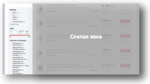
Secondly, with such a page layout, the filter is visually separated from the issue itself and placed on the side panel. Where there is navigation, banners and other service elements that take the user out of the context of the specific task being solved. One of the basic principles of composition is not observed - the principle of proximity, when elements that perform similar functions are grouped in a common local area.
In the third, here it is necessary to mention such a feature of human perception as the locus of attention. A locus is a place or object that is in the center of our conscious attention. And we can have exactly one at a time. At the level of the cognitive unconscious, we can interact with a multitude of objects through many channels, but we can consciously focus only on one thing. That's the way a person works, and nothing can be done about it. This feature leads to important consequences. You can take it as a disadvantage, but at the same time it provides additional opportunities in the design, if you know how to use it.
In the examples given, the uniqueness of the locus is an obvious limitation. When a person is concentrated on filtering, his locus is this form that is infinite in length. In fact, we narrowed the scope of the site as an object of interaction to a narrow long column, turning off the rest of the site space from perception. For the user at this moment, the entire usable amount of screen space simply does not exist.
')
From all this, the following task is formulated:
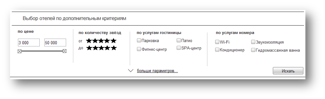
As a result, we get a fairly reasonable solution for the location of the filters.
Here we use the uniqueness of the locus for the benefit of the user and ourselves, since we no longer need to dynamically filter the output when each filter is installed. We would need it with filters on the side, despite the fact that the output is in the blind zone: we do not have context switching and we need to somehow show the system's reaction to user actions.
A sketch of this form might look something like this:
In no case do not pretend to be the ideal solution, please, take this picture only as an illustration of the approach. I’m sure you can find a dozen ways to improve it, and that’s great. The main thing is that it illustrates the essence of the approach to the filtering of issuing elements.
I hope, was useful, proving and illustrative.
It usually looks like in the picture (plus 10 more screens down). The division into pages (paging), of course, does not improve the interaction experience; it is only a way to reduce the load on the system.
Why abundance is evil?
The bad news is that the abundance of proposals does not help decision making. On the contrary.
At one time, an experiment was conducted in retail supermarkets. Buyers were offered to taste jams and buy one they liked.
On one table were exhibited 6 kinds of jam, on the other - 26 kinds. Only 40% of visitors came to the first table and 60% - to the second. As long as the bill in favor of abundance.
However, tasters tasted 2-3 jams from both tables. That is, the volume of the proposal does not affect the selection process.
Moreover, as a result of the tasting, they bought jam: from the first table 31% of tasters, from the second - 3% of tasters.
Such a striking difference in conversion is explained simply: in the second case, people thought that they had tried too few options and they had no good reason to choose.
We conclude: to increase conversion, it is necessary to reduce the number of options in the issue. At the same time, we cannot reduce the total number of proposals in the catalog and cannot divide the entire catalog into micro sections, as this will make navigation too complicated. What to do?
A good solution is catalog filtering forms.
The appearance of the form, or reasoning on how to do it is not necessary
Many (perhaps most) site developers have realized this fact. Or unknowingly copy the filters from each other, in this case it does not matter. These forms usually look like in the picture and traditionally cause users irritation. Let's try to figure out why.
First, we are again offered excess abundance, now at the level of parameters. Instead of looking at hundreds of offers, I am offered to look at hundreds of parameters of these offers and with some (rather large) probability in the end to get the wrong output that I was counting on. And in the clinical case - and the message "at your request, nothing was found."
Secondly, with such a page layout, the filter is visually separated from the issue itself and placed on the side panel. Where there is navigation, banners and other service elements that take the user out of the context of the specific task being solved. One of the basic principles of composition is not observed - the principle of proximity, when elements that perform similar functions are grouped in a common local area.
In the third, here it is necessary to mention such a feature of human perception as the locus of attention. A locus is a place or object that is in the center of our conscious attention. And we can have exactly one at a time. At the level of the cognitive unconscious, we can interact with a multitude of objects through many channels, but we can consciously focus only on one thing. That's the way a person works, and nothing can be done about it. This feature leads to important consequences. You can take it as a disadvantage, but at the same time it provides additional opportunities in the design, if you know how to use it.
In the examples given, the uniqueness of the locus is an obvious limitation. When a person is concentrated on filtering, his locus is this form that is infinite in length. In fact, we narrowed the scope of the site as an object of interaction to a narrow long column, turning off the rest of the site space from perception. For the user at this moment, the entire usable amount of screen space simply does not exist.
')
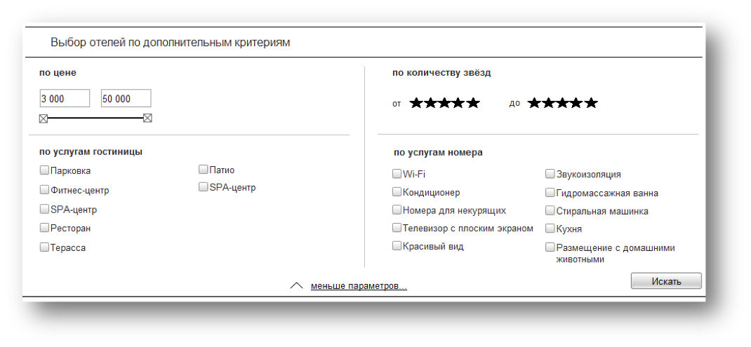
How to do?
From all this, the following task is formulated:
- The filtering form should be made as concise as possible with the additional opportunity to immerse into the filtering details if the main filters are not enough.
- The form should be placed as close as possible to the issue itself, creating a general search context on the page.
- • At the time of filtering, it is desirable to use the entire screen space, since the user at this time will still not consciously be able to do anything else.
As a result, we get a fairly reasonable solution for the location of the filters.
- We have a filtering form above the issue in short form and the “more parameters” button.
- When you click on the button, we expand the form to most of the screen, not saving on signatures, explanations, icons and other visualization tools.
- We give the opportunity to roll this form at the end of the filtering process, at this very moment we form the final issue.
Here we use the uniqueness of the locus for the benefit of the user and ourselves, since we no longer need to dynamically filter the output when each filter is installed. We would need it with filters on the side, despite the fact that the output is in the blind zone: we do not have context switching and we need to somehow show the system's reaction to user actions.
A sketch of this form might look something like this:
In no case do not pretend to be the ideal solution, please, take this picture only as an illustration of the approach. I’m sure you can find a dozen ways to improve it, and that’s great. The main thing is that it illustrates the essence of the approach to the filtering of issuing elements.
I hope, was useful, proving and illustrative.
Source: https://habr.com/ru/post/200798/
All Articles