Word for pixel values media queries
 While reading publications about web design, you repeatedly came across a recommendation not to use pixels in media queries. For example, here is a quote from a very recent article on Habré:
Instead of using fixed sizes, it is better to use relative units to define breakpoints. On Habré, the topic of using relative sizes in layout has been repeatedly revealed. Here is an incomplete list of articles: here , here , here . I will cite only the most important argument - it will allow browsers to change the design depending on the level of zoom set by the user, with the result that the user will see a more pleasant, more accessible site.
What if I tell you that using pixels in media queries does not only cause any harm to the layout, but also has advantages over using em's?
')
The term “breakpoint” is used in the article. Programmers, he cuts off hearing, as in the world of programming means something quite different. I assure you that in the English-speaking world of front-end development is a well-established and unambiguous term. It means the width of the browser window, beyond which the layout of the page changes. I did not distort it into Russian, as the term “media query”.
Media queries with pixel values do not interfere with zoom
Let's start with the “most important argument” against pixels: ostensibly, when the page is enlarged in the old browser, pixel values of media queries do not work. This is simply a lie. Pixel media queries work fine when zooming in all popular browsers. Even in Internet Explorer 8!
 Yes, IE 8 does not support media queries. But if you use the wonderful Respond.js polyfill in your project, then IE 8 will display it with full support for media queries. And you know what? They work correctly with the zoom even in it. Twist the mouse wheel with Ctrl pressed - the page layout is rearranged. For example, on a site whose zoom animation in IE is shown on the right, I used media queries of the following form:
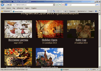
@media (min-width: 401px) { #header-first { float: left; width: 47.82609%; margin-right: 4.34783%; }} More ancient IE was not at hand, but it does not matter - the share of IE7 in Russia is only 0.7%, IE6 - 0.1%, and that, for the most part, at the expense of state institutions.
So, the problem, referred to as the main reason for the rejection of pixels in media queries, simply does not exist. Apparently, this is just a legend that is blindly passed from mouth to mouth, it even regularly enters the publications of influential publications and blogs of the frontend gurus, and no one bothers to just take and check whether this is true.
UPD 2013-10-31 : I found that in Safari media queries with the zoom does not work. But they do not work no matter what unit of measure is used in them. KrylCW helped confirm that this is also true for Safari 7. In addition, according to his data, media queries do not work when the zoom is in Yandex. Browser for MacOS (current version 1.7.1364.22074 (0b6c012)), but it works if after the zoom to update pages.
I tried Yandex Browser under Windows (actual version is 13.10.1500.8765 (e504cce)). There, the opposite is true: pixel media queries are zooming correctly, but relative ones are not! You zoom the page, media query works correctly. Let's say it happens at step 175% → 200%. Then you zoom in the opposite direction, and media query at step 200% → 175% does not work, but works at step 100% → 90%. And if you zoom in and out, the gap with each cycle increases!
For those who want to try it, they riveted the test themselves: pixels , em .
Changing the base font size causes all breakpions to "move out" if they are given in em's.
Imagine such a situation. The chief or the client calls you and says: “Why is the font on our site so small? My wife cannot read anything, make it bigger. ” To argue is useless. You inhale sadly, take a guilty look at the design department door, open the CSS code and increase the base font size from 13px to 16px (yes, the base font size is still defined in pixels, whatever one may say).
What happens when this happens? All breakpoints specified in ems are shifted. Now on the tablets the site is displayed in one column: the way it used to look only on the phone. It looks like this (make the window width less than 900px and be terrified). Are you happy about this? I am ready to argue that if you find yourself in such a situation, you will, swearing in a low voice, quickly rewrite all media queries ... or in full voice if the project does not use a preprocessor.
Yes, I'm aware of the Content First ideology, according to which the breakpoints should move, submitting to the scale of content that is comfortable for consumption. This allows you to get away from the need to take into account the durillion multi-caliber devices with a browser in the CSS code. Instead, you set breakpoints in units relative to the font size, and force the site to rebuild when the content becomes too crowded or too spacious.
But don't lie to yourself. Performing any commercial project, you want (or your client wants) a strictly defined layout on the most popular devices. For example, to make thumbnails that are displayed in one column on a mobile phone, on the iPad, in portrait mode, turn into a grid with three columns. You don't want it to break when you change the font size. If your designer decided that the iPad should have a sidebar in landscape mode, then it should be there no matter what font size is used on the site. If the narrow sidebar font is too large, you’ll rather reduce the font than get rid of the sidebar.
Yes, for content-oriented sites, the width of the text column should not go beyond comfortable limits. But, first, this width has a fairly wide range. I am aware of the recommendation of 45-75 characters, that is, the width of the column can change without serious consequences by up to 66 percentage points. Secondly, why exactly this width is considered standard? Open any glossy magazine, very often there are columns of text with a width of 15 characters across it, and it does not occur to anyone that this is bad. For example, it is very convenient for me to roll a magazine with a straw when I try to read it in a crowded metro car. And on Habré, the width of the text column is from 75 to about 115 characters, and the vast majority of Habr’s visitors see text exactly 115 characters wide.
By the way, have you noticed the substitution of concepts here? You can make the optimal text width using pixel media queries.
And finally, how often do you have to change the size of all the fonts on an already completed project, and without re-registering the rest? And if you have all the fonts in em'ah, and the client demanded to increase the font only the main text? Sorry, the last question does not apply to the topic of the article.
Related media queries specified in em'a displayed overlap
I call a pair of media queries "adjacent" when the maximum width of one matches the minimum width of the other. I will give an example taken from the ceiling:
.container { color: black; background-color: white; }} @media (max-width: 40em) { .container { color: red; }} @media (min-width: 40em) { .container { background-color: red; }} Guess what the visitor will see, who will be “lucky” to open this site in a browser exactly 40em wide?
The amount of overlap is only one pixel, but it is. If the visitor of the site suddenly finds exactly such a screen width, then the page layout and the design may turn out to be crucified, even to the point of complete unreadability.
When using pixels, the problem is solved in an elementary and completely reliable way:
@media (max-width: 600px) { /* ... */ } @media (min-width: 601px) { /* ... */ } When I blindly obeyed the majority opinion, wrote media queries on em'ah and found an overlap, I tried to solve the problem in a similar way:
(min-width: 20,1em) . The overlap has been replaced by a gap: neither the one nor the other media query is applied at a specific window width. I tried 20.01, then 20.001 ... Using the artillery fork method, I managed to find the necessary value after the comma.I quickly realized that it’s not enough to pick up this residue once. For each basic font size, the remainder will be different, otherwise either a gap or an overlap will occur. But I was not taken aback, because I am good at SASS and can write mixin, vybiruyuschiy correct balance for any value in em'ah. We take at the input how many em's, multiply by the base font size, add one, divide back by the base font size - and voila, we get a safe value at the output.
In this place you should have a vague feeling that this path is somehow ... wrong. At least I have it. I tried to look at the situation from the outside and asked myself: what do I actually do?
And that brings us to the following argument:
Em's in media queries is an intermediary between two pixel values: the base font size and the width of the browser window.
As mentioned above, the base font size is always in pixels. Otherwise, the browser simply does not know what font size to consider equal to one em'u. If the base font size is not specified, any normal browser will take it for 16 pixels. If it is specified in em, then the browser multiplies it by the same 16 pixels. The same applies to other relative units: 1 pt is taken as 4/3 px, and the number of pixels in a centimeter is written in the OS.
Min-width and max-width in media queries are matched with the width of the window, which any browser has an integer number of virtual pixels. For example, for iPhone on the fourth inclusive, it is 320 × 480, and for iPhone 5 - 320x568.
By asking media queries in em, you first do the conversion from pixels to em, and then from em back to pixels, to understand what width of the screen you actually get with this breakpoint.
There is no need to torture yourself like that. Just use pixels.
Using pixel media queries does not mean abandoning the content first approach.
The fact that you use pixels in media queries does not deprive you of the opportunity to proceed from the content when designing media queries.
There are lots of articles on how to correctly perform media queries on the Internet, and this topic is beyond the scope of this article. Therefore, I will confine myself to a few recommendations that I will try to support the thesis in the subtitle.
At this point the objective part of the article ends and begins a modest personal opinion, not implying that other ways are wrong.
First, do not use a separate CSS file for each screen width (you can provide IE support with a polyfill). Structure the code for the modules used on the site pages and arrange media queries individually for each module. This will facilitate control over each module and simplify code maintenance.
Secondly, when designing responsive layout, build on content. The method is very simple (and not invented by me). First roll up the module, focusing on the minimum width of the screen. Of course, the module must be "rubber". Then stretch the browser window until the module looks lousy. In this place, put a breakpoint and turn it over to this width. Repeat until you resist max-width of your site.
By the way, do not limit the maximum width of the site to a narrow column of 980 pixels. If you have a large monitor, see how luxurious a site can look at with a width of 1920 pixels. If you have a smaller monitor, for God's sake, scrape five thousand rubles and buy yourself a big one. This is your professional tool!
Third, use the preprocessor. Embedding the preprocessor into a project is not easy, especially for a beginner, but it will save you a tremendous amount of fuss.
Any preprocessor will do, but I warmly recommend Sass . Not because the Sass language itself is something better — they are all more or less equal in features, but because it has a whole library ecosystem. Libraries, which are commonly called “ Compass extensions,” are very rich in functionally and effectively interacting with each other.
Fourth, in order not to be buried under a bunch of mixed media queries ...
Cut the screen size into slices
In order to facilitate the task of working with media queries, I have constructed the Breakpoint Slicer extension (which, in turn, uses Breakpoint - a very powerful and universal extension for working with media queries).
The idea behind Breakpoint Slicer is very simple. You place breakpoints at short intervals, for example: 400px, 600px, 800px, 1050px. The module enumerates these gaps in order:
- 0–400
- 401-600
- 601-800
- 801-1050
- 1051 — ∞
And then in the Sass-code you just say which interval for which you need to put the media query:
at(2)- equivalent(min-width: 401px) and (max-width: 600px)from(2)- equivalent(min-width: 401px)to(2)- equivalent(max-width: 600px)between(2, 4)- equivalent(min-width: 401px) and (max-width: 1050px)
This allows you to quickly and efficiently distribute the styles of modules by ranges. The use of a large number of gaps allows you to cover all classes of devices, while not going into excessive specifics.
If you have a question about using Breakpoint Slicer, do not hesitate to ask it in the bug tracker (if you know English, it's better in English).
Source: https://habr.com/ru/post/199424/
All Articles