Usability boarding pass: how to save two lives a year
The airlines had 90 years to draw a boarding pass, and they still screwed up. I propose to do this:
Let me remind you that in 2013 this is still in progress:
')
He has disgusting usability. It does not group data, visual dominants, grids, good typography, space. He has the readability of a crumpled punch card.
Indeed, millions of people somehow fly. And in general, somehow live. Personally, I have never seen someone:
But they are. In the world, billions of people, and these billions turn any unlikely event into not only probable, but also massive. If we say “I don't know anyone,” we act unscientific. We build our argument on the so-called anecdotal evidence , that is, on individual cases in which problems did not occur.
Instead, we should appeal to the following things:
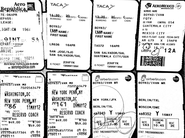
Airlines? Here we all see. Sucks solved. Selection:
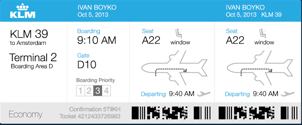
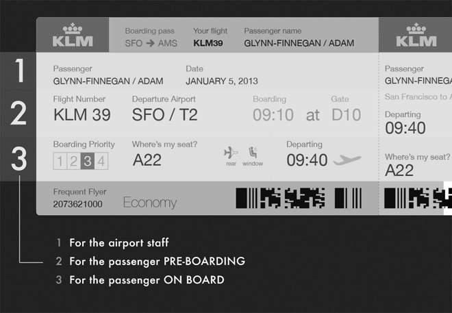
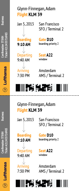
Designer community? It is solved. This is what Evernote Adam Glynn-Finnegan designer drew :
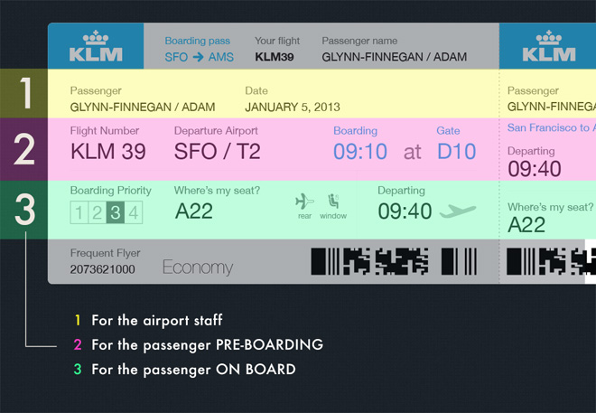
I like what Adam did. I like that he not only lynches everyone , but took a single item and improved it. I did the same thing: I took its version as a basis and further improved it.
You can move a lot, replace, draw. I did this (encore):
If we remove color from Adam’s version (and it’s not supposed to be in the final product), we’ll get this:
As a result, instead of conceived horizontal stripes, we see rather such a grouping:
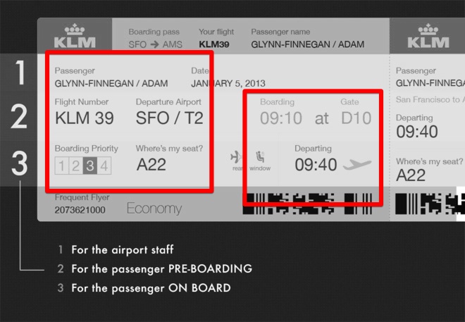
Instead, I suggest grouping fields not by lines, but by columns :
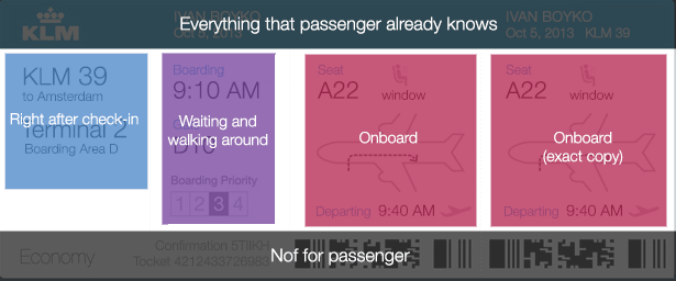
Flight attendants will save tons of vocal cords if they do not repeat something like “Next Pass, please”, “This way please in the back” or “Adelante, por favor”. Why not write on the ticket? And it is better to draw . I experimented with simplification and came to this form:
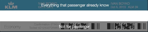
The passenger already knows his own name, so he can be put away. I removed all the non-priority for the passenger in the "header" and "footer."
Sometimes they tear off a large part, sometimes a small one. Now, when I am writing this, I am flying a connecting flight, and from me for one of the flights they took a large one, and for the other - a small one.
Therefore, I duplicate this part. What for? To make it clear that this is the same thing. I agree, it looks strange if you propose an alternative - Wellcome.
Indeed, alternatives have appeared. And, as is often the case, inherited the flaws of the original.
Printouts are the same paper boardings plus a mixture of legal information (so that we can stick our nose at the point in small print) and advertising (hotels, car rentals and transfers at an exorbitant price). Prints need to be improved as well as paper boarding passes, and also to put things in order: throw out everything that people don’t read (and they don’t read) and leave the key points. For example, write briefly and clearly how much is the excess of baggage.
Here is a good option:
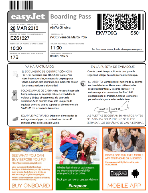
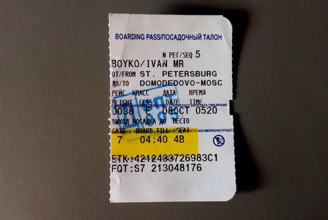
Electronic boarding - they are children of paper boarding, who inherited the curvature of their parents. Here are two landing passbook.

Pay attention to scattered chaotically fields, small letters. One day, when I was testing the usability of an iPhone app, one grandfather apologized and started looking for glasses: I was moved and made the font bigger. What is it like to look for points in a narrow passage? If we increase the fonts, we get a jumble of both in the original paper versions, as required.
Take the United States alone, with 500 million passengers a year. Suppose we save 10 seconds for each passenger. We get 158 years of saving every year, or two human lives:

I myself am a designer, and I know that you’ll wait for the good word from colleagues infrequently, so I’m enclosing a handy list for criticism. For convenience, you can specify the number of deficiency:
At the same time, I would really be happy to receive such criticism: “And what if this is done, here is my sketch in Photoshop”. I was happy to see improvements in my design. As a joke, tasks for warming up, as anything. I adore, when something is offered, they think, they ask "why so", "how did you do it" or "and here I have solved the same problem like this." Friends, my heart belongs to such small questions, advice and improvements. My heart belongs to you.
PS I hope my heart turned out quite dramatic.
Update: applied a great freextraz hack . Many thanks to him.
Update 2: Comments on printers from a former S7 employee
Update 3: A whole class of comments about what should be plus examples when it is needed (strange connections, group travel, and so on). Commentators want the airport of departure, the passenger’s name is large, and some are layouts of all the airline’s aircraft. UMAX took into account your wishes and made your layout:

Update 4 A great option sent by tonsky :
I like what is read in the column and in the line: landing at so much there.
Guys, those who drew updates - I would like in a token of gratitude to give you our icons with lifelong updates. If you accept, write in a personal. Thank you very much.
Let me remind you that in 2013 this is still in progress:
')
He has disgusting usability. It does not group data, visual dominants, grids, good typography, space. He has the readability of a crumpled punch card.
A voice from the audience: I have never seen anyone who had problems with a boarding pass . Why soar?
Indeed, millions of people somehow fly. And in general, somehow live. Personally, I have never seen someone:
- who hit the lightning
- who slipped and died in the bathroom
- with prostate cancer.
But they are. In the world, billions of people, and these billions turn any unlikely event into not only probable, but also massive. If we say “I don't know anyone,” we act unscientific. We build our argument on the so-called anecdotal evidence , that is, on individual cases in which problems did not occur.
Instead, we should appeal to the following things:
- quantitative usability research: time in seconds to find the information you need on a ticket
- percentage of errors: the percentage of passengers arriving late for boarding
- idle time from long loading in the plane .
How to solve the problem now?
Airlines? Here we all see. Sucks solved. Selection:
Designer community? It is solved. This is what Evernote Adam Glynn-Finnegan designer drew :
I like what Adam did. I like that he not only lynches everyone , but took a single item and improved it. I did the same thing: I took its version as a basis and further improved it.
What else can be improved in the version of Adam?
You can move a lot, replace, draw. I did this (encore):
Grouping
If we remove color from Adam’s version (and it’s not supposed to be in the final product), we’ll get this:
As a result, instead of conceived horizontal stripes, we see rather such a grouping:
Instead, I suggest grouping fields not by lines, but by columns :
Airplane layout
Flight attendants will save tons of vocal cords if they do not repeat something like “Next Pass, please”, “This way please in the back” or “Adelante, por favor”. Why not write on the ticket? And it is better to draw . I experimented with simplification and came to this form:
All unnecessary around the edges
The passenger already knows his own name, so he can be put away. I removed all the non-priority for the passenger in the "header" and "footer."
Duplication of information for landing
Sometimes they tear off a large part, sometimes a small one. Now, when I am writing this, I am flying a connecting flight, and from me for one of the flights they took a large one, and for the other - a small one.
Therefore, I duplicate this part. What for? To make it clear that this is the same thing. I agree, it looks strange if you propose an alternative - Wellcome.
Voice from the audience: dude, this is the last century. Now there is an electronic registration, printout of boarding passes, applications of airlines and in general in the iPhone there is a Passbook.
Indeed, alternatives have appeared. And, as is often the case, inherited the flaws of the original.
Printouts are the same paper boardings plus a mixture of legal information (so that we can stick our nose at the point in small print) and advertising (hotels, car rentals and transfers at an exorbitant price). Prints need to be improved as well as paper boarding passes, and also to put things in order: throw out everything that people don’t read (and they don’t read) and leave the key points. For example, write briefly and clearly how much is the excess of baggage.
Here is a good option:
Electronic boarding - they are children of paper boarding, who inherited the curvature of their parents. Here are two landing passbook.
Pay attention to scattered chaotically fields, small letters. One day, when I was testing the usability of an iPhone app, one grandfather apologized and started looking for glasses: I was moved and made the font bigger. What is it like to look for points in a narrow passage? If we increase the fonts, we get a jumble of both in the original paper versions, as required.
A voice from the audience: Dude, you rub the page already, and we are waiting for where the two saved lives came from!
Take the United States alone, with 500 million passengers a year. Suppose we save 10 seconds for each passenger. We get 158 years of saving every year, or two human lives:
Appendix: how to criticize this article: a quick guide
I myself am a designer, and I know that you’ll wait for the good word from colleagues infrequently, so I’m enclosing a handy list for criticism. For convenience, you can specify the number of deficiency:
- No one needs this, everything is already normal (we have two points of view on the same thing)
- Make the number of a place 10 times larger! It is important!!!
- Two times the same thing is nonsense. I am ready to agree, but how to be, if one part is torn off, then another?
- It would be better to take up the case.
At the same time, I would really be happy to receive such criticism: “And what if this is done, here is my sketch in Photoshop”. I was happy to see improvements in my design. As a joke, tasks for warming up, as anything. I adore, when something is offered, they think, they ask "why so", "how did you do it" or "and here I have solved the same problem like this." Friends, my heart belongs to such small questions, advice and improvements. My heart belongs to you.
PS I hope my heart turned out quite dramatic.
Update: applied a great freextraz hack . Many thanks to him.
Update 2: Comments on printers from a former S7 employee
Update 3: A whole class of comments about what should be plus examples when it is needed (strange connections, group travel, and so on). Commentators want the airport of departure, the passenger’s name is large, and some are layouts of all the airline’s aircraft. UMAX took into account your wishes and made your layout:
Update 4 A great option sent by tonsky :
I like what is read in the column and in the line: landing at so much there.
Guys, those who drew updates - I would like in a token of gratitude to give you our icons with lifelong updates. If you accept, write in a personal. Thank you very much.
Source: https://habr.com/ru/post/198896/
All Articles