Interface Animation
When we create static interface layouts (be it websites or mobile apps) in Photoshop, we don’t think too much about how this layout behaves in dynamics. Steve Jobs once said : “Design is not how the product looks, this is how it works.” Our product impression is formed on the basis of many factors, but the most important is a comfortable interaction with it.
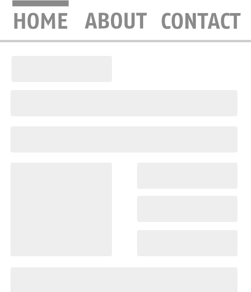
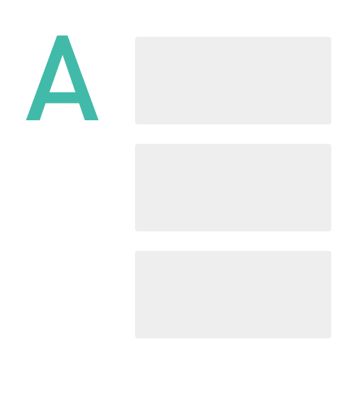
Hyperlinks revolutionized the Internet, but they also remain its main problem. You never know for sure where she will lead you. Even a hyperlink leading to the footer site can distract from the original thought.

Compare these two examples.
')
Drastic changes are hard to understand.
There is nothing more difficult for a person to perceive than instantaneous changes. Because in nature there is simply no instant change. In the following example, we can see that turning the “plus” sign by 45 ° completely changes its meaning.

Such switching is quite convenient, besides, the plus sign rotates in the same direction as the content, which is an additional indicator of the correct operation of the system.
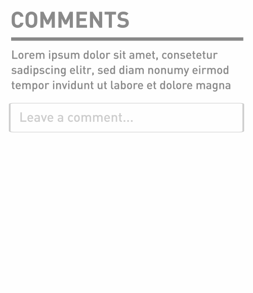
The form for adding a comment, whether for a blog or product discussion in an online store, still remains one of the most complex interface elements. The reason is that instead of simply starting to enter text, the user must take some other actions (log in for example). In order to somehow motivate people to write comments, you can simply show only the most important element - the comment field, which, after clicking on it, is fully revealed (for example, on the website of the New York Times).
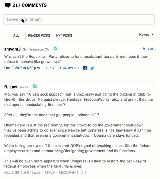
You can go further: set the focus of the cursor after the expansion in the comment field.
However, using this approach there is a small problem - one of the fundamental principles of user interaction is that switching should always occur near the place where interaction takes place.
As we can see from examples, such improvements contribute to the attractiveness of commenting. It is also a good practice to upload comments when reaching the page footer; the less buttons pressed, the better.
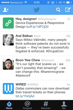
The popular “pull to refresh” on the iPhone (developed by Loren Brichter )
allows the user to update the content in reverse chronological order. You can see this in the example of Twitter.
The idea of the stickers is to bind the content to the context, as for example shown in the example below, and implemented in the iOS address book.
The method is great for situations where there is a lot of information, but it is necessary to consider it as a whole.
Look at the example below:
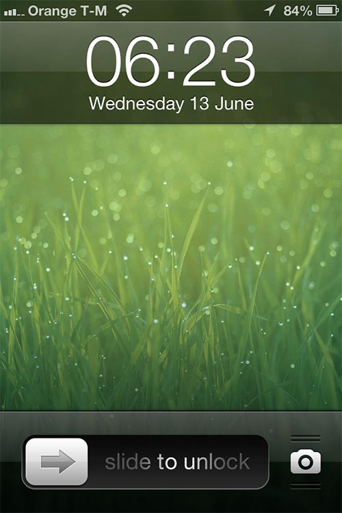
You can see small “ribs” around the “camera” icon. They kind of invite you to touch them and pull. The new iOS7 removed them due to the already developed user habits. You can also notice the flare animation on “slide to unlock” which invites you to perform an action to unlock the phone.
Google Chrome for iOS since its introduction has used the idea of hiding the search field while scrolling content. Thus, it was possible to increase the screen space in the first place, which is important for mobile devices.
About a week ago, Nikita Vasilyev, a UI designer from Toronto, came up with a rather interesting idea: a smooth movement of focus between interface elements. You can see the essence of this idea in the video below, or install a browser extension (Chrome and Safari only).
The examples above are just a small part of what we can do to improve user experience. But these details, which seem insignificant at first glance, can lead the user experience to a new, higher-quality level.
Scroll Animation
Hyperlinks revolutionized the Internet, but they also remain its main problem. You never know for sure where she will lead you. Even a hyperlink leading to the footer site can distract from the original thought.
Compare these two examples.
')
Drastic changes are hard to understand.
Dynamic switches
There is nothing more difficult for a person to perceive than instantaneous changes. Because in nature there is simply no instant change. In the following example, we can see that turning the “plus” sign by 45 ° completely changes its meaning.
Such switching is quite convenient, besides, the plus sign rotates in the same direction as the content, which is an additional indicator of the correct operation of the system.
Collapsing comments
The form for adding a comment, whether for a blog or product discussion in an online store, still remains one of the most complex interface elements. The reason is that instead of simply starting to enter text, the user must take some other actions (log in for example). In order to somehow motivate people to write comments, you can simply show only the most important element - the comment field, which, after clicking on it, is fully revealed (for example, on the website of the New York Times).
You can go further: set the focus of the cursor after the expansion in the comment field.
However, using this approach there is a small problem - one of the fundamental principles of user interaction is that switching should always occur near the place where interaction takes place.
As we can see from examples, such improvements contribute to the attractiveness of commenting. It is also a good practice to upload comments when reaching the page footer; the less buttons pressed, the better.
Pull to upgrade
The popular “pull to refresh” on the iPhone (developed by Loren Brichter )
allows the user to update the content in reverse chronological order. You can see this in the example of Twitter.
Stickers
The idea of the stickers is to bind the content to the context, as for example shown in the example below, and implemented in the iOS address book.
The method is great for situations where there is a lot of information, but it is necessary to consider it as a whole.
Inviting controls
Look at the example below:
You can see small “ribs” around the “camera” icon. They kind of invite you to touch them and pull. The new iOS7 removed them due to the already developed user habits. You can also notice the flare animation on “slide to unlock” which invites you to perform an action to unlock the phone.
Hiding Controls
Google Chrome for iOS since its introduction has used the idea of hiding the search field while scrolling content. Thus, it was possible to increase the screen space in the first place, which is important for mobile devices.
Moving focus
About a week ago, Nikita Vasilyev, a UI designer from Toronto, came up with a rather interesting idea: a smooth movement of focus between interface elements. You can see the essence of this idea in the video below, or install a browser extension (Chrome and Safari only).
Conclusion
The examples above are just a small part of what we can do to improve user experience. But these details, which seem insignificant at first glance, can lead the user experience to a new, higher-quality level.
Source: https://habr.com/ru/post/198826/
All Articles