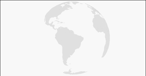
Animation of the transition from the globe to a two-dimensional map
I want to share with Habr my cartographic experiment, namely the animation of the transition from the Orthographic projection (the globe) to the Equivalent one (one of the projections of the usual two-dimensional maps). Also, this method is suitable for any other projections. The result of the experiments was this animation:
As before, we will use the d3.js library, as before we will make several implementations: SVG and Canvas. Both options can be effectively used for interactive infographics. So, let's start?
I somehow saw an advertisement on TV (like Gazprom), there the globe is spinning and then it turns into a map. A beautiful cartoon, I liked it, so I decided to do something similar, only interactive for the Internet. Challenge accepted .
')
Since we have already worked with maps ( Interactive SVG cartogram with d3.js ), and with the globe too ( Interactive Globe - SVG versus Canvas ), we will start immediately with the transition from one projection to another. The first thing that comes to mind is to give everything to the library, because the transition animation has already been implemented there: transitions . So I did. The full code of the first example can be viewed on GitHub : Globe to Map , felt on bl.ocks.org : Globe to Map . Yes, if you click on the block number in the upper left corner on bl.ocks.org , you will go to the corresponding gist on GitHub , so in the future I will give only one link.
So, what is what:
The
The rotation is implemented using d3.timer and applies only to the
The variable
Animation of the transition from the globe to the map:
Here we save the current rotation angle, then stop the rotation by removing the
The reverse transition is characterized by the addition of the
The rest of the code of questions, in theory, should not cause, especially if you read my previous articles.
If you played for a while with the first example, you should have noticed that the map looks different every time. This is due to the fact that we initiate the transition at different angles of rotation of the globe (
I have already described a similar function in the article Interactive Globe - SVG versus Canvas , so I will not repeat it. The code for the second example on bl.ocks.org : Globe to Map II .
It's time to complicate the animation, the metamorphosis of the first two examples look cool and have a right to exist, but I want something more aesthetic.
Under the victims in this case means the complication of the code. So, in order to make the transition from one projection to another not “stupidly” along the shortest path, but beautifully, we need to create our own interpolation of projections. I was lucky, I found a suitable example with Mike: Orthographic to Equirectangular . With minimal modifications it can be used to go both ways, just what we need. Here is the actual implementation of it:
At first glance, it looks difficult, but in reality it is not. What is going on here? We feed two projections
The final version on bl.ocks.org : Globe to Map III .
In the end, I also decided to make a version using canvas. This version differs in that all the functions moved inside
We got an interesting blank for an interactive map, to which you can fasten any information, or you can loop and make the same cartoon. You can also make your visualization more sophisticated by adding shadows, gradients, and other effects. Here are some examples of such whistles:
You can also add satellite photos or even tiles on top of our sketchy maps, making everything more realistic, but this is a topic for a separate article, and this is hardly appropriate for infographics.
This is where our experiment ends. Thanks to those who read to the end. Good luck and interesting projects.
As before, we will use the d3.js library, as before we will make several implementations: SVG and Canvas. Both options can be effectively used for interactive infographics. So, let's start?
Start
I somehow saw an advertisement on TV (like Gazprom), there the globe is spinning and then it turns into a map. A beautiful cartoon, I liked it, so I decided to do something similar, only interactive for the Internet. Challenge accepted .
')
From simple to complex
Since we have already worked with maps ( Interactive SVG cartogram with d3.js ), and with the globe too ( Interactive Globe - SVG versus Canvas ), we will start immediately with the transition from one projection to another. The first thing that comes to mind is to give everything to the library, because the transition animation has already been implemented there: transitions . So I did. The full code of the first example can be viewed on GitHub : Globe to Map , felt on bl.ocks.org : Globe to Map . Yes, if you click on the block number in the upper left corner on bl.ocks.org , you will go to the corresponding gist on GitHub , so in the future I will give only one link.
So, what is what:
focused - focus indicator on the country, ortho - projection indicator, speed - rotation speed, start - start of rotation, corr - variable to save the rotation phase.The
endall(transition, callback) function counts the number of elements to which the transition will be applied (animation), and, when everything is finished, performs the function that it has fed to ( callback ). In principle, it can be replaced with SetTimeout , but it is better to use endall(transition, callback) . //Starter for function AFTER All transitions function endall(transition, callback) { var n = 0; transition .each(function() { ++n; }) .each("end", function() { if (!--n) callback.apply(this, arguments); }); } The rotation is implemented using d3.timer and applies only to the
path with the ortho class. //Globe rotating via timer d3.timer(function() { var λ = speed * (Date.now() - start), φ = -5; projection.rotate([λ + corr, φ]); g.selectAll(".ortho").attr("d", path); }); The variable
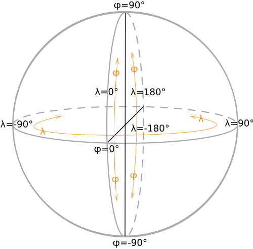
corr allows us to return to the same angle of rotation of the globe, which was before the change of the projection. The following picture from the wiki article Geographical coordinates will help you understand the longitude of λ and the latitude φ :Animation of the transition from the globe to the map:
//Transforming Globe to Map if (ortho === true) { corr = projection.rotate()[0]; // <- save last rotation angle g.selectAll(".ortho").classed("ortho", ortho = false); projection = projectionMap; path.projection(projection); g.selectAll("path").transition().duration(3000).attr("d", path); } Here we save the current rotation angle, then stop the rotation by removing the
ortho class, change the projection and turn on the built-in transition animation.The reverse transition is characterized by the addition of the
ortho class for all path at the end of the transition and the resetting of the angle of rotation of the globe (the timer has ticked all this time). //Transforming Map to Globe projection = projectionGlobe; path.projection(projection); g.selectAll("path").transition() .duration(3000).attr("d", path) .call(endall, function() { g.selectAll("path").classed("ortho", ortho = true); start = Date.now(); // <- reset start for rotation }); The rest of the code of questions, in theory, should not cause, especially if you read my previous articles.
If you played for a while with the first example, you should have noticed that the map looks different every time. This is due to the fact that we initiate the transition at different angles of rotation of the globe (
λ ), so the map is cut by different values of longitude (meridians). To get the usual view of the map (the section on the anti-meridian), we need to turn the globe to the zero meridian before the transition. Also, instead of adjusting, you can change the projection parameters of a two-dimensional map, but I chose the first option. In the second example, anti-meridian cutting is implemented, and the globe rotates with a mouse (drag event). The defaultRotate() function is responsible for defaultRotate() : //Rotate to default before animation function defaultRotate() { d3.transition() .duration(1500) .tween("rotate", function() { var r = d3.interpolate(projection.rotate(), [0, 0]); return function(t) { projection.rotate(r(t)); g.selectAll("path").attr("d", path); }; }) }; I have already described a similar function in the article Interactive Globe - SVG versus Canvas , so I will not repeat it. The code for the second example on bl.ocks.org : Globe to Map II .
It's time to complicate the animation, the metamorphosis of the first two examples look cool and have a right to exist, but I want something more aesthetic.
If beauty will save the world, then why does it constantly require some sacrifices? ©
Under the victims in this case means the complication of the code. So, in order to make the transition from one projection to another not “stupidly” along the shortest path, but beautifully, we need to create our own interpolation of projections. I was lucky, I found a suitable example with Mike: Orthographic to Equirectangular . With minimal modifications it can be used to go both ways, just what we need. Here is the actual implementation of it:
//Unreelling transformation function animation(interProj) { defaultRotate(); g.transition() .duration(7500) .tween("projection", function() { return function(_) { interProj.alpha(_); g.selectAll("path").attr("d", path); }; }) } function interpolatedProjection(a, b) { var projection = d3.geo.projection(raw).scale(1), center = projection.center, translate = projection.translate, clip = projection.clipAngle, α; function raw(λ, φ) { var pa = a([λ *= 180 / Math.PI, φ *= 180 / Math.PI]), pb = b([λ, φ]); return [(1 - α) * pa[0] + α * pb[0], (α - 1) * pa[1] - α * pb[1]]; } projection.alpha = function(_) { if (!arguments.length) return α; α = +_; var ca = a.center(), cb = b.center(), ta = a.translate(), tb = b.translate(); center([(1 - α) * ca[0] + α * cb[0], (1 - α) * ca[1] + α * cb[1]]); translate([(1 - α) * ta[0] + α * tb[0], (1 - α) * ta[1] + α * tb[1]]); if (ortho === true) {clip(180 - α * 90);} return projection; }; delete projection.scale; delete projection.translate; delete projection.center; return projection.alpha(0); } At first glance, it looks difficult, but in reality it is not. What is going on here? We feed two projections
interpolatedProjection(a, b) , they are normalized (one scale, coordinates in radians), then a combined projection is created, which is the pairwise sum of parameters (center, offset) of the original projections with coefficient α (interpolation step). And at each step we are given a combined projection depending on α . With increasing step α , the weight of the first projection decreases, and the weight of the second increases. Thus, we get a beautiful animation.The final version on bl.ocks.org : Globe to Map III .
In the end, I also decided to make a version using canvas. This version differs in that all the functions moved inside
ready(error, world, countryData) , since they must directly manipulate the geodata, otherwise the logic of the work is the same. There is nothing to comment on, so here is the code on bl.ocks.org right away : Globe to Map IV .results
We got an interesting blank for an interactive map, to which you can fasten any information, or you can loop and make the same cartoon. You can also make your visualization more sophisticated by adding shadows, gradients, and other effects. Here are some examples of such whistles:
You can also add satellite photos or even tiles on top of our sketchy maps, making everything more realistic, but this is a topic for a separate article, and this is hardly appropriate for infographics.
This is where our experiment ends. Thanks to those who read to the end. Good luck and interesting projects.
Source: https://habr.com/ru/post/198300/
All Articles