A selection of useful CSS recipes, or what we do on bare Fridays.
There is a good tradition in our web development department. Every 2 weeks we have “bare Fridays” - these are mini-conferences where we share interesting and useful knowledge accumulated in the process of work. Today, we have accumulated quite a lot of such knowledge, and we decided to start gradually sharing it with the public in the person of Habrasoobschestva.
So, we present to your attention the assembly of interesting and (we hope) little-known HTML and CSS-recipes. We will be glad if each of you learn something new!
Centering the block vertically and horizontally
Most often such blocks are shifted by 50% with the help of the top and left properties, and then shifted to the center by negative indents. But there is a more elegant way that not everyone knows about:
')
{ position: absolute; top: 0; bottom: 0; left: 0; right: 0; margin: auto; } 
In case a block is positioned, not an image, you will also have to set its height and width.
This technique does not work in IE7. I hope you haven't been targeting him for a long time)
Output a string of text to the ellipsis
A rather old property (works in IE 6!), However, it was officially added only to the CSS3 standard. Since its use is rarely found on the net, it can be concluded that not everyone knows about it.
.text-overflow { white-space: nowrap; /* -, */ overflow: hidden; /* , */ text-overflow: ellipsis; /* */ display: block; /* */ } 
The block can be set to the width, but by default it is stretched to the full width of the parent. Accordingly, ellipsis will begin to appear when the width of the child block exceeds the width of the parent block. This trick works only for one line.
Dependent width blocks
Suppose we want to add a sidebar to the site.
<aside class="panel"> ... </aside> <div class="content"> ... </div> Moreover, the width of the content depends only on the width of the panel. How to do this without explicitly specifying the width? There is a way:
.content { overflow: hidden; } .panel { float: right; width: 20%; } 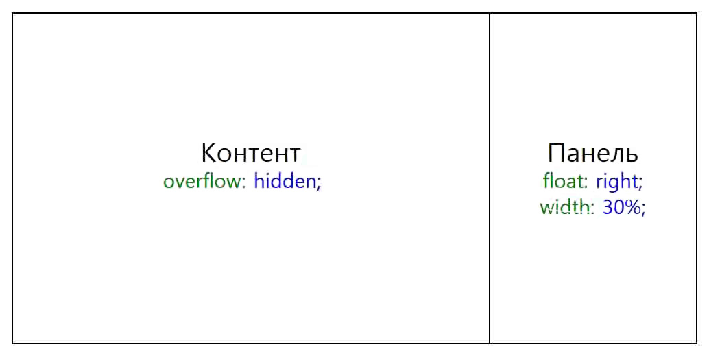
As you can see, “overflow: hidden” solved all the problems.
Elliptical angles
Few people know (or simply do not use in practice) that in the border-radius parameter one can set not 4, but as many as 8 parameters, 2 parameters per angle. In this case, the first parameter sets the radius horizontally, and the second - vertically. Example:
.circle { border-radius: 150px/100px 100px/200px 0 0; } 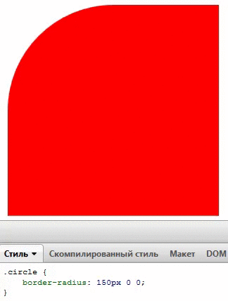
Little about pseudo-elements
The pseudo-elements: before and: after will override the element to which they are added. In the case when the pseudo-element must be placed on the Z-axis below the parent, a negative z-index is indicated.
Also, pseudo-elements will not work with tags that cannot contain textual content. These include <img>, <br> and, oddly enough, <input>.
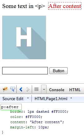
But <hr> for some reason picks up the pseudo-elements normally.
Bonus: mini firebug on pure HTML
Just paste this code on the page:
<style contenteditable style="display: block; border: 1px solid black; width: 90%; height: 300px; position: fixed; bottom: 50px; left: 5%;"></style> 
Voila, everything works. Thanks, HTML5!
A thing is almost useless, however, if you set a larger font size for it, it can serve you well during presentations. After all, few people will be able to see the tiny little letters of a real firebug.
That's all for today. Thank you all for your attention! We are waiting for your comments!
Source: https://habr.com/ru/post/198138/
All Articles