Dark patterns: interfaces designed to cheat

Harry Brignull is an independent user interface designer from London with a Ph.D. in cognitive science. He is also known as the creator of the Dark Patterns website, which he says is “listing and ridiculing websites that use deceptive user interfaces.” This article is based on the presentation he showed in Munich in April at Search Marketing Expo.
Article translated and published with the consent of the author .
When Apple released iOS 6, one of the new features was the not-too-advertised Advertising Tracking System Identifier for Advertisers (IDFA). It assigns each device a unique identifier that is used to track browser activity and create targeted ads. IDFA is anonymous but unacceptable for people who care about privacy.
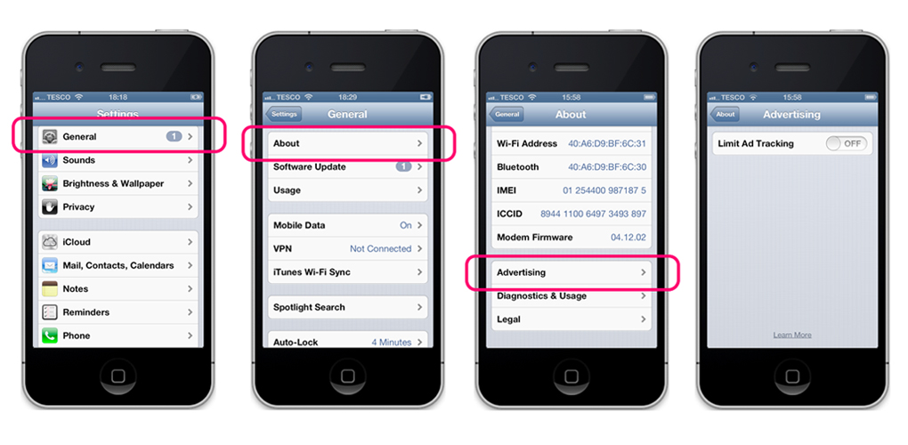
Fortunately, Apple has implemented the ability to disable features. However, you will not find the switch in the privacy settings. Instead, you have to go through a series of obscure options in the general settings menu. In addition, “General” is a lousy name for a menu item. Basically this is a set of different garbage, which they did not know where to go. In the "General" menu, select "About". At the end of this menu, under the terms of use and license points, there is an “Advertising” item.
')
If you didn’t go here, the only option in the ad menu, "Limit Ad Tracking", is probably set to "Off".
Let's take a closer look at the wording. She does not say "Ad Tracking - Off", she says "Limit Ad Tracking - Off". Twice no. Tracking is not limited, so when the switch is turned off, tracking is actually turned on. Off means on!
This is a great example of what I call the dark pattern.
What is a dark pattern?
Dark Pattern is a user interface, carefully crafted to trick users into forcing them to do something that they would not normally do. For example, the purchase of insurance when buying or signing recurring bills. When you encounter a bad design, you usually imagine that its creator is a lazy or careless person without malicious intent. Dark patterns are not errors. They are thoroughly thought out with a clear understanding of human psychology, and they do not take into account the interests of the user.
Interestingly, dark patterns are designed based on exactly the same rules that allow usability to be improved.
Nielsen's 10 heuristics is probably one of the best-known sets of usability tips. They were created in the early 90s. If we select the three tips and invert, we can describe the strategy for creating an Apple user interface for the example above.
[Approx. of the translator: heuristics were published on habrahabr, but without indication of authorship habrahabr.ru/post/75213 ]
The visibility of the state of the system . Instead of displaying key status information, it should be hidden. This can be done with the use of vague tags, blunt navigation and late messages.
Equality between the system and the real world . Instead of “talking to the user in his language,” the system should use “tortuous language,” talking about one and implying a completely different one.
Freedom of action by the user . Instead of granting freedoms, we will use the natural ability of the user to make mistakes. To achieve your goal, you should force the user to "randomly" perform the necessary actions.
Deceptive questions
Promotional emails use this tactic all the time. You may have already encountered this. After registering on the site, you are asked if you want to subscribe to the mailing list. This approach is quite common, but it is very inefficient due to the need for an explicit action for a subscription. There is a chance that users will be in a hurry and someone will not even notice this text. Some sites use mandatory switches without the option selected by default (on / off). Thus, the user will not be able to go to the next page without making an explicit choice. At first glance, there is no dark pattern in such a ploy. It is worth returning to the principles of anti-usability. The choice can be tricked for us, without focusing on it.
For example, the post-office.co.uk website does not focus on options, in the hope that you will be signed in error. Here tick means "no." Pretty tricky, because usually a tick confirms something.
The mailing list is definitely expanding thanks to hurried people who don’t read the text. On the one hand, it works - they accelerated the rate of subscription. However, some people will gnash their teeth, realizing that the site has inflated them. This probably will not force them to change the provider, but will lower its rating in the eyes of users.
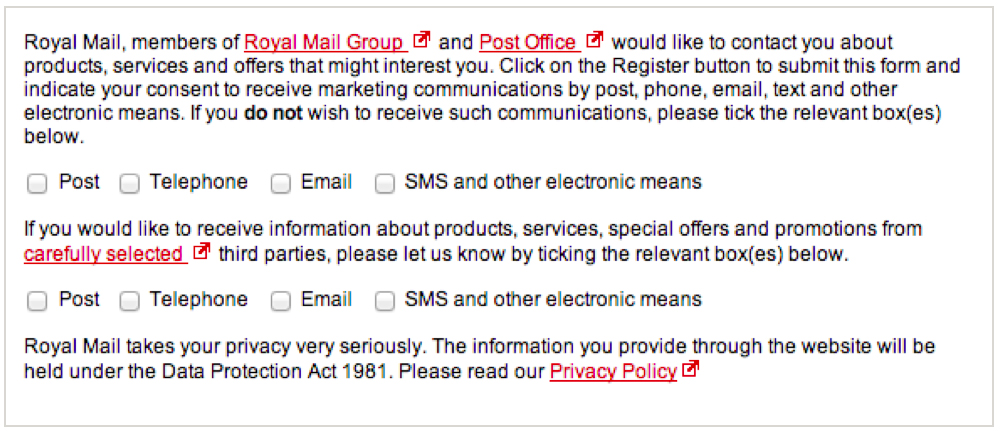
royalmail.co.uk goes one step further. Two rows of checkboxes: the first to unsubscribe, the second to sign.
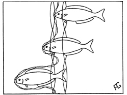
Have you heard of the multiwall network?
This is a type of fishing net made of two different types of mesh layers. The fish - or your user - can get caught in the first layer, in the second, or get stuck between two layers. Such networks are prohibited in most cases commercial fisheries, however you can easily place them in your interface without any legal consequences.
All these examples are just tiptoeing around the problem. It is possible to go to another level entirely and get rid of uncertainty altogether.
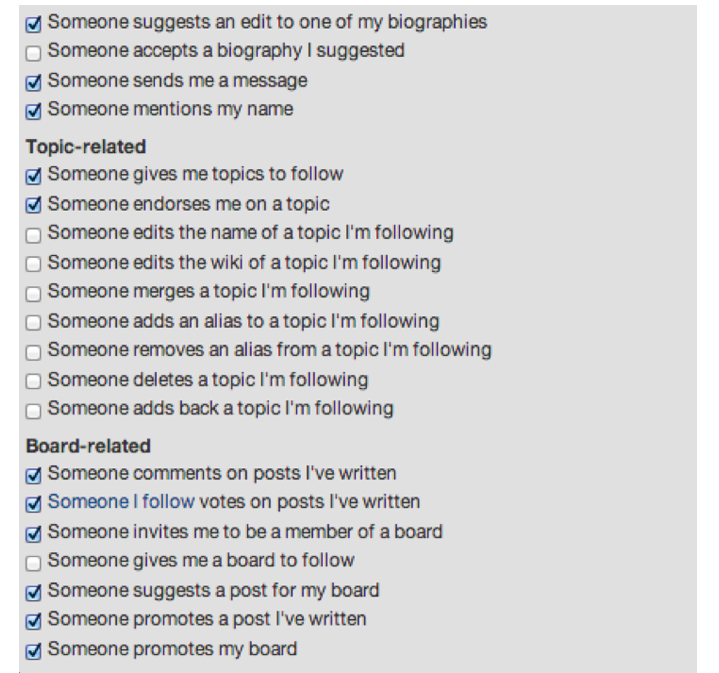
Quora is not currently playing with subscriptions or questions of any type. They simply list you according to the terms of use. This is what you see when registering - if you have time to go to the email notification page.
Now there are 35 types of email notifications. You are automatically subscribed to the majority.
Let us make a conclusion: although it is quite easy to play such tricks, they annoy the users. It is useful to reflect on the interaction of your brand with users from a human point of view.
Forced account renewal
Let's move on to the next dark pattern.
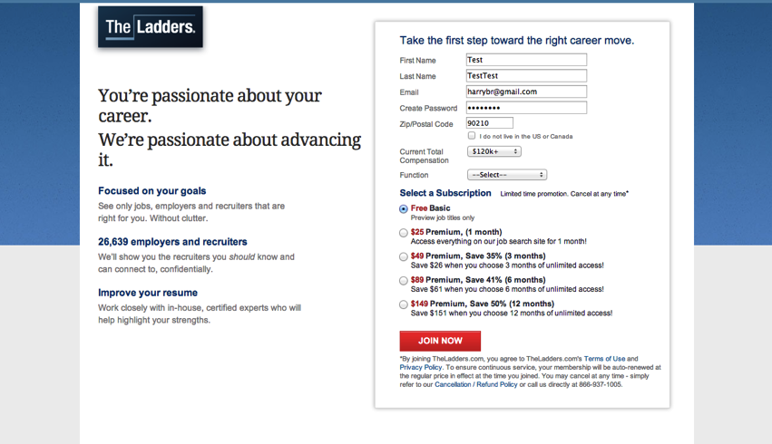
theladders.com is a fairly large job ad board, founded 9 years ago in the United States. They employ about 400 people, and the annual income is already about $ 100 million dollars. Funded by venture capital.
What I’ll tell you now is rather unpleasant, so please check it yourself and let me know if I'm wrong. In any case, let's register a simple free account.
It would seem that I am starting a free account - what could go wrong?

Then I go through several steps of registration and look for a job. Here are the search results. Suppose the second sentence looks attractive to me.
Here the first oddity is revealed: it is impossible to select the text. The site has disabled this feature using javascript. Most users will not think about it, so let's leave this thought and click on the title of the work to get more information and submit a resume.
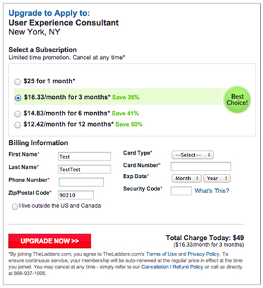
A second ago, I clicked “apply”, expecting to see the details of the work and the form of submission. Instead, I see a paid access banner that says I have to upgrade my account to submit my resume!
At the moment I do not know that this offer is freely available anywhere else on the net.
Suddenly, disabling text selection becomes meaningful. They want to discourage people from going around the paid access banner by copying a job description and searching it on Google. They do not want people to find the real source of the ad. In this case, the work was published on the Bloomberg's careers website, where you can send your resume for free.
I did not consider a large number of ads, but a superficial analysis yields similar results: many ads behind the paid access banner can be found elsewhere on the network at no cost.
WHO IN THE HEALTHY CRAFT WELL INTO THE ACCOUNT SETTINGS PAGE?
Pretty tricky, but forced renewal does not work until you start registration. The premium account page clearly reports its cost (from $ 25 per month to $ 150 per year), but obscures the fact that the one-month subscription is automatically updated, displaying this information in a gray 10m size on a gray background at the bottom of the page. Once registered, you need to find a membership page (in your account settings) to disable this behavior. As confusing as the IDFA settings in iOS.
Knock off
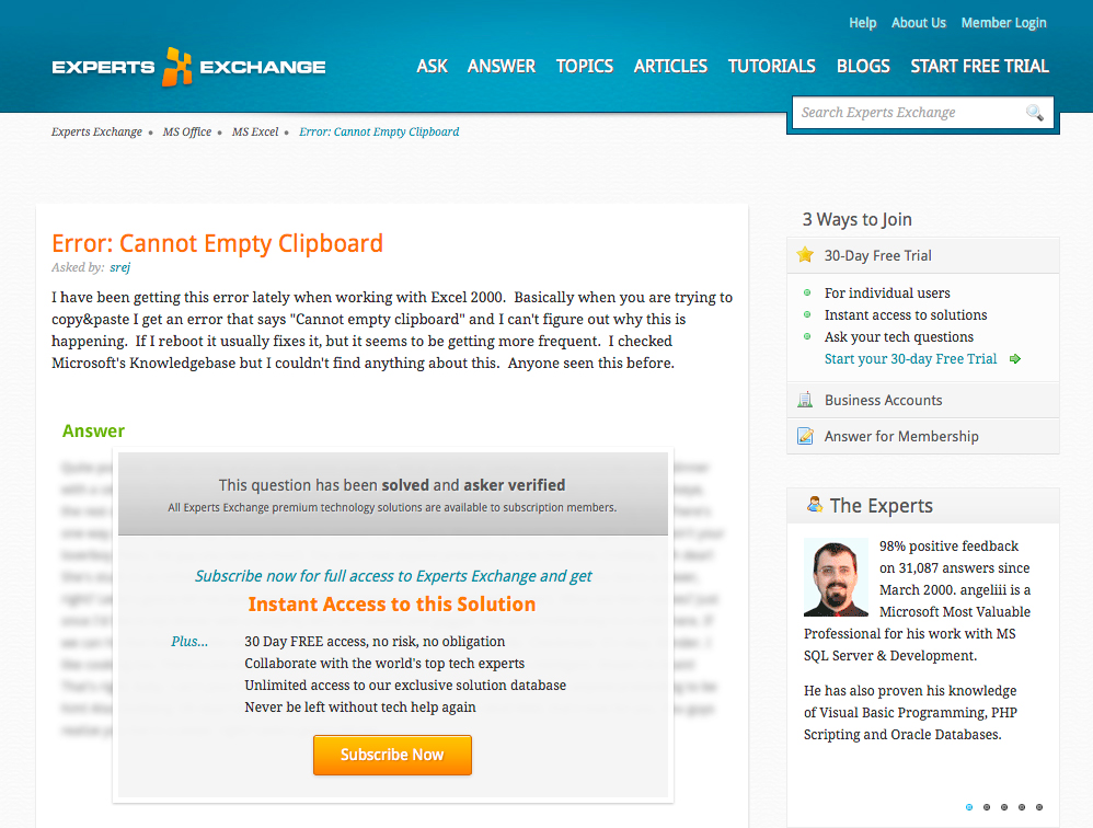
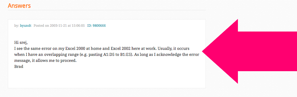
Last pattern: knocking out of the way. Imagine that you are looking for "I can not clear the clipboard in Excel" and go to the Experts Exchange page.
It seems to you that the answer is behind the paid access banner - this is how the page is designed. In fact, the answer is much lower - at the very end of the page.
Such a trick is useful for SEO and at the same time deceptively forces users to subscribe. They have been doing this for years - since 2007.
Case in point: using dark patterns as part of a growth strategy, you are unlikely to stay afloat for long. Experts Exchange could still be the dominant force, but this is no longer the case. They became greedy, used dark patterns, and everyone was sick of it. Users have gone to a more friendly and ethical competitor.
It is very easy to be distant from users and impersonalize them if you see only a gray mass in them. To understand the reality of the user should zoom in.
Good design - and good business - is empathy. The idea is not limited to business, such is society as a whole. That is what makes us human. To understand the impact of your design, you must work at the human level. You need to see the eyes of your users and their facial expressions. That's all.
In the end, you need to evaluate what you need from users. Do you want them to simply use your service, or do you need more?
Personally, I think that only use is cheap. A good brand is desirable. A great brand is loved and respected. You will never achieve this if you use dark patterns.
[Note. All examples are relevant at the beginning of 2013.]
[Approx. translator. I will gladly accept comments on the translation, typos, and style. It will be interesting to hear your examples of dark patterns]
Source: https://habr.com/ru/post/198044/
All Articles