Introduction to data visualization when analyzing with Pandas
Good day, dear readers.
As promised in the previous article , today I will continue the story about the pandas module and data analysis in the Python language. In this article I would like to touch on the topic of fast visualization of data analysis results. With this we will be helped by a library for data visualization matplotlib and the Spyder development environment.
So, as we saw last time, pandas has extensive capabilities for analyzing data, but the IPython interactive shell allows you to fully reveal them. You can read about it on Habré. As its main advantage, I would like to point out its integration with the matplotlib library, which is convenient for visualizing data in calculations. Therefore, when choosing IDE, I looked at the fact that she had support for IPython. As a result, my choice was on the Spyder .
Spyder (Scientific PYthon Development EnviRonment) is a development environment similar to MATLAB. The main advantages of this environment are:
A detailed overview of the environment is written here .
Preliminary analysis of the data and bringing them into the desired form by means of pandas
So, after a brief overview of the environment for work, let's move directly to the visualization of data. For example, I took data on the population in the Russian Federation.
First, let's load the downloaded xls file into the dataset using the read_excel () function:
In our case, the function has 6 parameters:
The rename () function is used to rename the headers of a dataset on a parameter. It is passed a dictionary of the following type: {'Old field name': 'New field name'}
Now our data set will look like this:
Well, the data is loaded, but, as you can see, the data in the index column is not entirely correct. For example, there are not only year numbers, but also textual explanations, but it also contains empty values. In addition, you can see that before 1970, the data are not very well filled, due to the large time intervals between adjacent values.
Bring data in a beautiful view in several ways:
Basic work with filters was shown in a previous article. Therefore, this time we use an additional DataFrame, because in the process of its formation it will be shown how pandas can be used to create a time sequence.
To form a timeline, you can use the date_range () function. In the parameters, it is passed 3 parameters: the initial value, the number of periods, the size of the period (Day, month, year, etc.). In our case, let's form a sequence, from 1970 to the present, because From this point on, the data in our table is filled in almost every year:
')
At the exit, we formed a sequence from 1970 to 2015.
Now we need to add this sequence to the DataFrame, in addition to connecting to the original data set, we need the year number itself, not the date of its beginning, as in the sequence. For this, our time sequence has the year property, which just returns the year number of each record. You can create a DataFrame like this:
The following values are passed as function parameters:
At the data set took the form:
Well, now we have 2 data sets, it remains to connect them. The last article showed how to do this merge () . This time we will use another function join () . This function can be used when your data sets have the same indexes (by the way, it was in order to demonstrate this function that we added them). In the code, it will look like this:
In the parameters to the function, we pass the set that joins the connection type. As you know, the result of an inner join will consist of the values that are present in both sets.
It is worth noting immediately the difference between the functions merge () and join (). Merge () can join in different columns; join (), in turn, works only with indices.
After the manipulation we have done, the data set looks like this:
Well now let's draw the simplest graph showing the dynamics of population growth. This can be done with the function plot () . This function has many parameters, but for a simple example it’s enough to specify the value of the x and y axes and the style parameter, which is responsible for the style. It will look like this:
As a result, our schedule will look like this:

When the plot () function is called in the IPython shell, the graph will be displayed directly in the shell, which will help avoid unnecessary switching between windows. (using the standard shell, the graph would open in a separate window, which is not very convenient). In addition, if you use IPython via Spyder, you can upload the entire session to the html file along with all the generated graphs.
Now let's display the dynamics in a bar chart. This can be done using the kind parameter. The default setting is `line`. To make a chart with vertical columns, you need to change the value of this parameter to `bar`, for horizontal columns there is a value` barh`. So for horizontal columns, the code will look like this:
The resulting graph is shown below:
As can be seen from the code, here we do not specify the value of x, unlike the previous examples, the index is used as x. For full-fledged work with graphics and beauty guidance, it is necessary to use the possibilities of matplotlib, there are already many articles about it. This is due to the fact that the pandas drawing function is just an add-on for quickly accessing the basic drawing functions from the above library, such as matplotlib.pyplot.bar () . Accordingly, all parameters used in when calling functions from matplotlib can be specified through the plot () function of the pandas package.
On this introduction to the visualization of the analysis results in pandas is completed. In the article I tried to describe the necessary basis for working with graphics. A more detailed description of all features is given in the documentation for pandas, as well as the matplotlib library. I would also like to draw your attention to the fact that I exist Python assemblies, sharpened specifically for data analysis, which already include such libraries and add-ons as matplotlib, pandas, IDE Spyder, and the IPython shell. I know two such builds are Python (x, y) and Anaconda . The first supports only Windows, but has a large set of embedded packages. Anaconda; t is cross-platform (this is one of the reasons I use it) and its free version includes fewer packages.
As promised in the previous article , today I will continue the story about the pandas module and data analysis in the Python language. In this article I would like to touch on the topic of fast visualization of data analysis results. With this we will be helped by a library for data visualization matplotlib and the Spyder development environment.
Development environment
So, as we saw last time, pandas has extensive capabilities for analyzing data, but the IPython interactive shell allows you to fully reveal them. You can read about it on Habré. As its main advantage, I would like to point out its integration with the matplotlib library, which is convenient for visualizing data in calculations. Therefore, when choosing IDE, I looked at the fact that she had support for IPython. As a result, my choice was on the Spyder .
Spyder (Scientific PYthon Development EnviRonment) is a development environment similar to MATLAB. The main advantages of this environment are:
- Customizable interface
- Integration with matplotlib, NumPy, SciPy
- Support for using multiple IPython consoles
- Dynamic function help when writing code (shows help for the last printed function)
- Ability to save the console in html / xml
A detailed overview of the environment is written here .
Preliminary analysis of the data and bringing them into the desired form by means of pandas
So, after a brief overview of the environment for work, let's move directly to the visualization of data. For example, I took data on the population in the Russian Federation.
First, let's load the downloaded xls file into the dataset using the read_excel () function:
import pandas as pd data = pd.read_excel('data.xls',u'1', header=4, parse_cols="A:B",skip_footer=2, index_col=0) c = data.rename(columns={u'':'PeopleQty'}) In our case, the function has 6 parameters:
- The name of the file being opened
- The name of the sheet that contains the data
- Line number containing the field names (in our case, this is line 4, since the first 3 lines contain reference information)
- List of columns that fall into the data set (in our case, we need only 2 columns from the entire table: the year and the number of people corresponding to it)
- The following parameter means that we will not take into account the last 2 lines (they contain comments)
- The last parameter indicates that the first column we receive will be used as an index.
The rename () function is used to rename the headers of a dataset on a parameter. It is passed a dictionary of the following type: {'Old field name': 'New field name'}
Now our data set will look like this:
| PeopleQty | |
|---|---|
| population, | |
| million people | |
| 1897.0 | |
| within the borders of the Russian Empire | 128.2 |
| within modern boundaries | 67.5 |
| 1914 | |
| within the borders of the Russian Empire | 165.7 |
| within modern boundaries | 89.9 |
| 1917 | 91 |
| 1926 | 92.7 |
| 1939 | 108.4 |
| 1959 | 117.2 |
| 1970 | 129.9 |
| 1971 | 130.6 |
| 1972 | 131.3 |
| 1973 | 132.1 |
| 1974 | 132.8 |
| 1975 | 133.6 |
| 1976 | 134.5 |
| 1977 | 135.5 |
| 1978 | 136.5 |
| ... | ... |
| 2013 | 143.3 |
Well, the data is loaded, but, as you can see, the data in the index column is not entirely correct. For example, there are not only year numbers, but also textual explanations, but it also contains empty values. In addition, you can see that before 1970, the data are not very well filled, due to the large time intervals between adjacent values.
Bring data in a beautiful view in several ways:
- Or using filters
- Or by connecting to DataFrame, which will contain years in a date format (this will also help in the design of the graphics)
Basic work with filters was shown in a previous article. Therefore, this time we use an additional DataFrame, because in the process of its formation it will be shown how pandas can be used to create a time sequence.
To form a timeline, you can use the date_range () function. In the parameters, it is passed 3 parameters: the initial value, the number of periods, the size of the period (Day, month, year, etc.). In our case, let's form a sequence, from 1970 to the present, because From this point on, the data in our table is filled in almost every year:
')
a = pd.date_range('1/1/1970', periods=46, freq='AS') At the exit, we formed a sequence from 1970 to 2015.
<class 'pandas.tseries.index.DatetimeIndex'>[1970-01-01 00:00:00, ..., 2015-01-01 00:00:00]Now we need to add this sequence to the DataFrame, in addition to connecting to the original data set, we need the year number itself, not the date of its beginning, as in the sequence. For this, our time sequence has the year property, which just returns the year number of each record. You can create a DataFrame like this:
b = pd.DataFrame(a, index=a.year,columns=['year']) The following values are passed as function parameters:
- The array of data from which the DataFrame will be created
- Index values for a dataset
- Name of the fields in the set
At the data set took the form:
| year | |
|---|---|
| 1970 | 1970-01-01 00:00:00 |
| 1971 | 1971-01-01 00:00 |
| 1972 | 1972-01-01 00:00 |
| 1973 | 1973-01-01 00:00 |
| 1974 | 1974-01-01 00:00 |
| 1975 | 1975-01-01 00:00 |
| 1976 | 1976-01-01 00:00 |
| 1977 | 1977-01-01 00:00 |
| 1978 | 1978-01-01 00:00:00 |
| 1979 | 1979-01-01 00:00:00 |
| 1980 | 1980-01-01 00:00:00 |
| 1981 | 1981-01-01 00:00:00 |
| ... | ... |
| 2015 | 2015-01-01 00:00:00 |
Well, now we have 2 data sets, it remains to connect them. The last article showed how to do this merge () . This time we will use another function join () . This function can be used when your data sets have the same indexes (by the way, it was in order to demonstrate this function that we added them). In the code, it will look like this:
i = b.join(c, how='inner') In the parameters to the function, we pass the set that joins the connection type. As you know, the result of an inner join will consist of the values that are present in both sets.
It is worth noting immediately the difference between the functions merge () and join (). Merge () can join in different columns; join (), in turn, works only with indices.
Visualization of analysis results
After the manipulation we have done, the data set looks like this:
| year | PeopleQty | |
|---|---|---|
| 1970 | 1970-01-01 00:00:00 | 129.9 |
| 1971 | 1971-01-01 00:00 | 130.6 |
| 1972 | 1972-01-01 00:00 | 131.3 |
| 1973 | 1973-01-01 00:00 | 132.1 |
| 1974 | 1974-01-01 00:00 | 132.8 |
| 1975 | 1975-01-01 00:00 | 133.6 |
| ... | ||
| ... | ... | ... |
| ... | ... | ... |
| 2013 | 2013-01-01 00:00:00 | 143.3 |
Well now let's draw the simplest graph showing the dynamics of population growth. This can be done with the function plot () . This function has many parameters, but for a simple example it’s enough to specify the value of the x and y axes and the style parameter, which is responsible for the style. It will look like this:
i.plot(x='year',y='PeopleQty',style='k--') As a result, our schedule will look like this:
When the plot () function is called in the IPython shell, the graph will be displayed directly in the shell, which will help avoid unnecessary switching between windows. (using the standard shell, the graph would open in a separate window, which is not very convenient). In addition, if you use IPython via Spyder, you can upload the entire session to the html file along with all the generated graphs.
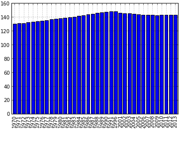
Now let's display the dynamics in a bar chart. This can be done using the kind parameter. The default setting is `line`. To make a chart with vertical columns, you need to change the value of this parameter to `bar`, for horizontal columns there is a value` barh`. So for horizontal columns, the code will look like this:
i.plot(y='PeopleQty', kind='bar') The resulting graph is shown below:
As can be seen from the code, here we do not specify the value of x, unlike the previous examples, the index is used as x. For full-fledged work with graphics and beauty guidance, it is necessary to use the possibilities of matplotlib, there are already many articles about it. This is due to the fact that the pandas drawing function is just an add-on for quickly accessing the basic drawing functions from the above library, such as matplotlib.pyplot.bar () . Accordingly, all parameters used in when calling functions from matplotlib can be specified through the plot () function of the pandas package.
Conclusion
On this introduction to the visualization of the analysis results in pandas is completed. In the article I tried to describe the necessary basis for working with graphics. A more detailed description of all features is given in the documentation for pandas, as well as the matplotlib library. I would also like to draw your attention to the fact that I exist Python assemblies, sharpened specifically for data analysis, which already include such libraries and add-ons as matplotlib, pandas, IDE Spyder, and the IPython shell. I know two such builds are Python (x, y) and Anaconda . The first supports only Windows, but has a large set of embedded packages. Anaconda; t is cross-platform (this is one of the reasons I use it) and its free version includes fewer packages.
Source: https://habr.com/ru/post/197212/
All Articles