Making css sprites more responsive on retina-displays and not only [less]
Why do we need sprites at all?
I will write only briefly why this is necessary, since the advantages and disadvantages of css sprites have already been described on the habr.
- First, using sprites, we speed up page loading; in the case of icons, you can create a universal tool for use in projects;
- Secondly, not all devices with high ppi (for example, Windows Phone 7.5-7.8, Android up to version 4 on the stock browser) support the use of webfonts.
- Easy integration using special sprite generation services
Problem statement or so life does not seem to raspberry
Using css sprites with many elements raises the problem of creating css properties with
background-position ; They need to write a lot, sometimes a lot. Of course, many sprite generation services help us - they also issue a css / less / sass file with coordinates along with the sprite. But almost always everything is rigidly tied up in pixels:- Changing the size (for example, for retina-screens) of the source file-sprite, everything “goes”;
- We cannot change the size of the container element where we want to insert, for example, an icon so that this icon is scaled: the
background-size: cover/contain/100%properties do not work for obvious reasons;
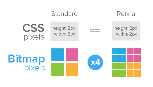
Using sprites prepared for 72ppi, on phones, tablets and new retina-laptops causes blurring of images, and looks ugly ...
Disclaimer on cross-browser compatibility, cross-platform and cross-something else
We will use css3 in this method only for displays with ppi, above the standard 72. Similar displays appeared relatively recently, and no IE 7.0-IE8.0 and the like old versions of Firefox or Opera will stand there. With the mobile segment, too, everything is in order, support for media queries is implemented everywhere .
Let's start forming a less-snippet
Immediately, I note that no one forces you to use less on a working project, everything can be compiled into regular css. A bunch of similar mac programs, WinLess will be useful for windows.
Now I will consider a special case of the sprite - a sprite with icons, generated by the wonderful resource icomoon.io
What would we do with a simple css, if you had to configure a sprite for retina? Most likely, we would have
But here we are faced with the problem of scaling this sprite to fit our size. And this, except for
transform: scale(x); just not to solve, and you have to redraw the sprite, rewrite the whole background-position . And everything would be fine, but sometimes the number of icons exceeds the limit, and in general I would like a universal solution .')
I have them
So let's get started:
- The first thing we need is to generate 2 sprites (you can 3 if you want to cover 400+ ppi) and the css-code for them. This is done easily through the above service. I generated 145 icons, sizes 16px (25kb), 32px (62kb) and 64px (163kb)
Initially, the attached css-file for 16px-icons looks like this: (I deliberately reduced it to four icons, so as not to scare the huge sheets of code).icon-rss,.icon-e-mail,.icon-youtube,.icon-mailru { display: inline-block; width: 16px; height: 16px; background-image: url(sprites.png); background-repeat: no-repeat; } .icon-rss { background-position: 0 0; } .icon-e-mail { background-position: -32px 0; } .icon-youtube { background-position: -64px 0; } .icon-mailru { background-position: -96px 0; } - Then find out the size of the picture sprite. For 16px icons, it was 496px. This value will be the reference for our less code. Now you should add the line
background-size: 496px; - Now we have to get rid of the units of measurement in all this css-sprite, replacing "
px" with a variable, the default equal to 1px. Let it be calledsize. This is done easily autocorrect. Along the way, do not forget to rename the file to the less extension and bind to the main less-file of your project:@size: 1px; .icon-rss,.icon-e-mail,.icon-youtube,.icon-mailru { display: inline-block; width: 16*(@size); height: 16*(@size); background-image: url(sprites.png); background-repeat: no-repeat; background-size:496*(@size); } .icon-rss { background-position: 0 0; } .icon-e-mail { background-position: -32*(@size) 0; } .icon-youtube { background-position: -64*(@size) 0; } .icon-mailru { background-position: -96*(@size) 0; } - It is important to note that we cannot simply add the resulting mixins to the tags - we have the width and height specified in the classes, which means we will add them to the pseudo-elements
::beforeor::after @mediarequests less support anywhere in the code: depending on the pixel density, we will connect this or that file.@size: 1px; .icon-rss,.icon-e-mail,.icon-youtube,.icon-mailru { display: inline-block; width: 16*(@size); height: 16*(@size); background-image: url(sprites.png); @media only screen and (-webkit-min-device-pixel-ratio: 2), only screen and ( min--moz-device-pixel-ratio: 2), only screen and ( -o-min-device-pixel-ratio: 2/1), only screen and ( min-device-pixel-ratio: 2), only screen and ( min-resolution: 192dpi), only screen and ( min-resolution: 2dppx) { background-image: url(sprites32.png); } @media only screen and (-webkit-min-device-pixel-ratio: 4), only screen and ( min--moz-device-pixel-ratio: 4), only screen and ( -o-min-device-pixel-ratio: 4/1), only screen and ( min-device-pixel-ratio: 4), only screen and ( min-resolution: 360dpi), only screen and ( min-resolution: 4dppx) { background-image: url(sprites64.png); } background-repeat: no-repeat; background-size:496*(@size); } .icon-rss { background-position: 0 0; } .icon-e-mail { background-position: -32*(@size) 0; } .icon-youtube { background-position: -64*(@size) 0; } .icon-mailru { background-position: -96*(@size) 0; }
Comments for use in practice
- You do not need to generate three different sprites at once through the generator program. You can generate one (for very-retina screens), get a precious css-file, and then through a graphics editor make a smaller version of the sprite for conventional devices (not retina).
- I don't use "
px" in my projects. Instead, I set thesizeto a value in the units of "rem". This gives the freedom to resize the icons to the required, and in case we open the site from the tablet, these samerembecome a bit more, because I set a slightly larger font size for tablets, for example:@media (min-width: 768px) and (max-width: 1366px) { html {font-size: 120%;} }
When to use this technique
- For the ability to load sprites of different quality for retina / non-retina screens;
- When possible resizing of an icon is expected during project development;
- When it is necessary to adapt the original sprite when creating a mobile version of the site;
- In my practice, I use this method only when webfonts are not supported by the device. In any other cases, it is easier to use the icon font: here you can change the color, set the shadow, and not sweat about sizes and blurring.
PS: About spelling, syntax and lexical errors, please write in the LAN.
PPS: This material does not claim to be added to the chamber of measures and weights, and the examples used are not perfect. Guru-less / sass in this post will not find anything special, but for beginners it will be useful.
Source: https://habr.com/ru/post/196030/
All Articles