The beta version of the new Yandex.Maps has opened: how and why we made them
Today we are launching the beta version of Maps . This is the beginning of a long way to create a new Yandex.Map interface from scratch. We can say that this is the third decisive turn in its history. Using this launch as an example, I will try to share with you a vision of how to organize the creation of a complex user product with a bunch of different requirements.
The Yandex.Map interface is a complex one-screen superinteractive application in the browser: a bunch of buttons, an interactive map, a search — you, as a user, press buttons, something happens on the screen. With the growth of functionality, we have come to a number of problems in the interface that can no longer be treated separately. We need some decisive step that will help not only to cure the current problems, but also make the service ready for an increase in the number of features, audience, speed of external and internal changes. That is why we came up with a beta: without breaking the habits of users, we developed a new version in order to test it thoroughly and only then switch users to it.
How to live with it? How to make our service solve the problems of users? How to choose what to do in the service interface and what not to do? What button to make more noticeable, what is not? It seems to me that we are constantly asking these questions, ordering various studies, polling users, looking at statistics, experimenting. Something turns out to do systematically, and something comes in the direction of travel. However, everything must fit into some big picture.
')
One way to reduce uncertainty is a streamlined and continuous process of testing hypotheses and ideas, fast, with the accumulation of acquired knowledge, with the investment of this experience in the team.
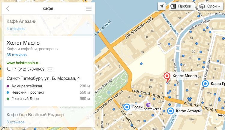
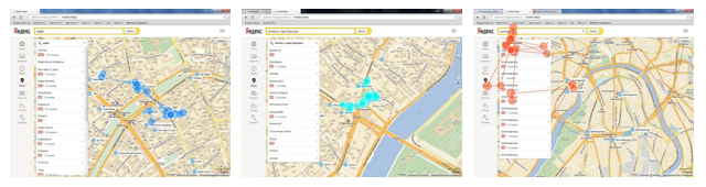
I will give an example of one such iteration. The search interface on the map is such an interface where there is a map, and there is a list that pops up after clicking on the label on it. With this interface, you can find a laundry, a pharmacy, a zoo - everything that users are looking for with us. There are a lot of life situations behind these searches. During the existence of cards in this form, we have accumulated quite a large number of signals about user problems: in some cases, someone was hampered by a list, information from someone who pops up by clicking on a tag, blocked the card. Moreover, it was rather difficult to determine which behavior was correct from these signals.
We decided to test our hypothesis. To do this, we made two prototypes and tested them for usability in the laboratory. These were two fundamentally different types of search interface:

And what do you think we did? Since the research in the laboratory is qualitative, not quantitative, we received equal portions of pros and cons for each solution. There was no understanding that a specific version of the prototype was the best. And I remind you that we have a lot of user scripts, which are quite difficult to compare with each other.
However, thanks to testing of somewhat bold versions of the interface, we understood a seemingly very simple thing: how and what would we ultimately decide to do, it is necessary that the person understands what happens to the product when it begins to interact with it. For users, the predictability of the interface is important.
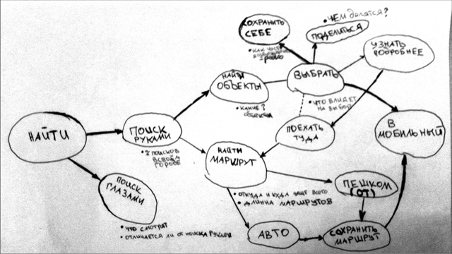
To move somewhere, you need to push off from something - you need to have a structure, a skeleton, on which you can string the details of the product. So the idea was born to work with basic cases. This meant that it was necessary to understand what a person was doing on the service, and very roughly to distinguish patterns of user behavior. For this, we analyzed a large number of sessions and selected several groups from them.
Using the example of a search script on the map, we made a series of assumptions about how the functions of the service are interconnected and how a person interacts with the product.
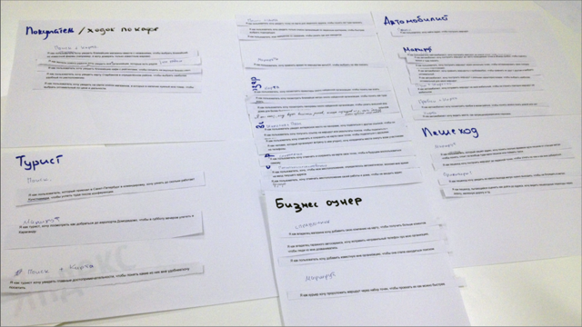
Product requirements are many. Signals, ideas, and "wishes" come from different sides all the time, and the user on the other side of the screen evaluates us as one thing. Therefore, we decided to start formulating demands on behalf of this user. And this needs to be done so that all interested parties, including product managers, development team, designers, testers, interface researchers, find a common language. Looking at several different methodologies, we decided to capture all user requirements in User Stories format.
After several brainstorms with representatives of different teams, we collected and made up ideas for three hundred such user stories.
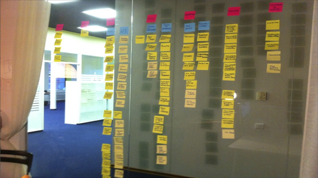
Obviously, to implement them all at once is impossible. Therefore, we have grouped them into the baseline scenarios that have been identified as a result of the analysis of the sessions. And they asked the service managers to prioritize the scenarios within each group.
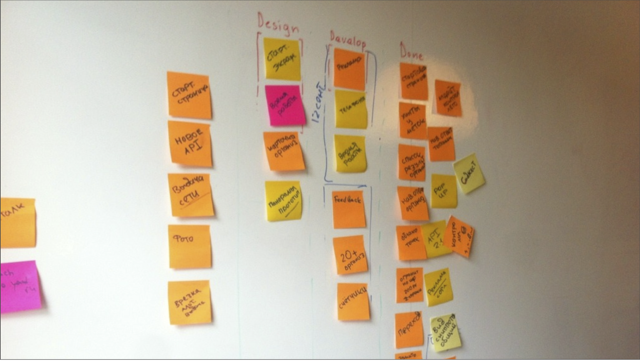
For tracking tasks and managing operational plans, we brought a separate board on which you could see the movement of the task from design to development, and from development to testing the resulting versions by live users.
We took the same User Stories as scripts for tests, offering users to test a new interface in the laboratory.
As a result, we identified and fixed a number of user problems with the interface prior to the launch of the public beta - that is, until today.
Simultaneously changing the interface of such a massive and complex service as Yandex.Maps is a big risk, so we start with a separate beta version with a new interface that works separately on beta.maps.yandex.ru . Not everything that is in the main version is implemented in it yet - this is only the beginning of a long way of its development. But we are glad that we were able to do everything quickly and efficiently and show you what has already happened.
The Yandex.Map interface is a complex one-screen superinteractive application in the browser: a bunch of buttons, an interactive map, a search — you, as a user, press buttons, something happens on the screen. With the growth of functionality, we have come to a number of problems in the interface that can no longer be treated separately. We need some decisive step that will help not only to cure the current problems, but also make the service ready for an increase in the number of features, audience, speed of external and internal changes. That is why we came up with a beta: without breaking the habits of users, we developed a new version in order to test it thoroughly and only then switch users to it.
How to live with it? How to make our service solve the problems of users? How to choose what to do in the service interface and what not to do? What button to make more noticeable, what is not? It seems to me that we are constantly asking these questions, ordering various studies, polling users, looking at statistics, experimenting. Something turns out to do systematically, and something comes in the direction of travel. However, everything must fit into some big picture.
')
One way to reduce uncertainty is a streamlined and continuous process of testing hypotheses and ideas, fast, with the accumulation of acquired knowledge, with the investment of this experience in the team.
I will give an example of one such iteration. The search interface on the map is such an interface where there is a map, and there is a list that pops up after clicking on the label on it. With this interface, you can find a laundry, a pharmacy, a zoo - everything that users are looking for with us. There are a lot of life situations behind these searches. During the existence of cards in this form, we have accumulated quite a large number of signals about user problems: in some cases, someone was hampered by a list, information from someone who pops up by clicking on a tag, blocked the card. Moreover, it was rather difficult to determine which behavior was correct from these signals.
We decided to test our hypothesis. To do this, we made two prototypes and tested them for usability in the laboratory. These were two fundamentally different types of search interface:
- in the first, we removed the list altogether, and the user interacted only with the map and the labels on it;
- in the second there were no baluns that pop up after clicking on a tag.
And what do you think we did? Since the research in the laboratory is qualitative, not quantitative, we received equal portions of pros and cons for each solution. There was no understanding that a specific version of the prototype was the best. And I remind you that we have a lot of user scripts, which are quite difficult to compare with each other.
However, thanks to testing of somewhat bold versions of the interface, we understood a seemingly very simple thing: how and what would we ultimately decide to do, it is necessary that the person understands what happens to the product when it begins to interact with it. For users, the predictability of the interface is important.
To move somewhere, you need to push off from something - you need to have a structure, a skeleton, on which you can string the details of the product. So the idea was born to work with basic cases. This meant that it was necessary to understand what a person was doing on the service, and very roughly to distinguish patterns of user behavior. For this, we analyzed a large number of sessions and selected several groups from them.
Using the example of a search script on the map, we made a series of assumptions about how the functions of the service are interconnected and how a person interacts with the product.
Product requirements are many. Signals, ideas, and "wishes" come from different sides all the time, and the user on the other side of the screen evaluates us as one thing. Therefore, we decided to start formulating demands on behalf of this user. And this needs to be done so that all interested parties, including product managers, development team, designers, testers, interface researchers, find a common language. Looking at several different methodologies, we decided to capture all user requirements in User Stories format.
After several brainstorms with representatives of different teams, we collected and made up ideas for three hundred such user stories.
Obviously, to implement them all at once is impossible. Therefore, we have grouped them into the baseline scenarios that have been identified as a result of the analysis of the sessions. And they asked the service managers to prioritize the scenarios within each group.
For tracking tasks and managing operational plans, we brought a separate board on which you could see the movement of the task from design to development, and from development to testing the resulting versions by live users.
We took the same User Stories as scripts for tests, offering users to test a new interface in the laboratory.
As a result, we identified and fixed a number of user problems with the interface prior to the launch of the public beta - that is, until today.
Simultaneously changing the interface of such a massive and complex service as Yandex.Maps is a big risk, so we start with a separate beta version with a new interface that works separately on beta.maps.yandex.ru . Not everything that is in the main version is implemented in it yet - this is only the beginning of a long way of its development. But we are glad that we were able to do everything quickly and efficiently and show you what has already happened.
Source: https://habr.com/ru/post/195890/
All Articles