Preparation of schedules in MatLab
In writing scientific articles, a considerable part of the time is occupied by the preparation of illustrations, graphs and diagrams. I want to share some thoughts and examples of how to speed up this process. The material is useful to those who use the system MatLab.
MatLab provides ample opportunities for displaying graphical information in the form of graphs, charts, etc. However, the default illustrations do not always meet the requirements for the design of articles. There are many options for this in the MatLab system. And in order to speed up the preparation of illustrations, I suggest using a few lines of code that will help to help customize the display of graphs.
First of all, you need to configure the fonts that will be used to display the values of axes and inscriptions on graphs, which also helps in cases of incorrect display of inscriptions in Russian:
Then you need to adjust the size of the graph and its position on the screen, for example, with full-screen display:
')
If necessary, insert the name of the chart:
Then you can enable the construction of several graphs in one window, using the same axes and properties of the graph:
We build graphics with a specific color, style and line thickness:
Insert a legend in the graph with a certain position in the figure, for example, at the bottom right:
When plotting in MatLab, fractional values of signatures on the axes of coordinates are displayed with a separator in the form of a point, whereas, the separator of the fractional and integer parts is usually displayed as a comma.
Not to manually change all the values of the axes data labels through the chart menu,
The code “punctures” the signatures of the x and y axes, as well as corrects dots for commas in the signatures on the y axis. For other axes it is necessary to repeat similar procedures.
And finally, let's display the grid lines:
For ease of use, in order not to repeat these actions every time, we conclude the written code in a function, in the parameters of which are indicated the display settings of the graphs and their data.
Will execute
By default, MatLab displays the Greek letter "phi" as in Cyrillic "f". One of the ways to display the familiar Greek letter "phi" with a loop-like outline is to select a special font with Greek letters. Download, for example, the Greek Normal font from here and install it. After reviewing the Greek font in the symbol table, we note that in this font the letter “phi” exists in two versions, and for the Latin code “f” we get the same result as in MatLab as “f”, and for the Latin code “j” the required result must be obtained.
Will execute
As a result of using the above code for plotting graphs using MatLab, we succeeded:
PS If someone knows a simple way to display the symbol of the Greek letter “phi” with the code unicode-036 in MatLab charts, please write in the comments.
UPD Another method, suggested in the comments, for displaying “phi” with a loop-like outline:
And some useful links:
Code on Github.com
Some useful tools for plotting (plot) in MATLAB
Matlab Notes Export graphs.
Simplest GUI application with MatLab 6.5
MatLab provides ample opportunities for displaying graphical information in the form of graphs, charts, etc. However, the default illustrations do not always meet the requirements for the design of articles. There are many options for this in the MatLab system. And in order to speed up the preparation of illustrations, I suggest using a few lines of code that will help to help customize the display of graphs.
First of all, you need to configure the fonts that will be used to display the values of axes and inscriptions on graphs, which also helps in cases of incorrect display of inscriptions in Russian:
set(0,'DefaultAxesFontSize',14,'DefaultAxesFontName','Times New Roman'); set(0,'DefaultTextFontSize',14,'DefaultTextFontName','Times New Roman'); Then you need to adjust the size of the graph and its position on the screen, for example, with full-screen display:
')
figure('Units', 'normalized', 'OuterPosition', [0 0 1 1]); If necessary, insert the name of the chart:
title(''); Then you can enable the construction of several graphs in one window, using the same axes and properties of the graph:
hold on;% hold all; We build graphics with a specific color, style and line thickness:
plot(X2,Y2,':k','LineWidth',3); plot(X2,Y3,':b','LineWidth',3); plot(X2,Y4,'-.','Color',[.1 .7 .7],'LineWidth',3); plot(X2,Y5,'--','Color',[.1 .4 .1],'LineWidth',3); plot(X2,Y6,'r','LineWidth',3); Insert a legend in the graph with a certain position in the figure, for example, at the bottom right:
legend(' ',' 3- ',' 4- ',' 5- ',' 7- ',' 9- ', 4); And here the most interesting begins ...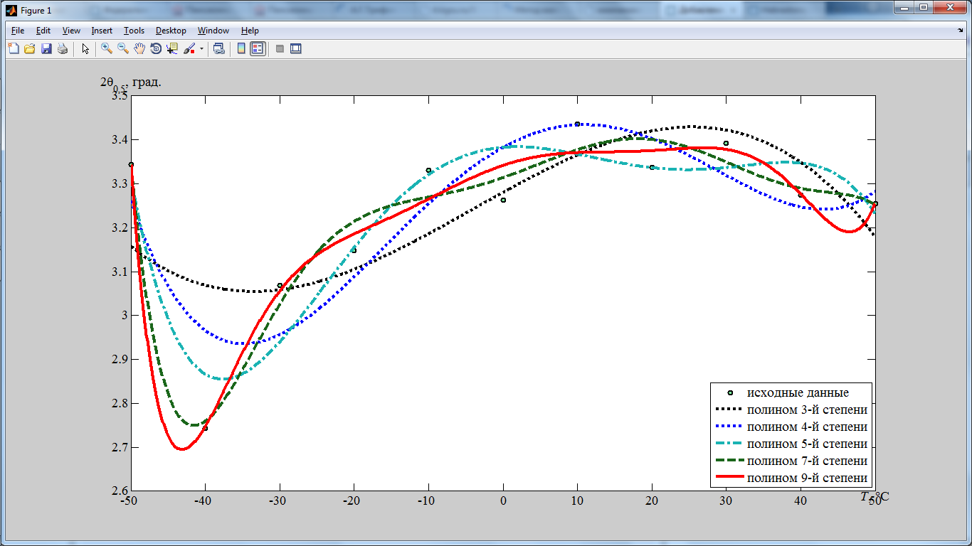
When plotting in MatLab, fractional values of signatures on the axes of coordinates are displayed with a separator in the form of a point, whereas, the separator of the fractional and integer parts is usually displayed as a comma.
Not to manually change all the values of the axes data labels through the chart menu,
use a small piece of code:
BX=get(gca,'XTick'); BY=get(gca,'YTick'); xlabel(XL,'Position',[BX(size(BX,2)) BY(1)]) ylabel(YL,'Rotation',0,'Position',[BX(1) BY(size(BY,2))]) XA=get(gca,'XTickLabel');% for i=1:size(XA,1) z=rem(i,2); if z==0; if XA(i,1)~='0' && XA(i,2)~=0 XA(i,:)=char(0); end end end XA(size(XA,1),:)=char(0); set(gca,'XTickLabel',XA); YA=get(gca,'YTickLabel');% for i=1:size(YA,1) z=strfind(YA(i,:),'.'); YA(i,z)=','; clear z; z=rem(i,2); if z~=0; YA(i,:)=char(0); end end YA(size(YA,1),:)=char(0); set(gca,'YTickLabel',YA); The code “punctures” the signatures of the x and y axes, as well as corrects dots for commas in the signatures on the y axis. For other axes it is necessary to repeat similar procedures.
And finally, let's display the grid lines:
grid on; For ease of use, in order not to repeat these actions every time, we conclude the written code in a function, in the parameters of which are indicated the display settings of the graphs and their data.
Subgraphic function
function result=subgraphic(X1,X2,Y1,Y2,Y3,Y4,Y5,Y6,Tit,TL,XL,YL,PL) figure('Units', 'normalized', 'OuterPosition', [0 0 1 1]); plot(X1,Y1,'o','LineWidth',2,'MarkerEdgeColor','k','MarkerFaceColor',[.49 1 .63],'MarkerSize',5); if Tit title(TL); end hold on; plot(X2,Y2,':k','LineWidth',3); plot(X2,Y3,':b','LineWidth',3); plot(X2,Y4,'-.','Color',[.1 .7 .7],'LineWidth',3); plot(X2,Y5,'--','Color',[.1 .4 .1],'LineWidth',3); plot(X2,Y6,'r','LineWidth',3); legend(' ',' 3- ',' 4- ',' 5- ',' 7- ',' 9- ', PL); BX=get(gca,'XTick'); BY=get(gca,'YTick'); xlabel(XL,'Position',[BX(size(BX,2)) BY(1)]) ylabel(YL,'Rotation',0,'Position',[BX(1) BY(size(BY,2))]) XA=get(gca,'XTickLabel');% for i=1:size(XA,1) z=rem(i,2); if z==0; if XA(i,1)~='0' && XA(i,2)~=0 XA(i,:)=char(0); end end end XA(size(XA,1),:)=char(0); set(gca,'XTickLabel',XA); YA=get(gca,'YTickLabel');% for i=1:size(YA,1) z=strfind(YA(i,:),'.'); YA(i,z)=','; clear z; z=rem(i,2); if z~=0; YA(i,:)=char(0); end end YA(size(YA,1),:)=char(0); set(gca,'YTickLabel',YA); grid on; result=1; Will execute
subgraphic(B,T,A,Y3,Y4,Y5,Y7,Dva_theta_0_5,Tit,'','{\itT}, \circC','{2{\phi}_{0,5}, .',3); with pre-prepared data.And here we are waiting for a small ambush ...
As a result, we get the following schedule:
By default, MatLab displays the Greek letter "phi" as in Cyrillic "f". One of the ways to display the familiar Greek letter "phi" with a loop-like outline is to select a special font with Greek letters. Download, for example, the Greek Normal font from here and install it. After reviewing the Greek font in the symbol table, we note that in this font the letter “phi” exists in two versions, and for the Latin code “f” we get the same result as in MatLab as “f”, and for the Latin code “j” the required result must be obtained.
Will execute
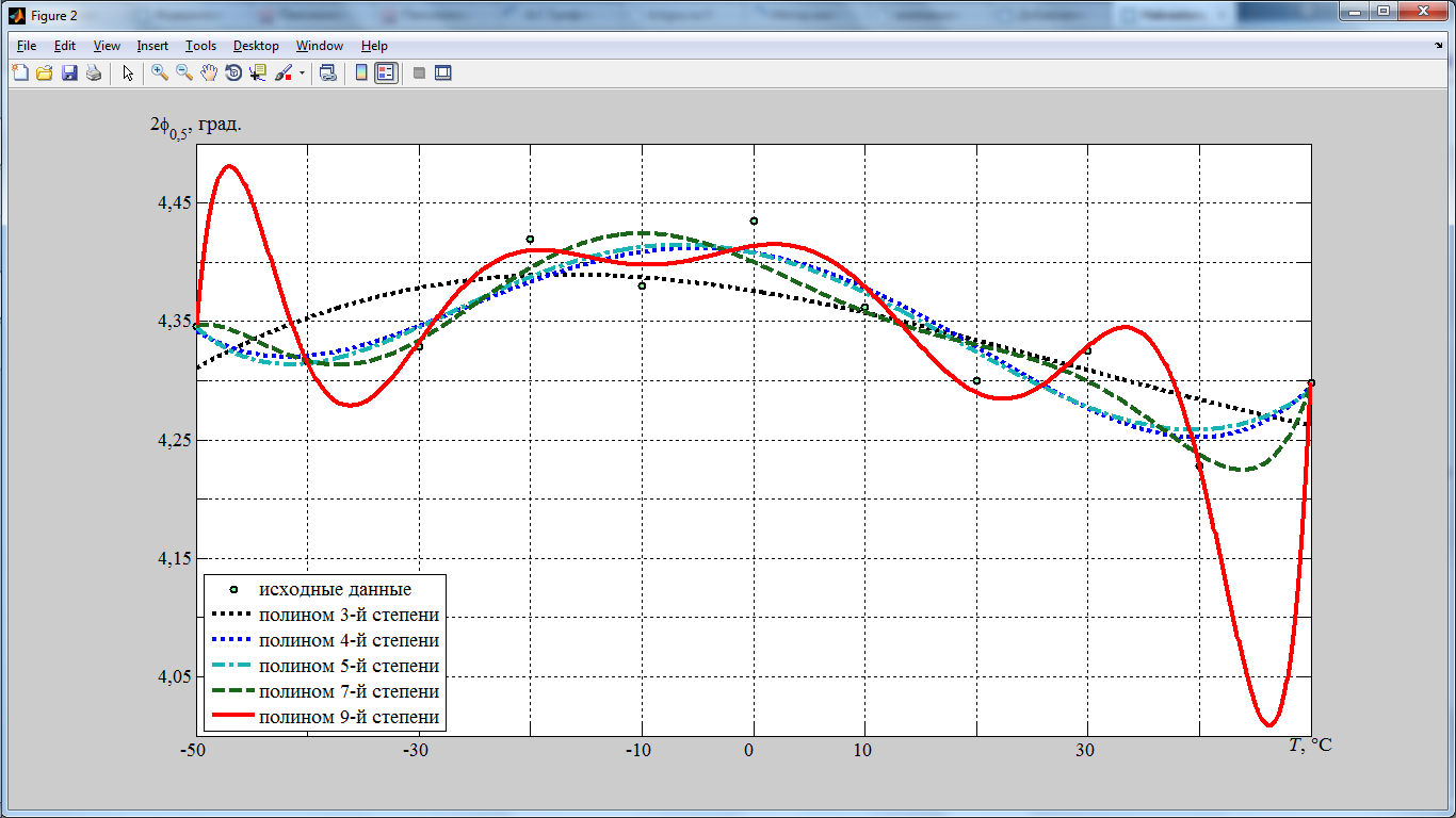
subgraphic(B,T,A,Y3,Y4,Y5,Y7,Dva_theta_0_5,Tit,'','{\itT}, \circC','{2\fontname{Greek}j}_{0,5}, .',3); And here we get this schedule:
As a result of using the above code for plotting graphs using MatLab, we succeeded:
- Solve the problem with incorrect display of Cyrillic fonts;
- Automatically replace the separator between the integer and fractional parts of a number from a point to a comma in the graph;
- Display the Greek letter fi in a looped shape.
PS If someone knows a simple way to display the symbol of the Greek letter “phi” with the code unicode-036 in MatLab charts, please write in the comments.
UPD Another method, suggested in the comments, for displaying “phi” with a loop-like outline:
text(x, y, '$\varphi$', 'FontSize', 14, 'Interpreter', 'latex'); And some useful links:
Code on Github.com
Some useful tools for plotting (plot) in MATLAB
Matlab Notes Export graphs.
Simplest GUI application with MatLab 6.5
Source: https://habr.com/ru/post/195842/
All Articles