Color in the interface
I want to consider an interesting topic for me creating a user interface. This will probably be a series of articles.
So: the user interface ... What is it? I think, an important component of a successful product. It is precisely how comfortable it will be for users to work with an application that determines the further fate of the application itself and, probably, the financial (or non-financial) state of the developer.
I find it convenient to classify the user interface by its final application:
')
Perhaps my classification is too generalized, or incomplete. If you want, correct.
With the first name of the list everything is clear. When creating an interface, the greatest emphasis is on functionality. Therefore, usually, the program itself does not invest too much effort, adhering to the rules of minimalism and brevity. For example, I would like to consider our "favorite" Windows. Only in the latest versions of the developers began to invest some kind of rationalism. In general, the user interface is not only not thought out, but also, in many respects, contradicts the main aspects of the psychology of human perception.
In the second case, everything is exactly the opposite. The game interface is sometimes difficult to call the interface, since it is embedded in the essence of the game and is most adapted to the user. In order to find this or that solution, usually, it is not necessary to think too much. Everything is intuitive. Ideal for the user. My dream is a WoT graphical operating system.
Everything is much more complicated with sites. If you pay attention to the interfaces of sites, you can stumble upon an incredible variety of solutions. And, usually, who in the forest, who for firewood. Some developers adhere to severity and minimalism, which on the contrary overload the interface.
Quite a lot of optimal solutions. But, just as often, one has to stumble upon completely undeveloped sites, where, it seems, they tried, but, apparently, overdid it.
At the moment I want to focus on the development of interface sites. Although, this article is generalized.
So, what is important in achieving optimal results?
Apparently, one or another design decisions must be drawn from the functional component of the site. But, in any case, the main task of any site is to convey information. And, in order for it to reach the addressee (in the literal and figurative sense), it must be accessible, readable, adapted. To achieve this goal, considerable attention should be paid to design development.
It is impossible in one article to consider all the details.
Now I want to focus on color. For some reason, it seems to me, it is necessary to begin with it.
Yes, perhaps a lot has already been said about the effect of color on a person, passion, appetite, and similar features of the human body ... But I will not focus on color therapy, but on a little more practical things.
How do you pick color on your website? Usually, this question is answered by either “the customer chose”, or “the concept and style of the company”, or “I select intuitively”.
I do not argue, many developers have a "stuffed" eye and virtuoso intuition. However, knowledge of the basics greatly simplifies the choice of color solutions and saves time. There are many concepts for choosing color harmony. I will describe, in my opinion, the most simple and effective.
There is such a thing as the Itten color wheel. It looks something like this:
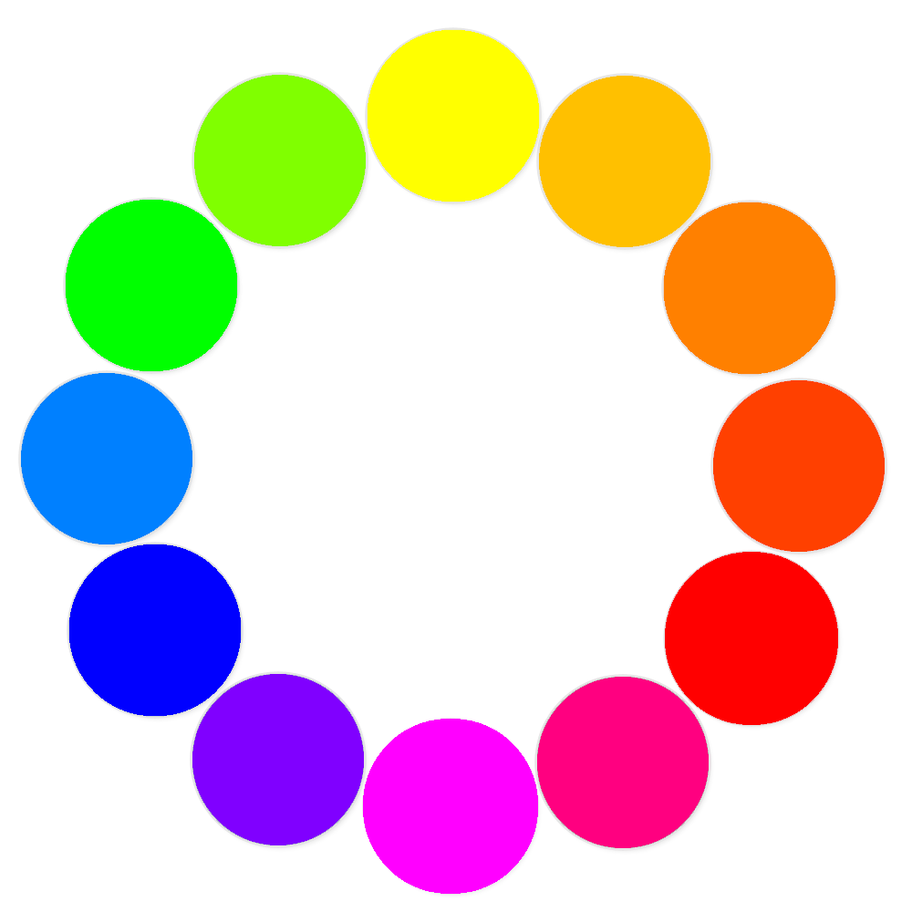
It consists of 12 colors. These colors are considered the most familiar and easy to human perception.
The primary colors are considered to be three primary colors: yellow (ffff00), blue (0000ff), and red (ff0000). Based on these colors, the entire color wheel is created. They are primitive because if you have these three pure colors by mixing them, you can create a whole palette. Any colour.
Second order colors are obtained by mixing the primary colors: tangerine (ff8000), magenta (ff00ff), green (00ff00).
Third-order colors are obtained by mixing primary colors and second-order colors. There are six of them:
This circle can be said to be a panacea for all ills. With the help of it you can select the most successful color combinations. For this there are six principles of color harmony. The so-called color models.
The principle of working with color in Itten's circle is simple: pick up 2-4 colors through the principles of color harmonies and experiment with brightness-contrast, fill area.
Well, in addition, it is worth mentioning the achromatic colors. No colors, no shades. Only gradation from black to white. Full range of dullness. Huge selection.
And, lastly, small nuances and subtleties:
The presence of pure white or pure black in the color scheme of the main six harmonies, enhances the contrast, respectively, the interface will be very “alive” if you do not overdo it with the color coverage area. Otherwise, excessive color activity will be annoying.
Want to draw attention to the color and make the site as bright and expressive as possible? Take contrasting colors. Add some pure white or velvet black. Make a large menu and volume font. It'll be enough.
We need a calm unobtrusive interface for a serious project — monochrome combinations to help you.
And, an important rule in the interface color matching: minimalism. Five colors is the maximum limit. Do not overload your site with all the colors of the rainbow. No need for a patchwork blanket here. Your task is to convey information, but not to frighten people with variegation.
Used materials:
Adams Morioka and Terry Stone. "Color Design. Practical".
Yandex Color
So: the user interface ... What is it? I think, an important component of a successful product. It is precisely how comfortable it will be for users to work with an application that determines the further fate of the application itself and, probably, the financial (or non-financial) state of the developer.
I find it convenient to classify the user interface by its final application:
- Software interface (including operating systems and all sorts of applications);
- Gaming interface;
- Interface sites.
')
Perhaps my classification is too generalized, or incomplete. If you want, correct.
With the first name of the list everything is clear. When creating an interface, the greatest emphasis is on functionality. Therefore, usually, the program itself does not invest too much effort, adhering to the rules of minimalism and brevity. For example, I would like to consider our "favorite" Windows. Only in the latest versions of the developers began to invest some kind of rationalism. In general, the user interface is not only not thought out, but also, in many respects, contradicts the main aspects of the psychology of human perception.
In the second case, everything is exactly the opposite. The game interface is sometimes difficult to call the interface, since it is embedded in the essence of the game and is most adapted to the user. In order to find this or that solution, usually, it is not necessary to think too much. Everything is intuitive. Ideal for the user. My dream is a WoT graphical operating system.
Everything is much more complicated with sites. If you pay attention to the interfaces of sites, you can stumble upon an incredible variety of solutions. And, usually, who in the forest, who for firewood. Some developers adhere to severity and minimalism, which on the contrary overload the interface.
Quite a lot of optimal solutions. But, just as often, one has to stumble upon completely undeveloped sites, where, it seems, they tried, but, apparently, overdid it.
At the moment I want to focus on the development of interface sites. Although, this article is generalized.
So, what is important in achieving optimal results?
Apparently, one or another design decisions must be drawn from the functional component of the site. But, in any case, the main task of any site is to convey information. And, in order for it to reach the addressee (in the literal and figurative sense), it must be accessible, readable, adapted. To achieve this goal, considerable attention should be paid to design development.
It is impossible in one article to consider all the details.
Now I want to focus on color. For some reason, it seems to me, it is necessary to begin with it.
Yes, perhaps a lot has already been said about the effect of color on a person, passion, appetite, and similar features of the human body ... But I will not focus on color therapy, but on a little more practical things.
How do you pick color on your website? Usually, this question is answered by either “the customer chose”, or “the concept and style of the company”, or “I select intuitively”.
I do not argue, many developers have a "stuffed" eye and virtuoso intuition. However, knowledge of the basics greatly simplifies the choice of color solutions and saves time. There are many concepts for choosing color harmony. I will describe, in my opinion, the most simple and effective.
There is such a thing as the Itten color wheel. It looks something like this:

It consists of 12 colors. These colors are considered the most familiar and easy to human perception.
The primary colors are considered to be three primary colors: yellow (ffff00), blue (0000ff), and red (ff0000). Based on these colors, the entire color wheel is created. They are primitive because if you have these three pure colors by mixing them, you can create a whole palette. Any colour.
Second order colors are obtained by mixing the primary colors: tangerine (ff8000), magenta (ff00ff), green (00ff00).
Third-order colors are obtained by mixing primary colors and second-order colors. There are six of them:
- Amber (ffc000)
- Cinnabar (ff4000)
- Light cherry (ff0080)
- Purple (8000ff)
- Azure (0080ff)
- Poisonous green (80ff00)
This circle can be said to be a panacea for all ills. With the help of it you can select the most successful color combinations. For this there are six principles of color harmony. The so-called color models.
- Monochrome colors.
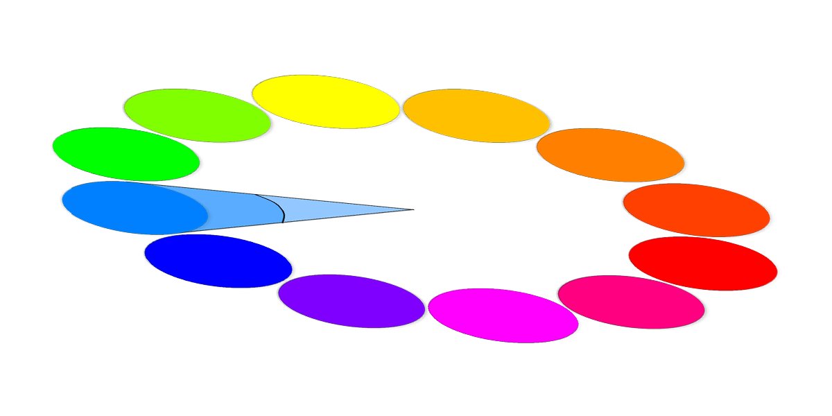
The basis is one color and its different saturation and transparency. Monochrome combinations are very easy to use and quite soft on perception. But they often lack expressiveness. - Close colors
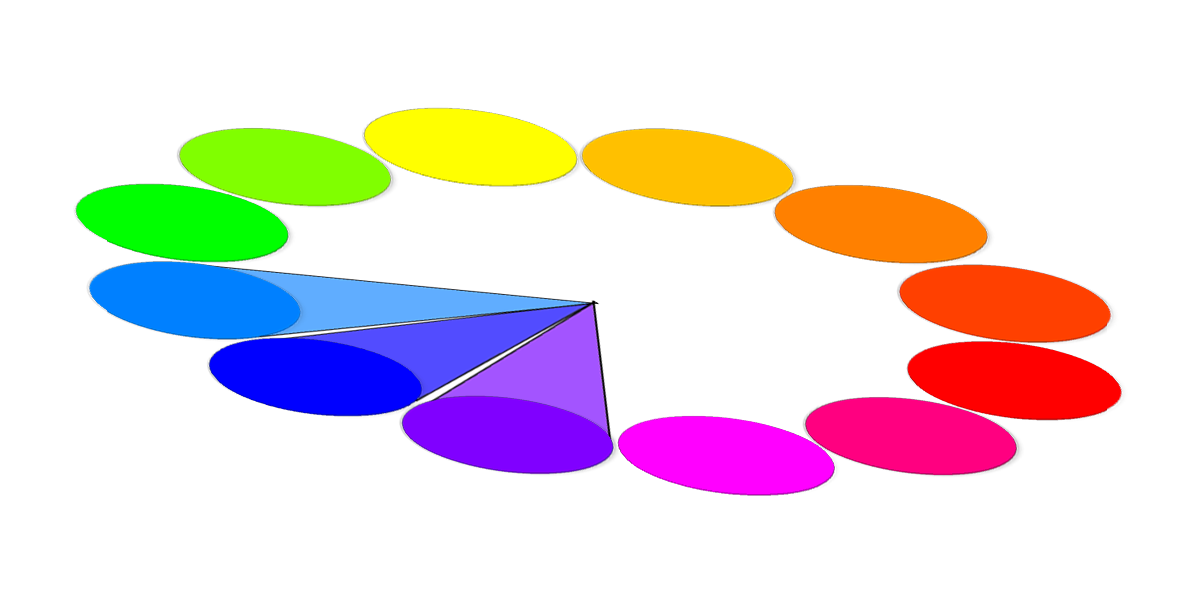
The colors that are next on the color wheel. These colors have similar characteristics of light waves, so they combine very simply. - Complementary.

These are colors located strictly opposite each other. They give the biggest contrast. It's all catchy, lively, daring. - Close and complementary.
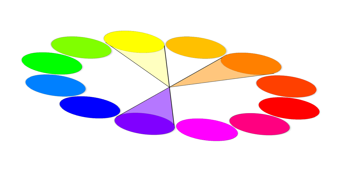
Everything is simple! Opposite colors are taken, for example, A and B. U B has neighbors B (l) on the left and B (n) on the right. Actually, the combination of A, B (p) and B (l) is the desired quantity! When playing with brightness, you can get very interesting options. - Dual complementary.
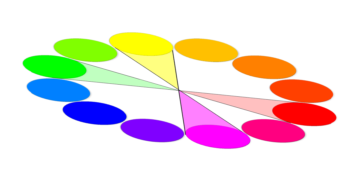
Here, too, everything is simple. We take B (p) and B (l) and look for complementary (opposite) colors for them. All the same catchy, lively, bold only in the square. - Triadic colors.
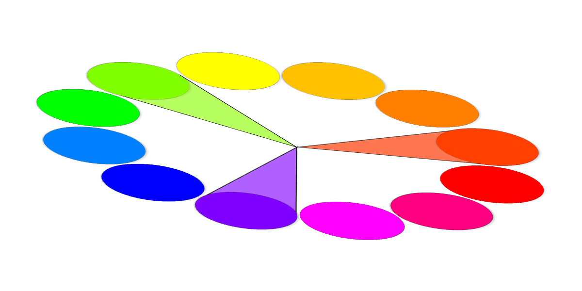
Located across three sectors. Usually, contrasting colors are difficult to combine, although, in their pure form, they will look very impressive in radically different proportions. However, the lower the color brightness, the more possibilities. Triads of primary colors are too sharp. The secondary and tertiary triads are softer.
The principle of working with color in Itten's circle is simple: pick up 2-4 colors through the principles of color harmonies and experiment with brightness-contrast, fill area.
Well, in addition, it is worth mentioning the achromatic colors. No colors, no shades. Only gradation from black to white. Full range of dullness. Huge selection.
And, lastly, small nuances and subtleties:
The presence of pure white or pure black in the color scheme of the main six harmonies, enhances the contrast, respectively, the interface will be very “alive” if you do not overdo it with the color coverage area. Otherwise, excessive color activity will be annoying.
Want to draw attention to the color and make the site as bright and expressive as possible? Take contrasting colors. Add some pure white or velvet black. Make a large menu and volume font. It'll be enough.
We need a calm unobtrusive interface for a serious project — monochrome combinations to help you.
And, an important rule in the interface color matching: minimalism. Five colors is the maximum limit. Do not overload your site with all the colors of the rainbow. No need for a patchwork blanket here. Your task is to convey information, but not to frighten people with variegation.
Used materials:
Adams Morioka and Terry Stone. "Color Design. Practical".
Yandex Color
Source: https://habr.com/ru/post/195616/
All Articles