Usability: Value swapping error or worse than the built-in Android dialer
Today I would like to draw your attention to one important error in the design of the interface - the substitution of meaning . This is not the crudest or most common mistake, but it often sneaks into fairly expensive and well-thought-out interfaces. It can even be said that this is a re-optimization error when the designer overdone the interface “simplification”. It is relatively easy to catch at the development stage, but you need to know where to look.
As a basic example, I’ll give a standard Nexus diler, and I suspect that other Android dealers also have it.
By changing the meaning, I call the moment when the same button, depending on the context, changes its function. And the substitution of value - when this happens is opaque to the user.
')
The basic example of changing the value of an element is the button to add an article to your favorites. If the article is already there, then this control is replaced with a button to remove the article from the favorites.

Simple and logical?
For the user, yes. Moreover, if this element worked somehow differently, the user would have to think hard about where to look for this removal from the favorites.
The second example: the buy button in the online store. If the product is not available, instead of the "buy" button, the "leave order" button may appear. Of course, this should be made quite obvious to the user - a different color, a different inscription, an explanation. If everything is correct - this change will not cause any difficulties, moreover, it is quite convenient.

Let's think about why this is a successful change of meaning?
Naturally, the third rule also works right there, which we always keep in mind, even if we don’t write: This is quite obvious to the user. We do not write it because no one knows what these users obviously. We can only assume.
And now the climax:
All other substitution of element values is an extra headache for the user.
It sounds radically, but believe me, if you are not 100% sure what you are doing, it is better to avoid changing the value of the button, except for those that do not fall under the above rules.
And now we will pass to a practical part, analysis of flaws in Android.
Here are two screenshots from the dealer of my Nexus. On the left - the last calls, and on the right - the phone book. I marked with colors the actions performed when I click on a particular area.
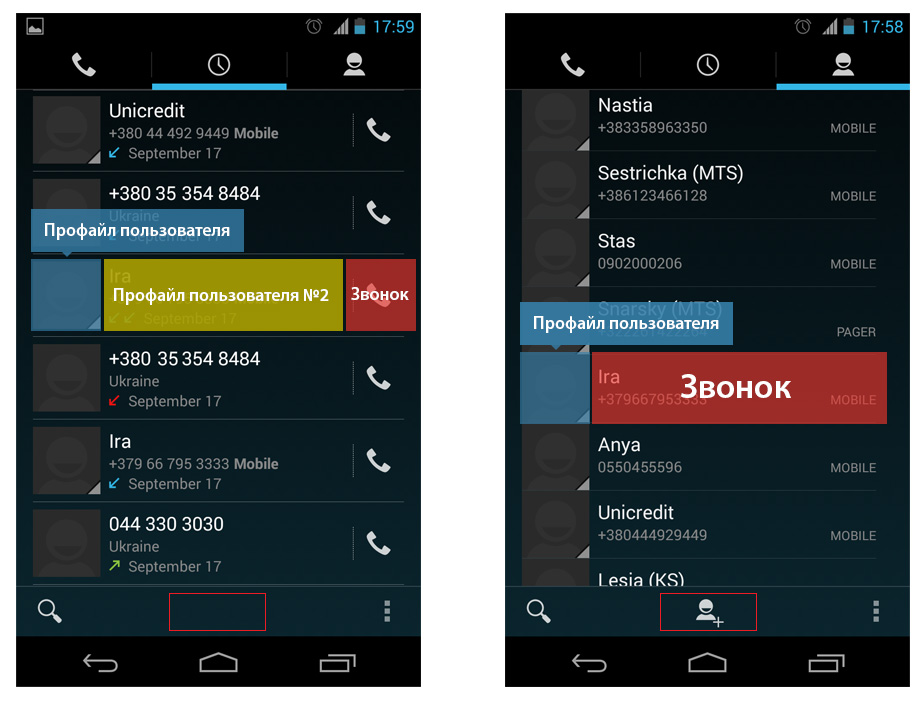
As you can see, the context changes, and with it the value of the element in the middle also changes. But at the same time, this is, firstly, not mutually exclusive elements, and secondly, it is completely obvious to the user. Nothing has really changed, the screen looks the same, and the button has started to perform another function.
Gross error and a very good illustrative example. Sure, thousands of people call trying to change the profile picture and open the profile trying to call.
Plus, the button for adding a new contact disappears somewhere, I circled it with a red frame in the picture. I see no objective reason for her to disappear. But the situation is aggravated by the next screen, the profile screen, which is shown when you click on the subscriber icon. Let's call his profile number 1.
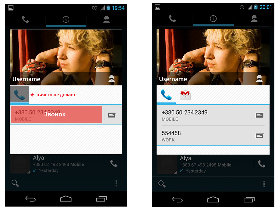
Now the handset "does not ring", although on the previous screen it was the only way to call the subscriber. Here it does not cause such a sharp dissonance, because it looks different, and the design of the screen itself is different. However, the logic also rebels.
You will find the solution to this handset if you add additional contacts to this subscriber, e-mail or something else. On the right picture, it’s pretty obvious that now it’s just a rubric icon. I hope I never have to explain it, for example, to my mother. I'm afraid in the usual 15 minutes here you can’t keep up.
In general, this is all that I wanted to tell, I hope it turned out not too long, but instead of concluding, I would like to ask that you never do this in your products.
But since I got to write the design flaws of the dialer, then, as a bonus, I want to draw your attention to the fact that in android there are already three different subscriber profiles in appearance, but completely identical in functionality. And that's not counting the subscriber editing screen, which, in general, could replace all three. And although there is nothing supercritical about this, I am afraid to even imagine how this could go into production.
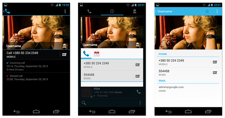
The first two profiles are called from the "Last Callers" menu, and the third one is clicked on a photo in any of the first two.
Now that's all, thank you for your attention.
PS: Maybe someone did not know: a screenshot on Nexus'e (and, perhaps, on some other android-phones) is done if you hold down, simultaneously, the shutdown button and the volume down button.
PS2: The numbers on the screenshots are fake, I don't like these blunders, they distract from the point. There are not even always codes of existing countries.
As a basic example, I’ll give a standard Nexus diler, and I suspect that other Android dealers also have it.
By changing the meaning, I call the moment when the same button, depending on the context, changes its function. And the substitution of value - when this happens is opaque to the user.
')
The basic example of changing the value of an element is the button to add an article to your favorites. If the article is already there, then this control is replaced with a button to remove the article from the favorites.
Simple and logical?
For the user, yes. Moreover, if this element worked somehow differently, the user would have to think hard about where to look for this removal from the favorites.
The second example: the buy button in the online store. If the product is not available, instead of the "buy" button, the "leave order" button may appear. Of course, this should be made quite obvious to the user - a different color, a different inscription, an explanation. If everything is correct - this change will not cause any difficulties, moreover, it is quite convenient.
Let's think about why this is a successful change of meaning?
- We operate with one entity, in the first case with the “favorites” folder, and in the second - the purchase of the same product.
- These buttons are mutually exclusive. If there is a product, then it makes no sense to order it, and if not, then it can not be bought.
Naturally, the third rule also works right there, which we always keep in mind, even if we don’t write: This is quite obvious to the user. We do not write it because no one knows what these users obviously. We can only assume.
Another small example, for those who have not figured out what the essence
In the picture you see two identical buttons. The first (+1, like) will change its value after clicking, and the second (to broadcast this post to another source) will not change. Why?

That's right, the second button does not have a mutually exclusive component. You can share this post several times, and if you have already put a plus one, then the only thing left for you is to remove plus one.
That's right, the second button does not have a mutually exclusive component. You can share this post several times, and if you have already put a plus one, then the only thing left for you is to remove plus one.
And now the climax:
All other substitution of element values is an extra headache for the user.
It sounds radically, but believe me, if you are not 100% sure what you are doing, it is better to avoid changing the value of the button, except for those that do not fall under the above rules.
And now we will pass to a practical part, analysis of flaws in Android.
Here are two screenshots from the dealer of my Nexus. On the left - the last calls, and on the right - the phone book. I marked with colors the actions performed when I click on a particular area.
As you can see, the context changes, and with it the value of the element in the middle also changes. But at the same time, this is, firstly, not mutually exclusive elements, and secondly, it is completely obvious to the user. Nothing has really changed, the screen looks the same, and the button has started to perform another function.
Gross error and a very good illustrative example. Sure, thousands of people call trying to change the profile picture and open the profile trying to call.
Plus, the button for adding a new contact disappears somewhere, I circled it with a red frame in the picture. I see no objective reason for her to disappear. But the situation is aggravated by the next screen, the profile screen, which is shown when you click on the subscriber icon. Let's call his profile number 1.
Now the handset "does not ring", although on the previous screen it was the only way to call the subscriber. Here it does not cause such a sharp dissonance, because it looks different, and the design of the screen itself is different. However, the logic also rebels.
You will find the solution to this handset if you add additional contacts to this subscriber, e-mail or something else. On the right picture, it’s pretty obvious that now it’s just a rubric icon. I hope I never have to explain it, for example, to my mother. I'm afraid in the usual 15 minutes here you can’t keep up.
In general, this is all that I wanted to tell, I hope it turned out not too long, but instead of concluding, I would like to ask that you never do this in your products.
But since I got to write the design flaws of the dialer, then, as a bonus, I want to draw your attention to the fact that in android there are already three different subscriber profiles in appearance, but completely identical in functionality. And that's not counting the subscriber editing screen, which, in general, could replace all three. And although there is nothing supercritical about this, I am afraid to even imagine how this could go into production.
The first two profiles are called from the "Last Callers" menu, and the third one is clicked on a photo in any of the first two.
Now that's all, thank you for your attention.
PS: Maybe someone did not know: a screenshot on Nexus'e (and, perhaps, on some other android-phones) is done if you hold down, simultaneously, the shutdown button and the volume down button.
PS2: The numbers on the screenshots are fake, I don't like these blunders, they distract from the point. There are not even always codes of existing countries.
Source: https://habr.com/ru/post/195572/
All Articles