Writing a plugin for XBMC with its own interface: Part II - Dialogues and Decorations
Introduction
This is part II of a series of articles on writing plugins for XBMC with its own interface. Part I describes the general information about creating plug-ins for XBMC with its own interface and provides the simplest example. In this part I will give some more general information - I will talk about the dialogues, and also consider a few more complex examples, which will show the use of pictures to decorate the interface, as well as the creation of the simplest interactive elements.
So, go to the dialogues.
Dialogues
Unlike controls, dialogs do not require a parent container class and can be invoked directly — by creating an instance of the corresponding class and then calling the appropriate method. The second difference is that the dialogs automatically use the necessary textures from the current skin, i.e. we do not need to worry about their visual appearance. Functionally, XBMC UI dialogs resemble tkFileDialog / tkMessageBox modal dialogs in Tkinter or QDialog heirs in PyQt dialogs.
')
Most of the dialogs, except two, are methods of the xbmcgui.Dialog class. The methods are static, i.e. they can be called without creating an instance of the corresponding class.
Dialogs xbmcgui.Dialog
Next will be discussed the dialogues implemented by methods of the xbmcgui.Dialog class.
browse
Dialog of the choice of files and folders. It has many parameters that allow you to customize the selection mode: file, folder, multiple selection, etc.
Returns a string containing the path to a file or folder, or a tuple of strings with paths depending on the selection mode.
Not quite an obvious point: the 3rd call parameter (s_shares) represents one of the tags of the \ userdata \ sources.xml file: video, music, pictures or files. The first 3 options are used to access video, music and photo sources, respectively, and the files parameter gives access to the disks / folders added to the file manager. If the file manager is empty, access to the entire file system is opened.
Example:
dialog = xbmcgui.Dialog() path = dialog.browse(1, 'Select file', 'video', '.avi|.mkv|.mp4') browseMultiple
Subspecies of the previous method. Implements multiple choice. Returns a tuple of strings with paths.
browseSingle
Also browse subspecies to select a single file / folder. Returns the path as a string.
input
Input dialog with a virtual keyboard. It has different modes: entering text, numbers, dates, times, etc. Returns the entered data as a string.
numeric
Subspecies of the previous dialog, allowing you to enter numeric information. Also returns the entered value as a string.
notification
Displays a popup notification in the XBMC interface. The position of the notification depends on the current skin. In Confluence, this is the lower right corner.
Warning: this method was added in 13.0 Gotham. In previous versions, use alternative ways to display pop-up messages, the benefit of these methods is several.
yesno
Dialog with “Yes” and “No” buttons. Returns True when selecting “Yes” and False otherwise.
ok
Dialogue with the "OK" button. Returns True when pressing OK and False if the dialog was closed in any other way (for example, pressing ESC).
select
A list of text strings for selecting one item from a set. With a large number of lines, the list scrolls. Returns the number of the selected line, starting from 0, or -1 if the dialog was closed by pressing ESC (or another button that implements the cancellation).
Then two dialogs that are not Dialog methods.
DialogProgress
The DialogProgress class implements a dialog box with a progress bar showing the progress of a process.
DialogProgressBG
"Background" window with a progress bar. Usually displayed in the upper right corner of the interface.
As we see, the dialogues complement the possibilities of controls. By combining different controls and dialogs, you can implement a fairly complex user interaction.
The most up-to-date short help on the dialogs and other elements of the XBMC plug-in interface can be found here .
Adding decorations and interactive elements
Next, we will look at slightly more complicated examples than the simple “Hello, world!” In the previous section. To decorate the interface, we need images and textures. As mentioned in part I, in the source code for skins you can find a fairly wide range of images and textures. The textures for the examples below are taken from the sources of the Confluence skin , and I found a picture with a dancing banana on the Internet.
Window based example
We begin, of course, with the file addon.xml.
Content addon.xml
<?xml version="1.0" encoding="UTF-8" standalone="yes"?> <addon id="script.test.buttons" name="Buttons test script" version="0.0.1" provider-name="Roman_V_M"> <requires> <import addon="xbmc.python" version="2.0"/> </requires> <extension point="xbmc.python.script" library="default.py"> <provides>executable</provides> </extension> <extension point="xbmc.addon.metadata"> <platform>all</platform> <summary lang="en">Buttons test script</summary> <description lang="en">My buttons test script.</description> </extension> </addon> Now go directly to the plugin code.
default.py
# -*- coding: utf-8 -*- # Licence: GPL v.3 http://www.gnu.org/licenses/gpl.html # . import os, sys # XBMC. import xbmcgui, xbmcaddon # Addon . # xbmcaddon.Addon() , # . _addon = xbmcaddon.Addon() # . _addon_path = _addon.getAddonInfo('path').decode(sys.getfilesystemencoding()) # . ACTION_PREVIOUS_MENU = 10 # Esc ACTION_NAV_BACK = 92 # Backspace # . ALIGN_CENTER = 6 # : # ; background_img = os.path.join(_addon_path, 'images', 'SKINDEFAULT.jpg') # ; button_nf_img = os.path.join(_addon_path, 'images', 'KeyboardKeyNF.png') # ; button_fo_img = os.path.join(_addon_path, 'images', 'KeyboardKey.png') # :-). banana_img = os.path.join(_addon_path, 'images', 'banana.gif') class MyAddon(xbmcgui.Window): def __init__(self): # . background = xbmcgui.ControlImage(1, 1, 1280, 720, background_img) self.addControl(background) # . banana_picture = xbmcgui.ControlImage(500, 200, 256, 256, banana_img) self.addControl(banana_picture) # (). self.set_controls() # . self.set_navigation() def set_controls(self): # "". self.privet_btn = xbmcgui.ControlButton(500, 500, 110, 40, u'…', focusTexture=button_fo_img, noFocusTexture=button_nf_img, alignment=ALIGN_CENTER) self.addControl(self.privet_btn) # "". self.exit_btn = xbmcgui.ControlButton(650, 500, 110, 40, u'', focusTexture=button_fo_img, noFocusTexture=button_nf_img, alignment=ALIGN_CENTER) self.addControl(self.exit_btn) def set_navigation(self): # "". self.privet_btn.controlRight(self.exit_btn) self.privet_btn.controlLeft(self.exit_btn) # "". self.exit_btn.controlRight(self.privet_btn) self.exit_btn.controlLeft(self.privet_btn) # "". self.setFocus(self.privet_btn) def onAction(self, action): # . if action == ACTION_NAV_BACK or action == ACTION_PREVIOUS_MENU: self.close() def onControl(self, control): # . # ""... if control == self.privet_btn: # ... .Dialog().ok(). xbmcgui.Dialog().ok(u', !', u' :-)') # "", . elif control == self.exit_btn: self.close() if __name__ == '__main__': addon = MyAddon() addon.doModal() del addon Further line by line analysis. To display line numbers, use an editor with such a function, such as Notepad ++.
Obvious or previously described moments are missing.
12, 14: Create an instance of the Addon class to access the parameters of the plugin. In this case, we need the path to the plugin to access the image files.
21: numeric constant that defines the text alignment in some controls, including the button.
25-31: define the paths to the image files. All pictures are stored in the subfolder \ images folder with the plugin.
Note: if you specify a file name without a full path, XBMC will search for a picture in the resources of the current skin. However, this should not be abused, since the names of image files in different skins often do not match.
39-43: create two controls with pictures and display them on the screen.
49-55: create 2 buttons. The texture files and text alignment of the label on the button are explicit.
57-65: create navigation rules. In this case, assign each of the neighbor's buttons to the right and left. Since there are only 2 buttons, each of the buttons is adjacent to each other, i.e. when you press the right or left arrow keys, the focus will alternate between our two buttons.
67: for the navigation to work, set the focus to one of the buttons. If this is not done, the controls can only be activated with the mouse.
67-70: the onAction method is the same as in the previous example. Again, if you decide to redefine this method in your class, be sure to prescribe the command (commands) to exit the plugin!
72-80: process controls. The onControl method receives as a second parameter an instance of an activated control, i.e. the control that we clicked on or pressed ENTER when it was in focus.
77: when you click the "Hello ..." button, a simple dialog box with the "OK" button is displayed.
79, 80: “Exit” button is an alternative way to exit the plugin, besides the ESC and BACKSPACE keys.
If done correctly, we should see
such a picture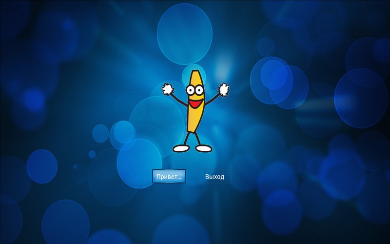
Pay attention to 2 points:
- first, animation is supported in the gif file (as in the png);
- secondly, controls created later (picture with a banana, buttons) are displayed over the background that was created first.
If you select / click the "Hello" button, it will open
dialog box with text.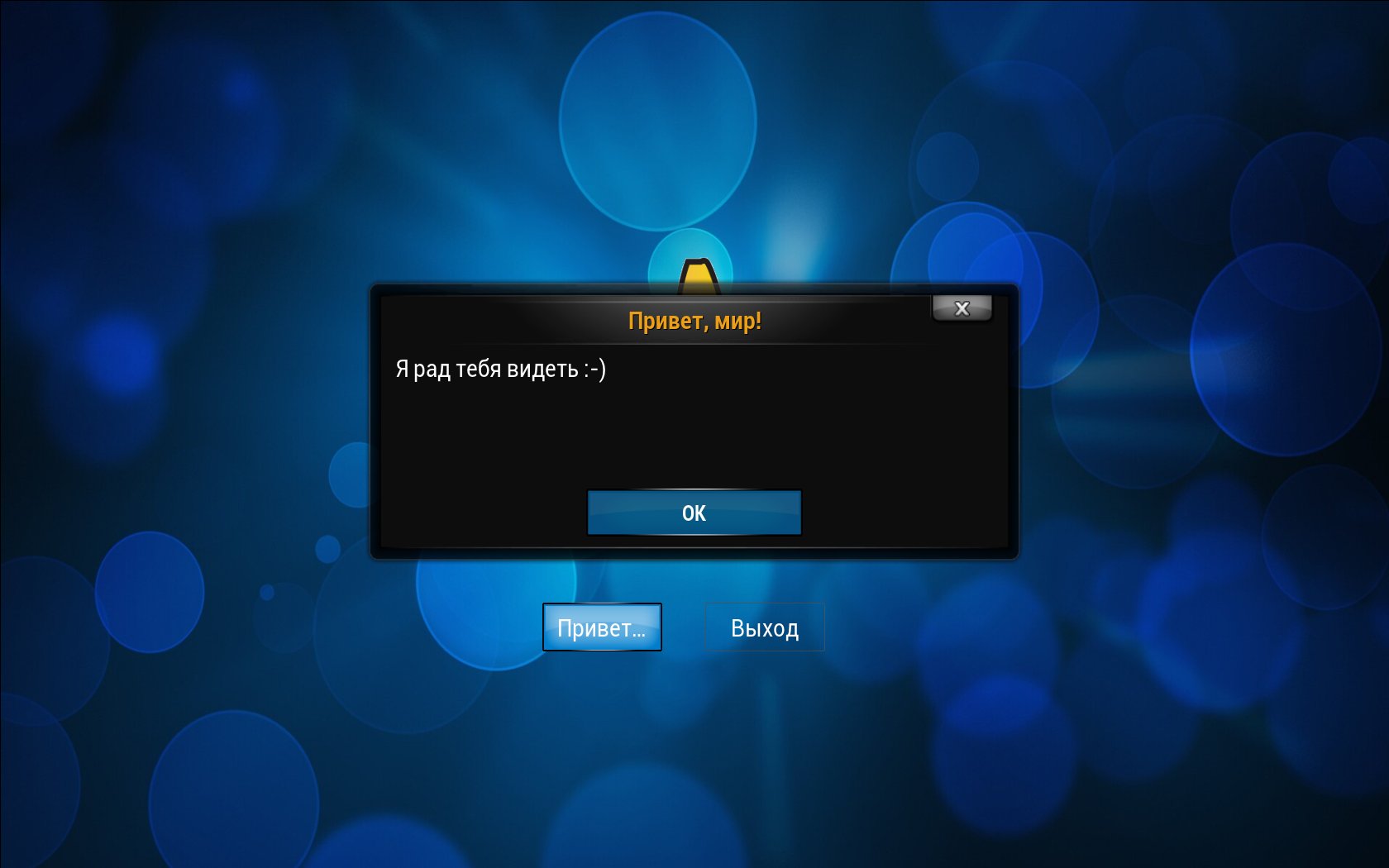
Fully plugin example can be downloaded from here .
WindowDialog based example
In the previous example, we inherit from the Window class. As mentioned in Part I (and as you can see from the very first example), the Window container class has a black opaque background, so in the previous example we placed a background texture in the background, over which other controls were placed. Now we will try to modify our previous example somewhat. First, we will inherit from the WindowDialog class, and, second, we will select a texture with partial transparency, which will occupy only part of the screen, as the background. Let me remind you that the class WindowDialog has a transparent background, i.e. as a result we have to get the window of our plug-in over the XBMC interface. Let's check it in practice.
As always, addon.xml is the main plugin file.
Content addon.xml
<?xml version="1.0" encoding="UTF-8" standalone="yes"?> <addon id="script.test.buttons.alt" name="Buttons test script - Dialog" version="0.0.1" provider-name="Roman_V_M"> <requires> <import addon="xbmc.python" version="2.0"/> </requires> <extension point="xbmc.python.script" library="default.py"> <provides>executable</provides> </extension> <extension point="xbmc.addon.metadata"> <platform>all</platform> <summary lang="en">Buttons test script</summary> <description lang="en">My buttons test script.</description> </extension> </addon> Next, the code itself.
default.py
# -*- coding: utf-8 -*- # Licence: GPL v.3 http://www.gnu.org/licenses/gpl.html # . import os, sys # XBMC. import xbmcgui, xbmcaddon # Addon . # xbmcaddon.Addon() , # . _addon = xbmcaddon.Addon() # . _addon_path = _addon.getAddonInfo('path').decode(sys.getfilesystemencoding()) # . ACTION_PREVIOUS_MENU = 10 # Esc ACTION_NAV_BACK = 92 # Backspace # . ALIGN_CENTER = 6 # : # ; background_img = os.path.join(_addon_path, 'images', 'ContentPanel.png') # ; button_nf_img = os.path.join(_addon_path, 'images', 'KeyboardKeyNF.png') # ; button_fo_img = os.path.join(_addon_path, 'images', 'KeyboardKey.png') # :-). banana_img = os.path.join(_addon_path, 'images', 'banana.gif') class MyAddon(xbmcgui.WindowDialog): def __init__(self): # . background = xbmcgui.ControlImage(370, 100, 500, 500, background_img) self.addControl(background) # . banana_picture = xbmcgui.ControlImage(500, 200, 256, 256, banana_img) self.addControl(banana_picture) # (). self.set_controls() # . self.set_navigation() def set_controls(self): # "". self.privet_btn = xbmcgui.ControlButton(500, 500, 110, 40, u'…', focusTexture=button_fo_img, noFocusTexture=button_nf_img, alignment=ALIGN_CENTER) self.addControl(self.privet_btn) # "". self.exit_btn = xbmcgui.ControlButton(650, 500, 110, 40, u'', focusTexture=button_fo_img, noFocusTexture=button_nf_img, alignment=ALIGN_CENTER) self.addControl(self.exit_btn) def set_navigation(self): # "". self.privet_btn.controlRight(self.exit_btn) self.privet_btn.controlLeft(self.exit_btn) # "". self.exit_btn.controlRight(self.privet_btn) self.exit_btn.controlLeft(self.privet_btn) # "". self.setFocus(self.privet_btn) def onAction(self, action): # . if action == ACTION_NAV_BACK or action == ACTION_PREVIOUS_MENU: self.close() def onControl(self, control): # . # ""... if control == self.privet_btn: # ... xbmcgui.Dialog().ok(). xbmcgui.Dialog().ok(u', !', u' :-)') # "", . elif control == self.exit_btn: self.close() if __name__ == '__main__': addon = MyAddon() addon.doModal() del addon Compared to the previous example, only 3 lines have changed.
25: different background texture.
33: inherit from WindowDialog.
37: Other coordinates and sizes of the background image.
Check the result.
Now our plugin does not occupy the entire screen, but modestly fits in the window. This option is suitable for plugins with a small number of controls that will not play video or music, because, I remind you, when inheriting from WindowDialog, all controls always remain on top of the video or music visualization.
Fully plugin from this example can be downloaded from here .
Conclusion
In Part II of a series of articles on creating plug-ins for XBMC with its own interface, I talked about dialogues, and also gave two relatively simple examples of plug-ins that use textures for interface design and have simple interactive elements.
In Part III, I plan to touch upon the issues of plug-in interaction with XBMC through various APIs, and also demonstrate the micro-framework written by me, which simplifies the creation of an XBMC plug-in interface.
Information sources
Brief XBMC Python API documentation .
HOW-TO: Write Python Scripts for XBMC .
Previous articles
Detailed anatomy of a simple XBMC plugin .
We write a plugin for XBMC with its own interface: Part I - the theory and the simplest example .
Source: https://habr.com/ru/post/194124/
All Articles