About the value of direct communication with the user
Testing the interface in a usability lab
I’m sure each of you went through the stage from “I like the feature - it means everyone likes it” to “if the conversion in charts is growing, it means that the feature is needed”. Therefore, "how to overcome a blind man," I will not tell. And I want to share the following experience.
Last year, I discovered a wonderful channel of invaluable information - direct communication with the user. It is direct, not through letters of feedback and, especially, graphics.
')
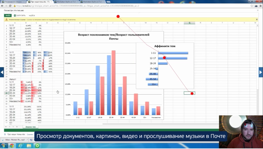
I'm rolling out a new functionality. I look at the graphics: everything is fine, I come to the study satisfied (by the way, we have an excellent laboratory ). The user says: “You recently added something new here, I don’t like it, I want to disable it”.
But then you can make a gross mistake. You begin to prove with foaming at the mouth that the feature is good. How many weeks did you think about her, then draw her, then her team did, as it is well reflected in the charts. And what will happen in reality? The person who came to the study and you paid him, will receive new information. And what do you get? Zero information for analysis, time spent, money and spoiled mood.
In fact, you need to do exactly the opposite. Turn off emotions and, like a surgeon with a scalpel and steel nerves, step by step to find out why the user doesn’t like the changes in the interface. After all, this is, ultimately, just a misunderstanding between you and the user.
An example of a wrong dialogue, on the example of avatar features in the mail:
- Good afternoon, how do you like the avatars that appeared in our mail?
- I do not like them, I turned them off.
- Most users like it, it shows the result of the vote.
- Strange, I feel uncomfortable.
- How can be uncomfortable, now you can easily see who wrote to you!
An example of the correct dialogue, on the example of the same feature:
- Good afternoon, how do you like the avatars that appeared in our mail?
- I do not like them, I turned them off.
- Can you describe in more detail what you don’t like?
- Yes, just do not like, it became inconvenient.
- And let's switch to the old version and try to compare.
We are switching and we see that in the old version at the user the expanded look has been included! And the expanded view is a view with avatars, only not 26x26, but 45x45, almost 2 times more. Strange, we continue to ask.
- Is it convenient to use this list?
- Yes, it is convenient.
- And what exactly is convenient?
- Well, I do not know ... I immediately see what letters have not been read.
- Do you see the new interface?
- Not.
- How do you determine that the letter is not read?
- But he has a big yellow envelope.
That caught a pearl! It turns out that in the old interface some users had an extended view. But avatars appeared only in the event that the letter came from the user Mail.ru. And if not, then large envelopes were displayed: yellow for the unread and white for the read. Compared to this, the selection of an unread letter in bold text was simply lost.
Having made most of the letters with the avatar, and not with the envelope, and even leaving a mark of read only by the thickness of the font, we "killed" the usability of the program for some users. On the general background, they, of course, are few, but in absolute figures are already very sensitive.
The most interesting thing is that even interviewing people who liked innovations, with the same predilection, you will also learn nothing less. It may easily turn out that they do not like the feature, not because of why you intended. And just in combination with something else nearby it turned out to be convenient, smash it to different places - and get a disgruntled user.
Now I adore meeting new people (they are all familiar with Mail.ru), asking them about the failures and failures of our interface. Without emotions and advertising, but I get a lot of useful information.
Andrey Sumin,
Head of Client Mail.Ru Development
Source: https://habr.com/ru/post/192798/
All Articles