Unification of interfaces: the experience of e-commerce projects
In early 2012, the e-commerce line was reorganized into Mail.Ru Group, and we faced the task of updating all services. As part of the update, the interfaces of all projects were brought to a common denominator. In this post I will talk about what unification provides in practice, and what methods can be used to minimize costs when working with large-scale projects.
The Mail.Ru Group e-commerce business includes Goods, Money, Real Estate and Travel. In addition to them, during the year we worked on new products - satellites of the main services. The result was the emergence of new projects Flights, Finance and Repair.
Our main task was to create a basic interface in a short time, which later could and would need to be improved and scaled.
')
The input data on the resources of the design department was as follows: two people on staff and the possibility of attracting freelance specialists. In practice, this meant that part of the work would be outsourced and there would be a lot of communication.
Based on the resources and terms, a strategy for further work was defined - the unification of the interfaces of all projects. Since such a large-scale unification in Mail.Ru Group was the first, it was necessary to clearly substantiate such a decision.
Economic benefit by development
Unifying projects allows you to reduce the time for designing interfaces, creating a design and developing a frontend. But the most important thing is that a unified platform allows you to quickly and painlessly connect different services to each other, transfer modules from a project to a project, and create satellite services at a lower cost. Ultimately, we get a universal constructor for creating interfaces.
Savings are not only the cash equivalent of production costs. The most important factor is the time during which it is possible to bring the finished product to the market. Saving time helps not only to reduce the actual work, but also to reduce organizational processes within the team and when working with freelance specialists.
Economic benefits with support
The unified interface simplifies versioning support, which facilitates the subsequent evolution of the product. When a new functionality appears or existing modules change, changes are implemented on all projects at minimal cost.
Problems of similar projects are also similar. When conducting usability studies, some of the results can be broadcast to other projects. Exactly the same successful solutions that raise the conversion can be cross-cutting.
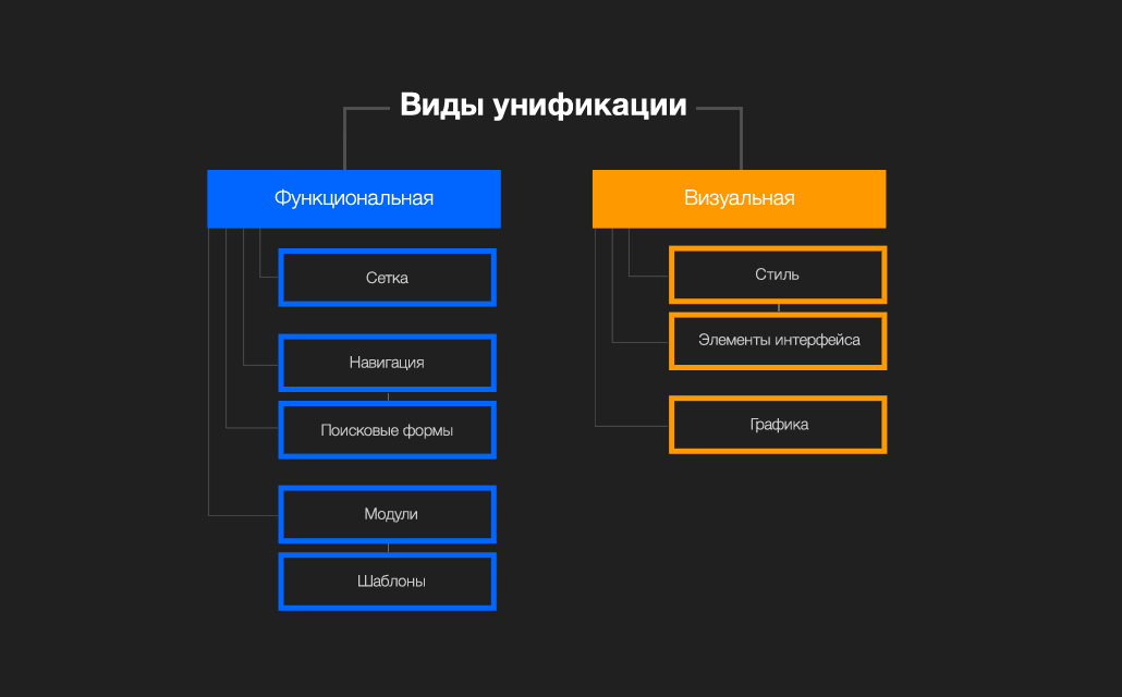
Unification can be divided into two components: functional and visual.
Functional unification implies a coercion of a grid, navigation, logic of building and operating search forms and other modules to a common denominator.
For visual unification , various elements of the brand are used - fonts, colors, distance rhythmics, graphics, etc. The result is a style guide. In addition, simple interface elements such as buttons, drop-down lists, input fields and other controls and their animation are included in the visual unification. This part is described in the so-called UI kit.
The two components of unification have different purposes and different areas of implementation.
Thus, the visual component affects brand awareness, helps to streamline and synchronize work on the project within a large team. However, visual unification practically does not save time. Creating a single guideline is a long and painstaking work. For example, it is sometimes easier to draw ten unrelated icons than to develop a single visual platform for creating a large set of icons. Thus, a further reduction in the time spent on communication is leveled by the time spent on drawing up and supporting guides.
But visual unification is only the tip of the iceberg. Most of the work on unification falls on the functional component.
Functional unification describes the general principles of creating and operating various parts of an interface. This type of unification is most conducive to saving resources and time. Interface modules always have their own mechanics and many different states; it is their migration from project to project that drastically reduces development time. For example, comment modules or registration module can be repeated in projects with almost no changes.
These two types of unification need not be carried out simultaneously. Each of them can be used separately, based on the task.
A good example is white-label projects. The service provider provides a functionally unified product, the interface of which the client can design for his brand or, in other words, visually unify.

One-time approach to the problem
The first method assumes that at the beginning of the work an analytics is carried out for all projects, functional and business requirements are formed, on the basis of which a single solution is proposed for all products.
Plus method:
- availability of a general picture and analytics on projects
Minuses:
- the creation of such a solution may require a lot of time and effort
- high cost of error
This method works best on small projects, when analytics do not become obsolete during product development, and the cost of an error decreases in proportion to the size of the project.

"Evolutionary" approach
The essence of the second method is that work begins with a single product. Gradually, work scenarios and visual style are worked out, a minimum set of rules and elements is created, which is further extended to other projects.
This is similar to how one learns to speak, with the rules and elements being comparable to letters. Putting out “letters” and creating “words” from a project to a project, you can expand the “vocabulary” and then improve the quality of the “text”.
Advantages of the solution:
- to start “talking”, you don't need a complex system, you can do it right here and now
- low cost of error, its correction will not be labor-intensive
- the maximum flexibility of the created system, it is always painless to adjust the chosen course
Minus:
- lack of full analytics
But this disadvantage is smoothed out by a clearly defined interface development strategy.
This method is suitable for large-scale projects, where the work is constructed iteratively. In our case, the evolutionary method was optimal, since it is the quickest and most painless way to launch updated projects within a reasonable time and further improve these projects.
We have relied on a minimalist, lightweight design, where the main thing is simple and intuitive interface mechanics. The minimalist solution is much more focused on the product being sold and ultimately on the consumer. For e-commerce projects, it is important that the user is focused on the final action, expressed in conversion, the number of purchases or other transactions that bring income to projects.
In addition, this solution is more durable. We started a redesign in early 2012, and the direction we have chosen is still relevant, including after the arrival of the Windows 8 UI and the so-called flat-design.
If we talk about the mechanics of the interface, then simple solutions work better, and they are later easier to improve.
By the way, many people make the mistake of believing that creating a minimalist design takes less time. In reality, there is no difference in the amount of time spent creating a simple or graphics-loaded interface.
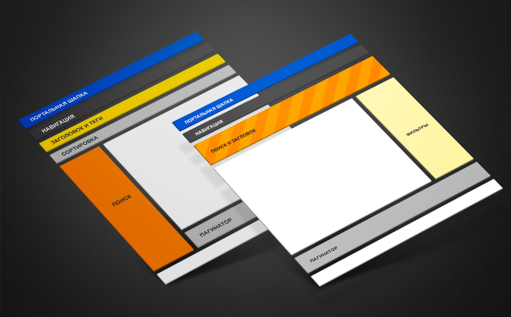
Grid, navigation, search forms, interface modules
Modular grid
It can be assumed that there is a way to design a single modular grid once. This is well suited for projects with the same type of information.
However, in e-commerce projects, there are many types of information: search forms, commodity issues, search results, payment forms, text. In this case, it is impossible to set a single grid for all projects, because each type of information requires its own scenario of grid construction and behavior: fixedness, full or limited adaptability.
For each project, we determined the behavior of the grid, based on the dominant type of information on this project.
For example, in the Commodities project, the main type of information is product issuances that exist in two states. Depending on the type of product, either photographs or textual data dominate. Consider two categories of goods: "Clothing" and "Computers." Appearance in the form of photos is obviously important for clothes, for computers - technical characteristics in the form of text. While pictures can occupy almost the entire screen area without losing readability, the text has a width limit. In this case, it is better to compromise: use a grid that changes its width to a certain size, thus maintaining a balance between information richness and good readability.
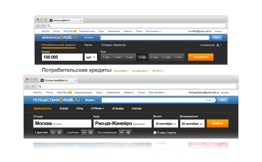
In the project Travel is a completely different situation. The project can be divided into two main parts. The first is a system for searching and booking flights, hotels, tours. This part does not need to be scaled, because text and tables are most convenient to read when they are limited in width. The second part - the content, with articles, reviews, photos - on the contrary, needs adaptability. In this case, it was necessary to determine which part of the project is a priority. We identified booking as a priority part, and the service received a fixed grid.

Navigation and search modules
The situation with navigation and search forms is simpler. The logic of the location of the search forms and navigation is set once. Migration of these elements by the project would be ambiguously perceived by users, disorienting them, since a person studies the interface and gets used to the fact that certain common elements are located in one place or according to one logic. Thus, it is much more effective to train users once in uniform scenarios for working with search and navigation on projects.
The F-shaped zone was used to locate the elements, which, according to the results of usability testing, are best read by users. Such an arrangement makes searching and navigating the highest priority and transparent on all projects.
We created some simple scripts and rules that were used in the work on all projects.
Rule 1
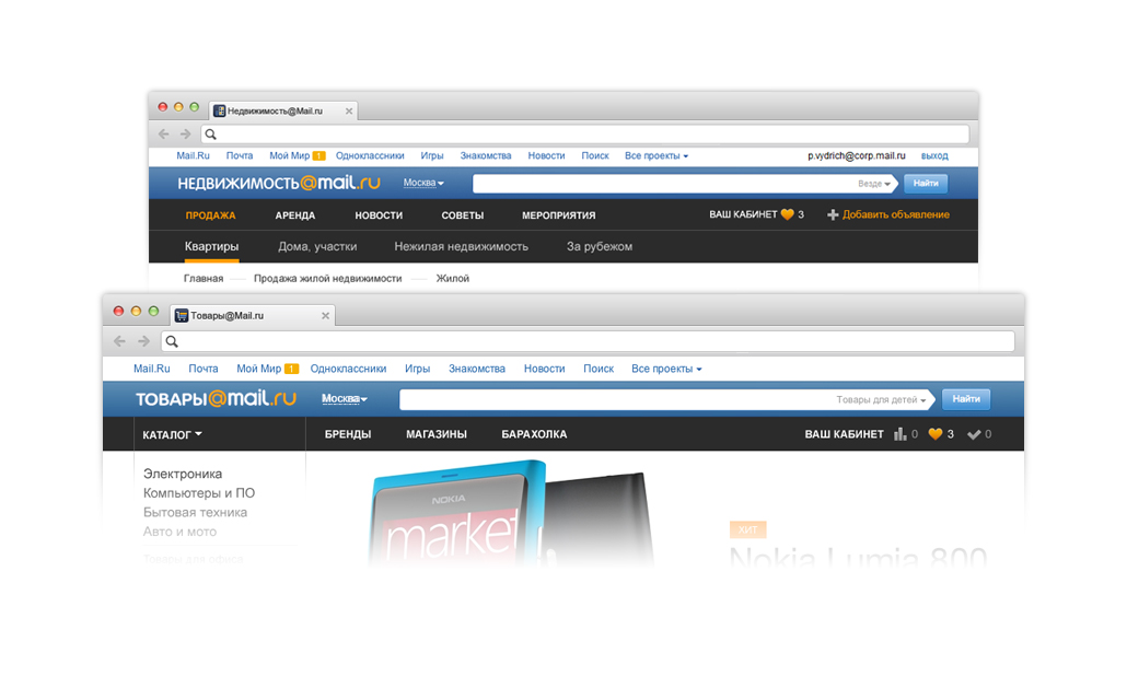
First and second level navigation is located above, under the portal header.
All Mail.Ru projects have uniform requirements for a general portal header with a project logo and search. We selected the project navigation as much as possible with the help of a dark plate, playing in contrast with the blue portal heading and white background. This decision stuck, and now it can be seen also outside of e-commerce projects, for example, on the projects of Poster and Sport.
Rule 2
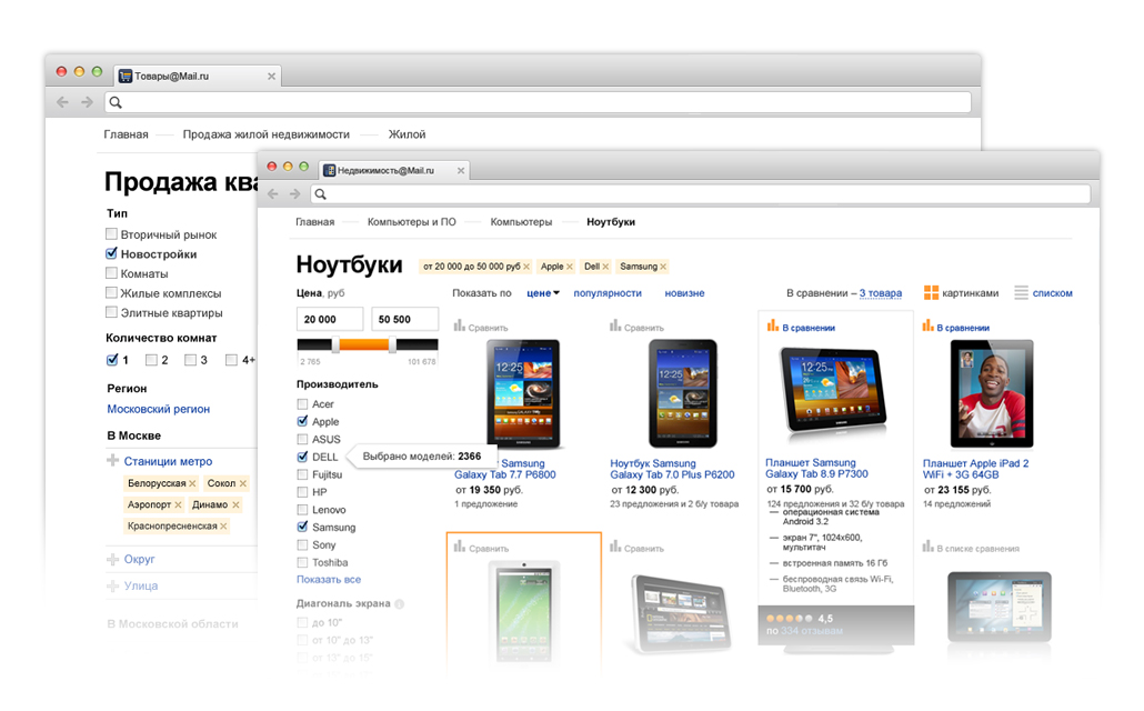
Large search forms are located in the left column.
They can be displayed both in short and in full. The vertical location allows you to freely change the number of search parameters, leaving it clear and transparent. This is important, for example, for projects Goods and Real Estate.
Rule 3
Small search forms are arranged horizontally.
Search forms with a limited number of parameters (for example, in projects Travel and Finance) are displayed under the header, on a dark background next to the navigation. This arrangement is also end-to-end and allows you to effectively use the screen area. In addition, a dark background separates the search from the content part, which is important in Travel.
Rule 4
If there is a small search form, filtering is located on the right.
With this placement, filtering does not overload the user's main attention and remains an additional element to control search results.
Once adopted, the rules save time searching for solutions and coordination.
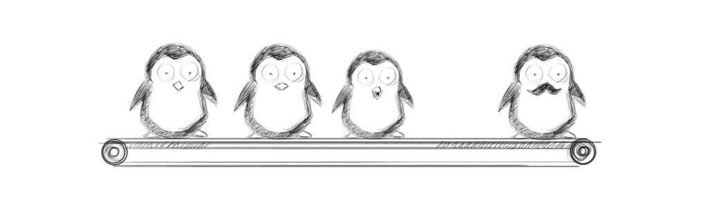
Inheritance of modules is a striking force in the struggle to save time and resources. A module can be either a simple paginator or a fairly large commenting system.
Modules always have strictly defined work scenarios, but can be used outside a single visual base. In the presence of a thoughtful prototype with a work scenario, the design of the module may change from project to project. For example, we created a clothing catalog showcase for Lady Mail.Ru based on the “Clothing” section of Mail.Ru Products.
The more projects, the fuller the module base, and the greater the labor saving. Simple modules can be combined into more complex ones; in the end, typed pages or blocks of pages — templates (for example, the “Articles” or “Creating a new entity” block) are obtained.
Templates are not a finite and strictly defined solution. Depending on the project or task, the templates need to be improved, but at the same time the amount of effort expended is less than when developing such blocks from scratch.
The amount of work on the templates may vary. For example, a block of articles needs minimal refinement.

The block “Creating a new entity” on different projects has a wide range of functionality. This could be a block of pages called Ad Creation, New Project Creation, etc. In this case, the general scenario is the same, but the steps of the scenario differ. For example, "Upload photos - Describe photos - Describe project - Publish project". As a result, we have a common scenario of the interface with implementation sub-options.
Font system, graphics, simple interface elements
Style elements
The system of fonts, color schemes, the system of indents and distances are created in the process of working on the first project and are further supplemented and improved from project to project. It is best to describe them in the guideline along with other elements of the brand. Such a document simplifies the task of a team of designers and layout designers.
In our case, we work with the Arial and Helvetica families, using Georgia for large text arrays. The main corporate colors, blue and orange, are bright enough and serve to highlight elements. We mainly use white and shades of gray. This solution allows you to neutralize the aggressiveness of blue and orange, making the design fresh and bright.
Interface elements
Buttons, switches, input fields, progress bars form the UI kit - a set of simple interface elements. You must understand that one such set is not enough to visually unify the product.

Icons and illustrations
The most powerful tool for visual unification is the single style of the main graphic elements, icons and illustrations.
We have created a single visual platform for icons: project icons contain the main colors of the Mail.Ru Group brand on a neutral substrate, on a dark background for best readability. We specifically focused on simple forms that are easily recognizable in any size and look good both on the web and on various mobile devices. The overall solution allows you to scale and expand the line. Our solution a year ago successfully incorporated into the current design trends.

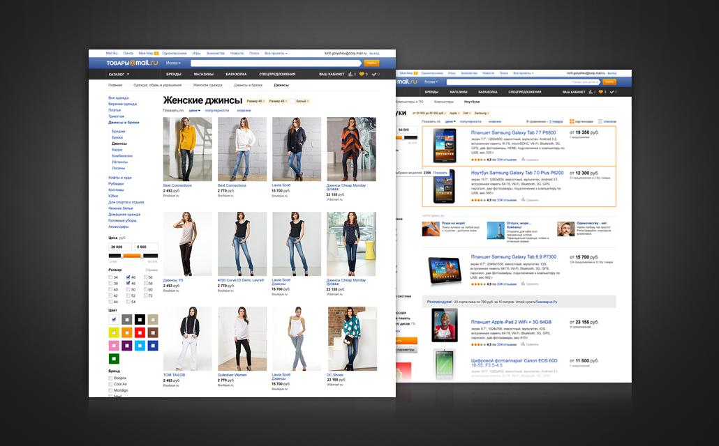
Type of projects before redesign
View of projects after redesign
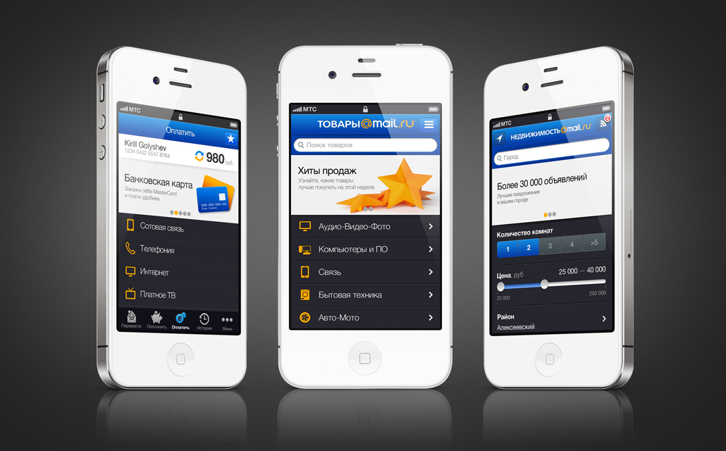
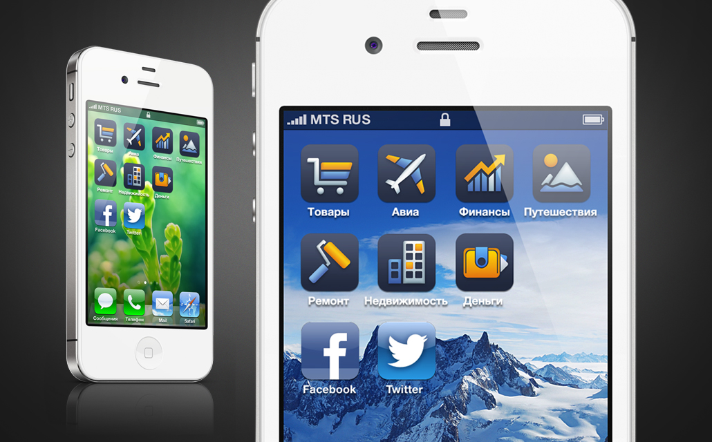
Mobile projects
What was done
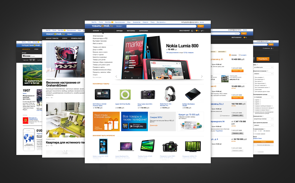
Since March 2012, that is, in 18 months, we have carried out a complete redesign of three web projects - Goods, Travel, Real Estate in the basic version. Later, based on usability research, we continued to develop these projects and prepared updates. In addition, 3 new web services were created - Avia, Repair and Finance. In addition to web projects, we actively developed the mobile direction: four mobile applications were created for Money, Commodities, Real Estate and Travel for two platforms - iOS and Android.
Entertaining arithmetic
The average duration of a web project is 2.5 months
Maximum number of participants in the design process - 4 people
The average number of layouts for one project - 60
The average duration of a mobile project is 1 month.
The average number of screens for one application - 22
- Unification is a flexible method of managing design processes and company resources
- There are several methods of unification, which are applied depending on the situation and needs.
- With the right methodology, you can unify any products.
Thanks a lot to Polina Vydrich for participating in writing this huge amount of letters and working on all the above projects. And a special thank you to Nikita Gutorov for cheerful penguins!
If you have experience in unifying small or large projects, I invite you to share it in the comments.
Kirill Golyshev,
e-commerce design team leader
Input data
The Mail.Ru Group e-commerce business includes Goods, Money, Real Estate and Travel. In addition to them, during the year we worked on new products - satellites of the main services. The result was the emergence of new projects Flights, Finance and Repair.
Our main task was to create a basic interface in a short time, which later could and would need to be improved and scaled.
')
The input data on the resources of the design department was as follows: two people on staff and the possibility of attracting freelance specialists. In practice, this meant that part of the work would be outsourced and there would be a lot of communication.
Based on the resources and terms, a strategy for further work was defined - the unification of the interfaces of all projects. Since such a large-scale unification in Mail.Ru Group was the first, it was necessary to clearly substantiate such a decision.
Why do we need unification?
Economic benefit by development
Unifying projects allows you to reduce the time for designing interfaces, creating a design and developing a frontend. But the most important thing is that a unified platform allows you to quickly and painlessly connect different services to each other, transfer modules from a project to a project, and create satellite services at a lower cost. Ultimately, we get a universal constructor for creating interfaces.
Savings are not only the cash equivalent of production costs. The most important factor is the time during which it is possible to bring the finished product to the market. Saving time helps not only to reduce the actual work, but also to reduce organizational processes within the team and when working with freelance specialists.
Economic benefits with support
The unified interface simplifies versioning support, which facilitates the subsequent evolution of the product. When a new functionality appears or existing modules change, changes are implemented on all projects at minimal cost.
Problems of similar projects are also similar. When conducting usability studies, some of the results can be broadcast to other projects. Exactly the same successful solutions that raise the conversion can be cross-cutting.
Types of unification
Unification can be divided into two components: functional and visual.
Functional unification implies a coercion of a grid, navigation, logic of building and operating search forms and other modules to a common denominator.
For visual unification , various elements of the brand are used - fonts, colors, distance rhythmics, graphics, etc. The result is a style guide. In addition, simple interface elements such as buttons, drop-down lists, input fields and other controls and their animation are included in the visual unification. This part is described in the so-called UI kit.
The two components of unification have different purposes and different areas of implementation.
Thus, the visual component affects brand awareness, helps to streamline and synchronize work on the project within a large team. However, visual unification practically does not save time. Creating a single guideline is a long and painstaking work. For example, it is sometimes easier to draw ten unrelated icons than to develop a single visual platform for creating a large set of icons. Thus, a further reduction in the time spent on communication is leveled by the time spent on drawing up and supporting guides.
But visual unification is only the tip of the iceberg. Most of the work on unification falls on the functional component.
Functional unification describes the general principles of creating and operating various parts of an interface. This type of unification is most conducive to saving resources and time. Interface modules always have their own mechanics and many different states; it is their migration from project to project that drastically reduces development time. For example, comment modules or registration module can be repeated in projects with almost no changes.
These two types of unification need not be carried out simultaneously. Each of them can be used separately, based on the task.
A good example is white-label projects. The service provider provides a functionally unified product, the interface of which the client can design for his brand or, in other words, visually unify.
Methods
One-time approach to the problem
The first method assumes that at the beginning of the work an analytics is carried out for all projects, functional and business requirements are formed, on the basis of which a single solution is proposed for all products.
Plus method:
- availability of a general picture and analytics on projects
Minuses:
- the creation of such a solution may require a lot of time and effort
- high cost of error
This method works best on small projects, when analytics do not become obsolete during product development, and the cost of an error decreases in proportion to the size of the project.
"Evolutionary" approach
The essence of the second method is that work begins with a single product. Gradually, work scenarios and visual style are worked out, a minimum set of rules and elements is created, which is further extended to other projects.
This is similar to how one learns to speak, with the rules and elements being comparable to letters. Putting out “letters” and creating “words” from a project to a project, you can expand the “vocabulary” and then improve the quality of the “text”.
Advantages of the solution:
- to start “talking”, you don't need a complex system, you can do it right here and now
- low cost of error, its correction will not be labor-intensive
- the maximum flexibility of the created system, it is always painless to adjust the chosen course
Minus:
- lack of full analytics
But this disadvantage is smoothed out by a clearly defined interface development strategy.
This method is suitable for large-scale projects, where the work is constructed iteratively. In our case, the evolutionary method was optimal, since it is the quickest and most painless way to launch updated projects within a reasonable time and further improve these projects.
Strategy
We have relied on a minimalist, lightweight design, where the main thing is simple and intuitive interface mechanics. The minimalist solution is much more focused on the product being sold and ultimately on the consumer. For e-commerce projects, it is important that the user is focused on the final action, expressed in conversion, the number of purchases or other transactions that bring income to projects.
In addition, this solution is more durable. We started a redesign in early 2012, and the direction we have chosen is still relevant, including after the arrival of the Windows 8 UI and the so-called flat-design.
If we talk about the mechanics of the interface, then simple solutions work better, and they are later easier to improve.
By the way, many people make the mistake of believing that creating a minimalist design takes less time. In reality, there is no difference in the amount of time spent creating a simple or graphics-loaded interface.
Functional unification
Grid, navigation, search forms, interface modules
Modular grid
It can be assumed that there is a way to design a single modular grid once. This is well suited for projects with the same type of information.
However, in e-commerce projects, there are many types of information: search forms, commodity issues, search results, payment forms, text. In this case, it is impossible to set a single grid for all projects, because each type of information requires its own scenario of grid construction and behavior: fixedness, full or limited adaptability.
For each project, we determined the behavior of the grid, based on the dominant type of information on this project.
For example, in the Commodities project, the main type of information is product issuances that exist in two states. Depending on the type of product, either photographs or textual data dominate. Consider two categories of goods: "Clothing" and "Computers." Appearance in the form of photos is obviously important for clothes, for computers - technical characteristics in the form of text. While pictures can occupy almost the entire screen area without losing readability, the text has a width limit. In this case, it is better to compromise: use a grid that changes its width to a certain size, thus maintaining a balance between information richness and good readability.
In the project Travel is a completely different situation. The project can be divided into two main parts. The first is a system for searching and booking flights, hotels, tours. This part does not need to be scaled, because text and tables are most convenient to read when they are limited in width. The second part - the content, with articles, reviews, photos - on the contrary, needs adaptability. In this case, it was necessary to determine which part of the project is a priority. We identified booking as a priority part, and the service received a fixed grid.
Navigation and search modules
The situation with navigation and search forms is simpler. The logic of the location of the search forms and navigation is set once. Migration of these elements by the project would be ambiguously perceived by users, disorienting them, since a person studies the interface and gets used to the fact that certain common elements are located in one place or according to one logic. Thus, it is much more effective to train users once in uniform scenarios for working with search and navigation on projects.
The F-shaped zone was used to locate the elements, which, according to the results of usability testing, are best read by users. Such an arrangement makes searching and navigating the highest priority and transparent on all projects.
We created some simple scripts and rules that were used in the work on all projects.
Rule 1
First and second level navigation is located above, under the portal header.
All Mail.Ru projects have uniform requirements for a general portal header with a project logo and search. We selected the project navigation as much as possible with the help of a dark plate, playing in contrast with the blue portal heading and white background. This decision stuck, and now it can be seen also outside of e-commerce projects, for example, on the projects of Poster and Sport.
Rule 2
Large search forms are located in the left column.
They can be displayed both in short and in full. The vertical location allows you to freely change the number of search parameters, leaving it clear and transparent. This is important, for example, for projects Goods and Real Estate.
Rule 3
Small search forms are arranged horizontally.
Search forms with a limited number of parameters (for example, in projects Travel and Finance) are displayed under the header, on a dark background next to the navigation. This arrangement is also end-to-end and allows you to effectively use the screen area. In addition, a dark background separates the search from the content part, which is important in Travel.
Rule 4
If there is a small search form, filtering is located on the right.
With this placement, filtering does not overload the user's main attention and remains an additional element to control search results.
Once adopted, the rules save time searching for solutions and coordination.
Modules
Inheritance of modules is a striking force in the struggle to save time and resources. A module can be either a simple paginator or a fairly large commenting system.
Modules always have strictly defined work scenarios, but can be used outside a single visual base. In the presence of a thoughtful prototype with a work scenario, the design of the module may change from project to project. For example, we created a clothing catalog showcase for Lady Mail.Ru based on the “Clothing” section of Mail.Ru Products.
The more projects, the fuller the module base, and the greater the labor saving. Simple modules can be combined into more complex ones; in the end, typed pages or blocks of pages — templates (for example, the “Articles” or “Creating a new entity” block) are obtained.
Templates are not a finite and strictly defined solution. Depending on the project or task, the templates need to be improved, but at the same time the amount of effort expended is less than when developing such blocks from scratch.
The amount of work on the templates may vary. For example, a block of articles needs minimal refinement.
The block “Creating a new entity” on different projects has a wide range of functionality. This could be a block of pages called Ad Creation, New Project Creation, etc. In this case, the general scenario is the same, but the steps of the scenario differ. For example, "Upload photos - Describe photos - Describe project - Publish project". As a result, we have a common scenario of the interface with implementation sub-options.
Visual unification
Font system, graphics, simple interface elements
Style elements
The system of fonts, color schemes, the system of indents and distances are created in the process of working on the first project and are further supplemented and improved from project to project. It is best to describe them in the guideline along with other elements of the brand. Such a document simplifies the task of a team of designers and layout designers.
In our case, we work with the Arial and Helvetica families, using Georgia for large text arrays. The main corporate colors, blue and orange, are bright enough and serve to highlight elements. We mainly use white and shades of gray. This solution allows you to neutralize the aggressiveness of blue and orange, making the design fresh and bright.
Interface elements
Buttons, switches, input fields, progress bars form the UI kit - a set of simple interface elements. You must understand that one such set is not enough to visually unify the product.
Icons and illustrations
The most powerful tool for visual unification is the single style of the main graphic elements, icons and illustrations.
We have created a single visual platform for icons: project icons contain the main colors of the Mail.Ru Group brand on a neutral substrate, on a dark background for best readability. We specifically focused on simple forms that are easily recognizable in any size and look good both on the web and on various mobile devices. The overall solution allows you to scale and expand the line. Our solution a year ago successfully incorporated into the current design trends.
Results of unification
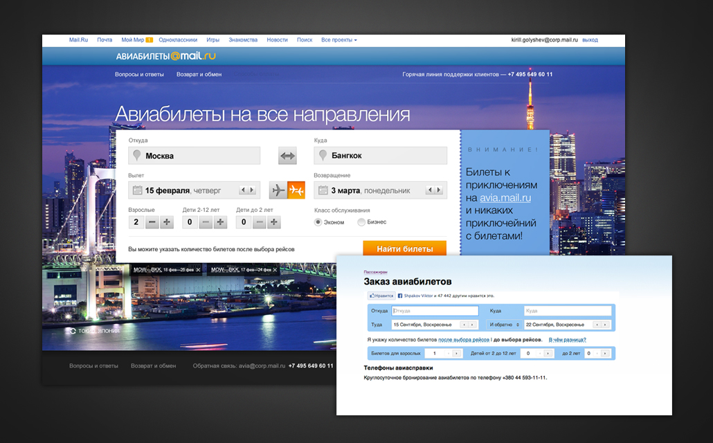
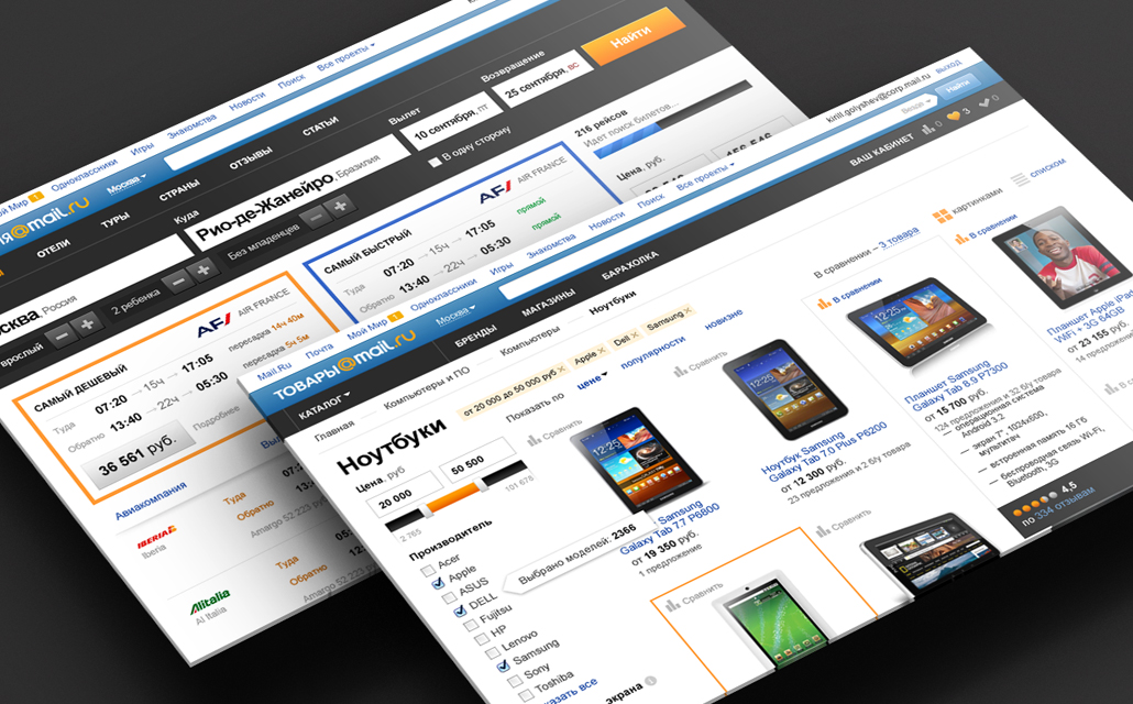
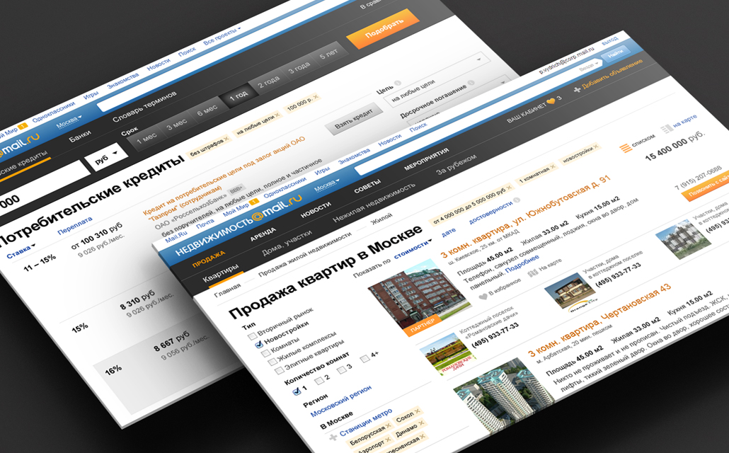
Type of projects before redesign
View of projects after redesign
Mobile projects
What was done
Since March 2012, that is, in 18 months, we have carried out a complete redesign of three web projects - Goods, Travel, Real Estate in the basic version. Later, based on usability research, we continued to develop these projects and prepared updates. In addition, 3 new web services were created - Avia, Repair and Finance. In addition to web projects, we actively developed the mobile direction: four mobile applications were created for Money, Commodities, Real Estate and Travel for two platforms - iOS and Android.
Entertaining arithmetic
The average duration of a web project is 2.5 months
Maximum number of participants in the design process - 4 people
The average number of layouts for one project - 60
The average duration of a mobile project is 1 month.
The average number of screens for one application - 22
findings
- Unification is a flexible method of managing design processes and company resources
- There are several methods of unification, which are applied depending on the situation and needs.
- With the right methodology, you can unify any products.
Thanks a lot to Polina Vydrich for participating in writing this huge amount of letters and working on all the above projects. And a special thank you to Nikita Gutorov for cheerful penguins!
If you have experience in unifying small or large projects, I invite you to share it in the comments.
Kirill Golyshev,
e-commerce design team leader
Source: https://habr.com/ru/post/192676/
All Articles