Google interface update
On the rights: "But men do not know, after all" - I’ll show you what Google’s search now looks like in Chrome browser:

Notice that the dark line at the top of the pages no longer exists. It was replaced by the “Services” icon, to the left of the notification icon (bell).
More controversial point - the search string remains only in the address bar. On the one hand, there is no need to produce identical entities, on the other hand, the microphone and the settings button look "lonely."
And here is the start page (new tab) of Chrome:
As you can see, it has ceased to be divided into 2 screens (on frequently visited sites and applications).
The list of applications can be accessed by clicking on the corresponding item in the tabs.
Finally, information about the user, notification, etc.
An additional search line simply delegates input to the address bar, but there is a reason to show your logo.
Below the search bar are screenshots of the 8 most visited sites.
On the page there is no list of recently closed tabs, you need to look for them through the "Setup and Control" button.
It is a pity that the confusion of colors from bookmarks, the logo and frequently visited websites interferes with obtaining aesthetic pleasure from the contemplation of the start page. But in terms of usability, this is probably a very user-friendly interface.
As dioneo rightly pointed out, you can enjoy this interface by turning on the chrome flag: flags / # enable-instant-extended-api. If it does not work, you can try to switch Chrome to the English (US) version, and then set the flag. On Linux, the changes are only partial and only in Chromium and Canary.
')
PS Sorry that the style of the post “First n ... x”, but I have endured for several hours, waiting for similar posts and saying goodbye to karma.
Notice that the dark line at the top of the pages no longer exists. It was replaced by the “Services” icon, to the left of the notification icon (bell).
More controversial point - the search string remains only in the address bar. On the one hand, there is no need to produce identical entities, on the other hand, the microphone and the settings button look "lonely."
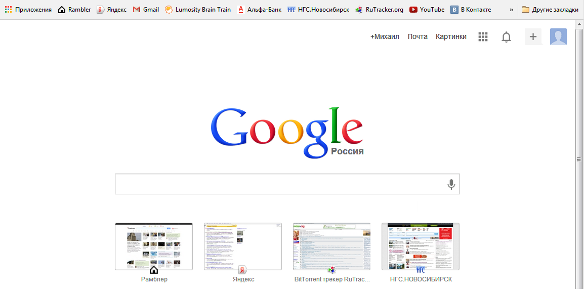
And here is the start page (new tab) of Chrome:
As you can see, it has ceased to be divided into 2 screens (on frequently visited sites and applications).
The list of applications can be accessed by clicking on the corresponding item in the tabs.
Finally, information about the user, notification, etc.
An additional search line simply delegates input to the address bar, but there is a reason to show your logo.
Below the search bar are screenshots of the 8 most visited sites.
On the page there is no list of recently closed tabs, you need to look for them through the "Setup and Control" button.
It is a pity that the confusion of colors from bookmarks, the logo and frequently visited websites interferes with obtaining aesthetic pleasure from the contemplation of the start page. But in terms of usability, this is probably a very user-friendly interface.
As dioneo rightly pointed out, you can enjoy this interface by turning on the chrome flag: flags / # enable-instant-extended-api. If it does not work, you can try to switch Chrome to the English (US) version, and then set the flag. On Linux, the changes are only partial and only in Chromium and Canary.
')
PS Sorry that the style of the post “First n ... x”, but I have endured for several hours, waiting for similar posts and saying goodbye to karma.
Source: https://habr.com/ru/post/192432/
All Articles