Several interesting and useful things for a web developer (release 2)
Good day, dear habravchane. Recently, I saw some interesting and useful tools / libraries / events that I want to share with Habr.
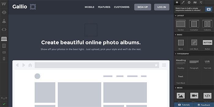
With this service you can create a cross-browser responsive layout in 55 minutes. Very nice and user-friendly interface. The perfect solution for web designers, 26,000 of whom are already using Webflow. To create two projects, the service is free, and in the longer term, you are waiting for quite affordable prices. The tool is really "cool."
If the GUI for the layout is not comme il faut by itselfas for me , I still recommend registering and exporting a couple of responsive layouts. And then there is a simple generator of responsive layout and Responsive Patterns .
')
Functional and simple tool to create parallax effect.
For all elements on which the effect will be applied, we specify the
Then we transfer the parent element to the Parallax constructor:
A small but useful library that simplifies the process of developing an adaptive, not responsive, design. Everything is very simple. The principle of operation is clearly illustrated in the following image.

The script, according to the Modernizr principle, assigns HTML classes to the tag
Speaking of “cross-gaming”, I would also like to mention Risizer - Bookmark for testing responsive design. We all know about a lot of similar services, but it seems to me that this method is the most convenient.

GistBox synchronizes with your GitHub profile and displays the Gist sheet in the desired form. All your snippets are sorted by tags and always at hand. Available as an extension for Chrome.
To begin with, the project was created by one of the members of the Boilerplate team. CSS Modal is the easiest way to add an adaptive modal window to your project:
And you just need to connect the script itself before the closing body tag, after which this markup will become a modal window.
Recently, I needed to reduce paragraphs with ellipsis. But standard
Uikit - plus one to existing web frameworks with its own features.
HTML2PDF . The service is based on Phantom.js. Perhaps useful for processing the portfolio in .pdf.
Many thanks to all for your attention.
Next Collection (Release 3) Previous Collection (Release 1)
Webflow
With this service you can create a cross-browser responsive layout in 55 minutes. Very nice and user-friendly interface. The perfect solution for web designers, 26,000 of whom are already using Webflow. To create two projects, the service is free, and in the longer term, you are waiting for quite affordable prices. The tool is really "cool."
If the GUI for the layout is not comme il faut by itself
')
Parallax.js
Functional and simple tool to create parallax effect.
For all elements on which the effect will be applied, we specify the
layer class and set the motion speed value in the data-depth attribute. The library has a number of parameters: <ul id="scene" data-calibrate-x="false" // data-calibrate-y="true" data-invert-x="false" data-invert-y="true" // data-limit-x="false" data-limit-y="10" // 10 data-scalar-x="2" data-scalar-y="8" // data-friction-x="0.2" data-friction-y="0.8"> // <li class="layer" data-depth="0.00"><img src=""></li> <li class="layer" data-depth="0.20"><img src=""></li> <li class="layer" data-depth="0.40"><img src=""></li> <li class="layer" data-depth="0.60"><img src=""></li> <li class="layer" data-depth="0.80"><img src=""></li> <li class="layer" data-depth="1.00"><img src=""></li> </ul> Then we transfer the parent element to the Parallax constructor:
var scene = document.getElementById('scene'); var parallax = new Parallax(scene); Intention.js
A small but useful library that simplifies the process of developing an adaptive, not responsive, design. Everything is very simple. The principle of operation is clearly illustrated in the following image.
Device.js
The script, according to the Modernizr principle, assigns HTML classes to the tag
ios/android/windows/blackberry phone/tablet landscape/portrait , thereby eliminating the need to prescribe basic device resolutions in media queries.Speaking of “cross-gaming”, I would also like to mention Risizer - Bookmark for testing responsive design. We all know about a lot of similar services, but it seems to me that this method is the most convenient.
Gistbox
GistBox synchronizes with your GitHub profile and displays the Gist sheet in the desired form. All your snippets are sorted by tags and always at hand. Available as an extension for Chrome.
CSS Modal
To begin with, the project was created by one of the members of the Boilerplate team. CSS Modal is the easiest way to add an adaptive modal window to your project:
<section class="semantic-content" id="modal-text" tabindex="-1" role="dialog" aria-labelledby="modal-label" aria-hidden="true"> <div class="modal-inner"> <header id="modal-label"><!-- Header --></header> <div class="modal-content"><!-- The modals content --></div> <footer><!-- Footer --></footer> </div> <a href="#!" class="modal-close" title="Close this modal" data-close="Close" data-dismiss="modal">×</a> </section> And you just need to connect the script itself before the closing body tag, after which this markup will become a modal window.
Dotdotdot.js, Uikit, HTML2PDF
Recently, I needed to reduce paragraphs with ellipsis. But standard
text-overflow works only on a single line with no-wrap . And on the Internet, I met a wonderful script (dotdotdot.js) , which perfectly solves this problem.Uikit - plus one to existing web frameworks with its own features.
HTML2PDF . The service is based on Phantom.js. Perhaps useful for processing the portfolio in .pdf.
Many thanks to all for your attention.
Next Collection (Release 3) Previous Collection (Release 1)
Source: https://habr.com/ru/post/192012/
All Articles