We measure the quality of search in the Mail
In January, in this post, I talked about full-text search in Mail.Ru Mail.
However, how to determine that a new search is really better? How to measure the quality of the search, I will tell in this post.
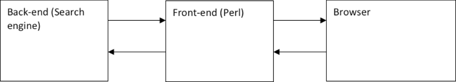
To begin, consider the general scheme for the execution of a search query.
')
The main parameter of the search quality is its speed . It is most convenient to measure it on the frontend side like this:
Data is written to the log, and a special daemon once every 5 minutes collects the next portion of logs from all the frontends and builds the next segment on the graph. It is worth noting that you should have two graphs with a search speed indicator.
First, the "five-minute" graph, which displays the current state. It can be useful for diagnosing “acute” conditions, for example, if after the next update, the search suddenly began to work not as expected, but much slower.
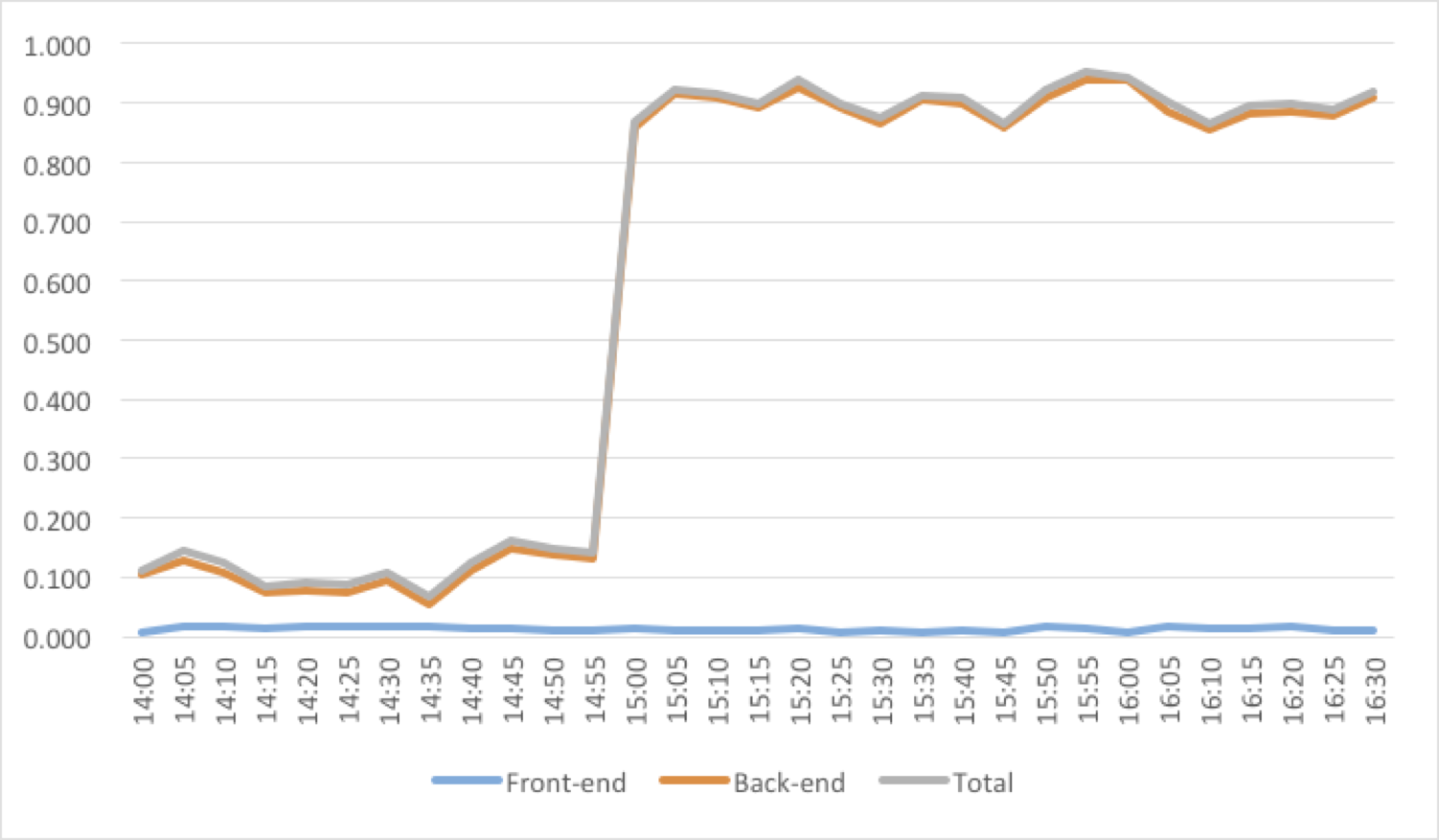
Figure 1. Oops! It seems that something was rolled out ...
Secondly, we also need a “daily” schedule, which allows us to detect deeper and less noticeable problems at first glance. For example, if the rebuilding of indexes occurs too rarely, then a certain “debt” will constantly accumulate - a certain amount of un-indexed data, for which only sequential search is possible. This “debt” will be seen on the graph as a slow degradation in speed over several days or weeks (Figure 2). This behavior of the chart is a signal that it would be worthwhile to revise the policy of the work of the indexing scheduler in order to index more often.
Also, this chart was very useful for us when switching from the old search engine to the new one. He allowed to clearly answer the question: “Has it become better with the new search?”. Full server reindexing usually takes several days, and the daily graph shows how, over this time, the search has gradually accelerated up to a difference of 2.5 times (Figure 3).
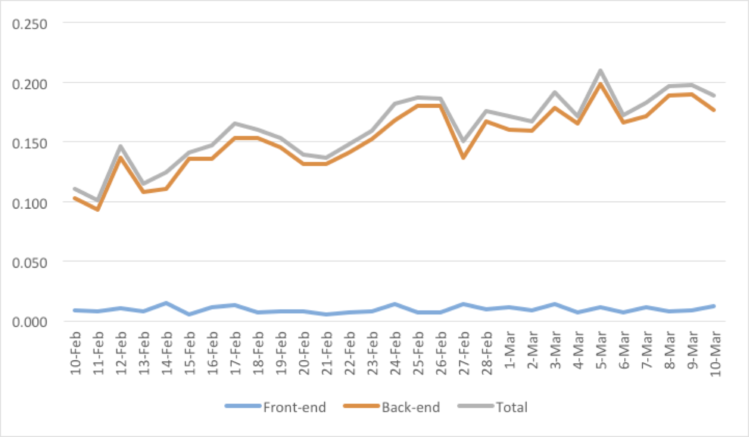
Figure 2. We are collecting the “debt” by indexing. Reason to think ...
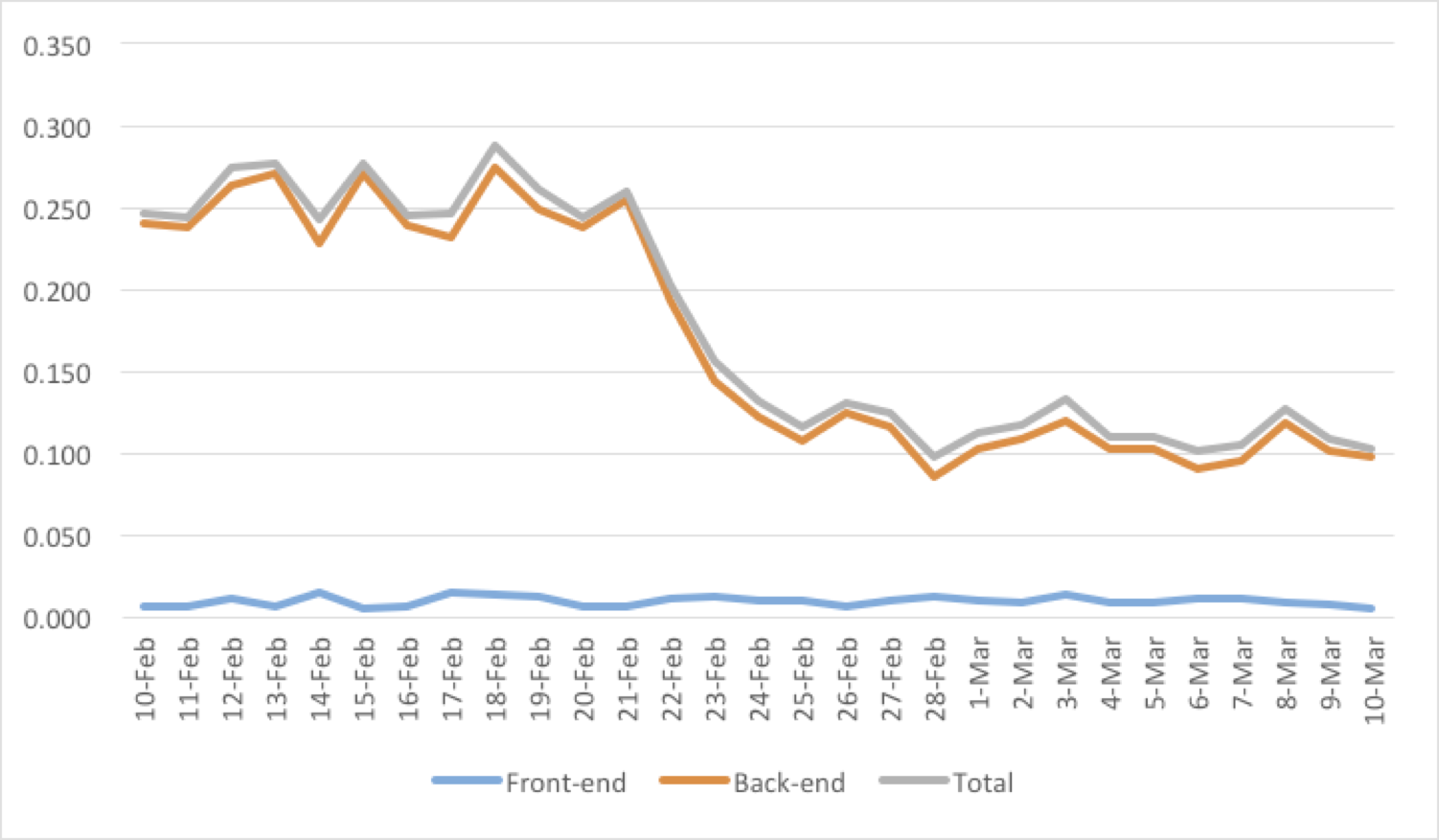
Figure 3. Go to the new search engine.
The following is worth noting the graph of the number of search queries . This graph itself is difficult to explore without analyzing other data. For example, a decrease in the number of search queries may indicate two opposite things:
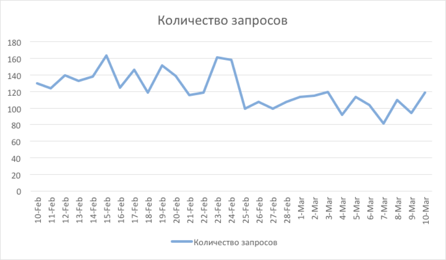
Figure 4. In this case, they began to more often find what they wanted from the first attempt.
An important parameter of the quality of the search is the number of queries with an empty result . On average, it is equal to 30%, most of these requests are constantly open page "all unread" for many users (waiting for a new letter). A sharp increase in this indicator may indicate a fatal search error (if this indicator exceeds a certain threshold value, it makes sense to send an SMS notification to developers and system administrators, since such errors need to be fixed in the shortest time, see Figure 5).
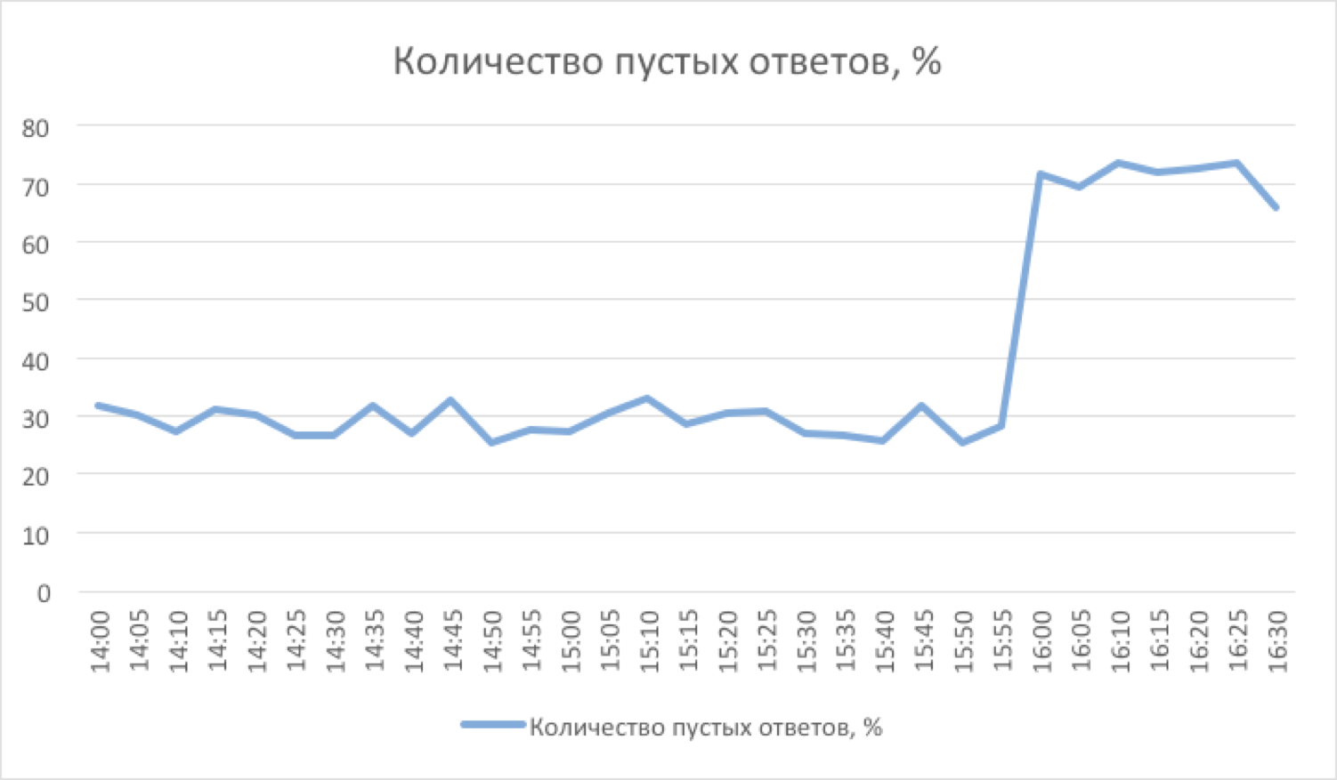
Figure 5. Some kind of problem appeared ... It's time to send SMS.
The number of clicks on the letters from the search directly indicates the quality of the sample of results (Figure 6). Due to the fact that there are snippets (short excerpts from the text of the letter with words highlighted in the request), users rarely click on letters that do not meet their expectations. Typically, the degradation in quality is slow, and the dynamics should be viewed over a long period of time after the layout of the next version of the search.
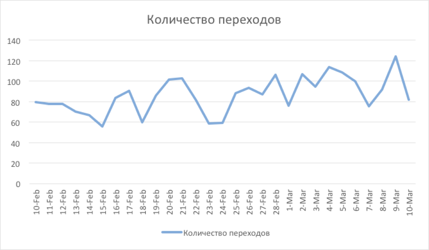
Figure 6. Search quality improved - the number of conversions increased.
It also makes sense to measure the number of "refinement" search queries. It is more likely that a search query made from the open page of search results can be considered as a refinement query . This conclusion is due to the assumption that after the user tried to find something, but the search results did not suit him, he decided to repeat the search, but somehow “differently”, with a different query. Such requests on average 1-3%. The growth of this indicator indicates that the search has ceased to find something from what was previously successful (Figure 7).
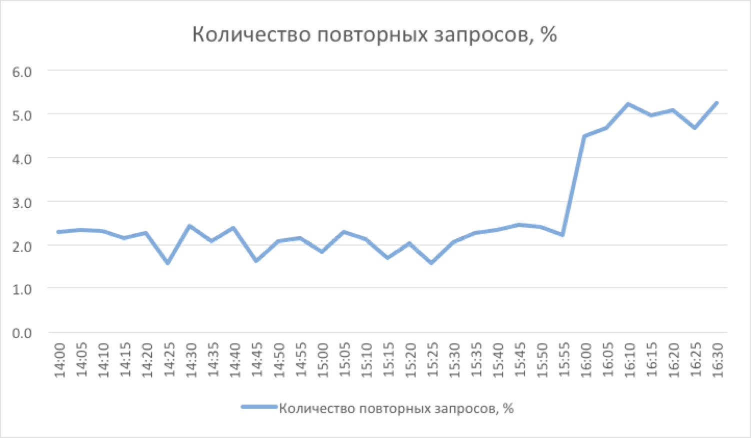
Figure 7. The extra 3% of repeated requests.
Developing the topic of "refining" search queries, it is worth noting that it makes sense to measure also the number of "flipping" search results . The growth of this value may serve as evidence, for example, that the resulting sample is too large. Such requests on average 1-2%. Most of them are due to the natural need to sometimes look for old letters, flipping "deeply" in time. The growth of this indicator indicates that something “superfluous” got into the results and pushed back (to the following pages) relevant letters. The fall of this indicator, on the contrary, is definitely a good sign, because users are starting to find what they are looking for on the first page of search results (Figure 8).
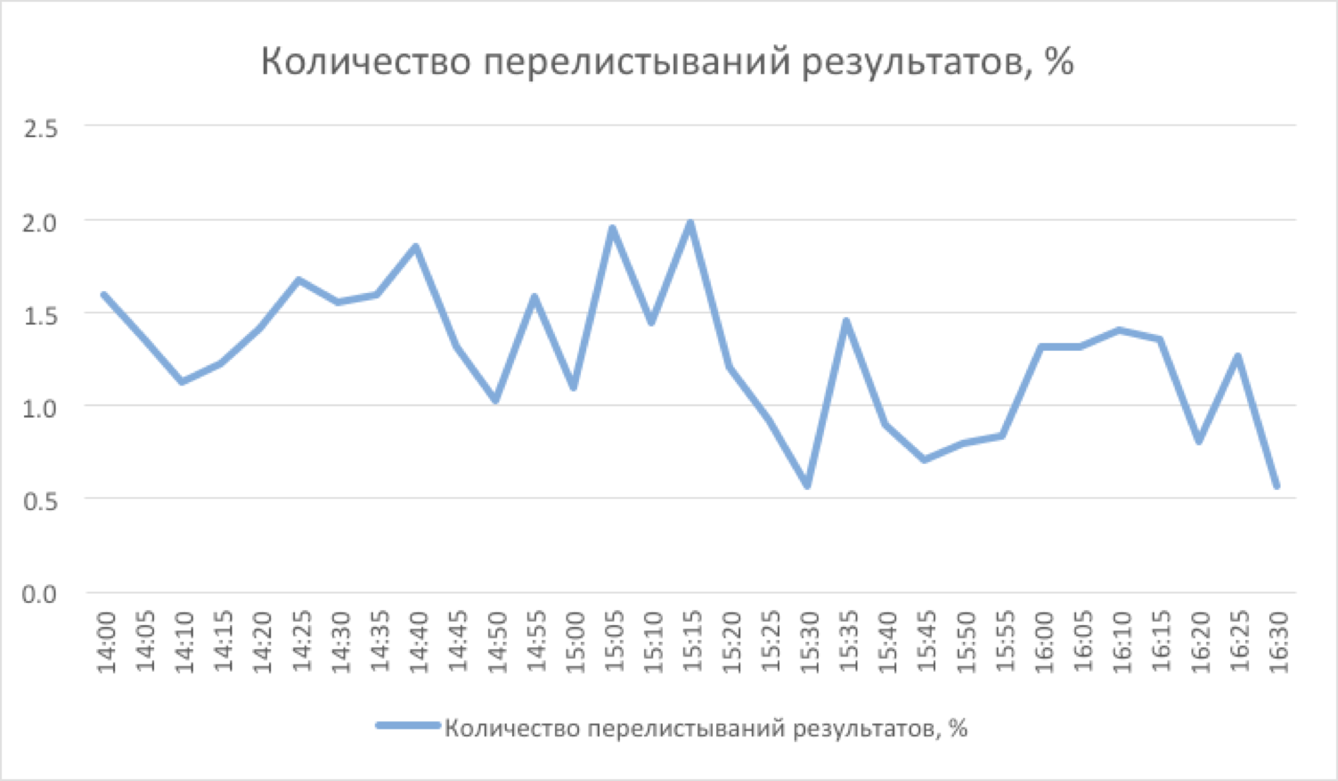
Figure 8. Now everything you need is on the first page, and scroll less often.
Finally, consider such a parameter as the average time you click on a letter after receiving the search results. This graph shows both the quality of the search sample (its accuracy) and the quality of the backlight of the snippets. The faster the user finds the letter in the sample with his eyes, the faster he clicks on it (Figure 9). The speed of finding the result increases both the search works correctly (correct sorting, the absence of “extra” results in the sample) and the quality of “highlighting” the words from the query in the snippet (the better it is, the faster the eye will “catch” for the desired result).
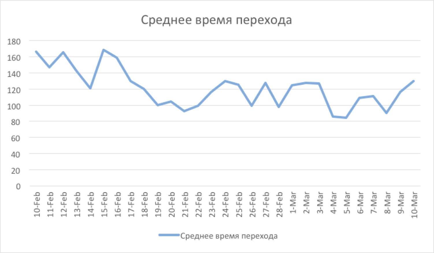
Figure 9. Recycled snippet coloring, and the average transition time has fallen.
Assessing the quality of the search, it makes sense to analyze all these indicators together. Similar graphics exist for sadzhes (search tips), the quality of which directly affects the quality of the search itself (3% of search queries are done with the help of sadzhestov). Due to the fact that often the quality of the search is degraded only after a certain time, all the graphs are built on two scales - five minutes and daily. Thus, it is possible to diagnose and solve possible problems with the search until they become visible to a wide range of users.
If you have questions, ideas or experience in solving problems in the field of QA search, let's discuss in the comments.
Dmitry Kalugin-Balashov
Mail.Ru Mail team programmer
PS: All the graphs are made personally by me in Excel for reasons of real events.
However, how to determine that a new search is really better? How to measure the quality of the search, I will tell in this post.
To begin, consider the general scheme for the execution of a search query.
')
The main parameter of the search quality is its speed . It is most convenient to measure it on the frontend side like this:
$mailsearch_start = Time::HiRes::time(); $answer = MailSearch::Query($request); $mailsearch_end = Time::HiRes::time(); Data is written to the log, and a special daemon once every 5 minutes collects the next portion of logs from all the frontends and builds the next segment on the graph. It is worth noting that you should have two graphs with a search speed indicator.
First, the "five-minute" graph, which displays the current state. It can be useful for diagnosing “acute” conditions, for example, if after the next update, the search suddenly began to work not as expected, but much slower.
Figure 1. Oops! It seems that something was rolled out ...
Secondly, we also need a “daily” schedule, which allows us to detect deeper and less noticeable problems at first glance. For example, if the rebuilding of indexes occurs too rarely, then a certain “debt” will constantly accumulate - a certain amount of un-indexed data, for which only sequential search is possible. This “debt” will be seen on the graph as a slow degradation in speed over several days or weeks (Figure 2). This behavior of the chart is a signal that it would be worthwhile to revise the policy of the work of the indexing scheduler in order to index more often.
Also, this chart was very useful for us when switching from the old search engine to the new one. He allowed to clearly answer the question: “Has it become better with the new search?”. Full server reindexing usually takes several days, and the daily graph shows how, over this time, the search has gradually accelerated up to a difference of 2.5 times (Figure 3).
Figure 2. We are collecting the “debt” by indexing. Reason to think ...
Figure 3. Go to the new search engine.
The following is worth noting the graph of the number of search queries . This graph itself is difficult to explore without analyzing other data. For example, a decrease in the number of search queries may indicate two opposite things:
- Users more often began to find what they wanted from the first attempt (well, see figure 4)
- Users generally stopped finding what they were looking for (bad)
Figure 4. In this case, they began to more often find what they wanted from the first attempt.
An important parameter of the quality of the search is the number of queries with an empty result . On average, it is equal to 30%, most of these requests are constantly open page "all unread" for many users (waiting for a new letter). A sharp increase in this indicator may indicate a fatal search error (if this indicator exceeds a certain threshold value, it makes sense to send an SMS notification to developers and system administrators, since such errors need to be fixed in the shortest time, see Figure 5).
Figure 5. Some kind of problem appeared ... It's time to send SMS.
The number of clicks on the letters from the search directly indicates the quality of the sample of results (Figure 6). Due to the fact that there are snippets (short excerpts from the text of the letter with words highlighted in the request), users rarely click on letters that do not meet their expectations. Typically, the degradation in quality is slow, and the dynamics should be viewed over a long period of time after the layout of the next version of the search.
Figure 6. Search quality improved - the number of conversions increased.
It also makes sense to measure the number of "refinement" search queries. It is more likely that a search query made from the open page of search results can be considered as a refinement query . This conclusion is due to the assumption that after the user tried to find something, but the search results did not suit him, he decided to repeat the search, but somehow “differently”, with a different query. Such requests on average 1-3%. The growth of this indicator indicates that the search has ceased to find something from what was previously successful (Figure 7).
Figure 7. The extra 3% of repeated requests.
Developing the topic of "refining" search queries, it is worth noting that it makes sense to measure also the number of "flipping" search results . The growth of this value may serve as evidence, for example, that the resulting sample is too large. Such requests on average 1-2%. Most of them are due to the natural need to sometimes look for old letters, flipping "deeply" in time. The growth of this indicator indicates that something “superfluous” got into the results and pushed back (to the following pages) relevant letters. The fall of this indicator, on the contrary, is definitely a good sign, because users are starting to find what they are looking for on the first page of search results (Figure 8).
Figure 8. Now everything you need is on the first page, and scroll less often.
Finally, consider such a parameter as the average time you click on a letter after receiving the search results. This graph shows both the quality of the search sample (its accuracy) and the quality of the backlight of the snippets. The faster the user finds the letter in the sample with his eyes, the faster he clicks on it (Figure 9). The speed of finding the result increases both the search works correctly (correct sorting, the absence of “extra” results in the sample) and the quality of “highlighting” the words from the query in the snippet (the better it is, the faster the eye will “catch” for the desired result).
Figure 9. Recycled snippet coloring, and the average transition time has fallen.
Assessing the quality of the search, it makes sense to analyze all these indicators together. Similar graphics exist for sadzhes (search tips), the quality of which directly affects the quality of the search itself (3% of search queries are done with the help of sadzhestov). Due to the fact that often the quality of the search is degraded only after a certain time, all the graphs are built on two scales - five minutes and daily. Thus, it is possible to diagnose and solve possible problems with the search until they become visible to a wide range of users.
If you have questions, ideas or experience in solving problems in the field of QA search, let's discuss in the comments.
Dmitry Kalugin-Balashov
Mail.Ru Mail team programmer
PS: All the graphs are made personally by me in Excel for reasons of real events.
Source: https://habr.com/ru/post/191554/
All Articles