Understanding of letters
In order to choose the right fonts for good readability of the text, it is necessary to understand the basic principles of typography. The devil is in the details, and the main component of typography is the letter.
The book "The Basics of Style in Typography" (The Elements of Typographic Style), which should be recommended to all novice designers, begins with the words:
If you can fit all the knowledge of typography in one phrase, then it is she. Content may scream or whisper. Similarly, fonts can be "loud" and "quiet." Letters, and in particular glyphs , their differences, allow to give the text a lot of shades.
The correct combination of letters allows you to clearly convey the mood of the text. And best of all, logo designers can do it!
')
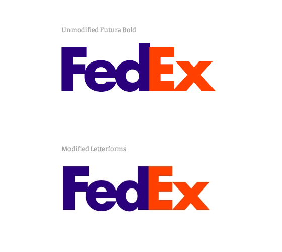
Perhaps the most popular logo that shows “possession of letters” is the FedEx logo, developed by Lyndon Leader. At first glance, this is the usual application of Futura Bold. However, if you look closely, you can see how the letters “E” and “x” were changed to form an arrow:
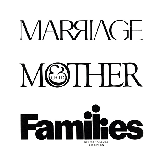
Here are some more examples from Herb Lubalin ( Herb Lubalin ), who was one of the best typography designers:
Good examples of logos can teach us a lot. Take a look at one of these from Volkan Eksi :

Excellent implementation of the idea without sacrificing readability! To understand the perception of such logos, consider an example. Which of these pieces of text is easier to read?
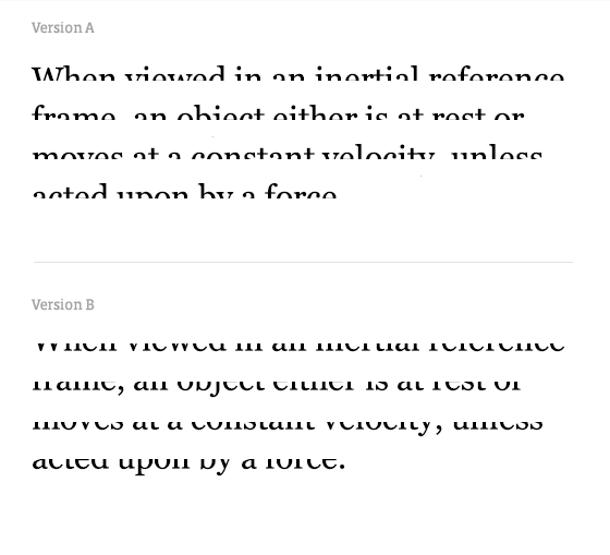
Obviously, option A, because it is much easier to disassemble the upper parts of English letters than the lower ones. Original:
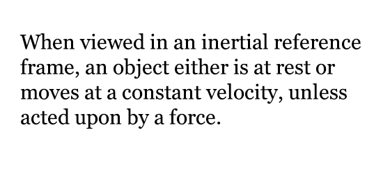
Therefore, changing the lower parts of the letters in the design is safer for readability than the upper ones. Please note that this is usually the case - in the lower parts of the logos make more changes.

Let us look at one more example, clearly demonstrating the factors that affect readability:
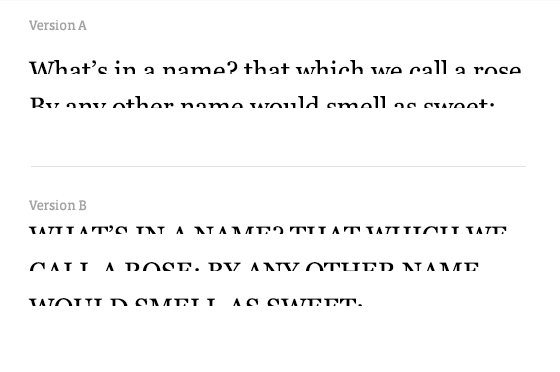
And again, option A reads better. And all because the person by virtue of habit does not respond to specific letters, but to the form of whole words. Therefore, it is more difficult to read in upper case.
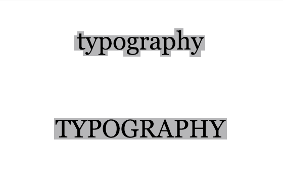
Probably many have come across a text where all the letters are mixed, but the text is easy to read:
But if you mix letters strongly, it will be difficult to read:

Back to the Pause logo: why is it so good? Because they changed only the lower part of the letters, and also did not change the form of the word!
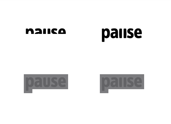
These are very simple principles that underlie typography; remember them!
The book "The Basics of Style in Typography" (The Elements of Typographic Style), which should be recommended to all novice designers, begins with the words:
Typography exists to pay tribute to the content.
If you can fit all the knowledge of typography in one phrase, then it is she. Content may scream or whisper. Similarly, fonts can be "loud" and "quiet." Letters, and in particular glyphs , their differences, allow to give the text a lot of shades.
The correct combination of letters allows you to clearly convey the mood of the text. And best of all, logo designers can do it!
')
Perhaps the most popular logo that shows “possession of letters” is the FedEx logo, developed by Lyndon Leader. At first glance, this is the usual application of Futura Bold. However, if you look closely, you can see how the letters “E” and “x” were changed to form an arrow:

Here are some more examples from Herb Lubalin ( Herb Lubalin ), who was one of the best typography designers:

Principles of readability of letters
Good examples of logos can teach us a lot. Take a look at one of these from Volkan Eksi :

Excellent implementation of the idea without sacrificing readability! To understand the perception of such logos, consider an example. Which of these pieces of text is easier to read?

Obviously, option A, because it is much easier to disassemble the upper parts of English letters than the lower ones. Original:

Therefore, changing the lower parts of the letters in the design is safer for readability than the upper ones. Please note that this is usually the case - in the lower parts of the logos make more changes.

Let us look at one more example, clearly demonstrating the factors that affect readability:

And again, option A reads better. And all because the person by virtue of habit does not respond to specific letters, but to the form of whole words. Therefore, it is more difficult to read in upper case.

Probably many have come across a text where all the letters are mixed, but the text is easy to read:
According to rzelulattas, orseudadal odongo unlegisokgo univertiset, they have no dates, in which cocoa cake baked in a salt. Gavvone, chotby preavya and plopendyaya bkvuy blyi on mset. Osatlyne bokva mgout Seldovti in ploonm bsepordyak, all-torn tkest chtaitsey without browning. The pichrion egoto is the fact that we cite not on a separate boulevard by otllenotsi, but everything is solvo to him.
But if you mix letters strongly, it will be difficult to read:

Back to the Pause logo: why is it so good? Because they changed only the lower part of the letters, and also did not change the form of the word!

These are very simple principles that underlie typography; remember them!
Source: https://habr.com/ru/post/190910/
All Articles