Adaptive emails
Today, users are increasingly reading emails on mobile devices. What is the viewing of a large HTML email on the phone? We have to scale and scroll a lot, in general, it becomes very inconvenient to read. Therefore, emails should be made responsive.
Training
First of all, let's define the main features of responsive emails:
')
- Clean and concise content: on small screens it is much more important to efficiently use the usable space.
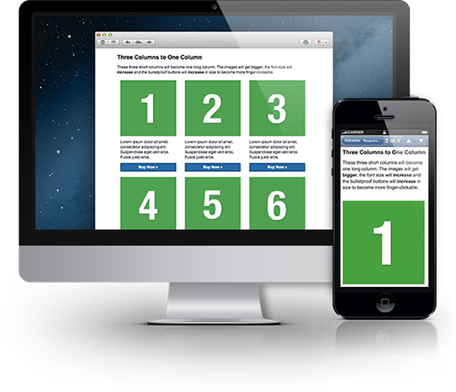
- One column: it is obvious that the content on the screen of the phone should not be split into several columns.
- Short subject: short e-mail letters stand out among many others in the inbox.
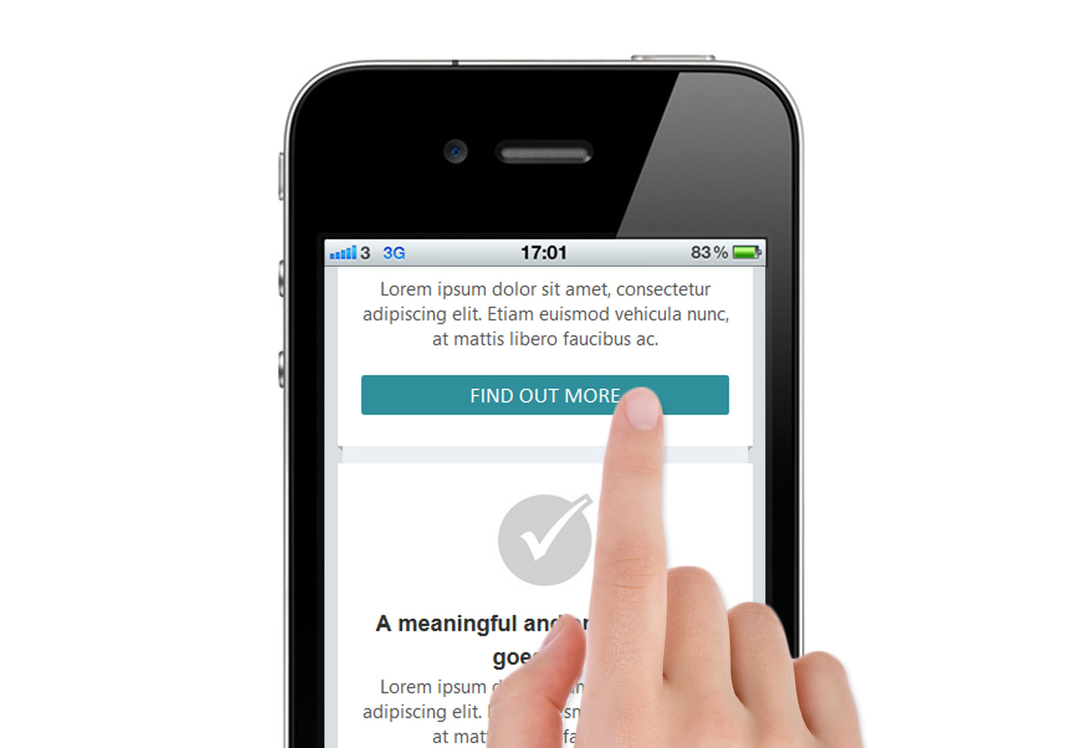
- Large “call to action” buttons: Apple iOS Human Interface Guidelines recommends making the button at least 44 × 44 px.
- The correct font: the text should be readable on any device.
- Pre-header: the initial text of the letter should reflect the content as much as possible.
- Aligning text to the left: Most users pay more attention to the left side of the screen. In addition, some operating systems may not fully display the letter, so the content should be aligned to the left.
- Vertical hierarchy: the most important information, including the “call to action” buttons, should be located at the top of the letter.
- Minimum images: the user does not expect to see big pictures in letters. In addition, many have disabled image display.
Start
HTML letters are slightly different in structure from ordinary plain HTML pages. For example, CSS styles should be written directly in the markup, in addition, some email clients ignore any CSS styles inside the head tag. For convenience, you can use special templates with competent markup HTML-letters. For example HTML Email Boilerplate .
Doctype
Hotmail and Gmail forcibly add doctype to XHTML 1.0 code.
<!DOCTYPE html PUBLIC "-//W3C//DTD XHTML 1.0 Strict//EN" "http://www.w3.org/TR/xhtml1/DTD/xhtml1-strict.dtd"> Viewport and Media Queries
For correct display on mobile devices, you should use the viewport meta tag. Unfortunately, it does not work on the Blackberry:

It is also advisable to define a content-type title tag. Many email clients will ignore this, but do not forget about the “browser version” of the letter. You can also add a bit of CSS to set some display options yourself.
<head> <meta name="viewport" content="width=device-width, initial scale=1.0"/> <meta http-equiv="Content-Type" content="text/html; charset=iso-8859-1"> <title>Email subject or title</title> <style type="text/css"> .ExternalClass {width:100%;} img {display: block;} </style> When adding Media Queries, we hide elements with the hide class using display: none if the screen width is less than 600 px:
@media only screen and (max-width: 600px) { table[class="hide"], img[class="hide"], td[class="hide"] { display:none!important; } } This is the standard approach for creating responsive emails: overwriting CSS in the head with! Important. In doing so, GMail will ignore styles in the head. Therefore, it is necessary to ensure that the content is displayed correctly everywhere. Using Media Queries, you can also limit the width of the content block:
@media only screen and (max-width: 600px) { table[class="content_block"] { width: 92%!important; } } Buttons
After reading the letter, the user, ideally, should perform some kind of action. Therefore, the role of “call to action” elements is very important. Buttons should be large, visible and located, if possible, at the top of the letter.
Unfortunately, there is no single cross-platform solution for buttons in letters. One of the options:
@media only screen and (max-width:600) { a[class="button"]{ display: block; padding: 7px 8px 6px 8px; -webkit-border-radius: 5px; -moz-border-radius: 5px; border-radius: 5px; color: #fff!important; background: #f46f62; text-align: center; text-decoration: none!important; } } Well, quite a simple way - the usual link. However, usability on touchscreen devices suffers:
<a href="#" style="color:#f46f62; font-weight: bold; text-decoration: underline;">Click me!</a> Download the example described in the article.
"Rubber" letters
Instead of adaptive layout of letters, you can use regular rubber. This is much easier, and email will be displayed correctly everywhere. However, in this case there are a number of disadvantages. First of all, usability will suffer greatly because elements of the letter cannot be moved depending on the screen width of the device. Therefore, rubber layout is not our way!
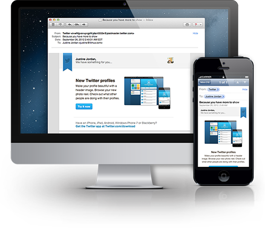
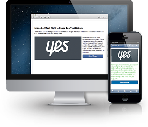
Examples of responsive emails
Here are a couple of good examples of how responsive emails should appear on large and mobile screens:
Conclusion
Due to the fact that there are a large number of types of platforms, devices and screens, it is very difficult to create a universal solution for the layout of adaptive emails. To sum up the above, one can come to one simple rule - “Simplicity is the key to good usability of letters.”
Related articles and material used
Source: https://habr.com/ru/post/190814/
All Articles