It's clear about CSS Masking and Shapes Modules, or the Future Revolution of Content Design
Good day, dear habrazhiteli. Today, with CSS, you can create many different elements. This is certainly very good, remembering the web a few years ago. But sometimes you “get tired” of all these cunning things with: before and: after ... Recently, I found two interesting specifications of CSS Masking Level 1 and CSS Shapes Level 2 , thanks to which in the near future we will open up completely new possibilities for content design and form element development. .
All modern browsers support the mask and clip-path properties, as defined in SVG 1.1 for SVG elements. But only Firefox allows you to apply these properties to HTML elements, and without prefixes. But speaking specifically about the CSS Masking specification, the mask, clip-path, mask-box-image properties are supported only on the latest Webkit / Blink with the prefix webkit.
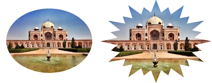
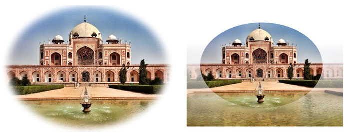
The clip-path property creates a clipping region for any of the HTML elements or graphic elements, including the SVG container elements - clipPath. The resulting elements can be animated. One impressive demo (unfortunately only works on the latest Chrome).
In addition to circumcision, the specification regulates the imposition of a mask in CSS (as in Photoshop). The mask image is used as a “color grid” to filter the visible parts of an element. Masks are divided into two types: a mask of color saturation (Luminance Mask) and an alpha mask (Alpha Mask).
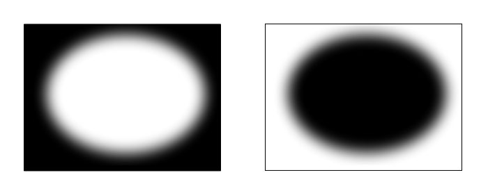
The image of the mask of color saturation (Fig. Top left) turns into a rasterized image of the brightness scale (if it is not already in the brightness scale). The “lighter” part of the mask image, the more the element will be visible in this place.
In the imposition of an alpha mask (Fig. Top right), the same principles are used as in the color saturation mask. The difference is that here the value is only the alpha channel of the image. The more opaque the part of the mask image, the less visible the element will be in the same place.
The values and functions of the following properties are fully equivalent to backgroud :
The only property of an unparalleled background is mask-box-image . The property divides the image mask into nine mosaic elements: four corners, four edges and a middle. The resulting parts can be layered, scaled and stretched in various ways.
An interesting feature is that the mask can be a CSS gradient. And the values of x-repeat and y-repeat are the same as in border-image:

As far as I understand this specification is a modernized CSS Exclusions . If I'm wrong, I will be grateful for comments explaining this moment.
CSS Shapes are supported in the latest builds of WebKit Nightly and Chrome Canary (in the chrome: // flags check the Enable experimental WebKit features option ).
Shape-outside creates a shape inside the element around which wrapping will occur. The property only works for float elements.
For a better understanding of shape-outside, he clearly demonstrated his work in the inset-rectangle example below. The element itself is transparent blue in color, the form for wrapping inside. You should also pay attention to the fact that the clip-path property is used for all elements, which only cuts off the specified shape of the element, but does not affect the flow around.
Demo
Shape-inside creates a shape inside the element within which the wrapping will occur.
Codepen demo page
This property determines the threshold of the alpha channel of the image on the basis of which the shape is determined. Values from 0.0 to 0.1, by default 0.5. That is, if you determine the shape of a particular image, then the default zone where the opacity is less than 50% will not be taken into account.
The specifics of the work of these properties is slightly different from the standards of margin and padding. The principle of operation is very clearly demonstrated on this page (below).
I can not mention this little wonderful property. It is used in most examples with shape-inside, and one of its functions is the automatic hyphenation of words with a hyphen. Without this property, content inside a certain form would look awful. It already works in Firefox, IE, Safari isamazing, that it is not in Chrome .
Resources used besides W3C specifications:
HTML5ROCK
CSS Shapes and Float Positioning: What's Old is New Again
The CSS Shapes Module - Breaking Out of the Box
Web platform
Thank you very much for your attention.
CSS Masking
Compatibility
All modern browsers support the mask and clip-path properties, as defined in SVG 1.1 for SVG elements. But only Firefox allows you to apply these properties to HTML elements, and without prefixes. But speaking specifically about the CSS Masking specification, the mask, clip-path, mask-box-image properties are supported only on the latest Webkit / Blink with the prefix webkit.
clip-path
The clip-path property creates a clipping region for any of the HTML elements or graphic elements, including the SVG container elements - clipPath. The resulting elements can be animated. One impressive demo (unfortunately only works on the latest Chrome).
rectangle(x, y, width, height, [rx, ry]);
')circle(cx, cy, r);ellipse(cx, cy, rx, ry);polygon(<x1> <y1>, <x2> <y2>, ..., <xn> <yn>);url(path/to/image.png);
Usage example
.element1 { clip-path: url(#clipping); } .element2 { clip-path: circle(50%,50%,50%); } Masks
In addition to circumcision, the specification regulates the imposition of a mask in CSS (as in Photoshop). The mask image is used as a “color grid” to filter the visible parts of an element. Masks are divided into two types: a mask of color saturation (Luminance Mask) and an alpha mask (Alpha Mask).
Mask color saturation
The image of the mask of color saturation (Fig. Top left) turns into a rasterized image of the brightness scale (if it is not already in the brightness scale). The “lighter” part of the mask image, the more the element will be visible in this place.
Alpha mask
In the imposition of an alpha mask (Fig. Top right), the same principles are used as in the color saturation mask. The difference is that here the value is only the alpha channel of the image. The more opaque the part of the mask image, the less visible the element will be in the same place.
The values and functions of the following properties are fully equivalent to backgroud :
- mask
- mask-image
- mask-repeat
- mask-position
- mask-clip
- mask-origin
- mask-size
Usage example
img { mask: url(#masking); } <svg> <defs> <linearGradient id="gradient" x1="0" y1="00%" x2 ="0" y2="100%"> <stop stop-color="black" offset="0"/> <stop stop-color="white" offset="1"/> </linearGradient> <mask id="masking" maskUnits="objectBoundingBox" maskContentUnits="objectBoundingBox"> <rect y="0.3" width="1" height=".7" fill="url(#gradient)" /> <circle cx=".5" cy=".5" r=".35" fill="white" /> </mask> </defs> </svg> mask-box-image
The only property of an unparalleled background is mask-box-image . The property divides the image mask into nine mosaic elements: four corners, four edges and a middle. The resulting parts can be layered, scaled and stretched in various ways.
mask-box-image: <URL/Gradient> [<top> <right> <bottom> <left> <x-repeat> <y-repeat>] An interesting feature is that the mask can be a CSS gradient. And the values of x-repeat and y-repeat are the same as in border-image:
- stretch - stretches the border pattern to the size of the element. This value is used by default.
- repeat - repeats the mask display on the entire border of the element.
- round - repeats the mask display and scales it so that on the side of the element is an integer number of images.
img { mask-box-image: url("stamp.svg") 35 repeat; /* 35 */ } CSS Shape
As far as I understand this specification is a modernized CSS Exclusions . If I'm wrong, I will be grateful for comments explaining this moment.
Support
CSS Shapes are supported in the latest builds of WebKit Nightly and Chrome Canary (in the chrome: // flags check the Enable experimental WebKit features option ).
Shape-outside
Shape-outside creates a shape inside the element around which wrapping will occur. The property only works for float elements.
For a better understanding of shape-outside, he clearly demonstrated his work in the inset-rectangle example below. The element itself is transparent blue in color, the form for wrapping inside. You should also pay attention to the fact that the clip-path property is used for all elements, which only cuts off the specified shape of the element, but does not affect the flow around.
Demo
rectangle(x, y, width, height, [rx, ry]);rectangle(x, y, width, height, [rx, ry]);circle(cx, cy, r);ellipse(cx, cy, rx, ry);polygon(<x1> <y1>, <x2> <y2>, ..., <xn> <yn>);url(path/to/image.png);
Shape-inside
Shape-inside creates a shape inside the element within which the wrapping will occur.
shape-inside has the same meaning as shape-outside
rectangle(x, y, width, height, [rx, ry]);rectangle(x, y, width, height, [rx, ry]);circle(cx, cy, r);ellipse(cx, cy, rx, ry);polygon(<x1> <y1>, <x2> <y2>, ..., <xn> <yn>);url(path/to/image.png);
Codepen demo page
Shape-image-threshold
This property determines the threshold of the alpha channel of the image on the basis of which the shape is determined. Values from 0.0 to 0.1, by default 0.5. That is, if you determine the shape of a particular image, then the default zone where the opacity is less than 50% will not be taken into account.
Shape-margin and shape-padding
The specifics of the work of these properties is slightly different from the standards of margin and padding. The principle of operation is very clearly demonstrated on this page (below).
Hyphens
I can not mention this little wonderful property. It is used in most examples with shape-inside, and one of its functions is the automatic hyphenation of words with a hyphen. Without this property, content inside a certain form would look awful. It already works in Firefox, IE, Safari is
- none - Prohibits hyphenation, line breaks are placed only between words. (Usual display)
- manual - Manual hyphenation - words are broken only in places where special characters are placed.
- auto - Automatic hyphenation, but priority is given in places with special characters.
Resources used besides W3C specifications:
HTML5ROCK
CSS Shapes and Float Positioning: What's Old is New Again
The CSS Shapes Module - Breaking Out of the Box
Web platform
Thank you very much for your attention.
Source: https://habr.com/ru/post/190246/
All Articles