Moving ActionBar to the next level
Back in November 2012, I wrote a blog post entitled " ActionBar on the Move ." This article mainly focused on how to liven up your
Being on Google I / O, I finally found an application that uses animation techniques in
The last update of Play Music (v5.0) has undergone a complete redesign and appearance of pages with a description of the artist and album. If you open such a page, you will notice that
Here are the two main advantages of this
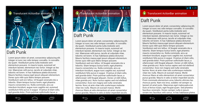
In this article I will delve into the details of the implementation of the methodology described in the article “ ActionBar in motion ” to create an effect similar to that used in the Play Music application. In order to better understand what goals we plan to achieve, you can take a look at the screenshots below or download the sample application.
')
Download the sample APK
As you can easily see, in order to reproduce such an effect, the
values / themes.xml
Logically, the ActionBar style is defined in values / styles.xml as follows:
values / styles.xml
In conclusion, we must use this theme to apply this style to our
AndroidManifest.xml
Please note that with the help of themes and styles, we remove all potential flicker problems at startup (see “ Launching an Android application correctly ” for more information).
As I explained earlier, the attenuation of the
NotifyingScrollView.java
Now we can use this new scroll container in our XML layout:
layout / activity_home.xml
Now most of our template is ready, and we can connect all these components together. The algorithm used for
HomeActivity.java
As described in the ActionBar in Motion article, this code snippet above does not work for pre-JELLY_BEAN_MR1 devices. Indeed, the
HomeActivity.java
HomeActivity.java
You can already run the code. Although the result looks the same as in the animation of the Play Music application, we can continue to refine it to make it even better.
Having a transparent
The easiest way to avoid such a problem is to modify the image to make it a little darker at the top. Thus, in the worst case (i.e. white image) we have a gray area at the top of the
You can do this by superimposing a dark translucent gradient at the top of the image, which we will create in the XML description
drawable / gradient.xml
Gradient overlay is implemented via
layout / activity_home.xml
In Gingerbread (API 9), Android introduced a new way to notify the user that the scroll container is trying to go beyond the content of the borders. The concept of
You can replay this simply by
One of the best ways to avoid over-scroll is to use
NotifyingScrollView.java
I don’t know if the Play Music app team used behavior based on my article. But they brilliantly used this technique to polish and emphasize the user interface. Obviously, this is a great pattern for those cases where you need to implement a screen whose content speaks for itself and is more important than the content of the ActionBar.
ActionBar beautifully and uniquely. Although I mentioned some of the possibilities of applying this effect, I never had the time to add this kind of ActionBar animation to any of my own applications. But I saw an application in the Play Store using it.Being on Google I / O, I finally found an application that uses animation techniques in
ActionBar . Let's be honest, it literally blew my mind when I first saw it. I fell in love with a nice, subtle, and extremely useful animated effect, and probably even more than in the app itself! I am sure you know the application I am talking about, since it was presented during Google I / O. This application is Play Music!The last update of Play Music (v5.0) has undergone a complete redesign and appearance of pages with a description of the artist and album. If you open such a page, you will notice that
ActionBar initially invisible and is layered on a large image describing the artist or album. But as soon as you start scrolling down the page (if it is possible), the ActionBar gradually appears. ActionBar turns out to be completely opaque when the image becomes scrolled behind the screen.Here are the two main advantages of this
ActionBar animation:- Exquisite UI : the animation is synchronized with the element on which you interact and is positively appreciated by the users, because it makes them feel naturally with your UI, which reacts to their actions. The fading of the animation is a direct consequence of the pixel-by-pixel scrolling state, and not the animation that was once triggered.
- It takes advantage of the real state of the screen : while maintaining the UX platform, this model allows the user to focus primarily on the content, and not on the controls. It is used as an addition to a beautiful design and can be perceived as an exciting game in the interface of your application.
In this article I will delve into the details of the implementation of the methodology described in the article “ ActionBar in motion ” to create an effect similar to that used in the Play Music application. In order to better understand what goals we plan to achieve, you can take a look at the screenshots below or download the sample application.
')
Download the sample APK
Themes and styles for the application
As you can easily see, in order to reproduce such an effect, the
ActionBar must overlap the screen. This is done using the android:windowActionBarOverlay XML attribute. The code below describes the definition of a theme that we will use:values / themes.xml
<?xml version="1.0" encoding="utf-8"?> <resources> <style name="Theme.TranslucentActionBar" parent="@android:style/Theme.Holo.Light.DarkActionBar"> <item name="android:actionBarStyle">@style/Widget.ActionBar</item> </style> <style name="Theme.TranslucentActionBar.ActionBar" /> <style name="Theme.TranslucentActionBar.ActionBar.Overlay"> <item name="android:actionBarStyle">@style/Widget.ActionBar.Transparent</item> <item name="android:windowActionBarOverlay">true</item> </style> </resources> Logically, the ActionBar style is defined in values / styles.xml as follows:
values / styles.xml
<?xml version="1.0" encoding="utf-8"?> <resources> <style name="Widget.ActionBar" parent="@android:style/Widget.Holo.Light.ActionBar.Solid.Inverse"> <item name="android:background">@drawable/ab_background</item> </style> <style name="Widget.ActionBar.Transparent"> <item name="android:background">@android:color/transparent</item> </style> </resources> In conclusion, we must use this theme to apply this style to our
Activity :AndroidManifest.xml
<?xml version="1.0" encoding="utf-8"?> <manifest xmlns:android="http://schemas.android.com/apk/res/android" package="com.cyrilmottier.android.translucentactionbar" android:versionCode="1" android:versionName="1.0" > <uses-sdk android:minSdkVersion="14" android:targetSdkVersion="17" /> <application android:allowBackup="true" android:icon="@drawable/ic_launcher" android:label="@string/app_name" android:theme="@style/Theme.TranslucentActionBar"> <activity android:name=".HomeActivity" android:theme="@style/Theme.TranslucentActionBar.ActionBar.Overlay"> <intent-filter> <action android:name="android.intent.action.MAIN" /> <category android:name="android.intent.category.LAUNCHER" /> </intent-filter> </activity> </application> </manifest> Please note that with the help of themes and styles, we remove all potential flicker problems at startup (see “ Launching an Android application correctly ” for more information).
Getting ready content
As I explained earlier, the attenuation of the
ActionBar synchronized on the pixel state of the scroll container. In this example, we'll just use ScrollView as a scroll container. One of the major drawbacks of this container is that you cannot register a listener in order to receive notifications when the scrolling state has changed. But this can be easily circumvented by creating the NotifyingScrollView inherited from the original ScrollView :NotifyingScrollView.java
package com.cyrilmottier.android.translucentactionbar; import android.content.Context; import android.util.AttributeSet; import android.widget.ScrollView; /** * @author Cyril Mottier */ public class NotifyingScrollView extends ScrollView { /** * @author Cyril Mottier */ public interface OnScrollChangedListener { void onScrollChanged(ScrollView who, int l, int t, int oldl, int oldt); } private OnScrollChangedListener mOnScrollChangedListener; public NotifyingScrollView(Context context) { super(context); } public NotifyingScrollView(Context context, AttributeSet attrs) { super(context, attrs); } public NotifyingScrollView(Context context, AttributeSet attrs, int defStyle) { super(context, attrs, defStyle); } @Override protected void onScrollChanged(int l, int t, int oldl, int oldt) { super.onScrollChanged(l, t, oldl, oldt); if (mOnScrollChangedListener != null) { mOnScrollChangedListener.onScrollChanged(this, l, t, oldl, oldt); } } public void setOnScrollChangedListener(OnScrollChangedListener listener) { mOnScrollChangedListener = listener; } } Now we can use this new scroll container in our XML layout:
layout / activity_home.xml
<?xml version="1.0" encoding="utf-8"?> <com.cyrilmottier.android.translucentactionbar.NotifyingScrollView xmlns:android="http://schemas.android.com/apk/res/android" android:id="@+id/scroll_view" android:layout_width="match_parent" android:layout_height="match_parent"> <LinearLayout android:layout_width="match_parent" android:layout_height="wrap_content" android:orientation="vertical"> <ImageView android:id="@+id/image_header" android:layout_width="match_parent" android:layout_height="wrap_content" android:scaleType="centerCrop" android:src="@drawable/daft_punk"/> <! -- Some long content --> </LinearLayout> </com.cyrilmottier.android.translucentactionbar.NotifyingScrollView> Show \ hide ActionBar
Now most of our template is ready, and we can connect all these components together. The algorithm used for
ActionBar quite simple and consists only of calculating the alpha channel depending on the current pixel state of our scrolling container NotifyingScrollView . It should be noted that the effective scroll distance must be attached to [0, image_height - actionbar_height] to avoid erroneous values that may arise due to the behavior of scroll container bars in Android:HomeActivity.java
package com.cyrilmottier.android.translucentactionbar; import android.app.Activity; import android.graphics.drawable.Drawable; import android.os.Build; import android.os.Bundle; import android.support.v4.view.GravityCompat; import android.support.v4.widget.DrawerLayout; import android.util.Log; import android.view.Menu; import android.widget.ScrollView; public class HomeActivity extends Activity { private Drawable mActionBarBackgroundDrawable; @Override public void onCreate(Bundle savedInstanceState) { super.onCreate(savedInstanceState); setContentView(R.layout.activity_home); mActionBarBackgroundDrawable = getResources().getDrawable(R.drawable.ab_background); mActionBarBackgroundDrawable.setAlpha(0); getActionBar().setBackgroundDrawable(mActionBarBackgroundDrawable); ((NotifyingScrollView) findViewById(R.id.scroll_view)).setOnScrollChangedListener(mOnScrollChangedListener); } private NotifyingScrollView.OnScrollChangedListener mOnScrollChangedListener = new NotifyingScrollView.OnScrollChangedListener() { public void onScrollChanged(ScrollView who, int l, int t, int oldl, int oldt) { final int headerHeight = findViewById(R.id.image_header).getHeight() - getActionBar().getHeight(); final float ratio = (float) Math.min(Math.max(t, 0), headerHeight) / headerHeight; final int newAlpha = (int) (ratio * 255); mActionBarBackgroundDrawable.setAlpha(newAlpha); } }; } As described in the ActionBar in Motion article, this code snippet above does not work for pre-JELLY_BEAN_MR1 devices. Indeed, the
ActionBar does not denote itself invalid when required, since it does not register itself as a callback for Drawable . You can work around this problem by simply attaching the following onCreate(Bundle) in the onCreate(Bundle) method:HomeActivity.java
private Drawable.Callback mDrawableCallback = new Drawable.Callback() { @Override public void invalidateDrawable(Drawable who) { getActionBar().setBackgroundDrawable(who); } @Override public void scheduleDrawable(Drawable who, Runnable what, long when) { } @Override public void unscheduleDrawable(Drawable who, Runnable what) { } }; HomeActivity.java
if (Build.VERSION.SDK_INT < Build.VERSION_CODES.JELLY_BEAN_MR1) { mActionBarBackgroundDrawable.setCallback(mDrawableCallback); } You can already run the code. Although the result looks the same as in the animation of the Play Music application, we can continue to refine it to make it even better.
Brush strokes
Strengthen the contrast ActionBar
Having a transparent
ActionBar can lead to design issues, because you usually don’t know about the background color that you will display at the top. For example, you can end up displaying a transparent ActionBar with a white header and a white image in the description. Needless to say, this makes ActionBar invisible and useless.The easiest way to avoid such a problem is to modify the image to make it a little darker at the top. Thus, in the worst case (i.e. white image) we have a gray area at the top of the
ActionBar making its content (name, icons, buttons, etc.) visible.You can do this by superimposing a dark translucent gradient at the top of the image, which we will create in the XML description
Drawable :drawable / gradient.xml
<?xml version="1.0" encoding="utf-8"?> <shape xmlns:android="http://schemas.android.com/apk/res/android" android:shape="rectangle"> <size android:height="100dp"/> <gradient android:angle="270" android:startColor="#8000" android:endColor="#0000"/> </shape> Gradient overlay is implemented via
FrameLayout :layout / activity_home.xml
<FrameLayout android:layout_width="match_parent" android:layout_height="wrap_content"> <ImageView android:id="@+id/image_header" android:layout_width="match_parent" android:layout_height="wrap_content" android:scaleType="centerCrop" android:src="@drawable/daft_punk"/> <View android:layout_width="match_parent" android:layout_height="wrap_content" android:background="@drawable/gradient"/> </FrameLayout> Avoid excessive scrolling
In Gingerbread (API 9), Android introduced a new way to notify the user that the scroll container is trying to go beyond the content of the borders. The concept of
EdgeEffect was introduced for the first time (available in API starting at API 14), including over-scroll. Although this is not a problem, but in general, it can be very annoying when one of the edges of the scrollable content differs from the background color.You can replay this simply by
ScrollView up. And you will notice that something white (background color) appears at the top of the screen, because the image is scrolled beyond its limits. Personally, I consider this an interface glitch and usually prefer to disable this behavior.One of the best ways to avoid over-scroll is to use
View#setOverScrollMode(int) to change the View#OVER_SCROLL_NEVER mode View#OVER_SCROLL_NEVER . Although it works, this option also removes the EdgeEffect , which may not be visually acceptable. Therefore, it is easier to change the NotifyingScrollView to limit the over-scroll values to zero when necessary:NotifyingScrollView.java
private boolean mIsOverScrollEnabled = true; public void setOverScrollEnabled(boolean enabled) { mIsOverScrollEnabled = enabled; } public boolean isOverScrollEnabled() { return mIsOverScrollEnabled; } @Override protected boolean overScrollBy(int deltaX, int deltaY, int scrollX, int scrollY, int scrollRangeX, int scrollRangeY, int maxOverScrollX, int maxOverScrollY, boolean isTouchEvent) { return super.overScrollBy( deltaX, deltaY, scrollX, scrollY, scrollRangeX, scrollRangeY, mIsOverScrollEnabled ? maxOverScrollX : 0, mIsOverScrollEnabled ? maxOverScrollY : 0, isTouchEvent); } Conclusion
I don’t know if the Play Music app team used behavior based on my article. But they brilliantly used this technique to polish and emphasize the user interface. Obviously, this is a great pattern for those cases where you need to implement a screen whose content speaks for itself and is more important than the content of the ActionBar.
Source: https://habr.com/ru/post/190102/
All Articles